
Do you know that Excel 2010 makes creation of dynamic dashboards very simple?
Yes, that is right. Using slicers feature, you can create dynamic excel dashboards from your data in very little time. Today we are going to learn a technique that will help you create a dashboard like below.
(Note: The technique works only Excel 2010 or above.)
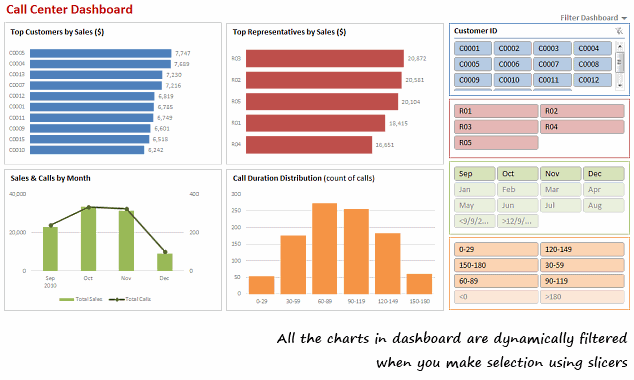
[View the dashboard image in large size]
How to make a Dynamic Dashboard in Excel using Pivot Tables & Slicers
I made a short (12 min) video tutorial explaining the concept and construction of this dynamic dashboard. Watch it below.
[Watch the dynamic dashboard tutorial on YouTube]
If you are new to Pivot Tables,
Read this excellent pivot tables tutorial & watch the video on pivot tables.
Download Dynamic Dashboard Workbook:
Click here to download the Excel 2010 workbook. Remember, it works only in Excel 2010 or above.
Do you use Slicers? What is your experience like?
I have been using Excel 2010 for the last several months. I really like the new features – sparklines, slicers & pivot table enhancements. They give a lot of muscle for analyst in me.
What about you? How do you like the slicers feature in Excel 2010. How are you using them?
Get Dashboard Training from Chandoo.org
I have made an hour long video training explaining how to construct Excel Dashboards using a recent dashboard I made as an example. If you work on dashboards, this is a good program for you. Click here to learn more.

More Resources on Dashboards, Dynamic Charts & Pivot Tables
Visit these pages to learn more.


8 Responses to “Introducing PHD Sparkline Maker – Dead Simple way to Create Excel Sparklines”
This looks like it could be very useful for a project I'm putting together right now, thank you so much. Quick & silly question, how do I copy & paste the sparkline as a picture?
Question answered. For anyone else:
Select chart>Hold Shift key & select Edit/Copy Picture>Paste
[...] more information about PHD Sparkline Maker, please read this article and to learn more about Sparklines, read this article from Microsoft Excel 2010 blog. Also there [...]
Am I right in thinking that the y-axis is set automatically by excel?
That makes it possible to get the column chart not to start at zero.
Andy - yes, it is currently set to 'auto', which defaults to a zero base for positive values, but you can change that by left-clicking the chart, then choosing (in Excel 2007):
"Chart Tools/Layout/Axes/Primary Vertical Axis/More Primary Vertical Axis Options"
PUBLIC SERVICE ANNOUNCEMENT: When manually editing a chart's minimum/maximum axis values, PLEASE be sure there's a valid reason and that doing so won't skew the message shown by the data (e.g. by exaggerating differences). If in doubt, go back and read Tufte. (W.W.T.D.?)
[...] gridlines, axis, legend, titles, labels etc.) and resize it so that it fits nicely in a cell [example]. This is the easiest and cleanest way to get sparklines in earlier versions of excel. However this [...]
thanks for the work creating the template!!!!
looks good