Creating Triangular Plots using Excel

Share

Facebook
Twitter
LinkedIn

This is a guest post by Faseeh, one of the Excel Ninja’s at our forum.

Triangular plot…! What is it?

Recently, a Chandoo.org forum member asked this,

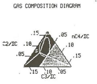
I want to be able to make a graph that, in some aspects, looks like below, but I have no idea how to do it at all.

Triangular plot example - used in gas composition digrams

After seeing it, I said to myself in Barney Stinson’s tone, ‘Challenge Accepted!

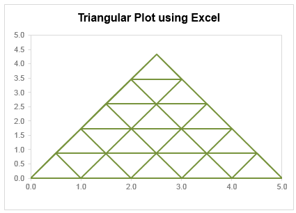
The final plot is like this:

Triangular plot made using Excel

Making triangular plot in Excel – Tutorial

The first step to create such a chart starts from a manual drawing of how your chart will be looking like; at least you need to mark some important connecting points that will make smaller triangles.

The trick in this chart is simply to locate points in all three sides of the triangle and connect them in a way that results in smaller triangle. Here is a step by step approach to make this chart:

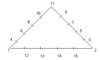
  1. Make a rough sketch of the triangle. Divide each side of the triangle roughly into the number of segments that you want, each side with equal number of segments (in this case 05 segments). And give each of them a number including corners of the triangle
    Triangle plot outline. This helps us identify various points in the chart.
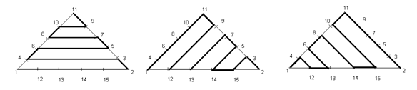
  2. Now we can split this chart into three types of lines, horizontal, tilted towards right, tilted toward left.
    Individual lines that make the triangle plot
  3. For each of these lines we need to join certain points and when we combine these lines into a single series we will get our desired chart. So let’s list down the points in each line.

    Horizontal Lines (L1): Point 01, 02, 03, 04, 06, 05, 07, 08, 10, 09, 11.
    Right Lines (L2): Point 01, 11, 09, 12, 13, 07, 05, 14, 15, 03, 02
    Left Lines (L3): Point 02, 11, 10, 15, 14, 08, 06, 13, 12, 04, 01

  4. Now we need to setup a table where the coordinates of these points are listed in tabular order, like this:

    Data & calculations for triangle plot in Excel
    This can be done by using trigonometric ratio of sine and cosine, by representing each point in terms of Polar Coordinates [ These coordinates represent each point in terms of a distance “R” and an angle represented by Greek alphabet Theta (q), Line 01 makes an angle of 0° from X-Axis, Line 02 of 60° and Line 03 of 120° from +ive X- Axis, these details can be simply skipped if you don’t like math  😉 ]
    Avoiding the details of trigonometry you can simply use following two formulas to get these values…

    For Value of X (Ordinate) you can use the following formula:
    =IF(O6=”H”,N6*COS(RADIANS(Q6)),IF(O6=”L”,N6*COS(RADIANS(Q6)),$D$5+N6*COS(RADIANS(Q6))))

    For Y (Abscissa) you can use following:
    =IF(O6=”H”,N6*SIN(RADIANS(Q6)),IF(O6=”L”,N6*SIN(RADIANS(Q6)),N6*SIN(RADIANS(Q6))))

  5. Once this Lookup Table is created we need to create another table where we list points in accordance to the Lines that we have already created. We will use VLOOKUP () to fetch the corresponding coordinate through this formula and we will do this for all the three Lines. The VLOOKUP() simply looks for the point in the left most column of the first table and bring the corresponding values from the 3rd and 4th column to form the point in second table.
  6. When we are done with bringing the coordinates of all of these points we just need to plot a Scatter Chart. Now use a XY scatter chart to plot the data. You need to add only one series, actually there are three types of lines but we can accommodate them in just one series. When they overlap, they will give smaller triangles in result.

Download Triangular Plot workbook

Click here to download the chart. Examine the formulas & chart series to understand how this is made.

Added by Chandoo

Do you make such complex charts for your work?

I will be honest. I never had to make a triangle plot. But then, I never had to make Ratatouille either. That doesn’t make me appreciate both of them any less. I think this chart shows fantastic technique. It also proves that Excel is highly flexible if you know which bolt to turn and which screw to tighten.

What about you? Do you make such complex charts or visual analysis for your work? What is the most challenging chart you have worked on? Please share using comments.

Shape up your Chart skills – Charts + Shapes

If your job involves making charts in all shapes and sizes, then you are in luck. Check out these tutorials to learn how to bend Excel charting rules to get any shape you want:

Thank you Faseeh

Many thanks to Faseeh for sharing this tutorial with all of us. I really enjoyed this and learned a few tricks from it.

If you like this chart, say thanks to Faseeh using comments.

Facebook
Twitter
LinkedIn

Share this tip with your colleagues

Excel and Power BI tips - Chandoo.org Newsletter

Get FREE Excel + Power BI Tips

Simple, fun and useful emails, once per week.

Learn & be awesome.

Welcome to Chandoo.org

Thank you so much for visiting. My aim is to make you awesome in Excel & Power BI. I do this by sharing videos, tips, examples and downloads on this website. There are more than 1,000 pages with all things Excel, Power BI, Dashboards & VBA here. Go ahead and spend few minutes to be AWESOME.

Read my storyFREE Excel tips book

Overall I learned a lot and I thought you did a great job of explaining how to do things. This will definitely elevate my reporting in the future.
Rebekah S
Reporting Analyst
Excel formula list - 100+ examples and howto guide for you

From simple to complex, there is a formula for every occasion. Check out the list now.

Calendars, invoices, trackers and much more. All free, fun and fantastic.

Advanced Pivot Table tricks

Power Query, Data model, DAX, Filters, Slicers, Conditional formats and beautiful charts. It's all here.

Still on fence about Power BI? In this getting started guide, learn what is Power BI, how to get it and how to create your first report from scratch.

49 Responses to “Interactive Pivot Table Calendar & Chart in Excel!”

  1. Saran says:

    Excellent post again from awesome chandoo.org

    This is one of the post to evident, without using macros we can create excellent charts using available excel options.

    Slicer is one of the useful option in excel 2010 .. excited to see more options in excel 2013.

    Regards,
    Saran
    http://www.lostinexcel.blogspot.com

  2. Pavi says:

    Nice one chandoo............... great work done.....

  3. Luke M says:

    Cool article. Only downside was that I didn't see at first that I needed 2010. Guess I still have to wait awhile before getting to try this out myself.

  4. Jason says:

    I consider myself an Excel expert, but you constantly amaze me with posts like this.  Fantastic calendar!

  5. Kevin says:

    Good post, like this little trick!!
    How to not show the value in the cell
    format the cell to custom with the below
    ;;;

  6. parsnip says:

    Could you add lists of holidays to be transferred to the calendar days?
    Two lists would be needed: 1) for the holidays that stay fixed (eg, CHristmas), and 2) for the holidays that move around (eg, Thanksgiving).
    Such lists would be prepared externally, and the program would transfer their information to the appropriate days.

  7. Wow! This is something amazing. I am going to do some practicals with this and show a sales trend on this. As we have our sales plans weekly basis, this should impress by boss when put in dashboard. Cool.

    And thanks1

  8. John H says:

    Chandoo you have a knack of getting on to these great looking very creative ideas! 

    One thing with calendars I have seen before is not catering for able to enter notes or appointments or project milestones.  But with this one it's easy enough to add the extra lines as you have done for the chart concept and link to this other type of info.

    For 2003 we could replace slicers with a validation style dropdown couldn't we?
     

  9. Jitto says:

    Chandoo, you are awesome;)  i was using calender to show my reports, but i had made all months and then underneith date shows the value, man its really awesome . i am going to use this format for my reports.. only draw back for me is i am using 2007. hence no slicer.. may be have to modify with out slicer.

  10. Mawdo81 says:

    Why not use =weeknum() for the weeknum column?

  11. 3G says:

    Great tricks! I love trying to reproduce the charts myself to get the hang of 'em. This one was great.

    My only issue is getting the VBA in the year object to refresh the data. I used the VBA provided at the link, and, I can see it in the Macros tab, but, when I click the spinner the data does not update. Any tips?

    Thx!
    3G

  12. Vaughan says:

    Just started at chandoo - this is great!

    I opted to use the formula  =IF(F6>F5,G5,G5+1) for my weeknum - worked for me (I didn't get all the way through the example, since I'm running Excel 2007 - so don't know if that'll affect anything later in the example). I'm open to comments on this alternative approach.

    Thanks for creating this website!

    VC (Excel student).
     

  13. Jordan Goldmeier says:

    Very cool - but now I'm even more excited for the new time controls for Excel 2013!

  14. shanmughan says:

    Great calendar... 

    I wonder whether we can make a school calendar (Class, subjects, teachers) using this calendar, assuming the weekly plan is duplicated across the year.


    • Jan Halliday says:

      I would love to be a part of creating a class schedule...I'm attempting to help a friend (gratis) to do just that - can you point me in the right direction or provide a sample of sorts?

  15. [...] Wow – what do you think of the interactive calendar chart demo above? To achieve this impressive effect you must have Excel 2010 because it utilises slicers, which is a feature introduced in Excel 2010. Find out how this treasure was created on Chandoo’s page. [...]

  16. Jiakun says:

    Hello Chandoo,

    Great works! I learn a lot from this website. Here is the problem I met when I follow your tutorial: once I run and save this cool pivot calendar chart , the size of excel file will increase every time. Could you let me know how to figure it out? Thank you for your time in advance.

    An excel chart-fan from China. 

  17. Rob says:

    wow, love the calendar, i'm a newbie, found this site and it's amazing.

    Got it mostly figured out, but could do with help with your named range 'tblchosen'

    I can build the pivots, link the calendars together but can't see how to use index(tblchosen...) to pull through the productivity figures 

    appreciate any help

    thanks 

  18. Ninad says:

    Great. Miss the Today button.  Will try and figure a way to add this to the file.

  19. Mike says:

    I want to start the week on Monday, not Sunday (MTWTFSS).  Re-arranging the calendar tab works however, any month where the 1st is a Sunday starts on the second and totally omits Sun 1.  I have been tinkerign for a while, but can't seem to figure this out.

    • Mike says:

      Changing F2 on the 'Calcs' tab to 2 so that the week starts on Monday works.

      Cutting & pasting Sunday on the 'Pivot Calendar' tab and moving all cells up 1 row works.

      However, using April 2013 for example, you lose the 1st off of the pivot calendar so that the month starts on 2 April. What should happen is the first row should only show Sun 1 April and then the next row starts Mon 2 April. Still can't fugure out where the problem lies.

      • Mike says:

        "Further Enhancements:

        Adjust week start to Monday: Likewise, you can modify your formulas to adjust weekstart to Monday or any other day you fancy."

        I have tinkered with this previously with no success, does anyone know which formulas require tinkering, I have only succeeded in breaking this in an effort start a week on a Monday.

  20. [...] Interactivo    Artículo original var dd_offset_from_content = 50; var dd_top_offset_from_content = 0; Tags: 2013, calendario, [...]

  21. Jeroen says:

    Completely off topic, but how do you create those animated pictures in your tutorials? It is not a movie (like the Youtube movie), so what software do you use to create such high quality "animated" pictires? Thanks

  22. James says:

    This is fairly easy to do just using calendar formulas, which would be quicker, and doesn't need VBA? Am I missing something?

  23. [...] on how to generate an interactive calendar using pivot tables. Please check out Chandoo’s Interactive Pivot Table Calendar & Chart in Excel before reading this, as I want to go through how I used his method to adapt a calendar which was [...]

  24. FK says:

    Great tip shared by you... howevr would appreciate if you could mention in your tricks about excel version. The example above would work only in excel 2010 and above I believe. Please help me if there is any way we can use the tip in excel 2007 as well..
     
    Many Thanks,
    Regards,
    FK

  25. swissfish says:

    Hi, I'm going to give this a shot, but one small question before I do. Can a linked cell be updated based on the date that is selected from the calendar? The calendar is really cool and this would make is especially good to use (and easy and fast).
    Regards,
    swissfish.

  26. ElliJ says:

    This post is awesome, and using your instructions, I was able to get this to work with a pivot table that pulls directly from a Project Server database. It was a bit complicated to get the day to sum correctly, but I managed to finagle it. I hope you don't mind if I link back to you when I post my instructions.

    Thanks for giving me a starting point for this!

  27. Seb says:

    This is great, and pretty much everything I was looking for.

    However, I already have a large spreadsheet, and I want to include your worksheets in it. I copied all the worksheets and the Module 1, but I can't get it to work. What else do I need to transfer / update please?

  28. marycmjd says:

    Hello there, is it possible to use this pivot to produce a calendar style chart, with returns multiple data per date, which on the calendar then, when clicked links to the data to provide more background information? What do you think? I'd love if I could pivot when i need. thanks, m

  29. Andrew says:

    This is amazing and will work well for my calendar project! My question is, how can I expand the calendar to fit a standard sheet of paper?

  30. Paula says:

    Wow - this is so creative. I'm taking the basic idea and building a reservation calendar.
    Question: How do you get the month and year slicers on a different page than the pivot tables? I'd like to have my final calendar on a separate page from the pivot.

  31. Mack says:

    This is perfect...is there a way to add notes/tasks to the individual days?

  32. Jennifer says:

    Excel will not let me insert blank rows between lines in the pivot table. I am use Excel 2013 - is there a pivot table tools command that must be used?

    I can create the pivot table calender with a year spinner & month slicer but I do not see how to display the the attendance information that I have in the original data table.

    Thank you for the wonderful post and I am sorry for my lack of understanding...

  33. Christopher says:

    Excellent!

    Please show me how to add an alternative calendar to this calendar, Chinese or lunar calendar (and by lunar I don't mean phases of the moon), like what they still use in Asia

    Thanks
    Christopher

  34. […] Wow – what do you think of the interactive calendar chart demo above? To achieve this impressive effect you must have Excel 2010 because it utilises slicers, which is a feature introduced in Excel 2010. Find out how this treasure was created on Chandoo’s page. […]

  35. A.Maurizio says:

    Hello my name is Maurice, excuse me for my further request, but believe me, without your help priprio not know how to solve this problem.
    So: always using a chart positioned on an excel sheet I wanted to match each square (series) to a single cell, to create a perpetual calendar.
    Now everything works fine; except that for a fact, and it is this: In the calendar as you well know some numbers may not be apparent until certain conditions, which I solved by writing this "= O code (AA5 = DATE ( $ H $ 1; MONTH ($ AD $ 12) +1; 1)) and the game and done.
    Now I would like to achieve the same thing using the Chart; How can I do to make this happen! let me also just a practical example so that I can understand all the rest then I'll do; Thanks Greetings from A.Maurizio

    Link Program : Link: https://app.box.com/s/lhqva3eji0xcf2nmk8lxyki88tt1mi5t

  36. Ileana Dentremont says:

    Great info, thanks for sharing

  37. Mike Deryck says:

    Hi,

    I love your calendar however I am modifying it for use in displaying employee performance metrics on a day by day basis.
    I see where tblChosen and tblDates are named ranges however I cannot find them anywhere.
    Are they assigned to specific cells because I cannot tell.
    I see both of them in the Name Manager, which tells me what they refer to but does not give a value or cell location.

    • Hui... says:

      @Mike
      With the Names in the Name Manager
      Simply select the name
      Then click in the Refers To: box at the Bottom
      Excel will take you to where the Named Range is referring to

  38. […] Wow – what do you think of the interactive calendar chart demo above? To achieve this impressive effect you must have Excel 2010 because it utilises slicers, which is a feature introduced in Excel 2010. Find out how this treasure was created on Chandoo’s page. […]

  39. Nelson says:

    Hi, Chandoo
    This Pivot Calendar is an excellent idea. I’ve done one for myself using your guidelines. I just need something I’m not being able to do. I need that when I open the file the default date is set to today’s date. I know how to do it with conditional formatting. But I think I’ll need some vba coding for this. Can you please help me with this. Thanks in advance

Leave a Reply