
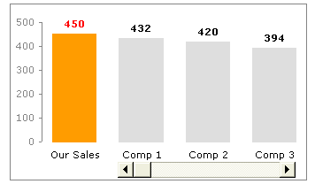
One of the common uses of charts is to compare one value with another. For eg. our sales vs. competitor sales.
Today we will learn a little trick to compare 1 value with another, especially when you have a large set of values to compare. We will learn how to create a chart like this:
Prepare your data
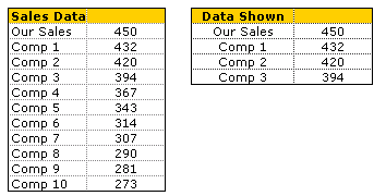
By now you must have realized what the first step for most of our tutorials. It is always prepare your data (or occasionally it is Have you signed up for PHD, but not today). Assuming you have the data in the table format shown to the right, we will also create a 4×2 table to hold the 4 items to be displayed in the chart. First item in the chart is “our sales”, remaining three are competitor figures which will change based on scroll bar position.
We will comeback to how the other three items are computed. So dont worry about them at this point.
Add a Scroll Bar Form Control
Now comes the fun part. Insert a scrollbar control in your workbook. If you are using excel 2003 and earlier, you can find it under view > toolbars > forms and select the scroll bar option and draw it on your worksheet. For excel 2007 you can find it in developer ribbon tab (you need to turn this on first from Office button > Excel Options)
Once you have added a scrollbar control, right click on it and select Format Control option. Here in the “control” tab, adjust the settings of the scrollbar to something like this.
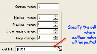
Make sure you have adjusted the minimum and maximum values based on the amount of data you have. In our case we have 10 values to display and at any point we are displaying 3+1 values, so the maximum is 10+3-1 = 8 (why so? think…)
Also, mention a cell link where the scroll bar selection is updated. We will use this cell (F11) to calculate the 3 values to be displayed.
Now, Write the Formulas to Display 3 Values
This is very simple step, especially if you know excel INDEX formula.
What is Index formula and how it works?
Index() is your way of telling excel to fetch a particular item in a list by its position (unlike vlookup or match which lookup a matching item). For eg. INDEX(list, 10) returns the 10th value in that list. INDEX works with both lists and tables, when used on tables, you should also specify which column you want the value from. For eg. INDEX(table, 5,3) returns the 3rd element in 5th row.
Ok, so how do we use it to fetch values for our “data shown” table?
Simple, we use a formula like =INDEX(names_list,F11) to fetch the first competitor name, =INDEX(sales_list,F11) to fetch first competitor sales figures. For the other two, we can use formula like.. =INDEX(names_list,F11+1), =INDEX(names_list,F11+2)
Finally We Make the Comparison Chart
We will insert a simple column chart based on “data shown” table. Adjust the formatting for first column. And position the scroll bar beneath last 3 columns. And you are good to go.
Download Comparison Chart Template & Play With It
I think this is a good way to bring focus to particular data point, especially if it needs to be compared to 100 other values. If you want to know more about the technique, I encourage you to download the workbook and play with it: comparison chart template
Learn Few More Techniques Before Calling it a Day
who says you have to learn only one thing a day? So, learn how to display one chart from many, prepare a matrix chart instead of data tables or make an incell bullet chart


