On 14th July, evening 4:51 PM (GMT), Chandoo.org received its 20,000th comment. 20,000!
The lucky commenter was Ishav Arora, who chimed, “Like super computers…Excel is a super calculator!!!!” in our recent poll.
It took us 8 years & 15 days since the very first comment to get here. And it took just 1 year 7 months & 23 days to add the last 10,000 comments (we had our 10,000th comment on 21st November, 2010).

Out of curiosity, I wanted to understand more about these 20,000 comments. So I downloaded our comment database, dumped it in Excel and start analyzing.
Understanding the comment growth
Although Chandoo.org has been around since 2004 July, we grew particularly chatty since 2009, when the site started becoming popular. If you look the time from first comment to now & plot total comments by date, this is how it looks. Each 1000 is highlighted (and 5,000s are marked in green).

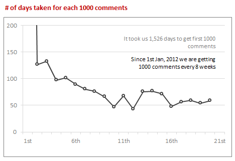
While it took us more than 5 years to get to 5,000 comment mark, the next 5k came in less than an year. Now a days, we are adding 114 comments every week.
Here is another chart, showing how many days it took us to get each successive thousand comments.
Which months & days of week are popular?
Lets look at monthly trends of comments since 2008.
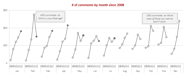
As you can see, All the months have seen growth since 2008 (and yoy for most months).
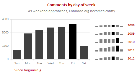
And when it comes to weekdays, Thursdays & Fridays are most popular with Chandoo.org commenters.
Who comments on Chandoo.org?
Between Hui & me, we have left 2,650 odd comments on Chandoo.org. The top 10 commenters have left a whopping total of 3,695 comments to date.
Lets look at how many comments are left by first time commenters vs. existing commenters.
Existing commenter is someone who has left a comment earlier with same email id.
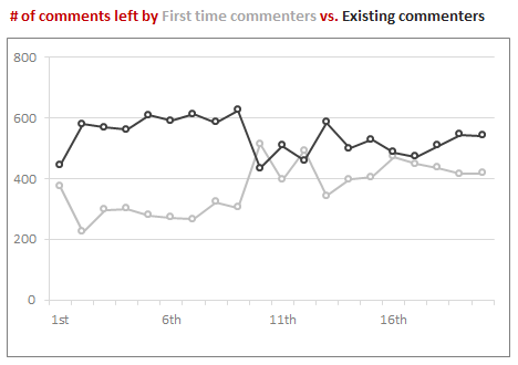
As you can see, During first 10,000 comments, existing commenters used to rule. Now a days, about 40% comments are from new commenters.
Do newsletter subscribers comment?
We have more than 36,00 odd people tuned in to our newsletter. I wanted to know how many of them leave comments.
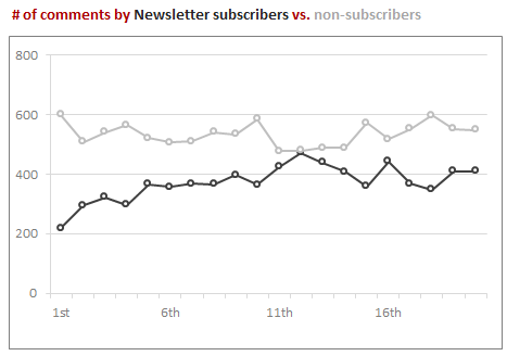
About 45% of comments are from Newsletter commenters. About 5% of our newsletter subscribers (2,055 people) actually comment. The rest are happy to read the newsletter and learn.
That means, on average, each newsletter subscriber adds 5 comments (where as non-subscribers add only 2 comments)
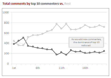
How much % of comments are from Top 10 commenters?
In the early days (for first few thousand comments), Top 10 commenters used to contribute 50% of comments. Now a days, their contribution is at 20%. This is because of the huge number of commenters we are adding every month. As our community grew, we have lots of people who are helping each other.
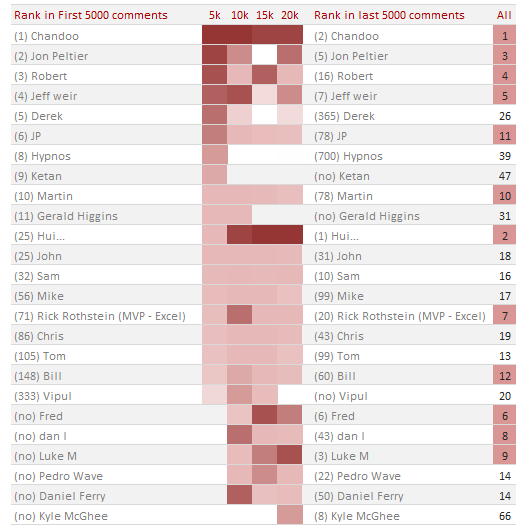
Top 10 commenters – then & now
Here is how top 10 commenters fared since first 5000 comments. You can see how Hui raised to Top 2 from nowhere & how we lost some of the frequent commenters over time.
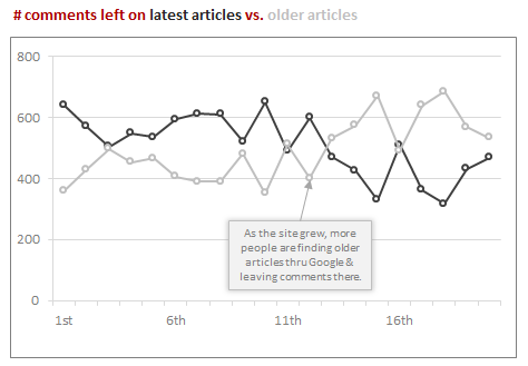
Where do the comments go?
In early days, comments are always on the latest articles. So if a post is one month old, it is quiet. But now a days, we are adding more comments on older posts than on new ones. Thanks to Google, people are discovering older content more and asking questions (or thanking us) there.
Which posts attract most comments
Next, lets see which posts are most chatty. But looking at # of comments alone is not enough. So I added % of page views (out of total page views on Chandoo.org between a sample period of APR-JUN 2012) and yearly break-up of comments received since 2008. As you can see, some posts are like blips, they get lots of comments and then become quiet. These are often polls, one time messages (like congratulations, happy new year etc.). The other posts consistently attract a lot of comments because they are visited by hundreds of people every week.
PS: You can click on link to see the actual post.
What do the commenters say?
I have an in house metric to see what the commenters say. It is called as Awesomeness Quotient. It is very simple to measure. I check the comment text to see if any of these words are in it.
Love, awesome, wow, !!, great, incredible, super, fantastic, blowing, perfect, excellent
If so, I give the comment 1 point. Else 0 points.
Then, I add up all these points to see how many points we have over the total number of comments.
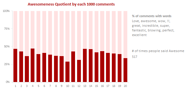
As you can see, we have been hovering around 45% awesomeness quotient since inception.
PS: If I had a $ every time, someone said cool, I would have 335 cool ones.
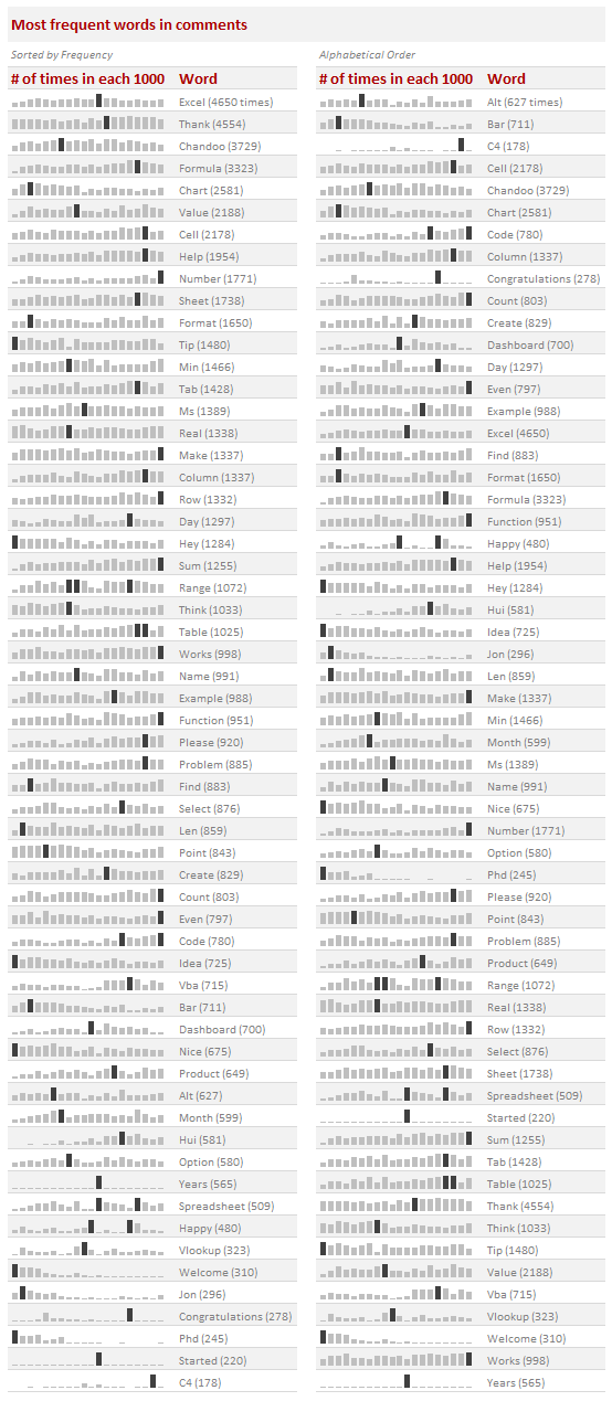
Most frequent words in the comments
The most frequent word in our comments is Excel, used 4,650 times. The next frequent word is thank used 4,554 times. I guess that sums up what commenters say nicely.
Here is a list of 64 59 most frequent words (arranged by frequency and alphabetical order).
Note: Each sparkline has its own axis maximum. You cannot compare frequency of one word with another by looking at their heights.
Note 2: If you want this info with same axis maximum for all, click here.
Comments vs. Posts
Here are 2 tag clouds, one for the content in posts & the other for comments. Can you guess which is which?
[click here for larger version]

The left one is for comments.
Interesting Trivia
- 51% of comments are made with in one week after an article is published.
- We add 4% more in 2nd week, 4% more in next 2 weeks. That is, only 59% of comments are made with in one month of writing an article.
- We get 70% comments between 8AM-8PM (GMT). The busiest hours for commenting are 1PM & 5PM GMT
- Since 1st Jan 2010,
- We had 7 quiet days (days with 0 comments).
- And on 4 days, we received 100 or more comments
- We got 17 comments on Christmas & New year days
- The longest comment was 11,274 characters long by Ronald on 2nd June, 2010.
- There are 5 comments with more than 5,000 characters long.
- For every legitimate comment, we get 20 spam comments. So since Jan 2008, our spam filters have blocked 417,104 spam comments.
How these charts are made?
At least 5 cups of coffee, 2 hours of thinking, several hours of SQL, VBA, Pivot & SUMIFS, an hour of formatting & conditional formatting and may be 10 minutes on Wordle.net.
I am unable to share the actual Excel file with you as there is lots of sensitive data (email addresses, IPs etc.) and the file is too heavy – 30 MB at last count.
Do you comment on Chandoo.org?
If you have never left a comment, now is your time. Go ahead and lose your comment virginity. It feels awesome to share your thoughts with rest of us.
And if you are a commenter, well, you have my love & good thoughts. Go ahead and say something more. You know I am all ears to hear what you say.
Go ahead and leave a comment. Next stop, 30k.
Thank you
Thank you so much for taking time to learn from Chandoo.org. Special thanks to 7,278 of you who left a comment on Chandoo.org ever.
Analyzing 20,000 Comments
Chandoo
Share
On 14th July, evening 4:51 PM (GMT), Chandoo.org received its 20,000th comment. 20,000!
The lucky commenter was Ishav Arora, who chimed, “Like super computers…Excel is a super calculator!!!!” in our recent poll.
It took us 8 years & 15 days since the very first comment to get here. And it took just 1 year 7 months & 23 days to add the last 10,000 comments (we had our 10,000th comment on 21st November, 2010).
Out of curiosity, I wanted to understand more about these 20,000 comments. So I downloaded our comment database, dumped it in Excel and start analyzing.
Understanding the comment growth
Although Chandoo.org has been around since 2004 July, we grew particularly chatty since 2009, when the site started becoming popular. If you look the time from first comment to now & plot total comments by date, this is how it looks. Each 1000 is highlighted (and 5,000s are marked in green).
While it took us more than 5 years to get to 5,000 comment mark, the next 5k came in less than an year. Now a days, we are adding 114 comments every week.
Here is another chart, showing how many days it took us to get each successive thousand comments.
Which months & days of week are popular?
Lets look at monthly trends of comments since 2008.
As you can see, All the months have seen growth since 2008 (and yoy for most months).
And when it comes to weekdays, Thursdays & Fridays are most popular with Chandoo.org commenters.
Who comments on Chandoo.org?
Between Hui & me, we have left 2,650 odd comments on Chandoo.org. The top 10 commenters have left a whopping total of 3,695 comments to date.
Lets look at how many comments are left by first time commenters vs. existing commenters.
Existing commenter is someone who has left a comment earlier with same email id.
As you can see, During first 10,000 comments, existing commenters used to rule. Now a days, about 40% comments are from new commenters.
Do newsletter subscribers comment?
We have more than 36,00 odd people tuned in to our newsletter. I wanted to know how many of them leave comments.
About 45% of comments are from Newsletter commenters. About 5% of our newsletter subscribers (2,055 people) actually comment. The rest are happy to read the newsletter and learn.
That means, on average, each newsletter subscriber adds 5 comments (where as non-subscribers add only 2 comments)
How much % of comments are from Top 10 commenters?
In the early days (for first few thousand comments), Top 10 commenters used to contribute 50% of comments. Now a days, their contribution is at 20%. This is because of the huge number of commenters we are adding every month. As our community grew, we have lots of people who are helping each other.
Top 10 commenters – then & now
Here is how top 10 commenters fared since first 5000 comments. You can see how Hui raised to Top 2 from nowhere & how we lost some of the frequent commenters over time.
Where do the comments go?
In early days, comments are always on the latest articles. So if a post is one month old, it is quiet. But now a days, we are adding more comments on older posts than on new ones. Thanks to Google, people are discovering older content more and asking questions (or thanking us) there.
Which posts attract most comments
Next, lets see which posts are most chatty. But looking at # of comments alone is not enough. So I added % of page views (out of total page views on Chandoo.org between a sample period of APR-JUN 2012) and yearly break-up of comments received since 2008. As you can see, some posts are like blips, they get lots of comments and then become quiet. These are often polls, one time messages (like congratulations, happy new year etc.). The other posts consistently attract a lot of comments because they are visited by hundreds of people every week.
PS: You can click on link to see the actual post.
What do the commenters say?
I have an in house metric to see what the commenters say. It is called as Awesomeness Quotient. It is very simple to measure. I check the comment text to see if any of these words are in it.
Love, awesome, wow, !!, great, incredible, super, fantastic, blowing, perfect, excellent
If so, I give the comment 1 point. Else 0 points.
Then, I add up all these points to see how many points we have over the total number of comments.
As you can see, we have been hovering around 45% awesomeness quotient since inception.
PS: If I had a $ every time, someone said cool, I would have 335 cool ones.
Most frequent words in the comments
The most frequent word in our comments is Excel, used 4,650 times. The next frequent word is thank used 4,554 times. I guess that sums up what commenters say nicely.
Here is a list of
6459 most frequent words (arranged by frequency and alphabetical order).Note: Each sparkline has its own axis maximum. You cannot compare frequency of one word with another by looking at their heights.
Note 2: If you want this info with same axis maximum for all, click here.
Comments vs. Posts
Here are 2 tag clouds, one for the content in posts & the other for comments. Can you guess which is which?
[click here for larger version]
The left one is for comments.
Interesting Trivia
How these charts are made?
At least 5 cups of coffee, 2 hours of thinking, several hours of SQL, VBA, Pivot & SUMIFS, an hour of formatting & conditional formatting and may be 10 minutes on Wordle.net.
I am unable to share the actual Excel file with you as there is lots of sensitive data (email addresses, IPs etc.) and the file is too heavy – 30 MB at last count.
Do you comment on Chandoo.org?
If you have never left a comment, now is your time. Go ahead and lose your comment virginity. It feels awesome to share your thoughts with rest of us.
And if you are a commenter, well, you have my love & good thoughts. Go ahead and say something more. You know I am all ears to hear what you say.
Go ahead and leave a comment. Next stop, 30k.
Thank you
Thank you so much for taking time to learn from Chandoo.org. Special thanks to 7,278 of you who left a comment on Chandoo.org ever.
Share this tip with your colleagues
Get FREE Excel + Power BI Tips
Simple, fun and useful emails, once per week.
Learn & be awesome.
Welcome to Chandoo.org
Thank you so much for visiting. My aim is to make you awesome in Excel & Power BI. I do this by sharing videos, tips, examples and downloads on this website. There are more than 1,000 pages with all things Excel, Power BI, Dashboards & VBA here. Go ahead and spend few minutes to be AWESOME. Read my story • FREE Excel tips book
Want an AWESOME Excel Class?
FREE Goodies for you...
From simple to complex, there is a formula for every occasion. Check out the list now.
Calendars, invoices, trackers and much more. All free, fun and fantastic.
Power Query, Data model, DAX, Filters, Slicers, Conditional formats and beautiful charts. It's all here.
Still on fence about Power BI? In this getting started guide, learn what is Power BI, how to get it and how to create your first report from scratch.
FREE Calendar & Planner Excel Template for 2026
Here is a fabulous New Year gift to you. A free 2025 Calendar Excel Template with built-in Activity planner. This is a fully dynamic and 100% customizable Excel calendar for 2025.
Who is my boss’s boss? [Data Analytics Challenge – 001]
New Zealand GST Calculation with Excel [Free Template]
Make a Pivot from Another Pivot Table in Excel
How to use XLOOKUP with two sheets?
Related Tips
FREE Calendar & Planner Excel Template for 2026
Who is my boss’s boss? [Data Analytics Challenge – 001]
New Zealand GST Calculation with Excel [Free Template]
How to use XLOOKUP with two sheets?
Excel IF Statement Two Conditions
How to insert dates in Excel automatically