
Recently my iPhone 4 crashed. It is 3.5 years old. And just like any other 3 year old, it started acting weird & crazy one night. The next morning it went silent. It won’t go beyond the Apple logo whenever I start it. Since I couldn’t wait for the phone to start, I took out the SIM card (the phone is unlocked, if you are wondering) and placed it in my old Nokia phone. But alas, none of my contacts are on the SIM. They are in “cloud”.
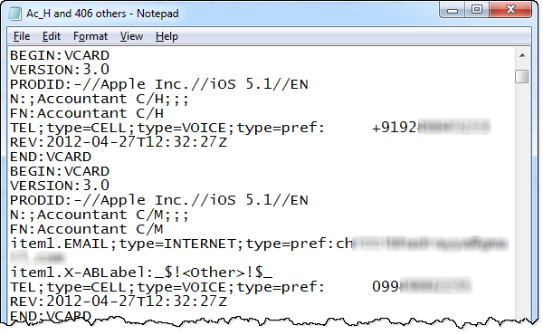
After a day of answering phone calls from everyone including my mom as “Chandoo here”, I’ve decided to get my contacts back. So I logged in to iCloud to download a backup. And the backup was a .VCF file. It has my phone numbers in this format:
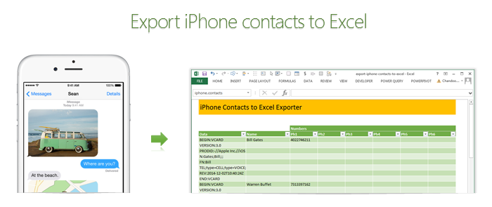
Since I wanted to have all my contact numbers in a spreadsheet, I did what any Excel nerd would do. I built a template for that.
Template for exporting iPhone contacts to Excel
As a first step, download the template.
This template can,
- Export iPhone contacts to Excel
- Create iPhone import format from a list of names & phone numbers in Excel
Exporting contacts from iPhone to Excel
To export the contacts from your iPhone to Excel, follow below steps
- First back up all the contacts on your phone to iCloud
- Now, visit iCloud and select all of your contacts.
- Using the settings gear icon at the bottom, export your contacts to a .VCF file.
- Open the vcf file in notepad & copy everything.
- Paste the data in Data column of “export” tab of the download file.
- Names & phone numbers will be extracted in column D:J
- Filter the table so no blanks are shown in Name column
- Copy the values from Name & phone number columns and paste in a separate sheet or file
- Save.
Importing spreadsheet contacts to iPhone
To copy all your spreadsheet contacts to iPhone,
- Go to “Import” tab of the download file.
- Type or paste your contact information in the columns B,C & D.
- Select “VCF to copy” range (from H4 to last cell)
- Copy
- Open notepad and paste.
- Save the notepad file as contacts.vcf
- Import the VCF file to your iCloud
- Done
Confused about the process? See this video
Since the process of exporting or importing contacts thru iCloud can be a little confusing, I made a small video explaining how the template works. See it below:
(click here to see the video on our YouTube channel)
How does the template work?
The vCard format files are simple text files. So when pasted in Excel, all we need to do is figure out where the contact name & phone numbers are and extract them using, what else… Excel formulas.
Exporting VCF to Excel:
- This uses MATCH formula to find the line in VCF data that has the information we want.
- Then OFFSET formula to extract the corresponding line of VCF data
- And then SUBSTITUTE, MID, LEFT & TRIM formulas to extract the text portions
You can examine all these formulas by unhiding columns C & K:Q in the export tab of the template.
Importing Excel data to VCF:
- This uses INDEX formula to get a name & phone number from entered data.
- Then uses CHOOSE & SUBSTITUTE formulas to create the corresponding VCF lines
- Finally TODAY & NOW formulas to create the timestamp element of the VCF
You can examine these formulas in columns F,G & H in the import tab.
Do you like this template?
It was fun building something useful & immediate like this in Excel. Although, soon after I created the template, my iPhone magically sprung back to life, I will be ready next time I need to look at my contacts or load them to another phone.
How do you like this template? Would you use this or some other app to export / import your contacts? Please share your thoughts and tips using comments.


24 Responses
I’d suggest simply using the subtotal function and filtering the data using the Win/Loss column. You get the same results and the formula is more comprehensible.
@John
That is one option.
There are times however when you want to see the whole data table or a filtered subset and still want to produce summary reports against an unfiltered field.
Is there a particular reason why you are using a comma and the unary (–) operator for the second array in the SUMPRODUCT formula? It seems to work the same if you were to string the arrays together using the asterisk (*). The advantage is that SUMPRODUCT treats the entire string of arrays as a single array.
@Mathew
Your correct, There is no difference.
I thought it may have been easier to explain this method.
Is there a way to do this on a large set of data? As in ~100,000 rows? When I try I get an error because the formula becomes too long. It says the max length of a formula is 8,192 characters. Excel 2010.
How do I incorporate a specific text within a cell for the second array. For instance, – -(C7:C13=”Apple”)
when I chose a specific text the formula does not work.
@RB
I am not sure what is the issue as if I use the sample data in the post the following work fine
Count:
=SUMPRODUCT(SUBTOTAL(3,OFFSET(C7:C13,ROW(C7:C13)-MIN(ROW(C7:C13)),,1)), –(C7:C13=”L”))
Sum:
=SUMPRODUCT(SUBTOTAL(3,OFFSET(C7:C13,ROW(C7:C13)-MIN(ROW(C7:C13)),,1)),(C7:C13=”L”)*(D7:D13))
You may want to check that there are no leading or trailing spaces in your list of Apples
I should have given a better explanation. Heres my situation. I have a column with cells filled with names like Column 1, Column 2, Pier 1, Pier 2, etc. If the cell just contained Pier and searched for that it works. But because it has other characters in the cell its not recognizing the pier. So how can I extract specific characters of a string of text in this formula?
Hopefully this was a better explanation
Hello-
This formula works pretty well for me except that it slow down excel and prevents some of my macros from working. I was wondering if there was a way to program this in VBA so that excel isn’t always trying to recalculate it. I would like to use a push of a button to get it to run then paste in a cell.
Thanks!
I am trying to sum filtered data in a column, but would want to ignore the negative values in the column. How to go about doing this?
@Akshay
Why not just add a filter to that column to only show the values greater than zero?
The negative values are required for reporting purposes, but their effect on the total is distorting the required output. Please advise.
@Akshay
I’d suggest making a post in the Chandoo.org Forums
http://forum.chandoo.org/
Attach a sample file to simplify the task
I have this working for counting and summing, however, I have a list and for the second array, I need a criteria. That is, I’m looking for b13:b200=”01.??.??” or =left((a1,2) or something like that. These types of criteria matches do not appear to work as I get a blank as a result.
Thanks!
@Bob
As your formula b13:b200=”01.??.??” looks like you are trying to check the first day of the month of the range
What about trying Day(B13:B200)=1
Hai Experts,
i understood this formula well and working fine in MS Excel 2013
but when the same am trying to place in google Spreadsheet it shows error as
“SUMPRODUCT has mismatched range sizes. Expected row count: 1. column count: 1. Actual row count: 2014, column count: 1.” and as a result #VALUE! Appears in cell.
Can anyone please help me how would i get it done in Google Spread sheet
or is there any other formula as a substitute for this.
Thank you very much.
thanks for providing this.. but why does excel keeps on prompting Circular referencing in cell D3?
@Vivek
I don’t know
I just downloaded the file and it is working fine and not showing that error
Goto the Formulas, Calculation Options Tab and check that Calculation is set to Automatic
What version of Excel and Windows are you using ?
I know that this forum is for MS Excel, but I am trying to help someone who is working in Google Sheets. The below formula works in Excel but Google Sheets returns:
“SUMPRODUCT has mismatched range sizes. Expected row count: 1. column count: 1. Actual row count: 39000, column count: 1.” and as a result #VALUE! Appears in cell.
This is the same problem asked by Srichirin above. Does anyone know if there is a formula for Google Sheets that will replicate what MS Excel does?
=SUMPRODUCT(SUBTOTAL(3,OFFSET($C$6:$C$39500,ROW($C$6:$C$39500)-MIN(ROW($C$6:$C$39500)),,1)),- -($C$6:$C$39500=H1),($D$6:$D$39500))
Trying to find a SUMPRODUCT formula that counts the word Closed by date for the last 7 days in a filtered list.
=COUNTIF(M:M,”>”&TODAY()-7) works ok for unfiltered count Column M contains Closure dates (blank if open) and Column L is Status Open or Closed
@ Terry
Please ask the question at the Chandoo.org Forums
https://chandoo.org/forum/
Please attach a sample file to ensure a quicker more accurate answer
I used this formula and worked like a charm! But, now I’ve been requested to use it but adding not one but two criteria in the same formula. For instance the sum I was doing added negative and positive numbers. I’ve been asked to use the exact same formula but adding that only positive numbers were considered… any idea on how to do this?
How exactly do you do sum filtered cells when two criteria are need not just one?
Thank you so much brother literally I have been struggling since morning to get the sum of the filtered category, however, after reading your blog attentively i got my solution, so thanks a lot once again.