
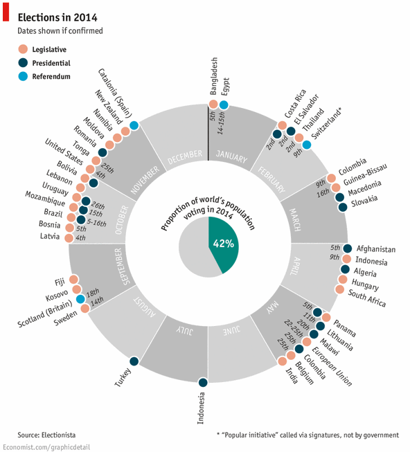
Today let’s have a poll. Lets debate if this pie chart about world elections in 2014 is good or bad.
First lets take a look at the chart
This chart, published by The Economist talks about how 42% of the world population is going to vote this year. Take a look:
My thoughts on this chart
Usually I try to avoid pie and donut charts. But this combination works. I like the simplicity of the chart and the clear message. Although rotated labels around the chart are tricky to read, you get the message quickly.
Even though a typical time line chart or map chart can convey the same information, they do not look as exciting and attention grabbing this one. Also, depicting the time line of events on a map is really tricky (unless you go for animated chart or use too many labels).
Can this be made in Excel?

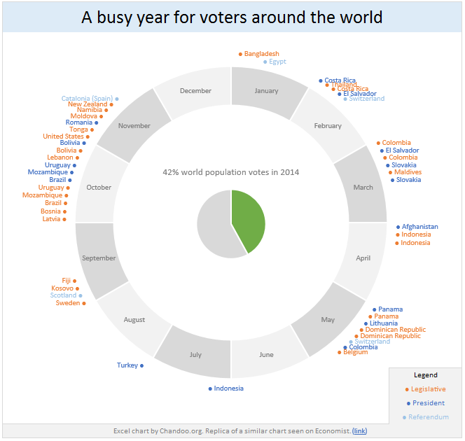
Gerald, One of our fans on Facebook asked if this chart can be recreated in Excel? That got me thinking… why not?
Steps for creating this chart in Excel
1. First organize the data. You can download election data from electionista. Since electionista site only showed data for next 6 months, I gathered rest of the data from Economist’s chart.
2. Make the 12 sliced donut
In a blank range, type the names of all 12 months and enter 1 in adjacent column for all of them. Now select everything and insert a donut chart.
3. Format the donut chart
- Select the slices of donut and fill all of them with same color.
- Select second slice of the donut. You have to click twice on the second slice, once to select all slices, again to select the particular slice.
- Fill it with another color.
- Repeat the process for every other month (April, June… December). You can just select each of these month’s slices and press F4 to repeat last action (which is filling the color)
- Finally fill the plot area & chart area of donut chart with no color. This makes the donut chart transparent so that anything behind it shows thru.
- Remove any chart titles, legends.
4. Calculations for the pie charts
As per the data, there are 48 elections in 2014. But if you plot these 48, the pie slices will not properly align with the months to which they belong. So we need to insert some gap slices so that each month’s elections are plotted in that wedge. Do not understand.. see this:
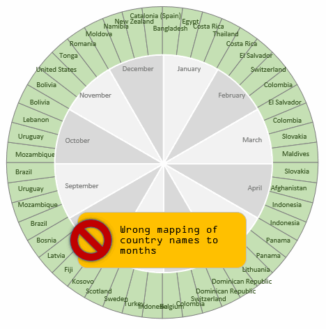
To fix this, we need to insert a few gap slices between elections. How many gap slices ?!?
Well, to answer that question, we first need to find out what is the maximum number of elections in any month?
The answer is 11.
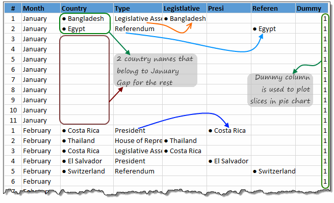
So, we are going to create a pie chart of 12 x 11 = 132 slices. Then, for each month, we just put the names of countries that have election in that month. If a month has only 5 elections (February for example), then we leave the rest of 6 cells in Feb empty. All of this can be done with lookup formulas. INDEX + MATCH to be exact. I am leaving how part of this to your imagination.
Once we have mapped the 48 election dates to 132 cells, we need to separate the country names to 3 columns depending on type of election. Legislative in first column, Presidential in 2nd column and Referendums in 3rd column.
The final calculations look like this:
5. Make pie chart for legislative election dates
Select legislative & dummy columns. Insert a pie chart.
Now format the pie chart.
- Fill color for slices = no color
- no line
- Set data labels to category
- Set the location of data labels to “outside edge”
- Color data labels.
- Set fill color for plot area & chart area to no color as well.
- Remove any chart titles, legends.
6. Repeat the process and create 2 more pie charts
One for Presidential & one for Referendum election dates.
7. Insert another pie chart
For 42% center pie chart. Just type 42% in a cell, 58% in another. Select both, insert a pie chart. Format it.
8. Align all charts
- Select all charts (by holding ctrl key or using Home ribbon > find & select > select objects tool
- Go to Format ribbon > Align
- Select Align in the middle
- Select Align Center
This ensures that everything is aligned properly.
Now adjust the sizes of these charts as needed until you get desired effect.
Since all charts are transparent, they work like layers to give you the desired effect.
How does the layering work?
This is how the layering works.
Download World Elections in 2014 Excel chart
Click here to download the chart workbook. Examine the charts, formulas and formatting to understand this better.
Our own election – Like it or hate it? World Elections in 2014 chart
Lets have our own election. What do you think about the world elections in 2014 chart? Do you like it or hate it? Please vote using comments.
Discussion on pie charts
At Chandoo.org parliament, we debate pie charts (and donuts, bars, spiders and scatter plots too) often. Here are some important bills we passed,


58 Responses
Chandoo,
I love your additions to the chart. I think any exercise that requires us to think outside the box to make something new in Excel is always worthwhile.
However, I’m not a huge fan of the Economist’s chart even as your improvements help it quite a bit. It really comes down to what the chart is trying to say. I think the Economist chart is a good example of “data dumping,” they dumped a lot of election relevant information into one chart. The result is not exactly a coherent message.
For example, if we don’t have dates for every election, then why incorporate dates at all? The placement of dates on the chart conveys time moving forward within each month. Take March for example. Neither Macedonia nor Slovakia have confirmed voting dates. Because of this, the designer decided to place them at the end of the list. When we read it, their placement implies an election will happen after the first two countries that do have confirmed dates. In fact, we don’t know when their elections will happen. Had the designer placed each country near a month without using dates, but instead organized them alphabetically, it would have conveyed that votes would happen in that month but without implying a specific order of events. This is a better option anyway since each month acts as a bucket of voting events with virtually no granularity to the specific date in which they happen (ie they’re shown as discrete events in order versus specific dates on a continues timeseries).
There’s also some information missing. For example, are voting events happening regionally? By continent perhaps? These are questions this chart could potentially answer if designed more appropriately.
Moreover, we are told that 42% of the world is voting via a pie chart in the middle. This type of data presentation does not pass what I call the ‘sufficiency test’ for data presentation. (Wrote about that test in my most recent blog post.) All the designer has done is color 42% of the chart. They have not proved the asserted proportion by providing total population statistics about each country as compared to the world population. A better designed chart would show (not tell) these figures for each country. We might see that a few large countries are in fact responsible for most of the voting that makes up this figure (or that many small countries voting outweigh the big ones).
Finally, I also take issue with the declaration that “42% of the world is voting.” Perhaps these countries contain 42% of the world’s population, but not everyone in each country votes. A more accurate description would have said, “countries that contain 42% of the world’s population are set to vote in 2014.” But maybe that’s me being nitpicky.
So I vote no to the Economist chart, but yes to your chart.
Meh.
The donut is by month but not by date, as Jordan pointed out. So there’s no reason not to use a simpler table. First column, list the months, but only the first time the month appears. Second column list the country. Third through fifth columns, insert a checkmark for legislative, presidential, and referendum. I presume some countries may have more than one category, even though this graphic assumes they are mutually exclusive.
The pie chart within the donut is a great big non sequitur. It’s going to be all too common for people to try at first glance to somehow relate the pie wedges to the donut wedges. It appears that the pie lines up with January through May, but there’s absolutely no relationship. Not to mention Jordan’s question about what 42% actually means.
good presentation I like it vey much and I will continuing to watch it
Hi Chandoo,
I loved your presentation and methodology for preparation of this chart…getting ideas to use it in a dashboard….will let you know of the feedback I get.
Can i ask one quistion? please… How to create breaked pictures in website (Chandoo.org)? what do you use programm?
Hi Chandoo,
I like the way you think about how to create the chart by using Excel; actually like the idea of applying what we’ve learnt in real life application. However, I think that chart is not a good one. To be honest, as a reader, I prefer a simple calendar for such information.
i am fan of yours……You have someting for everyone. The important point is you visualization is too cool…
Chandoo –
Great idea. While I always respect the opinions of Jordan and Jon, I think this chart is worthwhile. Let’s not discount the fun factor – it’s more attractive to look at than a table, and the ignorance about voting dates would also be reflected in such a table. Plus, the equivalent spacing of the months in the donut chart gives a visual representation of the “empty” summer months. A table wouldn’t give that, or would look like data was forgotten if blank rows were added. And what would you do about poor June – have a single row with ? You couldn’t leave it off without some poor soul wondering if there was an election in June and it was accidentally edited out by a careless intern.
The problem with the pie chart approach for the labels is that Excel is terrible at spacing labels at the top and bottom of the pie. Even in your chart we can see the overlap in February. It’s no coincidence that the least-active voting months are at the top and bottom. The Economist’s approach with the label orientation matching the angle from the center allows all points of the circle to have legible labels. The Economist approach also allows voting for multiple events (e.g. Uruguay) to be grouped along the radian and only display the date once.
To get closer to the Economist model you could use an XY chart with radians converted to XY values, so the points can be identified by radian and radius, with text orientation for the label also based on the radian.
The middle pie is gratuitous – as Jordan points out the 42% is meaningless. To get to the point of showing regions a designer might have put a map (Robinson projection of course!) with the voting countries highlighted.
I’d have chosen a lighter font than the Economist did.
“without some poor soul wondering if there was an election in June and it was accidentally edited out by a careless intern”
Or perhaps the point was dropped from the donut chart because it was too complex to generate and maintain. In fact, it’s more likely that a point is dropped from a complex display than from a simple one, and less likely that a missing point would be noticed.
How can you drop a point if it’s safely in the Excel table 😉
Jordan’s original point is valid and the chart isn’t clear about which of several messages it’s trying to convey. If it wants to show exact dates there isn’t enough information on most of the elections to make it worthwhile. If it wants to show voting patterns throughout 2014 the equivalent spacing for the inactive summer months is appropriate but then none of the elections should have dates. A timeline would have been simpler with legislative above the line and presidential below, for example. But I think for most (Economist) readers it would take an acceptably short time to appreciate that dates were given where available as a courtesy. The chart is navigating the middle ground between “there are a lot of elections in 2014” vs. sufficient accuracy to satisfy Nate Silver.
It may have come down to a page layout decision – I read The Economist on a tablet so I’m not sure if print layout choices apply anymore, but if they have to fit into a thin column then the radial chart has a better aspect ratio for information density (in this case) than a linear representation could provide.
“How can you drop a point if it’s safely in the Excel table?”
It’s harder than leaving one off a very complicated chart, no?
“if they have to fit into a thin column then the radial chart has a better aspect ratio”
Aspect ratio? If they have to fit a thin column, then a simple table as I described will be half as wide and maybe not as tall as the first chart on this page, with equivalent legibility. Because they are round (and for other reasons), pie charts suffer from a much lower data per pixel (or data per cm² if you will) than most other charts and tables.
One last point about the audience for the chart.
While I have had all of Tufte’s books shortly after their publication dates and agree with most of his design strictures, he was always writing for academic and scientific/engineering audiences where detail, accuracy, and precision are needed. In the business world too there are times when every dollar or date should be accounted for in graphic or tabular form.
But for strategic purposes, such as spotting trends and trying to decide which one should be the basis for extrapolation, some consolidation of data and loss of precision is needed. If I were a psephologist or campaign consultant I’d already know this information in more detail anyway. A country manager in a Latin American region would find this useful to see the distribution of elections (Feb, Mar, Oct) to decide if there are sales opportunities, concerns about logistics during the respective elections, etc. (though again, she should already be on top of those things). The chart is a good starting point, creating an itch that a capable businessperson who didn’t already know these things should want to scratch.
I suppose that’s a whole other thread… is it valid, and what is the best way to use numbers in graphics to inspire rather than merely inform? Spoiler alert – I absolutely believe that graphics can and should inspire, as long as the direction of the inspiration is clear and makes up for the (inevitable?) loss of precision. Very often there’s just not enough data available when a decision has to be made – or put another way, if there was enough data to justify a decision then it’s already a no-brainer. There are times to demonstrate to executives that the data already exists to show the way, and times to admit that there isn’t enough but the decision won’t wait. So I have less of a problem with inspirational graphics from a data perspective.
I appreciate you’re saying you respect my opinion. I don’t even respect my opinion.
So the inspiration vs inform debate is one of those that can go on forever. I try not to get into it too much. The best I can do is point to what the research says. Radial charts like the one The Economist has designed can’t really deliver compared to others.
And whatever arguments there are to say an inspirational data visualization can make up for the visual liberties taken I just don’t see them here. This chart isn’t very inspirational to me (but I’m also a pessimist, so take that for what its worth). I still assert it’s an example of data dumping. It’s not different than a did-you-know factoid found in the margins of a math textbook. It’s a lot of context thrown together, but without thought to what the overall message should be.
All that said, I also still maintain this is a GREAT exercise for Excel. Just wouldn’t recommended it for production material.
Yes, it’s data dumping. Our mileage will vary on its utility – my standards may simply be lower 😉
I wish someone far more qualified than I would write “The Visual Display of Qualitative Information.” So many (superb) efforts in visualization deal with a closed system, where the data is considered sufficient to answer an original question, support a pre-existing hypothesis, or deliver information/dashboards on finite boundaries.
When we want to build connections, suggest but not proscribe relationships, balance the forest and the trees, are Venn diagrams or Visio brainstorm graphics our only choices? Is the numeracy that Excel offers incompatible with qualitative analysis?
@GMF, Try Now You See it by Stephen Few.
http://www.amazon.com/Now-You-See-Visualization-Quantitative/dp/0970601980/
There’s enough in there to bridge the gap between qualitative and quantitative analysis.
As well, take a look at The Functional Art by Alberto Cairo:
http://www.amazon.com/Functional-Art-introduction-information-visualization/dp/0321834739/
Dear Chandoo,
Great job, tx.
Possible to get xlsm copy of this dashboard, pls advise?
Regards,
Sajjad
@Sajjad
Download the copy above in the Download section
It is an xlsx file as it contains no macros
hi hui.
Can i ask one quistion? please… How to create breaked pictures in website (Chandoo.org)? what do you use programm?
hi hui.
Can i ask one quistion? please… How to create breaked pictures in website? what do you use programm?
@Javhaa – try asking this question in the forums. You should receive a prompt answer there.
I use Camtasia to record and produce small animated clips like there. You can get a trial version of this from techsmith.com
For more on what tools we use, please visit http://chandoo.org/wp/about/what-we-use/
Tx Sir, Got it
My comments on this chart:
1. The same data can be better represented as a table or timeline. Both shine any day. I noted this in the article (“Even though a typical time line chart or map chart can convey the same information, they do not look as exciting and attention grabbing this one.”)
2. The reason for re-creating this in Excel is simple. I want to show the process of creating such charts. I want to explore various features, layering techniques that can help you draw almost any chart in Excel.
3. I am not a charting purist. I like to experiment often and see what works by throwing it out in public. I like the rules stipulated by Tufte, Few et al. But I don’t want to constrain myself with these rules. I want the freedom of making mistakes and testing theories myself. This chart falls right in to it. That is why I posted this as a poll. I want to hear from you why this does (or doesn’t) work.
4. I feel that even tough a table (or timeline) can do justice to this data, both of them will never be curious for a follow-up reading, much less poking my interest to recreate them in Excel.
As a business user, what should you do?
Simple. Understand the principles of good charts (recommended reading: Visual Display of Quantitative Information and Information Dashboard Design). But don’t lock yourself in the boundaries of these rules. Experiment and see what works best for your audience.
I agree that it’s good to find complicated charts and use them as an excuse to explore the capabilities of Excel.
However, it is dangerous to pick something that is a poor visualization example, because it implies your approval of the poor technique. Even if you advise against it, people will do it because it “looks cool”.
there are plenty of worthwhile examples available.
Jon has a point. In Information Visualization: Perception for Design, Colin Ware confirms (what we, as analysts and developers, already know): the moment you show data in any form onscreen, it gains a certain amount of unquestioned authority, regardless of its veracity. This is why I instruct clients to steer away from showing bad data on reports in the absence of good data. Presenting bad data (or even a flawed visualization) will be interpreted with some authority, even as viewers are instructed to disregard it.
It’s like leaving a wrong answer filled-in on a crossword puzzle. You know its incorrect, but you can’t help but use the letters anyway. (As you fill in the rest of the crossword puzzle, it becomes a “Garbage-In Garbage-Out” scenario.) I think it’s hard for our brains to not interpret most everything in our visual field as true information at first glance. (I suppose with some training, we can overcome this in very specific instances.) The point is, we’re already processing information before our cognitive filters kick-in to tell us what we are looking at may not be correct. Since what The Economist has created here isn’t the worst thing ever made, there’s probably no real damage done if someone were to use it. But it’s worth pointing out there’s also good reason NOT to use it.
Ultimately though, several other commentators have enjoyed this article. So even as I disagree on the usefulness of The Economists’ chart, if other people like this article, then it has served its purpose well.
Well, to those who have read the article and seen interesting ways to manipulate Excel charts, the article served its purpose. To those who have read the article and seen a cool new way to show information, the article has served the Devil’s purpose.
Another Pie / Donut chart, another group of haters.
Chandoo.org isn’t about telling people that you MUST do something this way, it is about teaching people techniques, so that when confronted with a new situation, they can say “Why don’t I try X, Y or Z”
This chart clearly shows me that there are 3 main periods where elections are held around the world (Feb/Mar, May and Oct/Nov)
Do I really care if Thailand & Costa Rica are on the same day or not, I know there both in early February and that is probably all I care about.
I also know that if I am required to vote in Thailand that I better get my act together and find out where to vote if I am not in Thailand.
The issues with whether a country has a a Senate, Presidential election or Referendum could easily be solved by adding a number of grouped categories, but that also will complicate the chart more.
I don’t really care what Few or others say about Pie chart, people have a natural affinity to them.
Sure they can be abused, but then can so can most things in life.
One of the greatest pie charts in history still hasn’t been bettered and that is the humble Analog Clock.
I don’t really need to know the time to 3 nano-seconds, I need to know roughly at a glance is it 8:00 am or 8:15 am, I need to know is it knock off time or damn, I’ve got another hour to go.
People have natural affinities to Analog Clocks and to Pie charts.
I in fact like the Elections in 2014 chart because it is simple and easily understood.
“Haters”? No, we just don’t want people using ineffective techniques.
Stephen Few wrote in “Our Irresistible Fascination with All Things Circular” (http://www.perceptualedge.com/articles/visual_business_intelligence/our_fascination_with_all_things_circular.pdf) about how we are drawn to circular charts, despite their proven ineffectiveness.
Anyone who has spent hours and days trying to teach a child to read an analog clock should realize how hard circular charts are to understand, despite their attractiveness.
Useful techniques can be taught with examples of more effective graphics.
The clock is an interesting analogy. Yes, my kids were hard to teach… but, when they learned, there’s an astonishing amount of information you can glean with just a glance. Depending on the time increment you’re interested in, the position of a hand, the angle between two hands, or the relation of a hand to the face is all you need. The numbers become immaterial, yet the clock also provides precision and accuracy. All in all, well worth the training. Digital clocks can only tell you the current time and all relationships to what you want to know have to be painstakingly calculated.
(My child that was toughest to teach, now in college, uses a reverse clock. If only we’d known.)
But that’s because the numbers and angles in a clock are consistent so no reorientation is needed. All charts demand education on what the reference points mean and I think Jon is right that circular charts demand greater up-front investment. In most cases the time needed for reorientation isn’t worth it. If one is going to use a circular metaphor, using a common denominator such as time or a calendar probably flattens the learning curve.
I don’t think the data in the chart is incorrect – merely incomplete. The use of the chart will certainly be a slippery slope to confusion for a lot of Excel users who take it to places it shouldn’t go… but that’s true for a lot of bad line, column, XY charts too.
Chandoo’s original post calls it out – he and his readers stand very close on different sides of a very thin line as to whether this chart served a reasonable purpose. I don’t want the people who don’t like the chart to cross the line to my side… I need them to keep me anchored.
(But the pie chart for labels still doesn’t work because it scrunches the high and low labels together!)
I agree the pie-chart-argument gets tiresome. But this article specifically asked for our opinions. Chandoo.org is inviting critical and respectful debate. I’m not really interested in telling others what to do, but if asked, I will present the research.
Something to think about. In the article, “3D pie charts are evil,” Chandoo doesn’t fix the pie chart by taking away its 3d effect. Instead, he turns it into a bar chart. This follows what Jon and I are saying: better alternatives to pie charts exist.
Very thoughtful discussion Jordan, Jon, Hui & GMF.
3 MVPs argue about what is the best way to chart this data… What more our readers can ask…?
“This follows what Jon and I are saying: better alternatives to pie charts exist.”
Of course there are better alternatives. No disagreement there.
No argument of pie charts is complete without someone bringing this image up:
http://24.media.tumblr.com/tumblr_m6m40lIqCc1rzz59zo1_500.jpg
It’s tradition!
wow, well done, a great visualisation and – what a surprise – Switzerland is marked .. 😉 .. normaly, there is a third referendum-section in Nov, kind regards, SomeintPhia
Well, these comments have certainly been enlightening. But here I am trying to re-create this chart for practice and I feel like my question will be lost in the flood.
My chart, for some inexplicable reason, overlaps the Orange “* Bangladesh” and the sky “* Egypt” at the top of the chart. The only solution I have managed to find is to physically move Egypt further down in the table, but Chandoo’s example spreadsheet doesn’t do this.
I’ve managed to make everything else identical. But I am constantly frustrated by Excel chart formatting. Can somebody enlighten me as to how to stop overlapping labels?
I am sorry for omitting this step in the tutorial. Even I had to manually move Bangladesh and Egypt to get the desired effect.
I like this date visualizzation by Economist . I think we can not consider as a pie chart. I think that is a big mistake to apply the rules of perception that are proven on pie charts .
It reminds me very much a clock or also, I immediately connected with the Earth’s orbit around the sun …
I’d also like to see the alternatives in order to judge … I think that Jon and Jordan in a few minutes can propose an alternative
I want to propose a test for you, here:
http://goo.gl/9Tkrvh
you will find two images is a ring the other a timeline … in which month there is the star, the triangle and the square ? where do you think it is easier to find the right result ? how many sector there are in both pictures?
Respect to the graph of Chandoo … I do not like very. It is not dynamic and is difficult to adapt for example the addition of a new election ( Italy probably will go to elections in 2014 ) … also the question of labels is very limiting … in the original view I really like the labels arranged in a radial manner (almost impossible to do in excel without making everything very fragile )
1. Any chart without axes is difficult to read. You’ve provided a circular chart and a linear chart each with only one axis position (January) labeled. The original circular chart has all months labeled. So the two alternatives are not even starting from the same cognitive baseline as the original graphic.
2. The data plotted in your two charts is not the same. In the linear chart, even without a proper axis, I can see precognitively that two of the three shapes are within the first half of the boxes. However, in the circular graph, two of the three are in the second half.
3. How many sectors in each? Given that only the first month is labeled, I still would assume that all twelve months are accounted for in both the circular and linear representations. I concede that it may be slightly easier to count sectors in the round version, because I need only count the sectors in what looks like a quarter of the circle and multiply by four. But is this slight advantage worth the much greater real estate involved?
4. My first thought was to use a simple table. I show two options in http://peltiertech.com/images/2014-01/ChandooMonthlyElectionTables.png. The first lists months with elections and the corresponding countries. The second includes months without elections with a blank in the countries column. I did not feel the need to take the time to color code by type of election.
5. An alternative which is less cluttered and takes up minimal space is a bar chart. You lose the names of the individual countries, but retain a clear sense of where the elections are clumped. I include horizontal and vertical bar chart alternatives in http://peltiertech.com/images/2014-01/ChandooMonthlyElectionGraphs.png. Again, each unit of the bars could be color coded by type of election if one wished.
Honestly I would not buy Economist with your charts
Roburto: “Honestly I would not buy Economist with your charts”
And I wouldn’t buy Playboy without the articles.
Who am I kidding? No-one buys Playboy primarily for the articles. No-one buys the Economist primarily for the charts.
Sure, The Economist sometimes ‘spins’ charts to make the page look a little more interesting. Just the way they spin headlines, to make them a little more interesting to read. To put a bit of personality in there. And I’m sure that has a very small positive effect overall on sales.
But I don’t think anyone seriously thumbs through a copy of The Economist, then consciously forms the opinion that they’re not going to buy it because of a feeling that some table could have been better represented by some undefined nice-looking chart type.
@Jeff
I try to change the perspective … if you were the editor of The Economist you would published the charts proposed by Jon?
I think Jon is capable of great things (we all know) but in this case for me are not beautiful and are not efficient too. So I did not I would have published.
If you were the editor of The Economist you would published the charts proposed by Jon?
The Economist does publish bar charts and plain tables. So yes, I would. And they do. They occasionally also go the other way, as evidenced by this chart. But they can and do publish exactly what Jon has suggested. In fact, that’s what they mostly do.
In this case for me [Jon’s charts ] are not beautiful and are not efficient too.
Yes, they are not beautiful. But they are very, very efficient.
Edward Tufte believes that the best visual presentation of statistical data communicates content efficiently and coherently without resorting to embellishment or overkill:
Sometimes decorations can help editorialize about the substance of the graphic. But it’s wrong to distort the data measures—the ink locating values of numbers—in order to make an editorial comment or fit a decorative scheme.
How do you define efficiency? How is your chart more efficient than a table or a bar chart?
@Jeff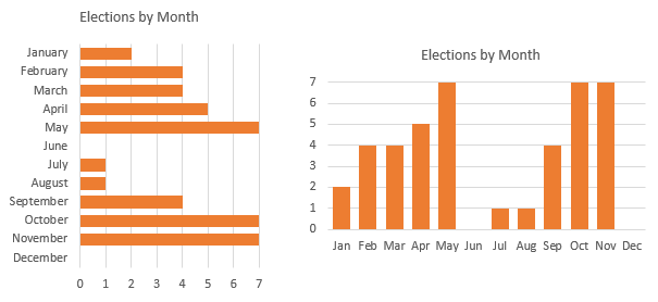 by Jon
in Italy it is very late now but I want to start responding to you
Jeff said:
“Yes, they are not beautiful. But they are very, very efficient”
Meanwhile, we agree that they are not beautiful, this is already a progress 🙂
so … about this bar chart http://peltiertech.com/images/2014-01/ChandooMonthlyElectionGraphs.png
1) we’re using numbers small and discreet, the mind is very fast to count and quantify
2) the bar chart by Jon returns little information in comparison to the circular calendar Economist, there is no distinction between the types of elections / referendum, they lack the names of countries
if I had to use a bar chart then I would have suggested something like this:
http://goo.gl/3DXmXg
graphs proposed by Jon were not efficient because:
1) it gives less information
2) require more effort, for example, in January there are 2 elections, febbrary there are 4 … but in the graph of Jon I have to go read the values on the axis along the grid 🙁
3) the circle with the months is more efficient compared to a line with the months
4) can not add labels with state names 🙁
p.s.
here the xlsx file that I used:
http://goo.gl/g2HPzT
Roberto:
1) we’re using numbers small and discreet, the mind is very fast to count and quantify
I don’t understand what you’re trying to say here.
The bar chart by Jon returns little information in comparison to the circular calendar Economist, there is no distinction between the types of elections / referendum, they lack the names of countries
True enough, but as Jon said, his first instinct would be to use a simple table, and then above he said:
An alternative which is less cluttered and takes up minimal space is a bar chart. You lose the names of the individual countries, but retain a clear sense of where the elections are clumped. Again, each unit of the bars could be color coded by type of election if one wished
And as you’ve shown, it’s trivial to change the chart type to a stacked bar. Heck, I’d probably use a stacked bar in conjunction with a table, if the business purpose required it. Question is, what message (or messages) does the audience need to understand?
Your revised chart looks nice. But what purpose does breaking things into blocks serve? Purely asthetic? Maybe those asthetics might overwhelm the data…what if I’m so busy admiring the chart, I don’t get the message. What if I’m more entertained by the black dots that result from the Hermann grid illusion than informed by the data in the chart?
Why not just go with this?
The graphs proposed by Jon were not efficient because:
1) it gives less information
This begs the question what information is relevant. If more information is more efficient, then I say put the names of each voter on there too.
It’s a bit hard to make an argument in this particular case as to what amount of information is actually needed to support the underlying article, because this article by the Economist quite frankly looks to be just an excuse to put this pretty looking graph on their webpage. There’s no insightful commentary or deep analysis to stand behind it…just a nonsense claim about the percentage of people voting. I particularly love the line “The first democratic parliamentary election in Fiji.” in the article. That’s rubbish on so many fronts, but I won’t digress here.
in the graph of Jon I have to go read the values on the axis along the grid Data labels could easily fix that. But we’re talking about a fairly miniscule change in efficiency.
the circle with the months is more efficient compared to a line with the months Is it? Says who? How?
can not add labels with state names
Does this matter? I don’t know. As per the above, the message of this chart isn’t really ‘interesting’ enough to have a meaningful debate on what level of additional information on the chart might be helpful to readers given the intention of the chart. Because the intention seems to be to garner web clicks, rather than impart some meaningful insight.
I wonder if this chart appears in the Economist’s print edition? I wouldn’t be surprised if it didn’t.
Jaff said:
I don’t understand what you’re trying to say here.
I’m sorry, for me is hard to write in English. I would preferred to have this discussion in my language. So you well done ask for an explanation, thank you.
I meant:
we’re using small and discrete numbers, the mind could easily count and quantify these
It is also true that Jon said …
I apologize for this too, I was almost sure I’ve missed something and you helped me to find. I had forgotten while my attention was all on his chart. I’d like to see a new proposal by Jon.
Jaff said:
Why not just go with this?
1) The order of the months is upside down (Jon has been attentive to this)
2) the axis scales with the minimum value of 2, not good (remember, we’re counting small and discrete numbers – we have to be precise)
3) It ‘difficult to understand which values ??have the presidential election … and you’re lucky that referendums are always one, I make a great effort to understand looking at your chart
4) I suggest (this is also valid for the graph of Jon) that the height of the bar is similar to the number 1 on the x axis … this would be a great help in counting
Now, Your graphic (I also changed the colors) can be improved as follows:
http://goo.gl/vWwJBT
The chart now is similar to my 🙂
Jeff said:
Your revised chart looks nice. But what purpose does breaking things into blocks serve? Purely asthetic?
I think I have already answered … is not only aesthetic, this allows me to remove the axes and grid while maintaining the effectiveness of the graph and making it even more beautiful … this is a good result
for me this is the latest version because I still prefer the beautiful view by the Economist
Ok … as an abacus in my kids’ notebooks 🙂
http://goo.gl/GUsXjd
@Chandoo
I like to be proactive, as I said, I like the version of the chart by Economist, on the other hand. I worked a bit on it … I made ??it dynamic for addition of new data (I added Italy, my country, even if they are not yet set the dates of the elections), and you can add new data too. I made ??the radial points as in the original graph (using xy scatter chart). Everything is in a single graph (6 series). I also fixed the problem of the function text (text (date, “mmmm”)) does not work well in all versions (I did for my friend Kris Hungarian 🙂 … in the original version labels were radials and I really like it but in excel this is very hard …
I’m sure it could be improved, but I have had very little time to do
the file is here:
http://goo.gl/2b5wHV
Well, what can I say. I have been a fan of your work on E90E50charts. And now this just proves that you are a legend. Thanks for taking time to create and share this with all of us.
@Chandoo I am honored, Thanks!
The download to look at your chart is opening a folder but everything is html files. An excel file is not in the zipped folder. This happened to one of your other posts as well a few weeks back.
Thanks for this post, Chandoo. It is very useful!
Hi Chandoo,
I too have tried to download your example sheet but only see html files rather than .xlsx. Can you advise please.
Thanks
Try opening this url – http://img.chandoo.org/c/pie-donut-election-chart.xlsx
in a browser tab. If its not working, I assume it is more to do with System / Browser issues.
Thanks Vad it was a browser issue works fine in Firefox
Should not the SUMPRODUCT read:
=SUMPRODUCT(–(MONTH(E3:E50)=MODE(MONTH(E3:E50))))?
Since you later created a follow up, “Makeover” article, I am really surprised that you did not come back to put a link to in at the bottom of this article …
Combine pie and xy scatter charts – World Polls chart Revisted
http://chandoo.org/wp/2014/02/04/world-polls-chart-revisited/
Few days ago, we learned how to create a pie+donut combination chart to visualize polls around the world in 2014. It generated quite a bit of interesting discussion (47 comments so far).
I really liked Roberto’s comments on the original post and a charting solution he presented. So I asked him if he can do a guest post explaining the technique to our audience. He obliged and here we go.