
Lets talk about people who inspire us. People who show us that anything is possible. People who prove that commitment, hard work and perseverance are true ingredients of a genius.
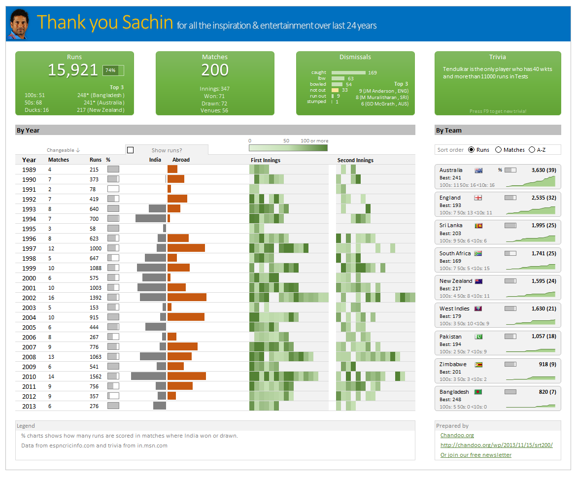
I am talking about Sachin Tendulkar. Those of you who never heard his name, he is the most prolific cricketer in the world. He is the leading scorer in both tests (15,921 runs) and one day matches (18,426 runs). Read more about him here.
Tendulkar has been an inspiration for me (and millions of others around the world) since I was a kid. The amount of dedication & excellence he has shown constantly motivates me. It is a pity that the great man is retiring from test cricket. He is playing his last test match (200th, most by any person) as I am writing this.
So as a small tribute, I have decided do something for him. Of course, I have never been a cricketer in my life. Once in college I was reluctantly asked to be a stand-by player in a game with seniors. I did not get a chance to pad up though. That is the closest I have been to a cricketer. So I did what I do best. I made an Excel dashboard celebrating Sachin’s test career.
Thank you Sachin – his test career in a dashboard
Here is a dashboard I made visualizing his test cricket statistics. It is dynamic, fun & awesome (just like Sachin).
(click on the image to enlarge)
Download the workbook
Click here to download the file and play with it.
How is this made?
Data:
The data for this dashboard is downloaded from espncricinfo.com and the trivia details are downloaded from in.msn.com
Data from Cricinfo website came in multiple tables. So it took a fair bit of massaging to get everything flow in to dashboard.
Formulas used:
This dashboard uses generous amounts of SUMIFS, COUNTIFS, INDEX, MATCH and VLOOKUP with an occasional LARGE.
For some of the calculations, I have also used Pivot tables.
PS: All the calculations & pivot tables are hidden. Unhide them to go Indian Jones on the dashboard.
Output:
The output dashboard is generated by using various ideas.
- Thermo-meter chart for % charts in the report
- Conditional formatting to show run heat map & India vs. Abroad bars.
- Area charts to show cumulative runs over the years.
- Form controls to capture user choices.
- Sortable country list using pre-sorted pivot tables.
- Picture links to show country flags.
- Text areas & shapes to make the layout of the dashboard.
I have used similar concepts in earlier dashboards. So I am not explaining everything in detail. Instead, let me point you to few detailed tutorials so you get the idea.
Thank you Sachin
Thanks for inspiring me Sachin. For 24 years, if there is a cricket match on TV, I would invariably ask, “Is Sachin playing?”. It would be hard to watch the sport knowing that you will not grace it with your presence. But you have given me and lots of people in my generation something even more valuable. You motivated us to excel in our life. For that I thank you.
Dig sports & Excel? Then you will love these dashboards
If you dig sports & work with Excel, then you are going to immensely enjoy below dashboards too.
- Roger Federer’s Wimbledon win – visualized in a dashboard
- India’s world cup victory in a dashboard
- Sachin Tendulkar info-graphic in Excel
- Official soccer balls in all worldcups in a chart!


18 Responses
awesome excel file!
Nice looking excel we have there Chandoo 🙂
Good that you have put the excel on a CDN :-))
nice way to say adieu
Thanks Chandoo! But I thought Sunil Gavaskar was the best Indian cricket player ever! 🙂
This is fantastic mate. Well done!
Hello Chandoo Ji!!
Really an Excellent Tribute to an Excelling Legend by an Excel Legend! Wow! great!
Excellent Tribute to an Excelling Legend
Amazing Visualization!!!
I was lucky enough to see the little master make a century against England in the tied game during the last world cup. The reaction from the crowd was like nothing I have ever seen!
Great visualisation.
Like most Americans, I know next to nothing about cricket. But the dashboard is great.
Dear sir,
I admire u because of your skills in excel and I want a detailed explanation regarding the following
1.macro and. Vba
2.offset and index match conditional formatting
im left as spell bound as one is when Sachin bats!
Chandoo, nice post & great instruction, at least i get to know this person through Excel even i have no idea of cricket at all. Excel is cultural tool now…
Brilliant work my friend !!
It’s a small and loverly tribute to the great master. Least we can do is to appreciate the stats and cherish the fact that we got to witness most of it, as it happened in our generation. Really lucky to be part of this era. 🙂
Cheerss… thanks, for the stats. THere are many pages on Wikipedia, that spawn from sachin’s home page, and they contain a lot of stats and details, including that for ODI etc. Some of you may want to take a look at that too. It’s amazing how people contribute and keep the wiki pages updaded.
Excel of course is great tool. I have used a lot of excel features, that I can see have been used for this sheet as well, it takes a lot of efforts and skill to make use of excel the way you did, I really appreciate your efforts. You have done a wonderful job. 🙂
Awesome dashboard!
Though what I can’t figure out is how the linked texboxes with a reference works?
Created a Visualization of Sachin Tendulkar? – Test cricket records using Tableau Public
http://public.tableausoftware.com/views/SachinTendulkar_TestCricketRecords/Sachin-TestCricketRecords?:embed=y
Such a humble tribute to the ‘God of Cricket’. Well done!