Pie of a Pie of a Pie chart [Good or Bad?]

Share

Facebook
Twitter
LinkedIn

There are some charts that look so stunning and yet confusing. You cant make up your mind whether it tells a compelling story or it is just plain wrong.

Today, let me present you one such chart. I call this Pie of a Pie of a Pie chart (source: thiswoo, thanks to Nassar, our forum member for mentioning this)
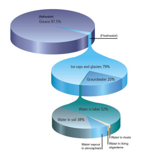
Water Stats - Pie of a Pie of a Pie chart

Pie of pie of pie – What is good about it?

The idea of this chart is quite noble. Show how the water in this world is distributed. Obviously, with such large numbers, making one chart would be difficult. So make 3. The initial pie of salt vs. fresh water, which explodes to show the distribution of fresh water which explodes to show the spread of other water sources.

The chart narrates the story of how little water is available for consumption and where it is one simple picture.

And the pie leaking in to another pie metaphor works really well in this case.

What is not good about it?

To begin with, the 3D pies are very deceptive. It is not clear how much % of water is fresh water (other than the fact that it is very little). Also, compared to a 2d pie, the fresh water slice in 3d pie looks bigger (due to its orientation and 3d effects).

Then, no matter how good the colors are, the 2nd and 3rd pies are confusing. The colors imply that the blue slice (fresh water) corresponds to just ice caps and glaciers.

Since all 3 pies are of similar sizes, we immediately think that we have enough water. Only on closer inspection it becomes obvious that the size of lower pies has no relation to actual water amount (only angles convey the information).

Finally, I think this chart is bad because it takes excessively large amount of time to make in almost any software. That said, it is a good exercise to come up with this tinkering with various drawing shapes etc.

Aren’t there any alternatives?

The easiest and clear (and obviously not so exciting as pie of pie of pie chart) alternative is to just show the numbers like this:

Water stats - showing as a table

Note: This table too is misleading as row heights wrongly indicate that we have more fresh water than salt water etc.

The next option is to use a variation of bar of bars, some thing like this:
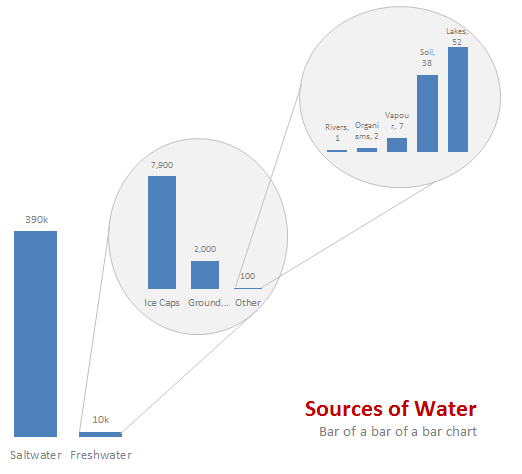
Water stats - displayed as a bar of bar of bar chart

One more option I can think of is a tree map. For hierarchical data like this Treemaps are also a very good option. That said, since the largest value is 390,000 times the smallest value, any treemap will be very large to show the smallest value clearly.

Do you like Pie of Pie of Pie chart?

What do you think? Do you love this or would you prefer some other chart to visualize this data? Share your opinion using comments.

Previously on Pie Charts

Pie charts are one of the most (mis)used charts in business world these days. That is why we talk about them from time to time. See these articles to learn more:

PS: If you want to know to create this pie of pie of pie chart in excel, see here.

Facebook
Twitter
LinkedIn

Share this tip with your colleagues

Excel and Power BI tips - Chandoo.org Newsletter

Get FREE Excel + Power BI Tips

Simple, fun and useful emails, once per week.

Learn & be awesome.

Welcome to Chandoo.org

Thank you so much for visiting. My aim is to make you awesome in Excel & Power BI. I do this by sharing videos, tips, examples and downloads on this website. There are more than 1,000 pages with all things Excel, Power BI, Dashboards & VBA here. Go ahead and spend few minutes to be AWESOME.

Read my storyFREE Excel tips book

Overall I learned a lot and I thought you did a great job of explaining how to do things. This will definitely elevate my reporting in the future.
Rebekah S
Reporting Analyst
Excel formula list - 100+ examples and howto guide for you

From simple to complex, there is a formula for every occasion. Check out the list now.

Calendars, invoices, trackers and much more. All free, fun and fantastic.

Advanced Pivot Table tricks

Power Query, Data model, DAX, Filters, Slicers, Conditional formats and beautiful charts. It's all here.

Still on fence about Power BI? In this getting started guide, learn what is Power BI, how to get it and how to create your first report from scratch.

23 Responses to “Shift Calendar Template – FREE Download”

  1. Alvin says:

    Hi Chandoo,

    your recent postings include only Excel 2007 templates. Unfortunately the company I work at still runs Excel 2003. Is it possible to get your awesome files in other excel version as well?

    Thanks so much for your great excel stuff!

  2. Stelios Tserkezis says:

    Is it possible to do this for shifts with hours instead of days? To organise a three shift day?

    Thanks in advance,

    Stelios

  3. MASTHAN says:

    In my organization there are 45 employees i need split then into three shifts ex:A shift:14,B shift:14,C shift:14 and week off:3 kindly help me on this.

  4. Hui... says:

    @Masthan

    You need to understand what rules your company has for the various shifts / roster combinations

  5. Georges Lacombe says:

    Chandoo, I once did a shift control spreadsheet for my team. I put one person in each line, the columns were the days. I put a shift code in each cell indicating in which shift that person should work, or if the person were out that day. I have two codes for being out. One is for vacations and one is to compensate days worked in weekends. This way I was able to count how many persons I have in each shift, how many were on vacations and how many were out compensating (that's the term we use here) weekend worked hours.
    Later I included the possibility of a person be in two lines one for normal hours other for overtime. This is mainly used for planning purposes. If you would like I can send you an example. The only problem of this spreadsheet is that we don't have a person view, only this consolidated view.

    • Chuck Vaughan says:

      Hi George, I would like to have a copy of your spreadsheet if you can share it.
       
      Thanks in advance, Chuck   

  6. Idan says:

    Hi Chandoo,

    Where is the code located ? is it VBA ? If so , how do you hide it ? Or it is .NET ?

    Thx

  7. Hui... says:

    @Idan
    .
    No VBA or code, it is all done with Mirrors.
    Only Joking,
    .
    But there is no VBA or code,
    It is all done with Named Formulas and Lookups.
    Have alook at the cells in the calander area and Named Formulas in the Formulas, Name Manager Tab.

  8. Anand Sant says:

    How can i calculate between two or more different workbooks? Please, reply me as early as possible.

    • Hui... says:

      @Anand
      Open the workbooks you want to link to
      Start a formula = and click and change between workbooks as required.
      You can use the View, Switch window menu to change workbooks mid formula

      The format for using workbooks is
      =[Workbook.xlsm]Sheet1!$A$1
      or
      =SUM('[Book2.xls]Sheet1'!$A$1:$D$10)
      etc

  9. Shemi says:

    Hi Chandoo,
    I am working with a call centre wherein i ned to update at the month end 20 to 30 employees login hours which are defict to track it at the month end is very difficult is there any template which can be made to track that why on a particular day a guy who needs to be on calls was why not on calls.

  10. Denice Lognshaw says:

    Thank you so much Chandoo. This is really helping me. As usual, you rock.

  11. Mukesh Verma says:

    What's FortyTwoDays and Calendar in Name manager?

    Both are unused and FortyTwoDays doesn't make any sense.

  12. Dave says:

    I have a SQL db that contains records of events scheduled/completed on a particular date. Can this method ous building a calendar be used to display those events on the respective day?

  13. Jan Halliday says:

    Positively awesome!
    I'm attempting to help a friend create a schedule for adult classes - and of course its not"paid help".  Here is the scenario:
    20 classes, instructor, room#, student class size, start date, number of class days (need to subtract weekends)

    class
    instructor
    room
    students
    start
    #days

    PATH
    karen
    201
    21
    01/01/13
    11

    BILLING
    jane
    401
    15
    01/12/13
    13

    MEDISOFT
    mike
    301
    11
    01/25/13
    9

    he'd like to see these classes show up in different colors within the same month's calendar chart.  He can draw it, but I'd like to see it done automatically through data, and I just can't visualize it, but I KNOW this will work - can you help?
    Jan 🙂
     

  14. Chan Tean says:

    Dear chandoo,

    Try many way to download still can't access. Any way we want to try out 3 shifts with 3 guys in a group .eg Group A Morn, Group B Night and Group C Rest. And every each group must work on sunday to take turns. In fact we are security teams so that's why sunday is required to work. Pls guide and show how to put in the working calendar. Thank you in advance.

  15. Veronica Burggren says:

    I've been trying to copy and/or recreate this to use in a workbook I'm doing for the transportation department I'm working for. I need to have the calendar on the first sheet in my document (it has graph's from data on another sheet). I'm trying to use it to track (with the conditional formatting) accidents and injuries. I've redone the conditional formatting to do 4 different accident types (no injury, near miss, OSHA recordable injury and work loss injury), but when I enter the formula's you have in the calendar portion where it says "DateOfFirst-FirstWeekDay" I can't figure out how you did that. Are you able to help?

  16. Pipin Fantom says:

    I would like to use Excel to solve the following problem for a community work. I want to create a Driver schedule for a given month from a pool of volunteers for a community service. Each of these volunteers can drive only on specific days in a week. I would like to populate the driving schedule for each weekday with primary, secondary and tertiary drivers in a random fashion so that I do not overburden one person. I would greatly any help you can provide.

  17. Ravichandra says:

    Hi chandoo,
    Thanks for your valuable effort for create this template and let me know how to add multiple employees in the the Roaster.

  18. Savitha says:

    Hi Chandoo,

    This article on shift roaster is very helpful. Could you please let me know how i can use the same for n number of resources who work 24/7, considering their leaves and holidays?

    Thanks,
    Savitha

  19. Balu says:

    Hi Chandoo,

    This article on shift roaster is very helpful to all. Could you please let me know how i can use the same if I want to add for some more shifts, since the color is not getting change if I add more shifts like 4,5 etc.,

    Thanks,
    Murali

  20. Sarah says:

    How can I change the date to 2017 under Shift Data worksheet.

Leave a Reply