
This is a guest article written by John for our Excel Dashboard Week.
Executive Review Dashboard using Excel
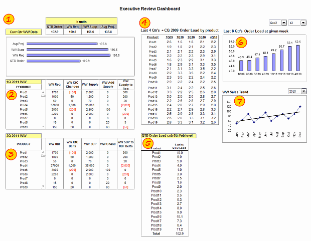
Snap-shot of the dashboard:
Purpose of the dashboard:
This Dashboard was constructed for a number of reasons, one of which was to reduce the number of reports produced with the same data ( up to 6 separate files ). As we all know, when it comes to senior management and reports / files the more information they can get on one report / file the better for them. So, with this in mind I created the Dashboard to show the data they need to see “quickly” each week.
How this Executive Review Dashboard is made?
I used various functions / formulas to help me construct this Dashboard, this isn’t the first one I have created, but I think this is the best one I have done so far and it is all thanks to the hints and tips and assistance I get form Chandoo’s site as well as Excel User *(Charley Kyd was the first inspiration for me to get involved with Dashboards ) and also a shout out to Clearly and Simply, another great site.
[Note by Chandoo: I have added numbers 1 to 7 on the snapshot to help you understand below portion.]
The top left corner (1) has data that shows what is happening right now, i.e. QTD Order volume, WW Requested supply, WW Available supply and the Avg projected orders ( based on historical analysis ). This table format is then supported by a simpler bar chart below it.
Below that I have used Scroll Bars (2 & 3) to allow a lot of data to be shown in a small space, scroll bars do this very nicely. The data in here would be a list of all the products within the current range of orderable parts ( the detail behind the table and bar chart above ). [Related tip: How to create a scrollable list in Excel Dashboards?]
The middle table (4) ( Last 4Qtrs + CQ 2009 Order Load by product ) shows the historical data for each of the current products ( and perhaps their predecessors ) with a bar chart to the right of it (6) showing the overall volume of those products and the table and bar chart are controlled by the drop down menus above the bar chart.
The Line Chart below (7) that shows the overall Sales Trend by month with a drop down menu to enable you to choose each year separately.
To the left of that there is a table (5), which is a snapshot using the picture link function, of the current order load status by product and again supports the data on the left hand side of the Dashboard.
Final Notes:
If anyone would like to leave a comment or ask questions about this Dashboard or indeed need help with anything ( even if I don’t know the answer I am sure Chandoo and his growing community would be able to help ) please feel free to ask.
Just a note to close. Since I started utilizing Chandoo’s site I have now started my own community internally within the company I work for and I am now teaching other people about Excel ( albeit 2003 level for now ) and encouraging them to expand their own knowledge of Excel and perhaps share what they learn with their colleagues and I fully intend to point some of these people to Chandoo’s site and will encourage them to sign up for Excel School.
Download Executive Review Dashboard Workbook:
Click here to download the executive review dashboard workbook & play with it.
Added by Chandoo:
What I liked in this Dashboard:
Techniques used: John used a variety of techniques like formulas (SUMPRODUCT, OFFSET), dynamic charts, scrollable lists and picture links which help us in analyze lots of information and present the results in minimal space.
Dynamic Dashboard: The dashboard lets us analyze and understand information for any quarter or region which is very good.
What can be improved in this dashboard:
Layout: Ideally, if a dashboard is in a rectangle or square layout, it would be easy to read and understand. The current setup suggests that it is incomplete.
A little more visualization: There are lots of numbers in this dashboard. I would suggest adding few more visualizations like showing indicators or applying conditional formatting or replacing a table with a chart. This would reduce the comprehension time. Of course, you can always add hyperlinks to detailed data so that if an executive is interested to drill-down, she can do so.
Spell out key messages: This dashboard would become even more effective by adding a small comment area at the bottom or top where key messages can be highlighted. [Related: Tweetboards as an alternative to Dashboards]
Thanks to John
Thank you very much John for sharing your work with all of us and showing us what is possible. I really appreciate your effort in writing this guest article and spreading good word about Chandoo.org and Excel School.
Say thanks to John
If you liked this dashboard, say thanks to John. Also, feel free to share your views on this dashboard. How would you have designed an executive review dashboard if it were up to you? Please share using comments.
Contribute to Excel Dashboard Week:
You can contribute tips, screen-shots, excel workbooks or links that I can share with our readers on Friday (25th March).
Click here to send your tips & files for Dashboard Week
PS: The link to Excel user site is affiliate link, meaning if you click on it and purchase anything from the site, I get a small commission. I do this because I think Charley’s products are awesome.


24 Responses
I’d suggest simply using the subtotal function and filtering the data using the Win/Loss column. You get the same results and the formula is more comprehensible.
@John
That is one option.
There are times however when you want to see the whole data table or a filtered subset and still want to produce summary reports against an unfiltered field.
Is there a particular reason why you are using a comma and the unary (–) operator for the second array in the SUMPRODUCT formula? It seems to work the same if you were to string the arrays together using the asterisk (*). The advantage is that SUMPRODUCT treats the entire string of arrays as a single array.
@Mathew
Your correct, There is no difference.
I thought it may have been easier to explain this method.
Is there a way to do this on a large set of data? As in ~100,000 rows? When I try I get an error because the formula becomes too long. It says the max length of a formula is 8,192 characters. Excel 2010.
How do I incorporate a specific text within a cell for the second array. For instance, – -(C7:C13=”Apple”)
when I chose a specific text the formula does not work.
@RB
I am not sure what is the issue as if I use the sample data in the post the following work fine
Count:
=SUMPRODUCT(SUBTOTAL(3,OFFSET(C7:C13,ROW(C7:C13)-MIN(ROW(C7:C13)),,1)), –(C7:C13=”L”))
Sum:
=SUMPRODUCT(SUBTOTAL(3,OFFSET(C7:C13,ROW(C7:C13)-MIN(ROW(C7:C13)),,1)),(C7:C13=”L”)*(D7:D13))
You may want to check that there are no leading or trailing spaces in your list of Apples
I should have given a better explanation. Heres my situation. I have a column with cells filled with names like Column 1, Column 2, Pier 1, Pier 2, etc. If the cell just contained Pier and searched for that it works. But because it has other characters in the cell its not recognizing the pier. So how can I extract specific characters of a string of text in this formula?
Hopefully this was a better explanation
Hello-
This formula works pretty well for me except that it slow down excel and prevents some of my macros from working. I was wondering if there was a way to program this in VBA so that excel isn’t always trying to recalculate it. I would like to use a push of a button to get it to run then paste in a cell.
Thanks!
I am trying to sum filtered data in a column, but would want to ignore the negative values in the column. How to go about doing this?
@Akshay
Why not just add a filter to that column to only show the values greater than zero?
The negative values are required for reporting purposes, but their effect on the total is distorting the required output. Please advise.
@Akshay
I’d suggest making a post in the Chandoo.org Forums
http://forum.chandoo.org/
Attach a sample file to simplify the task
I have this working for counting and summing, however, I have a list and for the second array, I need a criteria. That is, I’m looking for b13:b200=”01.??.??” or =left((a1,2) or something like that. These types of criteria matches do not appear to work as I get a blank as a result.
Thanks!
@Bob
As your formula b13:b200=”01.??.??” looks like you are trying to check the first day of the month of the range
What about trying Day(B13:B200)=1
Hai Experts,
i understood this formula well and working fine in MS Excel 2013
but when the same am trying to place in google Spreadsheet it shows error as
“SUMPRODUCT has mismatched range sizes. Expected row count: 1. column count: 1. Actual row count: 2014, column count: 1.” and as a result #VALUE! Appears in cell.
Can anyone please help me how would i get it done in Google Spread sheet
or is there any other formula as a substitute for this.
Thank you very much.
thanks for providing this.. but why does excel keeps on prompting Circular referencing in cell D3?
@Vivek
I don’t know
I just downloaded the file and it is working fine and not showing that error
Goto the Formulas, Calculation Options Tab and check that Calculation is set to Automatic
What version of Excel and Windows are you using ?
I know that this forum is for MS Excel, but I am trying to help someone who is working in Google Sheets. The below formula works in Excel but Google Sheets returns:
“SUMPRODUCT has mismatched range sizes. Expected row count: 1. column count: 1. Actual row count: 39000, column count: 1.” and as a result #VALUE! Appears in cell.
This is the same problem asked by Srichirin above. Does anyone know if there is a formula for Google Sheets that will replicate what MS Excel does?
=SUMPRODUCT(SUBTOTAL(3,OFFSET($C$6:$C$39500,ROW($C$6:$C$39500)-MIN(ROW($C$6:$C$39500)),,1)),- -($C$6:$C$39500=H1),($D$6:$D$39500))
Trying to find a SUMPRODUCT formula that counts the word Closed by date for the last 7 days in a filtered list.
=COUNTIF(M:M,”>”&TODAY()-7) works ok for unfiltered count Column M contains Closure dates (blank if open) and Column L is Status Open or Closed
@ Terry
Please ask the question at the Chandoo.org Forums
https://chandoo.org/forum/
Please attach a sample file to ensure a quicker more accurate answer
I used this formula and worked like a charm! But, now I’ve been requested to use it but adding not one but two criteria in the same formula. For instance the sum I was doing added negative and positive numbers. I’ve been asked to use the exact same formula but adding that only positive numbers were considered… any idea on how to do this?
How exactly do you do sum filtered cells when two criteria are need not just one?
Thank you so much brother literally I have been struggling since morning to get the sum of the filtered category, however, after reading your blog attentively i got my solution, so thanks a lot once again.