
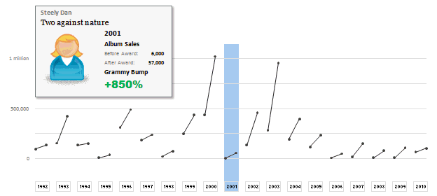
The folks at Washington Post made an interesting chart to understand whether winning a Grammy award makes any difference to album sales. Go ahead and browse it if you have not already seen it. Go, I will wait.
Are you impressed?
I really liked this chart. This is what I liked about the chart,
- It tells a story. [why charts should tell a story]
- It is an ego chart. We would all instantly search for our favorite artists and learn about how Grammy award changed their album sales.
- It is a simple chart. No clutter, no gaudy colors, just a bunch of lines and the story is out there.
- It lets you play. You can hover your most over an artist to see their sales before and after the award, and how much % bump they got.
In fact, I liked the chart so much that I wanted to make it in Excel.
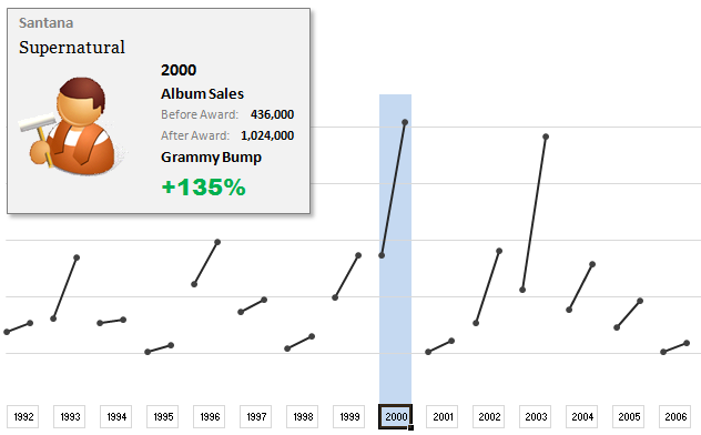
Here is what I came up with:
How does the chart work?
1. Data for the chart: The Washington Post guys did not give any details about the source of data. So I manually typed the data myself by looking at their chart. It took a few minutes. But totally worth it. I put the data in 5 columns – Year, Artist, Album, Before and After sales.
2. The chart: The chart is an XY Scatter plot. I took numbers from 0 to 37 (there is a total of 19 years of data – from 1992 to 2010. Each year has 2 data points – before and after). For even numbers I used the before sales and odd numbers I used the after sales. For this I wrote simple INDEX formula with a bit of MOD(). Again, nothing too fancy.
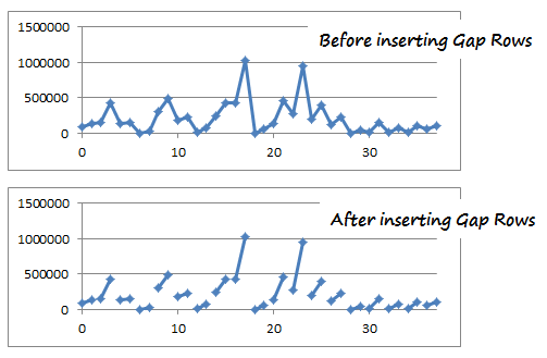
3. Getting the gaps in the chart:
This is the tricky part. By default, if you have 4 points (0,98000),(1,135000), (2,155000), (3, 427000) in the XY Scatter plot, Excel will draw a line connecting all 4. But we want to have a gap between first 2 points and second 2 points. How?!?
Thankfully, there is a simple workaround. You can insert blank rows between 2nd and 3rd row of your data and instantly you will see a gap in the chart. Repeat the same for remaining 18 points.
4. Year Selection & Highlighting
This is done using conditional formatting & Worksheet_SelectionChange Event Macro. First, I wrote a simple macro that would change the named range valSelectedYear to the selected year. The code is very simple. You can examine it in the download file.
Then, I used the valSelectedYear to drive the conditional formatting that would fill blue color across the column. As you can guess, the chart is transparent (ie no fill color for both chart area and plot area). So whatever color the cells beneath the chart have, they will show up in the chart too.
5. Creating the Dynamic Legend:
Here I have used picture links to fetch the artist image dynamically. (well, I was too lazy to download the actual images of Nora Jones and U2 etc. So I just used clip art).
Then, I used text boxes to make the dynamic legend, same as the technique demonstrated in smart chart legends & excel product catalog articles.
6. Formatting and aligning everything:
Once the basic setup is ready, I just moved and re-arranged the chart, legend box etc. so that everything looks right.
Download the Chart Workbook:
Click here to download the workbook in Excel 2007 format.
(click here to download the file in Excel 2003 format. I have not tested this, but it should work alright)
Mirror location for the files.
Please note that you must enable macros to select years.
Recommended Reading to make charts like these
- Picture Links – What are they and how to use them in Excel?
- Dynamic Chart Legends in Excel
- INDEX Formula – Examples, Tips & Tricks
- Conditional Formatting – Examples, Tutorials, Tips
- Further Examples,
How would you have made this chart?
I liked the original chart design and interactivity provided by Washington Post people. So I closely mimicked the same my Excel chart. But you may want to visualize the same data in a different way. So go ahead and download the workbook. It has data (hidden in columns A thru G). Play with it and make your own chart. Post them in comments.
I would love to see how you would have visualized the same information. Especially this type of data has a lot of relevance in business situations, so it would be fun to see your views and learn from each other. Go ahead and chip in.
Thanks to Washington post for the chart. Hat tip to Flowing Data for the link.


7 Responses to “Project Dashboard + Tweetboard = pure awesomeness!!!”
I would like to see actual hash-tagged DM tweets go out to the specific information consumers. That would be an interesting way to communicate the key daily data to interested parties.
A Twitter-like secure application like Yammer might be a good fit with this.
For example, how about daily tweets to selected user groups (secure) that would display sales, bookings, cash receipts, cash disbursed and a second version that would show the same info for MTD, QTD or YTD figures.
@Dan, it would be great. I did not taught about implementing it on this dashboard because twitter is blocked to the whole intranet here. However, there's a discussion here about how can we send these tweets to blackberries (probably through e-mail) automatically. (I'd like to see this implemented on a jabber restricted network as well, but here it'll probably not happen)
The wrap-up versions you mentioned doesn't apply to my particular scenario, but on a sales tweetboard it would be a great tool indeed - choosing who will receive which message according to hashtags. I'll think on something, thanks for the advice. 🙂
(Ah, btw, I'm Fernando... 🙂 )
@Dan: That is a fun idea. Instead of tightly integrating twitter functionality with a dashboard, i think it would be cool if we have a "tweet this" button that users can click after selecting a range of cells. We can easily show a dialog with the concatenated output of the selected cells and ask user to edit the text and eventually "send to twitter".
For eg. you can select the annual sales figure cell and click on "tweet this" button upon which a dialog will show the value. Then you can pre-pend it something like "DM @boss look at our sales this year: "
@Aires.. thanks once again.
Wow it looks really good. Not sure though how much the tweet facility would help in real world project management, but certainly having a dashboard on a project should be a key deliverable when learning how to manage a project
The other use of this is during the software development life cycle especially when you have parallel streams of development and testing going on. Using a dashboard is a quick way for everyone on the team to see where the project is at and how it all fits together.
Regards
Susan de Sousa
Site Editor http://www.my-project-management-expert.com
Hi Chandoo,
I purchased the project management toolkit but the dashboard shown above with the imbedded scroll bars. Is it included in the project pack??
Thanks
Sue
The gantt chart section of this dashboard is similar to one I have recently created: http://xlcalibre.com/hr-dashboard-gantt-chart-traffic-light-reportIt has a similar approach with scroll bars, but has a couple of additional features. I've tried to incorporate a traffic light report element, and also allow the timescale to adjusted so that can view it by days, weeks or months.I really like the other tables that you've incorporated, I may well try to replicate them to improve my version!
I am a monitoring and evaluation consultant in international development, and one of the services I offer is to help non-profits and foundations develop performance dashboards. I often advise them to develop dashboards for ongoing programs, rather than for one-time or pilot projects, because of the time involved. I am trying to find out from a few people how long it takes you to develop a project management dashboard, and to what extent the indicators vary from one project to the next.