
We make charts with date axis all the time. For example, lets say you want to plot the number of donuts consumed per month in a chart, like this:
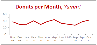
2 things become quite obvious when you look at this chart,
- The year -09 and -10 repeating across bottom of axis is pure chart junk.
- Aww, dude. How many donuts do you eat!?!
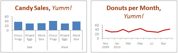
Now, there is nothing much I can do about donut consumption. But I can tell you how to fix that axis so it looks a lot better, may be like this:

Interested? Follow this simple recipe:
- Process your data: Assuming your data looks like what I shown to left, just use simple formulas to make it look like the table to right. [related: how to work with dates & times in excel]

- Now, make a chart from the data. Use both year and month columns for axis label series.
- That is all. Excel shows nicely grouped axis labels on your chart.
Pretty simple, eh?
Download the Excel Chart Template
Click here to download excel chart template & workbook showing this technique. Play with the formulas & chart formatting to learn.
2 Bonus Tips:
1. This technique really works with just any types of data.
So you can just have Product Group & Product Name in 2 columns and when you make a chart, excel groups the labels in axis.
2. Further reduce clutter by unchecking Multi Level Category Labels option
You can make the chart even more crispier by removing lines separating month names. To do this select the axis, press CTRL + 1 (opens format dialog). From Axis options, un-check Multi Level Category Labels option.
How do you format date axis on charts?
Most of the times when I make charts with date axis, the axis has 12 or 13 months of data. So I knock off the year part completely. But in some cases, I end up making charts that show data from multiple years. Now, repeating year value across bottom is a waste of chart ink. So I tend to use the above technique to make the chart look much more professional.
What about you? How do you format date axis? Please share your ideas and experiences using comments.
More Charting Formatting Tips:
- How to change data labels in charts to whatever you want
- Making your chart legends look awesome
- Use paste special to Speed up chart formatting
- … More chart formatting tips


33 Responses
Very CooOOOoool 🙂
Would it work if I merely change the display format for the dates, or do they actually need to be retyped in that format (Nov, Dec, etc)?
ps- it’s only about 34 donuts per month, or slightly more than 1 per day. Yum!
To make it work automatically when you create a chart, delete the labels above the Year and Month columns, but keep the label above the Y data (Donuts). The blank cells tell Excel that the first row and first two columns (indicated by the blanks) are special, so it uses the first row for series names an the first two columns for X axis labels.
This is better than the other kind of donut chart, but you’ll soon be carrying a big donut around your midsection.
First off, thank you Chandoo for being respectful and taking out the “Jesus” comment. Not that I’d threaten to kill you, or start world-wide riots, or make you go into hiding if you didn’t (as OTHERS would; wink, wink, nudge, nudge)… I just really appreciate your respectulness and consideration; so thank you. I was meaning to write you about it, but when I came to your site you’d already made the edit… so again, thank you!
Secondly, I wanna say I think there’s an easier way to do what you are demonstrating. I’ve got a pivot chart with months of data and all I had to do was right-click the x axis and then select “format axis”, under “Axis Options” there’s a check-box that says “Multi-level Category Labels”. The chart I was able to do this on was a pivotchart however so maybe it wouldn’t be that easy for a non-pivotchart.
Anyway, love the site. Keep up the good work. Thanks also for being so open about your success, it’s very encouraging and motivating.
God (aka Jesus) Bless. 🙂
Hi Chandoo – great site! Another option to save space is to simply rotate the orientation of the text by 90 degrees, so the dates read vertical rather than horizontal. However, I like the elegance of your solution also.
Hey Chandoo — Great tip. Only yesterday I was working through some strange behaviour with formatting dates in PivotCharts. Seems the axes never want to cooperate. This is a neat and elegant solution I hadn’t thought of using. May need to abandon pivotcharts to use formulas like that, but if we use dynamic named ranges, no big sacrifice.
BTW, whatever did you do to get your site blocked in China? Never heard of regime change by a grass-root spreadsheet movement. Maybe your ISP is hosting some problem sites. Chandoo.org is certainly worth it for me to fire up the VPN, but I’m sure you would lose a lot of other visitors from the middle kingdom.
Chandoo … pls help.. the link is blocked over here… pls can you put the regular link… 🙂
@JP… Excel Axis formatting is linked to cell formatting by default. So you can just have the dates which are formatted to look like months (mmm).
@Erin: It was not my intention to mock anyone’s faith or religion. I just used the word as it is quite common. I decided to remove it as I got 2 emails from readers requesting for the same.
Also, the pivot charts take pivot table groupings by default, so you need not do any of the above while making charts from pivot tables.
@Kein: I am not sure why Chinese authorities decided to block my site. I wish they would actually look at the content instead of blocking sites based on simple text matching rules.
@Kapil: The file is mirrored here: http://chandoo.org/img/d/date-axis-months-years-trick.xls
Cool, really cool…
Nice one Chandoo,
Also would like to mention abt useful method while creating dynamic charts.
In any chart where in the months keep on adding – instead of changing the range for the chart every time we add a month, we can actually format the months as dates (probably 1st of every month) still keep the format as “mmm” AND while selecting the data, we can select a huge rows (date column) once and for all, and the chart adjusts automatically with the data that we entered. So next month when I enter Dec’s data, I need not change the source data of the chart, however it automatically adjusts.
Hope I made sense.!
Regards,
SS
Thanks, Chandoo! This is a great tip – one that I will definitely put to use. I typically have an axis with mmm yy format, aligned vertically, but this will definitely look a bit cleaner (except in cases where the chart is too small for the axis labels to be displayed horizontally, even without the mmm yy on one line). Thanks again!
Tom
Chandoo,
Thank you for the posts you are very diligent not to mention very helpful. I would like to know how to get the separation lines on the axis? For example your candy sales chart has longer lines separating east and west how do you format that?
Thanks for being very awesome!
-Josh
Hi Chandoo, we can look the formulas because there is a message:”Unsupported features”.
Could you send a diferent Link ?
Thanks.
@SS But what if you’ve got formulas in the data block (i.e where you would enter static data for the month of december)? My chart now shows #N/A #N/A in the axis with no data for all future dates.
Chandoo, I’ve got a dynamic range set up showing #N/A errors for future dates. The MMM-DD date format format in row works fine, but when I use YYYY and MMM in two rows, the axis shows #N/A #N/A for all future dates with no data. How would you go about keeping those future months hidden?
Matt –
In order for the axis to automatically extend to the dates within the range and ignore #N/A at the end, you need a date-scale axis, and for this you need to use one column with the complete date, not two columns with year and month.
If you want to use two columns, you need to generate Names in the worksheet which define ranges only as long as the number of months. I have a review of dynamic chart approaches in http://peltiertech.com/WordPress/dynamic-chart-review/ and a whole category on my blog at http://peltiertech.com/WordPress/category/dynamic-charts/. Chandoo also has examples of his own on this site.
How do you make a dynamic chart out of this?
I can’t get the axis labels range right.
I tried something like this:
=OFFSET(REPORT!$H$10:$I$10;0;0;COUNTA(REPORT!$H$10:$I$100);1)
Any idea?
Ethan –
Your offset formula defines a range 1 row in size, but the technique here requires 2 rows. Your definition should end with
;2)
instead of
;1)
Thanks Jon,
Got it working now
Great! Now, is there any way to do this directly in Powerpoint? I don’t like having linked excel files, so I create the graphs right inside Powerpoint, any way to do this there? I tried and was unsuccessful.
Thanks.
Cool tip Chandoo……thanks
Hi there,
I have got a data ranging for 3 years. I want to show a chart which shows Jan of 2011, 2012 and 2013 together side by side; then Feb11, Feb12 and Feb13 side by side, then Mar11, Mar12 and Mar13, and so on until December.
Please help. Thanks.
@Bilal
Do you want a number of charts next to each other as separate charts or the data next to each other in a single chart?
What type of chart were you thinking about?
Can you post your data for us to review?
Refer upload instructions at: http://chandoo.org/forum/threads/posting-a-sample-workbook.451/
Hi there
Very good solution this. I have another question on it, though. How do you format the X-axis with monthly gaps (ie, with labels “Jan 2012”, “Apr”, “Jul”, “Oct”, “Jan 2013”, “Mar”, etc), when you’re dealing with a data series with weekly or daily data points? The Axis Options dialogue box doesn’t appear to offer “Date axis” as an option under the “Axis Type” section.
I’ve managed to do it in one case with weekly data by setting the interval between tick marks at 13 — the approximate number of weeks in a quarter — to get 3-month intervals. But this wouldn’t work if I wanted to show 1-month intervals, or had a more detailed daily data series to work with.
Any luck getting the dates to work on a scatter graph? I’m only getting numbers. Works fine on line graphs though.
How can we do the vice versa? i.e. on the x-axis showing year on the level 1, and months on level 2.
I wanted to build these kind of axis labels for 5 years, with year on top and months at the bottom, but it should form in such a way that the seperating lines should seperate the entire data set only at December of each year, and no lines in between any month.
@Apoorve
Just re-arrange the columns
You need to put a space in all cells where you don’t want a year
See the attached file
http://chandoo.org/wp/wp-content/uploads/2010/11/Chart-for-Apoorve.xlsx
Unfortunately you don’t get any control over lines its all or nothing.
Hello – the link seems to be broken:
http://cid-b663e096d6c08c74.office.live.com/view.aspx/Public/date-axis-months-years-trick.xls
Regards.
Like!!
Three times already today I have used this website and saved a ton of work time in researching excel tricks.
Suggestion: Why not have a “like” or “this article was useful to me” button. That way you can see what is most useful by your users and maybe generate more content based on those “likes”.
Just saying. Thanks again and you’re doing a great job!
Thanks for the tip. However, I couldn’t download your file. The link is broken.
Thank You for taking the time to post this tip. I hope that you have a blessed day.
The link does not work properly and I’m not sure how to actually get the graph to display like this, its frustrating me a tonne. I cant work out what to google either to find an answer elsewhere! 🙁
Is this possible with waterfall chart. Data hereunder –
Years Abbrevation Amt
2020 BEG 2,006
REV 1,950
EMP 1,058
DM (3,244)
OOE 1,078
OPMT 182
AB (638)
END 2,392
2021 REV 8,534
EMP 67
DM (2,142)
OOE (3,120)
OPMT 510
AB 1,008
END 7,249