
Excel Paste Special is one of my favorite features. So I was naturally thrilled when I discovered that you can use paste special to paste formatting from one chart to another.
When we have multiple charts, ensuring consistent color schemes, fonts etc. is very important. Often we individually format the charts because they have different chart types or source data. But instead, you can just use paste special to copy and paste chart formatting (formatting of labels, grid line settings, axis settings, colors, legends, titles) from one chart to another. See this small tutorial.
- To do this, Select the source chart, press Copy (or CTRL+C), now select the destination chart, go to Paste Special (or press ALT+ES). From the dialog select “Formats”.


38 Responses
Dear Mr Pointy Haired Dilbert,
You are a genius.
m
Awesome ! That would have saved me alot of time a month ago 🙂
You can also use the shortcut ctrl+alt+V for paste special
Hi,
Thanks for so simple but great tip 🙂
Great practical tip. Thanks!
Tom
Hats off Chandoo ! Another great tip from a guru!
Great, thanx!
Warning: pasting formats sometimes pastes content as well as formatting.
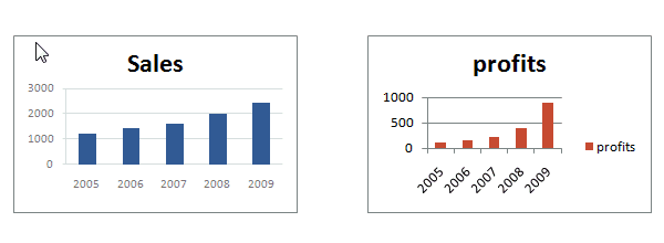
In Excel 2003 & earlier, the text in axis and chart titles and data labels is copied from the old chart to the new chart. For example, if you had axis titles of “Sales” in the first chart and “Profits” in the second, the title of the second would change to “Sales”.
In 2007, the text of the title of the second chart is not changed, but the text in axis titles and data labels does change to the text in the first chart.
Please tell me what to do then? I got same problem which you pointed off in excel 2013 that on following the above for formatting axis title also gets copied and paste then… 🙁
Nice find Chandoo.
Jon – thanks for giving the headsup.
Will have to keep that in mind when I use this.
Wow! Thanks for this tip. Excellent for chart maniacs like myself!
Great tip, Chandoo. Thanks for the caveats, Jon.
Wow! Just a couple of days back Mr Spreadsheet pointed to a wonderful keyboard shortcut in duplicating a charts, and Chandoo’s tip here is another great timesaver. Are they more to come?? Thanks Chandoo!
Great tip…….Thanks! Be great.
@All.. thank you. I am very happy you all liked this tip.
@Jon.. very good info. Thanks for bringing this to our notice.
@Chrisham.. Of course there will be more to come. Just that I dont know what or when. As I learn more, so will you.
This is very nice! 🙂 A real time saver.. I used to record macros for this purpose (which obviously break pretty easily)… This is good…
I think the only problem is that it is not able to know the difference between different chart types. For example, if I copy from a bar graph and paste special on a pie chart, it makes the new chart as a bar graph … If only it just copied the formatting.. it would have been great! 🙂
This is a quick and very simple solution – can’t believe I have previously overlooked it so thanks for the post!
My usual solution is to save a frequently used chart format as a user defined custom chart (i.e. right click on the template chart > chart type > user defined > add) which can then be applied when required to new charts.
The advantage of this is that you can keep lots of templates stored from different spreadsheets / reports, the disadvantage is as per Jon Peltier’s post that rather annoyingly Excel retains the original chart title from the template chart.
You are indeed a genius. This saved me SO much time!!
Great help! thanks will save a lot of my time!
thanks buddy. it saves a lot of time
Thanks Chandoo!
Awesome tip! You’ve just saved me heaps of time using it.
Thanks. I’m a big fan of this, but now, when I choose Paste Special for the destination chart, Excel doesn’t present the choice of All / Formats / Formulas.
Anyone know how I can get this back? I’m addicted..
Thanks loads.
Thanks for this tip. If only I had known about this years ago, I could have saved hours/days of copy/paste monotony!
I thought I’d add something I found out on this subject – also in reply to Sally’s question (Sept 21st, 2011). The Paste Special option will not work on Pivot Charts. If it’s just a normal chart referencing some cells, it works fine. However if it’s a Pivot Chart, driven by a Pivot Table, then I can’t seem to get it to work. However, I may be wrong, maybe someone knows a way to paste formats onto a Pivot Chart…?
Hi Jimo,
I was looking for the same as you, and found out that it is indeed very simple:
Just right click in an empty part of the “source” pivot chart, choose “Copy”, then right click in an empty part of the “Destination” pivot chart and choose “Paste”.
This will retain the values of the destination chart, while applying the format of the source one.
I suppose you probably found it already (since Juy 2012), but I thought it could help others as well.
Credits: http://simplylearningexcel.com/blog/2010/10/20/work-needed-copying-formats-part-4-charts-pivotcharts/
Hi Jimo,
I had the same concern, and found that the solution was easy, eventually.
You just have to click a blank area in the “source” chart, choose Copy from the Home/Clipboard menu, then click a blank area in the destination pivot chart, and choose Paste from the Home/Clipboard menu.
Destination data are retained, while source formatting applies.
I guess you already found the answer, but I thought others might be interested as well.
Credits: http://simplylearningexcel.com/blog/2010/10/20/work-needed-copying-formats-part-4-charts-pivotcharts/
friend i am not expert in excel but i have a tip about chart formating
First of All you Save you Chart —-> Save As Template and when ever you want to apply Saved Chart Format apply another Chart
simple you change your Chart Type —-> Template —-> ok.
Assalmu alikum
Jazak ALLAH Chandoo
Hi there
This tip was really awesome and saved my time a lot. I would like to do same thing in Microsoft Word on the tables. I really appreciate that if help me with that please.
Regards
Thank you so much Chandoo! This is a life-saver!
Great help! thanks will save a lot of my time!
But I Try using that technique in line graph with more than 10 series or name. But not all colors on line graph is the same. Do you have any solution. On excel 2010 what i did is just simply copy the line graph and paste it, then using Select data i have my new line graph already. I need help please.
I belive this can’t be done, with pivotchart. any idea?
thank you so much for your ideas chandoo!
Regards!
I love you
HI, my name is Saulo. I tried to apply this technique using Excel 2013 and something get wrong. Is it possible to do this using this version of excel?
Thanks!
Hi,
Before, it was a hedious task for tens of charts. But now with your great tip, it becomes a very simple task. Thanks a lot.
Regards,
Sameh
You just saved me hours!!! Yet again, you rock!