Product Recommendation – Excel Dashboard Training Kit

Share

Facebook
Twitter
LinkedIn

Excel Dashboard Training - Product Review and RecommendationIf you want to make better charts and create lasting impressions, chances are you have heard about Jorge Camoes. He writes at excelcharts.com (previously charts.jorgecamoes.com). I have been reading Jorge’s blog for over 2 years now and have linked to his excellent articles on PHD several times. Jorge also has an Excel Dashboard Training Kit, which teaches us how to make a dynamic and comprehensive excel dashboard.

What is Excel Dashboard Training Kit?

Jorge teaches a lot of charting and excel lessons at his blog excelcharts.com (I recommend that you subscribe to his blog, it is very good). The dashboard training kit is a culmination most of his lessons implemented in a practical way using Excel.

Jorge takes the demographic data of all countries in the world and creates an impressive dashboard out of it and teaches us how to do the same using this training kit. The training kit contains several videos explaining dashboard creation process as well as the dashboard excel files.

(take a look at final dashboard)

In the videos Jorge explains the process of dashboard creation by taking us thru,Final Demographic Dashboard - you will create something like this when you finish the training

  • How to connect Excel to Access to get data for the dashboard
  • How to create pivot tables from external data in MS Access
  • How to make charts from data in pivot tables
  • Putting the charts together in the dashboard (and adding form controls)
  • Adding macros to control the dashboard (and refresh data, animate charts etc.)
  • Final formatting touches to make it look better

The videos are structured in clear steps with lots of comments. Each video can take between 30 to 45 minutes to carefully watch and understand the concepts.

There are several valuable excel charting, formula, pivot table and VBA tricks and practical tips spread through out the tutorial vidoes. For eg. in the video “Creating pivot tables” Jorge teaches us how to make GETPIVOTDATA formula dynamic, how to fix pivot table layouts, how to get top10 values in pivot tables based on a data column. Most of these tricks are completely new to me. I have been replaying some of these videos whenever I have some time to keep the ideas fresh.

The final dashboard is shown to the right. (it is the non-VBA version, click on it for a larger image)

Benefits of Excel Dashboard Training Kit

If you have been reading PHD for a while, you will appreciate the necessity to know “tricks of trade” to make better charts and wow your audience. The dashboard training from Jorge is packed with tons of these.

In my opinion, this training will help you,

  • learn about connecting to external data sources
  • massaging (pre-processing) data so that you can create dashboard reports
  • learn a handful of tricks and formula uses that you can apply anywhere
  • format charts in aesthetically pleasing and info-graphically accurate ways
  • connect the dots – charts, formulas, form controls, macros, pivot tables to make something outstanding

Who is this training for?

Make no mistake, this is not a training for absolute dummies. You should be familiar with basics of formulas & charting. You should not be afraid to experiment and practice the ideas in this. You should be familiar with Excel 2003 (as the training videos are all in Excel 2003). If you have never seen excel 2003, then you may not be able to relate several things to Excel 2007 ribbon menus.

What will you get with this kit?

When you purchase a copy of excel dashboard training kit, you get,
Inside dashboard training kit

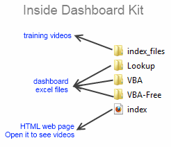
  • One Excel dashboard linked to MS Access (without VBA)
  • One Excel dashboard linked to MS Access (with VBA)
  • One Excel dashboard (all data inside, noVBA)
  • One Access DB with all the data
  • Training Videos and HTML web pages to see them
  • Free access to online training videos showing how to do this in Excel 2007 (only if you get this before Feb 1)

How much is the Excel Dashboard Training

For a limited time (until Feb1st), Jorge is selling the dashboard training kit for $47. This includes the free access to upgrades once they are released. Trust me when I say this is a HUGE bargain.

Go here to purchase a copy

My Review & Opinion

Jorge is a widely respected authority on charting. His commentary is always insightful and practical. In this training videos, he brings all his experience to teach us how to make better dashboards, charts, how to connect to external sources and how to manipulate pivot tables.

My only gripe is that these videos do not have any audio. But Jorge provides compelling video with lots of comments & interactivity to bridge that..

I recommend the dashboard training kit for anyone making dashboard reports frequently or aspiring to make them using Excel.

(for free dashboard tutorials and templates visit PHD’s excel dashboards page)

Any questions?

Do you have any questions about this product? Please drop a comment. I have asked Jorge to answer your queries here directly.

Also, if you bought a copy of this, please share your review here, it will help others.

Disclosure:

Jorge is a friend of mine. I have received a complimentary copy of this training kit. I also get a small commission when you buy a copy of the product. But I am sure you will derive more benefit out of this than what Jorge or I make.

Go ahead and get the dashboard training kit.

Facebook
Twitter
LinkedIn

Share this tip with your colleagues

Excel and Power BI tips - Chandoo.org Newsletter

Get FREE Excel + Power BI Tips

Simple, fun and useful emails, once per week.

Learn & be awesome.

Welcome to Chandoo.org

Thank you so much for visiting. My aim is to make you awesome in Excel & Power BI. I do this by sharing videos, tips, examples and downloads on this website. There are more than 1,000 pages with all things Excel, Power BI, Dashboards & VBA here. Go ahead and spend few minutes to be AWESOME.

Read my storyFREE Excel tips book

Overall I learned a lot and I thought you did a great job of explaining how to do things. This will definitely elevate my reporting in the future.
Rebekah S
Reporting Analyst
Excel formula list - 100+ examples and howto guide for you

From simple to complex, there is a formula for every occasion. Check out the list now.

Calendars, invoices, trackers and much more. All free, fun and fantastic.

Advanced Pivot Table tricks

Power Query, Data model, DAX, Filters, Slicers, Conditional formats and beautiful charts. It's all here.

Still on fence about Power BI? In this getting started guide, learn what is Power BI, how to get it and how to create your first report from scratch.

30 Responses to “18 Tips to Make you an Excel Formatting Pro”

  1. Hui... says:

    For my 2 cents worth:
    Less is more !
    Keep styles simple and in line with the corporate requirements of your employer/client

  2. Deb says:

    The table formatting is really useful, but I have found two sticky points:
    1. Cannot move or copy a sheet with a table in it.
    2. Cannot 'table format' multiple sheets at once.

    May be ways around these issues, but these are what keep me from using the table format more than I already do.

  3. Ulrik says:

    Remove gridlines in sheet
    Use dotted lines as internal borders in tables
    And just keep it simple - it's the substance that matters and there's already way too much eye candy out there

  4. Stephen says:

    I write a lot of financial reports conveying complex data in a userfriendly manner. I don't use colour (as it costs 7p/sheet verses B/W at 1p/sheet). The trick is to generate a table that someone will skim over for "the story" and then can refer back to understand it. very muck like Ulrik said, keep it simple.

    Some simple guidelines that I use:
    (a) align headings based on data (if data is text that means left, if data is numbers that means right)
    (b) do not align central numbers (unless all similar) i.e. how hard is it to read a column of numbers that contains €1.25 and €125
    (c) use borders to group columns and rows, don't format every line/column but allow the data to draw your eyes along it. "White lines" are as useful as borders
    (d) thin borders are better than fat borders - the fatter they are, the more they draw the eye... so use them to draw attention to key numbers (like a total) only.
    (e) use units to make numbers easier to read. Generally people cannot skim numbers with more than 3 d.p or 5 significant figures. so report in millions/thousands (or the other way as in ml)
    (f) avoid making text too small or too big. too small (less than 10) and people can't read it. too big (>14) and people struggle to skim over it (their eyes have to move too much)

    • Manjunath says:

      ......I don’t use colour (as it costs 7p/sheet verses B/W at 1p/sheet).....

      Not necessarily..
      Don't compromise on how good a sheet can be made to look on monitor. To print black and white, simply configure in page setup to print in black and white.

  5. Istiyak says:

    Like This post !!

    I m always using ALT + EST, not verymuch confirtable with cell style. will try to use color schemes (new feature)

    Regards
    !$T!

  6. Winston says:

    Hi Stephen,

    Do you have some non-proprietary samples you may share on drop box or Windows Live SkyDrive?

    Thanks
    w

  7. Carsten says:

    Great post!

    Which key ist EST from the shortcut "ALT+EST".
    I am using a german keyboard layout and have never heard something about an EST key.

    Thanks
    Carsten

    • Chandoo says:

      Hi Carsten...

      If you are using English version of Excel, then press ALT+E then leave the alt key, E key and then press S, then press T
      For German version of Excel, the keys would be different. I am not sure what they are.

  8. Fred says:

    it was nice MS come up with all the color schemes. However, corporate culture (or your boss) sometimes dominate or predetermine what style a spreadsheet should look like. So I hardly get a chance to use #1 to #3 shown above.

    Most of the times, it is someone else who wants a certain report or analysis gets to decide how s/he wants it to look like. I see myself more like a line chef or engineer. Others get to be the architect and I'm just a builder transforming a design into a real home. I don't get much say in it unless they are asking me to build a multistoried building on a single tooth pick as foundation.

  9. Carsten says:

    Hi Chandoo,

    thank you for your reply. Now I understand. It's something like searching for the ANY Key, because some program is displaying "Press any key to continue..."

    But to find the german version of this shortcut:
    ALT+E calls the Edit-menue? And for what are the S and T. Just tell me the english names of the menueitems, please.
    I think then I will find it.

    Carsten

  10. Adam says:

    @Carsten

    Alt+EST is
    (E)dit;
    paste (S)pecial;
    forma(T)s

    Excellent post guys!

  11. SARAN KUMAR says:

    @Carsten,

    Try to know how to find the shortcuts in the excel menu bar itself.

    You click Alt + any of the underline character in the menu bar, then excel will take you to that particular menu field.

    Now you can find different options in the dropdown menu. And each option has the name. Each name has underline in any of the characeter. That underline character is nothing but the shortcut key to execute that option.

    Like this you can find in excel all the options and their shortcut keys.

    Coming to the above example..

    Once you click alt + E, it will take you to the "EDIT" drop down menu. Under Edit there are so many options like cuT, Copy, Paste, paste Special, fIll.... etc., I think you can find underline under 't' in cut..'p' in paste..'s' in paste Special. You need to click the underlined character for the required options...Here the 'S' underlines for Paste Special option...

    Once you click 'S' it will open paste special options box...again you will find the same underlines in each of the names...here you can find different opetions like All, Formulas, Values, formaTs...etc. 'v' is nothing but Values option. Once you click V in the key board..it will execute paste special values option.

    As Summary Alt + (E)dit + paste (S)pecial + (V)alues

    Now you can find the shortcuts your own. all the best.

    Regards,
    Saran
    lostinexcel.blogspot.com

    • Manjunath says:

      You can also customize the quick access toolbar.. Once you find the icon you regularly use, right click and then select Add to quick access toolbar and once you are done, when you press Alt key it will be highlighted 1,2,3,4 etc depending upon the sequence of the icon..

  12. sixseven says:

    Ctrl-ES is sooooo 2003.

    Ctrl+Alt+V all the way baby!!!

  13. Jinesh says:

    You can DOUBLE-CLICK Format painter button to copy the formatting multiple times. Once you are done, press ESC key.
    //

  14. satheesh says:

    Hi,
    How to apply the custom styles for cells from the sql table, by using c# program.

    Thanks & Regards,
    Satheesh

  15. […] You can use the Page Layout section in Excel to apply colour themes to your reports. Chandoo.org has some useful Excel tips.  […]

  16. sujit says:

    Hi i want to print a page which have bottom line to print on each page end how to do that pls explain

  17. jay sharma says:

    Thanks Sir

  18. Srinivasan says:

    Thanks alot

  19. Srinivasan says:

    Very useful thanks

  20. mohamed salah says:

    thank you too much

  21. VIJAI S says:

    your tips are awesome.

  22. Kiran says:

    How to show a table with around 20-25 columns in the dashboard in the first page itself? I mean, within the dashboard area.
    Is there anyway we can add a horizontal scroll bar for the table?

    • Hui... says:

      @Kiran

      You never add tables directly to a dashboard

      You add cells that reference a table
      By reference I mean it gives you the ability via Formula or VBA to scroll up/down, Left/right or re-order the data
      Think of it as a window into the table

      This is discussed regularly in Chandoo's dashboard samples
      Have a look at the 2 links in Item 1: http://chandoo.org/wp/welcome/

      I'd then suggest asking a specific question in the Chandoo.org Forums and attach a sample file for a specific answer.

  23. sandra says:

    love it!!!!!!!!!!!!!!!!!!!!!!!!!!!!!!!!!!!!!!!!!!!!!!!!!!!!!!!!!!!!!!!!!!!!!!!!!!!!!!!!!!!!!!!!!!!!!!!!!!!!!!!!!!!!!!!!!!!!!!!!!!!!!!!!!!!!!!!!!!!!!!!!!!!!!!!!!!!!!!!!!!!!!!!!!!!!!!!!!!!!!!!!!!!!!!!!!!!

  24. Venkat says:

    I have a table of value for a month, with no data for few dates.
    I created a chart basing on above data.
    In the chart I find calendar dates, even though few dates with no data are not available in the table.
    How to remove the dates in the chart for those without data?

Leave a Reply