The other day while doing aimless roaming on the dotcom alley, I have seen some cool optical illusions. There are so many valuable lessons optical illusions can teach us – chart makers. Don’t believe me? Read on…
We cant measure sizes either
Much has been said about our inability to measure angles. That is why most of the charting gurus recommend you to not use pie charts. But what about sizes? Well, it seems we are bad at measuring them too. Look at this illusion.
Both the orange circles are of same size. As you can see, they don’t look so. I call this a bubble chart illusion.
What can this illusion teach us?
- Use data labels
- When you make a big chart, the neighbors of a data element determine how they are perceived. Avoid this illusion by adjusting axis, rearranging data or using color.
Colors are what we think they are
We talk alot about colors in charting. But when it comes to interpreting colors, our mind is very subjective. Look at this color illusion.
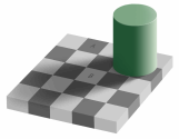
Can you believe both cells A and B are of the same color?
What can this illusion teach us?
- Use fewer colors when possible. Better still use one color.
- When you need to use multiple colors, make them distinct. If you use shades of same color, make sure they are not poorly juxtaposed.
Too much data can create un-necessary patterns
Look at this optical illusion that looks like a stacked bar chart. See how the lines don’t seem parallel.
I am sure some of you would have seen a stacked bar with enough data that looks closely like the above illusion.
What can this illusion teach us?
- If you are plotting too much data on a chart, make sure the chart is readable.
- Dont place chart elements (bars in this case) close to each other, don’t separate them too much either.
Gray color messes with our gray matter
There are just so many optical illusions involving gray color that I don’t know where to begin. See this for eg.
Because of its neither here nor there nature, gray color can easily mess with our mind (and eyes). One reason why excel 2003 and earlier charts looked so ugly is because of the gray color. They had that as default background.
What can this illusion teach us?
- Do not leave your chart’s underwear on – In other words, remove that default gray background from your charts.
- Avoid using close variations of gray when you plot multiple series of data.
No matter what your chart says, your audience will see what they want
You might think your chart proves pattern A. But your audience only see the pattern B. For eg. look at this illusion:
Some people instantly see a flower vase. Others see 2 faces. And this could be true for your charts.
What can this illusion teach us?
- Don’t leave the messages for interpretation. Spell them out if you can.
We over estimate our memory power
Our mind is notoriously forgetful and unlearns things so fast. Don’t trust me? Well, see this animated illusion.
Both yellow lines are of same length. But the moment the guiding lines are removed our mind tends to think first line is smaller than the next one. Add the guiding lines again and our mind quickly learns the fact that they are of same length. Remove it and it is as if we never learned the fact. In this great TED talk, the speaker Dan Ariely talks about the same and asks whether our mind is in complete control of the decisions we make.
What can this illusion teach us?
- Next time you set out to make that 50 slide presentation, remember this: “we are poor at remembering things”
- Use data labels, keep things simple and together if you can.
No one talks about a chart, but everyone talks about an illusion
Well, what can I say. I look at at least a dozen charts everyday. And yet, here I am, talking about optical illusions. That is true for most of us. We like magic, we like wonderful things and want to talk about them. We have seen one too many charts that they don’t excite us anymore. Show me an optical illusion and I am ready to stare at the black dot for 30 seconds. Show me a pie chart and I am yawning already.
What can this teach us?
- Whenever you can, tell a great story.
- Connect with your audience in unusual and exciting ways.
- Break some rules and don’t be shy to add a spark.
Additional charting resources to help you make magic:
- Better excel chart templates – Create great looking charts with these templates
- Vizooalization – What your neighborhood zoo can teach about visualization
- Charting Principles – Simple yet very effective rules to make great charts
30 Responses to “18 Tips to Make you an Excel Formatting Pro”
For my 2 cents worth:
Less is more !
Keep styles simple and in line with the corporate requirements of your employer/client
The table formatting is really useful, but I have found two sticky points:
1. Cannot move or copy a sheet with a table in it.
2. Cannot 'table format' multiple sheets at once.
May be ways around these issues, but these are what keep me from using the table format more than I already do.
Remove gridlines in sheet
Use dotted lines as internal borders in tables
And just keep it simple - it's the substance that matters and there's already way too much eye candy out there
I write a lot of financial reports conveying complex data in a userfriendly manner. I don't use colour (as it costs 7p/sheet verses B/W at 1p/sheet). The trick is to generate a table that someone will skim over for "the story" and then can refer back to understand it. very muck like Ulrik said, keep it simple.
Some simple guidelines that I use:
(a) align headings based on data (if data is text that means left, if data is numbers that means right)
(b) do not align central numbers (unless all similar) i.e. how hard is it to read a column of numbers that contains €1.25 and €125
(c) use borders to group columns and rows, don't format every line/column but allow the data to draw your eyes along it. "White lines" are as useful as borders
(d) thin borders are better than fat borders - the fatter they are, the more they draw the eye... so use them to draw attention to key numbers (like a total) only.
(e) use units to make numbers easier to read. Generally people cannot skim numbers with more than 3 d.p or 5 significant figures. so report in millions/thousands (or the other way as in ml)
(f) avoid making text too small or too big. too small (less than 10) and people can't read it. too big (>14) and people struggle to skim over it (their eyes have to move too much)
......I don’t use colour (as it costs 7p/sheet verses B/W at 1p/sheet).....
Not necessarily..
Don't compromise on how good a sheet can be made to look on monitor. To print black and white, simply configure in page setup to print in black and white.
Like This post !!
I m always using ALT + EST, not verymuch confirtable with cell style. will try to use color schemes (new feature)
Regards
!$T!
Hi Stephen,
Do you have some non-proprietary samples you may share on drop box or Windows Live SkyDrive?
Thanks
w
Great post!
Which key ist EST from the shortcut "ALT+EST".
I am using a german keyboard layout and have never heard something about an EST key.
Thanks
Carsten
Hi Carsten...
If you are using English version of Excel, then press ALT+E then leave the alt key, E key and then press S, then press T
For German version of Excel, the keys would be different. I am not sure what they are.
it was nice MS come up with all the color schemes. However, corporate culture (or your boss) sometimes dominate or predetermine what style a spreadsheet should look like. So I hardly get a chance to use #1 to #3 shown above.
Most of the times, it is someone else who wants a certain report or analysis gets to decide how s/he wants it to look like. I see myself more like a line chef or engineer. Others get to be the architect and I'm just a builder transforming a design into a real home. I don't get much say in it unless they are asking me to build a multistoried building on a single tooth pick as foundation.
Hi Chandoo,
thank you for your reply. Now I understand. It's something like searching for the ANY Key, because some program is displaying "Press any key to continue..."
But to find the german version of this shortcut:
ALT+E calls the Edit-menue? And for what are the S and T. Just tell me the english names of the menueitems, please.
I think then I will find it.
Carsten
@Carsten
Alt+EST is
(E)dit;
paste (S)pecial;
forma(T)s
Excellent post guys!
@Carsten,
Try to know how to find the shortcuts in the excel menu bar itself.
You click Alt + any of the underline character in the menu bar, then excel will take you to that particular menu field.
Now you can find different options in the dropdown menu. And each option has the name. Each name has underline in any of the characeter. That underline character is nothing but the shortcut key to execute that option.
Like this you can find in excel all the options and their shortcut keys.
Coming to the above example..
Once you click alt + E, it will take you to the "EDIT" drop down menu. Under Edit there are so many options like cuT, Copy, Paste, paste Special, fIll.... etc., I think you can find underline under 't' in cut..'p' in paste..'s' in paste Special. You need to click the underlined character for the required options...Here the 'S' underlines for Paste Special option...
Once you click 'S' it will open paste special options box...again you will find the same underlines in each of the names...here you can find different opetions like All, Formulas, Values, formaTs...etc. 'v' is nothing but Values option. Once you click V in the key board..it will execute paste special values option.
As Summary Alt + (E)dit + paste (S)pecial + (V)alues
Now you can find the shortcuts your own. all the best.
Regards,
Saran
lostinexcel.blogspot.com
You can also customize the quick access toolbar.. Once you find the icon you regularly use, right click and then select Add to quick access toolbar and once you are done, when you press Alt key it will be highlighted 1,2,3,4 etc depending upon the sequence of the icon..
Ctrl-ES is sooooo 2003.
Ctrl+Alt+V all the way baby!!!
You can DOUBLE-CLICK Format painter button to copy the formatting multiple times. Once you are done, press ESC key.
//
Jinesh,
This is a great tip that I use multiple times daily. People are always in awe when they see this one!
Jesse
Hi,
How to apply the custom styles for cells from the sql table, by using c# program.
Thanks & Regards,
Satheesh
[…] You can use the Page Layout section in Excel to apply colour themes to your reports. Chandoo.org has some useful Excel tips. […]
[…] http://chandoo.org/wp/2011/12/05/excel-formatting-tips/ […]
Hi i want to print a page which have bottom line to print on each page end how to do that pls explain
Thanks Sir
Thanks alot
Very useful thanks
thank you too much
your tips are awesome.
How to show a table with around 20-25 columns in the dashboard in the first page itself? I mean, within the dashboard area.
Is there anyway we can add a horizontal scroll bar for the table?
@Kiran
You never add tables directly to a dashboard
You add cells that reference a table
By reference I mean it gives you the ability via Formula or VBA to scroll up/down, Left/right or re-order the data
Think of it as a window into the table
This is discussed regularly in Chandoo's dashboard samples
Have a look at the 2 links in Item 1: http://chandoo.org/wp/welcome/
I'd then suggest asking a specific question in the Chandoo.org Forums and attach a sample file for a specific answer.
love it!!!!!!!!!!!!!!!!!!!!!!!!!!!!!!!!!!!!!!!!!!!!!!!!!!!!!!!!!!!!!!!!!!!!!!!!!!!!!!!!!!!!!!!!!!!!!!!!!!!!!!!!!!!!!!!!!!!!!!!!!!!!!!!!!!!!!!!!!!!!!!!!!!!!!!!!!!!!!!!!!!!!!!!!!!!!!!!!!!!!!!!!!!!!!!!!!!!
I have a table of value for a month, with no data for few dates.
I created a chart basing on above data.
In the chart I find calendar dates, even though few dates with no data are not available in the table.
How to remove the dates in the chart for those without data?