
Most of us are comfortable with numbers, but we are confused when it comes to convert the numbers to charts. We struggle finding the right size, color and type of charts for our numbers. The challenge is two fold, we want to make the charts look good (we mean, really… really good) but at the same time we want our audience to focus on the message and not on the bells and whistles. This is where it gets tricky.
Almost 2 months ago our reader Jennifer sent me an email asking if there is an effective way to present market share changes between two periods for 2 products among five competitors. I have replied her promptly with whatever I could think of as better ways to present the data. But I also posted a visualization challenge: How to show market share changes?
We have got quite a few comments and recently Jon Peltier himself wrote on this here: Show Market Share Changes – Few Alternatives
I thought it would be great to summarize various approaches we discussed as a case-study in how you can take same data and present it in different ways.
This is the data Jennifer had:

- Here is how she presented it initially:


- After seeing user discussions she remade the charts like this.

- Derek from Information Ocean responded to the challenge with this step graph (which he admits is not so effective). Nevertheless, they are another fun alternative

- Derek also proposed this “who is responsible for that?” chart. Despite looking little cluttered I liked this one.

- Dave from Favillae responds with this aligned bar chart alternative to present the same data. Another innovative way, he used blank series to adjust the gaps

- Nixnut, a commenter, tried bar charts to come up this variation. These are pretty good and provide both absolute and changes in market share values. He used overlapped chart technique to achieve this.

(image url) - Finally the alternatives presented by Peltier.
This one is a panel chart (here is an excel tutorial for panel charts)
- A stacked bar chart

- A line chart

- A simpler, neater bar chart

- A panel chart, but this time two products are separated

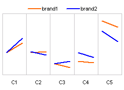
- Last but not least, these are the alternatives I could think of. First one is a Line chart.

- This is a tag cloud (excel tag cloud tutorial & templates). The fonts are sized based on their relative market share percentages.

- And in-cell chart variation.


Conclusions – Which chart is better?
Well, there were quite a few very good charts. Personally I liked the panel chart version (#7) and bar chart variation by NixNut (#6).
Which one did you like?
Knowing that there are various ways to present the same data and using the version most suitable for your needs and situation is very important. If you want to raise alarm about market share loss, use a chart that alarms people. If you want to downplay the marketshare loss, use a chart that barely shows the information.


18 Responses
Nixnut wins. hands down!
I also liked Nixnut’s version although it seems different data was used. Jennifer’s version 2 chart was also good.
Perhaps one reason I like Nixnut’s version is that the numbers were left in and some new slices of the data (% relative change) were added. The PTS charts removed all the numbers – intentionally I suppose but perhaps too much effort to remove non data ink in my opinion.
I have not used panel charts before but after looking at the alternatives posted here, it seems they can be very useful.
I look forward to your next visualization challenge and perhaps next time I’ll participate. I enjoyed looking at all the versions – Great stuff!
Hey Chandoo, in this case, I would use a chart which best conveys the message I want to send across. And more importantly, my audience should be able to interpret the data easily … I really liked the tag cloud chart .. although I doubt whether any of the audience might be able to interpret it correctly without help.
Chandoo –
Nice summary. Though I followed the discussions, I hadn’t seen all of these.
I would go for Nixnut’s solution too, as the variance is clearly measured.
G’d job !
Hi, all.
Jennifer here.
It is really cool to see all of these examples that evolved from a simple issue that I was having at work. When I originally wrote to Chandoo, I focussed mainly on my graphing problem: what are other ways to show market share changes. I was unhappy with the stacked bar chart because it was difficult for the viewer to quickly determine what was increasing and what was decreasing. The bump chart I went with shows that really well.
But it might have been better to share a more detailed explanation of the problem right at the beginning: How to show how an intervention (something that occured between time1 and time2) changed competitor 1’s relative position in the competitive landscape — did competitor 1 become the market leader? And at the expense of whom? Which is why the bump charts are so appropriate. You can see the “movement” and can see what happened to the competitors as well.
Thanks again, Chandoo for a great site!
And thanks to this whole community.
You all are wonderful resources.
Do you have template for #13. I have seen/used a few of Tag Clouds but this one was really neat and organized and a lot better than all those. Keep up the Good Work..
@Sumeet: You can get tag cloud generator VBA code from this post
http://chandoo.org/wp/2008/04/22/create-cool-tag-clouds-in-excel-using-vba/
For the above chart (#13) I have manually scaled the fonts. It is probably easier to use manual scaling for smaller set of values.
Having come across this interesting article… I’d agree with the majority that Nixnut’s charts are best for ease of interpretation by most end users. The use of both absolute and change values helps provide greater clarity of the values being presented.
Do you have any templates for Root Cause Analysis 🙂
any way to get a template for option 6
The overlapping bar charts (chart # 6) by Nixnut looks the best to me. I first got that technique from Jon Peltier’s blog and use it present comparisons like this in bar and column charts
Well, this is a partial solution to my problem. I am looking to show similar trend, but also when the overall available total pool has reduced. Thus showing that the % for a brand is increasing, while the entire pie continues to shrink. Any suggestions?