
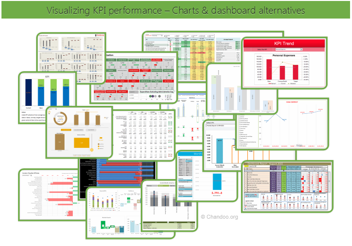
Hello all, prepare to be amazed! Here are 43 creative, fun & informative ways to visualize KPI data.
About a month ago, I asked you to visualize KPI data. We received 65 entries for this contest. After carefully reviewing the entries, our panel of judges have discarded 22 of them due to poor charting choices, errors or just plain data dumps. We are left with 43 amazing entries, each creatively analyzed the data and presented results in a powerful way.
How to read this post?
This is a fairly large post. If you are reading this in email or news-reader, it may not look properly. Click here to read it on chandoo.org.
- Each entry is shown in a box with the contestant’s name on top. Entries are shown in alphabetical order of contestant’s name.
- You can see a snapshot of the entry and more thumbnails below.
- The thumb-nails are click-able, so that you can enlarge and see the details.
- You can download the contest entry workbook, see & play with the files.
- You can read my comments at the bottom.
- At the bottom of this post, you can find a list of key charting & dashboard design techniques. Go thru them to learn how to create similar reports at work.
Thank you
Thank you very much for all the participants in this contest. I have thoroughly enjoyed exploring your work & learned a lot from them. I am sure you had fun creating these too.
So go ahead and enjoy the entries.
PS: I am sorry if your entry is not shown on this page. We had to disqualify 22 entries due to various reasons.
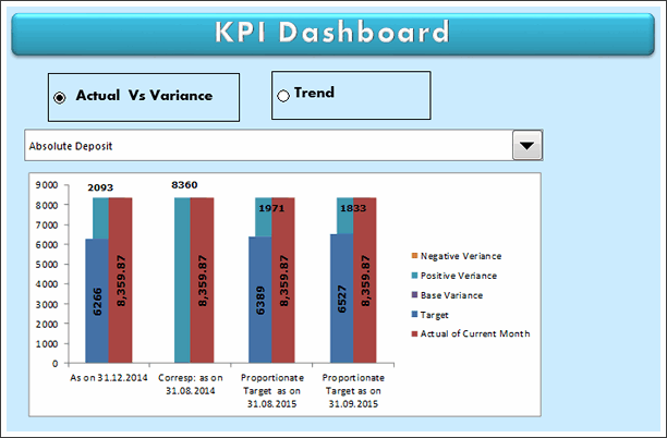
KPI Dashboard by Alberto Almoguera


- Interactive with selection mechanism
- Interesting representation
- Lower charts can be replaced with sparklines / in-cell to declutter

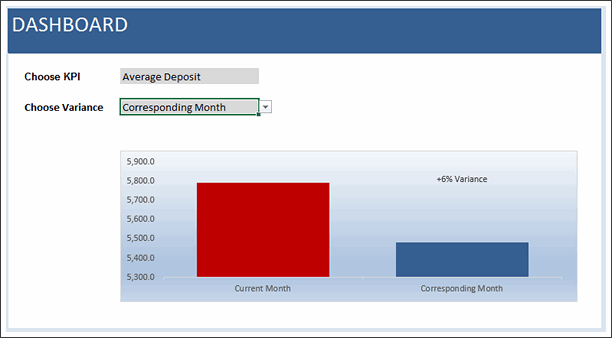
KPI Chart by Amit Sinha

- Comparison and variance analysis
- Could use some insights – plain text instead of second chart?


KPI Chart by Ben Spalding

- Thermo-meter chart
- Feels over formatted, could have used simple colors.
KPI Chart by Chad Markel


- Interactive
- In-cell charts
- simple colors and easy to read
- May be sorting?!?
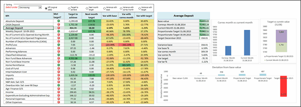
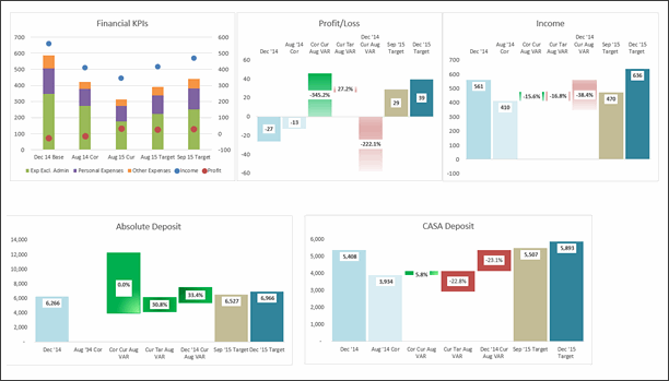
KPI Dashboard by Chetan Bhavsar


- Interactive
- Sortable
- The charts are well designed & labeled.
- Could have removed the table and kept charts (or reduced the content in table) as it is duplication.
KPI Dashboard by Francesco Petrella


- Interactive with slicers
- In-cell charts
- colorful & elegant
Become Awesome in Excel & VBA – Create dashboards like these…
- Learn how to create interactive dashboards & reports using Excel
- Develop your own macros & VBA code
- 50+ hours of video training
- Learn at your own pace
- Click here to know more
KPI Dashboard by George Gourgoulias
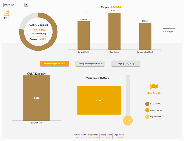

- Interactive with VBA / form controls
- Elegant and beautiful
- Ability to publish the report as PDF
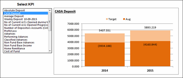
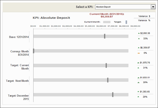
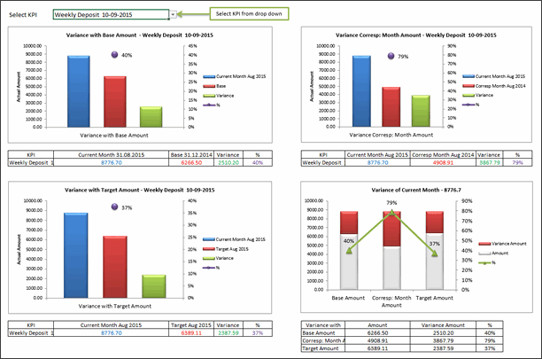
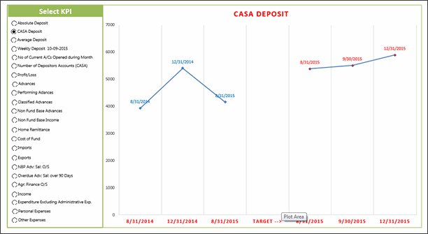
KPI Chart by Indranil Sarkar
- Interactive
- Scrollable list to select KPIs
- Could use alignment and simpler formatting
KPI Chart by Janet
- Interactive with slicers
- Bullet charts
- Could use labels / explanation
- Also, horizontal is better
KPI Dashboard by Jiakun Zheng

- Interactive with slicers
- power pivot (XL 2010+)
- Alignment problems, poor labeling
KPI Chart by Jonathan Decker

- Interactive
- Simple colors
- The current month bar feels repetitive. Could have used a line?
KPI Dashboard by Joon Tan
- Simple charts with elegant presentation
- Ability to add commentary
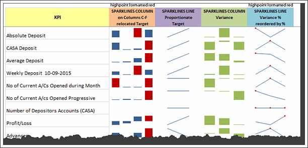
KPI Chart by Karthik Ranggarajan

- Sparklines
- Elegant table design to present the information in simple way
- Good colors and layout
KPI Chart by Kaushik Joshi
- Waterfall chart
- Interactive
- Interesting representation, reduce the colors
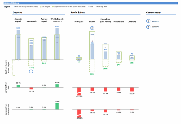
KPI Dashboard by Keriman Hande
- Summary of key KPIs on top and drill down at bottom
- Ability to view variance or amounts
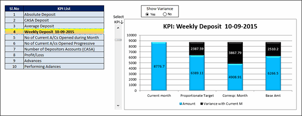
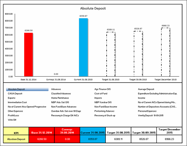
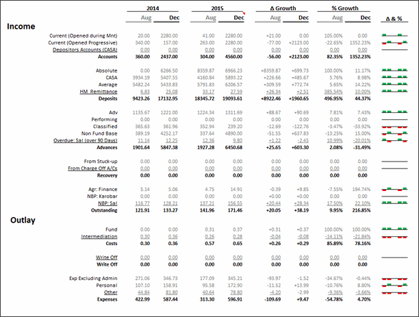
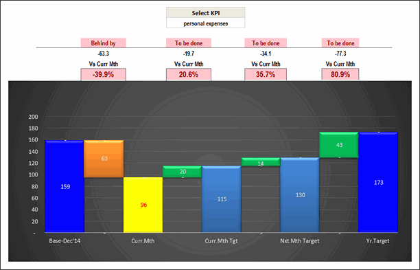
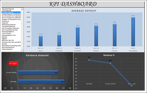
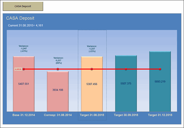
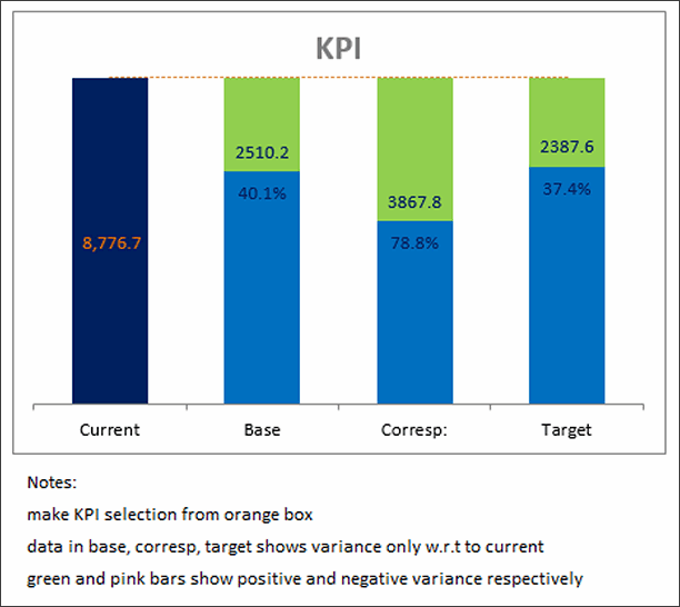
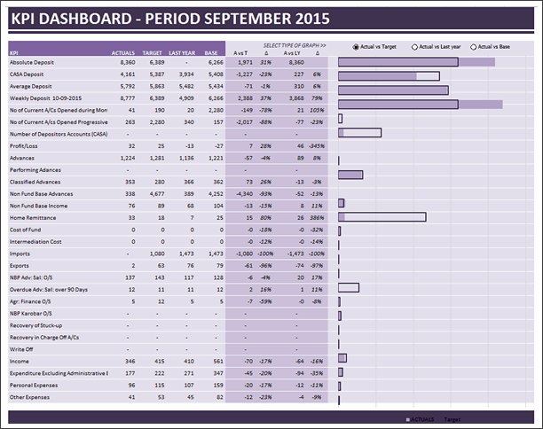
KPI Dashboard by Krishna Teja

- Interactive with VBA / form controls
- Ability to sort, drill-down to selected KPI
- Feels a bit cluttered, reduce the columns
- Could use alignment and simpler colors

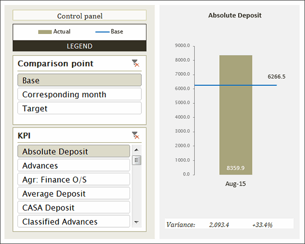
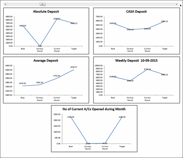
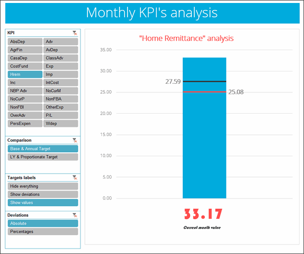
KPI Chart by M.Hussain Kawosh

- Interactive
- Grouped KPIs to multiple charts
- Could use explanation, not sure how to read the charts / grouping
KPI Chart by Marie-Anne Andre

- Interactive with slicers
- Interesting design and presentation
- Reduce the control panel size and give more insights.

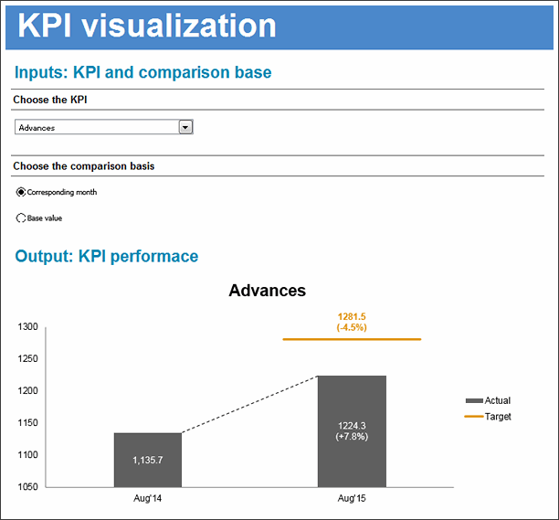
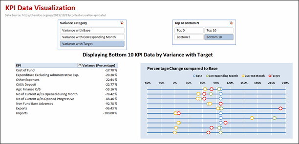
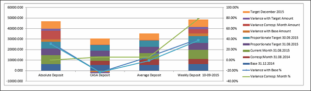
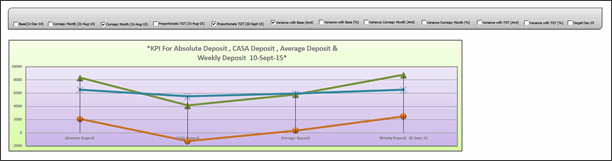
KPI Chart by Narayan Digambar


- Interactive
- Interesting take on the analysis – trend vs. variance
- Picture links
- Could use alignment and simpler colors
KPI Chart by Rabi Mahapatra
- Technically a data dump, but I give credit for the creative hexagonal KPI analysis.
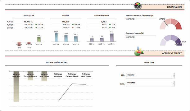
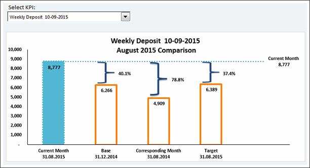
KPI Chart by Ramananda V
- Interactive
- Compares handful of KPIs amongst each other
- Could use less formatting
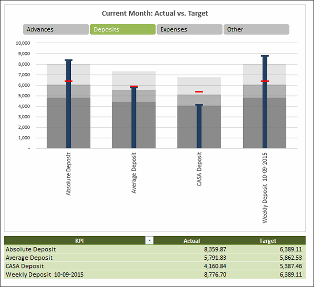
KPI Dashboard by Reynaldo Peña

- Interactive with slicers
- Clear and elegant design
- Various comparisons and insights
Become Awesome in Excel & VBA – Create dashboards like these…
- Learn how to create interactive dashboards & reports using Excel
- Develop your own macros & VBA code
- 50+ hours of video training
- Learn at your own pace
- Click here to know more
KPI Chart by Ronaldo Balas

- Interactive
- Interesting design, but feels over formatted. Reduce special effects, the caps on columns feel like stacked columns and confuse.

KPI Chart by Utkarsh Shah
- Interactive
- Error in the option button selection (25 visible KPIs vs 23 buttons)
KPI Chart by Wil Davis
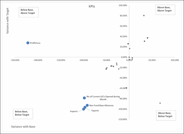

- Scatter plot with KPI performance
- Interesting representation
- Ability to drill down select KPI


Become Awesome in Excel & VBA – Create dashboards like these…
- Learn how to create interactive dashboards & reports using Excel
- Develop your own macros & VBA code
- 50+ hours of video training
- Learn at your own pace
- Click here to know more
Techniques used in these dashboards & charts
If you want to create these kind of charts & reports at work, I suggest reading up the Excel Dashboards & Excel Dynamic Charts pages. Also check out below links to know more about specific techniques.
- Form Controls
- Data validation
- Pivot tables
- Slicers
- Clickable Cells (VBA)
- VBA
- Formulas
- Sortable Tables
- Data bars (CF)
- Conditional Formatting
- Scrollable Tables
- Picture links
- Sparklines
How do you like these charts & dashboards? Which are your top 5?
Quite a few of these entries are really impressive. You can learn a lot by deciphering the techniques in these workbooks. Many thanks to everyone who participated. I will publish the winner names in next few days. Meanwhile, share your comments and tell me what you think. Share your top 5 entries too. 🙂


26 Responses
woop, woop, awesome! 🙂 great job contestans!
I’m really waiting for dashboard contest every year. Salary in 2013, State Migration last year, and also awesome KPI performance dashboard this year. I would like to send my esteem to all participants for inspiring me.
Thanks!!!
Awesome Contest wish more contest for improvisation …thanks chandoo for sharing your knowledge with us … 🙂
Really nice contest and really interesting dashborads. I have a couple of new Ideas to improve my version. Thans a lot for sharing your knowledge with us.
Regards to all.
Chandoo,
Really thanks for such type of competitions. There are different thinking & designs for excel case studies.
I was damn sure that my entry will not be qualified. But I seen my name. I am huge fan of Chandoo.org & now there is one more reason for this.
By far the best website for excel!
Still waiting for download link with all dashboards packed in zip 🙂
WOW, so many creative ideas. My top 4 but not in any order
Chad Markel
George Gourgoulias
Marie-Ann Andre
Renaldo Pena
Great work from all!
George Gourgoulias,beautiful informative visualization
Join Tan,beautiful charts,colours
Ata Biabani,Simple and interactive
Hello everyone.,
First of all thanks to Chandoo for coming up with this amazing contest, while posting this question on chandoo forum I never thought that it would become such an interesting learning resource for so many people, thanks to each & every participant for making it a success.
So so many great ideas here, didn’t explore all of them yet. For me each of them is a treasure to learn new tips & tricks 🙂 Will post my favourite 5 after going through all.
Thanks again everyone. Cheers 🙂
Hello Chandoo,
i am just speechless about the ways to represent the same data in all together 43 ways !!!!!
Thats too awesome.
Thank you for giving us the chance to show off the creativity we have.
Much more appreciated .
Keep it up.
Thanks,
Chetan
Really thanks for such type of competitions. There are different thinking & designs for excel case studies.
Nice Contest Chandoo! Congrats!
I was quite impressive for the first one (by Alberto Almoguera) is simple, personal and you feel confortable using that viz, and the most important thing is easy too uderstand the message.
Except few, all the charts are so amazing that it was tough to choose my top 05 dashboards.
Anyways, my top 05 entries are..
KPI Chart by Joe Lawless
KPI Dashboard by Reynaldo Peña
KPI Chart by Wil Davis
KPI Dashboard by George Gourgoulias
KPI Chart by Ata Biabani
My selection criteria based on
– Easy to use
– Simple presentation for easy understanding
Good luck participants for the final hunt 🙂
Simply Awesome… Keep it up
hi Everyone,
This is simply AMAZING ! Thanks all for inspiring. Thanks Chandoo for the contest and so painstakingly going through each chart and giving your precious comments.
I too never thought my entry would make it, but lo and behold its there! It made my day !!!
I am not giving my top five, frankly there is so much material that it will take me quite some time to even go thru, let alone digest. My congrats to every single one of the participants for their efforts. It contributes so much to Excel Dashboarding enthusiasts’ community !!
We are waiting for the winners!!! Amazing Contest!
They will be announced on Friday (4th of December).
Thank you to Chandoo for sharing them and to all participants who spent hours working for them and happy to share them with us. For sure I will go through them and you are an inspiration. This posts help me in my daily job…YOU ROCK GUYS.
Ok
I have been thinking of ways to improve my dashboard and I just got a whole new set of ideas to try.
Thanks to all of you for sharing your knowledge! 🙂
dear Chandoo,
thanks for our great website all the temple available to us.
great support and learning material!
Your generousity for sharing your knowledge has put me to a higher level in excel. Thank you chandoo
Thanks a lot.
Great works on KPI Dashboards.
Reg,
Selvam
I need help in designing KPI dashboard.