
During a recent training program, one of the students asked,
Thermo-meter charts are very good to show how actual value compares with target (or budget). But how can we add another point for say Last Year value to the chart with out cluttering it.
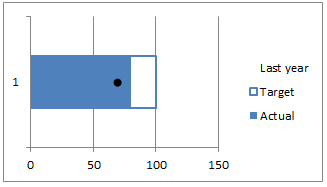
Something like this:

Sounds interesting? Read on.
Step 1: Create a bar chart from your data
Assuming you have data like this,
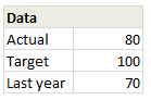
Select and create a bar chart from it. We need 3 bars (in different colors). If needed, use the Switch Rows / Columns button from Chart > Design ribbon. Once done, you should have something like this:
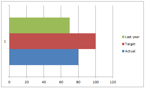
Step 2: Add Error bar to Last year series
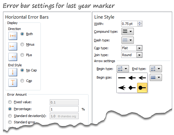
Select the last year series & Add % error bar. Now, select the error bar and press CTRL+1 to format it.
- Set error percentage to 1% (for smaller chart sizes, you need 2 or 3%)
- Remove error bar caps.
- Go to line style and set begin style as a dot
At this stage, your chart should look like this:
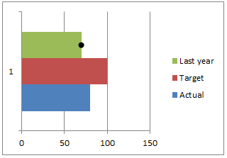
Step 3: Overlap series & Remove fill colors
This is easy. Select any series and press CTRL+1 to format it. Set series overlap to 100%.
Then select last year series and set its fill color to none.
Select Target series & set fill color to none.
Set outline to the same color as actual series and make line thickness as 1 pt.
Step 4: Clean-up
Finally, remove legend, grid lines, axes and re-size the chart.
Congratulations! you have just made a custom thermo-meter chart.
Download thermo-meter chart template
Click here to download the workbook & play with it. Examine how the chart is made and see what additional customizations can be made.
Do you use Thermo-meter charts to compare actual with targets?
I think thermo-meter charts are the easiest way to compare actual with target. I use them often in my dashboards & reports.
What about you? what kind of charts do you use to compare actual with target (or budget) values? Please share your techniques and ideas using comments. Go!
Compare Actual with Target values? Check out these
Please see these articles to learn how to compare actual with target values.
- Best charts to compare actual vs. targets
- Budget vs. Actual charts – 14 variations
- Using form controls to interactively compare
- World education rankings – interactive comparison chart


17 Responses to “Thermo-meter chart with Marker for Last Year Value”
Great !! So many information can be packed in this cool chart.
I use a similar chart in my work with two modifications:
1. I keep the target box a different color so it is visible even if the actual exceeds the target.
2. I make the dot bigger
Hi Chandoo,
These graphs look excellent and will really help improve the presentation of some of my files.
I have one question... what to do when (albeit rarely) a department exceeds budget/target. The graph does not seem to illustrate this when I've tested it. I have tried changing the colour of the outline box but it is not clear.
Please let me know what I am missing.
Thanks!!
Joe,
If you are using Excel 2007 and above, Select you Actual data bar and set the transparency to about 40%.
Choose a light shade of color for the Target and a Darker one for the Actual.
Now when your actual exceeds the target you will still be able to view the target in the background.
HTH
~VijaySharma
I agree with Sachin, except I like activating the error bar for the Target chart with a different color / shape.
Thanks Vijay Sharma. Not sure where your comment has gone though...
To be honest, I've never noticed the Error Bar button in Excel (my something new for the day). What else is it used for?
i want now about excel in 2007 excel charts radar style i want change x-axis data to y-axis data please reply answers anyone
I used this trick in a new report today; it works excellently, so thank you!
Great chart, thanks! I ahve one question to clarify: I need to show 3 sets of data using this view. I can just expand selection to the right (2 more columns with data). In case values are highly distinctive (e.g. 5000 and 300) in different colors than Error bar is not visible for small values.. Playing with properties I did not manage to fix that. Only solution I see is to use three separate charts, but that's not optimal..
Figured out how to deal with that: try to adjust Fixed Value parameter.
One more addition: it depends on physical dimension of the chart area
Hi Guys,
As Matt said,
“What if you if you go over the target?”
Is there a way to make it change color? or at least to show what the target was?
I am planning to use this with a “Forecasted vs Real” production chart but I do not know how to show overproduction.
Any clue?
Thanks
I'm using 2007 and cannot figure out how to get the error bars for only the last year. I double-click the "last year" bar and from the chart tools menu I select, "layout", then error bars but it applies the bars to all three data points. I cannot eliminate the other 2 without deleting all 3 points. What am I doing wrong?
Thanks!
I figured out my error. Please disregard my request. Thanks for all the very helpful tips!
Is it possible to have multiple thermocharts in a rolling bar chart?
I'd like a thermochart to show inflows (in borders) overlapped with net flows (solid color), over four different stores.... over different time periods (1Q11-2Q12). I'm having a hell of a time trying to get this work.. I can get close, but the overlap settings seem to modify all of the data sets instead of specifying particular series to overlap....
Nice chart .Thanks everyone for sharing your views