Today is the first anniversary of Excel Conditional Formatting post (Don’t worry, I am not going to make anniversary posts for all the 150 odd excel articles here). This is the most popular post on PHD. The post has 100 comments and bookmarked on delicious more than 700 times. It is truly a rock star post on PHD.
To celebrate the 1 year of teaching conditional formatting to you all, we have a series of posts, the first of which is “What is excel conditional formatting & How to use it?”
What is excel conditional formatting ?
Conditional formatting is your way of telling excel to format all the cells that meet a criteria in a certain way. For eg. you can use conditional formatting to change the font color of all cells with negative values or change background color of cells with duplicate values.
Why use conditional formatting?
Of course, you can manually change the formats of cells that meet a criteria. But this a cumbersome and repetitive process. Especially if you have large set of values or your values change often. That is why we use conditional formatting. To automatically change formatting when a cell meets certain criteria.
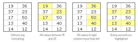
Few Examples of Conditional Formatting
Here are 3 examples of conditional formatting.

So How do I Apply Conditional Formatting?
This is very simple. First select the cells you want to format conditionally. Click on menu > format > conditional formatting or the big conditional formatting button in Excel 2007.
(we have used excel 2003 in this tutorial, but conditional formatting is similar in excel 2007 with lots of additional features)
You will see a dialog like this:

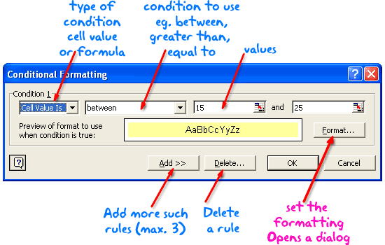
There are 2 types of conditions:
- Cell value based conditions: These conditions are tested on the cell value itself. So if you select a bunch of cells, and mention the condition as between 15 and 25, all the cells with values between 15 and 25 are formatted as you specify.
- Formula based conditions: Sometimes you need more flexibility than a few simple conditions. That is when formulas come handy. Conditional Formatting Formulas are slightly complicated and can be difficult to learn or use if you are new to excel. But they are very useful and intuitive and if you use them once you get a hang of it.
What are the limitations of Conditional Formatting?
In earlier versions of Excel you can only define max. of 3 conditions. This is no longer true if you are using Excel 2007 (read our review of excel 2007)
However, you can overcome the conditional formatting limitation using VBA macros (again, if you are new to excel, you may want to wait few weeks before plunging in to VBA)
Also, you can only use conditional formatting with cells and not with other objects like charts.
Ok, Enough Theory, Time for your First Conditional Formatting
Go ahead, open a new workbook and try few conditional formats yourself. See how easy and intuitive it is. Use it in your day to day work and impress your colleagues. Learn 5 impressive tricks about conditional formatting.
If you have trouble getting started, download the conditional formatting examples workbook.
Tell us how YOU use Conditional Formatting
Share with us how you use CF in your work. I am sucker for conditional formatting and use it wherever I can. What about you?
This post is part of our Spreadcheats series, a 30 day online excel training program for office goers and spreadsheet users. Join today.


31 Responses to “Beautiful Budget vs. Actual chart to make your boss love you”
Would be considerably easier just to have a table with the variance shown.
On Step 3, how do you "Add budget and actual values to the chart again"?
There are a few ways to do it.
Easy:
1) Copy just the numbers from both columns (Select, CTRL+C)
2) Select the chart and hit CTRL+V to paste. This adds them to chart.
Traditional:
1) Right click on chart and go to "select data..."
2) From the dialog, click on "Add" button and add one series at a time.
One more way to accomplish it is just select the columns into chart. Press Ctrl+C and then press Ctrl+V
Regards
Neeraj Kumar Agarwal
Unfortunately, this doesn't seem to work for me in Excel 2010. The "Var 1" and "Var 2" columns cannot combine two fonts to display the symbol and the figure side-by-side.
Secondly, there is no option to Click on “Value from cells” option when formatting the label options. The only options provided are Series Name, Category Name or Value.
@TheQ47... the emoji font also has normal English letters, so if you use that font, then you should be ok. I am assuming your computer doesn't have that font or hasn't been upgraded for emoji support.
Reg. Excel 2010, you can manually link each label to a cell value. Just select one label at a time (click on labels, wait a second, click on an individual label) and press = and link it to the label var 1 or var 2.
I am using excel 2010, please explain how to apply Step 12
Regards
Neeraj Kumar Agarwal
Hi Neeraj,
"Value from cells" option is only available in Excel 2013 or above. In older versions, you have to manually adjust the label value by linking each label seperately.
Read this please: https://chandoo.org/wp/change-data-labels-in-charts/
Sir, you are just awesome.
Your creativity has no limit.
Regards
Neeraj Kumar Agarwal
Hi Chandoo,
I just found your website, and really love it. It helps me a lot to be an Excel expert 😉
Currently I am facing with a problem at step 11:
Var1 Var2
D30%
A5%
B0%
B4%
B7%
C10%
C13%
D27%
I42%
Though at mapping table, I used windings, here formula uses calibra. How I can change it? I am able to change only the whole cell. In this case numbers will be Windings too.
Thanks for your help!
Hi Mariann... Welcome to Chandoo.org and thanks for your comment.
If you wanted to use symbols from wingdings and combine them with % numbers, then you need to setup two labels. One with symbol, in wingdings font and another with value in normal font. Just add the same series again to the chart, make it invisible, add labels. You may need to adjust the alignment / position of label so everything is visible.
[…] firs article explains how you can enhance your charts with symbols. You can simply insert any supported symbol into your data and charts. To some extend you can […]
You're a good person, thank you to share your knowledge with us, I will try to do in my work
Great visualization of variance. My question is that is this possible in powerbi?
How would you go about it?
HELLO, WHY CANT I FIND VALUES FOR LABELS IN EXCEL 2013
Dear chanddo sir,
What to do if we have dynamic range for Chart. How this will work. can you able to make the same thing works on dynamic range.
Sir Chandoo,
Good Day!
First, I'd like to say that I am very grateful for your work and for sharing all these things with us.
I tried to do this chart but it seems that the symbols don't work with text (abs(var%),"0%") unless we keep the Windings font style.
The problem is, it converts the text into symbol as well and you wont see the 0% anymore. I'm using Windows 7.
WOW - Segoe UI Emoji
This is the greatest discovery for me this month 🙂 Thanks for sharing.
Here's my two-cents:
https://wmfexcel.com/2019/02/17/a-compelling-chart-in-three-minutes/
Sir This is awesome chart, and very easy to made because of your way to explain is very simple , everyone can do. Thank you
one problem i am facing, I hv made this chart , but when i am inserting data table to chart it is showing two times , how can i resolve this
in this chart when i am adding new month data for example first i made this chart jan to mar but when i add data for the apr month graphs updated automatically but labels are missing for that new month
Hi Renuka,
Please make sure the formulas for labels are also calculated for extra months. Just drag down the series and set label range to appropriate address.
So I am playing with the Actual chart here - but amounts are bigger than your - you have 600 as Budget - my budget is 104,000 - is there a way to shorten that I am unaware of
thank you - I LOVE YOUR SITE
Thanks for the tips and tricks on Excel. In the Planned versus Actual chart examples, you use multiple values (ex. multiple Categories in above). How can this be done when we have only 1 set of values? For example if I have only this:
Planned Actual
SOW Budget 417480 367551
How can I create a single bar chart like the one above?
Thank you Chandoo.
This one is just perfect for my Quarterly Review presentation on Operational Budget against Actual Performance for the Hospital I'm currently working with.
Just Subscribed today (10 minutes ago)
Is there a way to make the table of data into a pivot table to be able to add a slicer for the graph due to many different categories and months?
Hi, I tried to modify you template with something appropriate for me, and I found a problem. this template was modified by me started with excel 2010, then 2016 and finally 2019. Same thing - somehow appear an error - or didn't show the emoticons for positive percentage or doubled the emoticons for some rows. I suspect to be from excel. if is need it I can sand you my xlsx for study. Please help if you can.
Hi Chandoo,
Could you please check the Var Formula in Step1. You have mentioned budget-actual and when i did this i got different values but when reversed like actual-budget i got the actual value what you have demonstrated in step1.
Please share your view.
This is a great chart (budget vs. actual). However, in trying recreate it, I cannot color in the UP Down bars individually, and they all become formatted with the same color. I'm using Office 365. Look forward to the feedback.
Thanks.
Dan
pls explain in detail step 7
While in the Excel sheet you have used following formula for Var
Var = Actual - Budget
But
in the note, you have written
Var = Budget - Actual
Good Presentation and Data information.thank you so much chandoo.