
Slicers are one of my favorite feature in Excel. And here is a quick demo to show why they are my favorite.
Slicers – what are they?
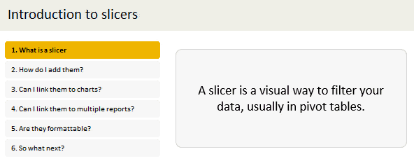
Slicers are visual filters. Using a slicer, you can filter your data (or pivot table, pivot chart) by clicking on the type of data you want.
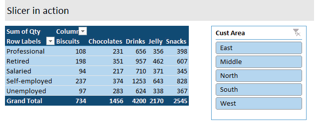
For example, let’s say you are looking at sales by customer profession in a pivot report. And you want to see how the sales are for a particular region. There are 2 options for you do drill down to an individual region level.
- Add region as report filter and filter for the region you want.
- Add a slicer on region and click on the region you want.
With a report filter (or any other filter), you will have to click several times to pick one store. With slicers, it is a matter of simple click.
See this demo:
Getting started with Slicers – Video
Here is a quick 5 minute video tutorial on Slicers. If are just getting started with this AWESOME feature, you must watch the video, NOW. See it below or head to my YouTube channel.
Download Slicer Examples Workbook
This post is very long and has many examples. Please click here to download slicer examples demo workbook. It contains all the examples shown in this post and a fun surprise too.
How to insert a slicer?
Note: Slicers are available only in Excel 2010 and above.
Adding a slicer in Excel 2010:
In Excel 2010, you can add a slicer only to pivot tables. To insert a slicer, go to either,
- Insert ribbon and click on Insert Slicer
- or Options ribbon (PivotTable Tools) and click on Insert Slicer
Adding a slicer in Excel 2013 / 2016 / 2019 / 365:
In Excel 2013 and above, you can add a slicer to either pivot tables or regular tables.
Adding slicers to regular tables:
When you add a slicer to regular Excel tables, they just act like auto-filters and filter your table data. To add a slicer to regular table, use Insert ribbon > Insert Slicer button.
Adding slicers to Pivot tables:
To add a slicer, you can do either of these things:
- Right click on pivot table field you want and choose “add as slicer”

- Use either analyze or insert ribbon to add the slicer.

Single vs. Multi-selection in Slicers
You can select a single item or multiple items in slicers. To multi-select,
- If the items you want are together, just drag from first item to last.
- If the items you want are not together, hold CTRL key and click on one at a time.
- You can also click on the “checkbox” icon in slicer header to multi-select items in slicers.
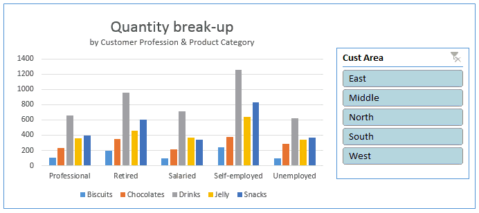
Creating interactive charts with slicers
Since slicers talk to Pivot tables, you can use them to create cool interactive charts in Excel. The basic process is like this:
- Set up a pivot table that gives you the data for your chart.
- Add slicer for interaction on any field (say slicer on customer’s region)
- Create a pivot chart (or even regular chart) from the pivot table data.
- Move slicer next to the chart and format everything to your taste.
- And your interactive chart is ready!
Demo of interactive chart using slicer:
Here is a quick demo.
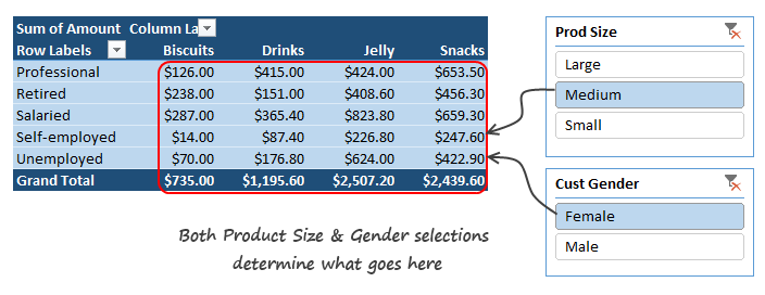
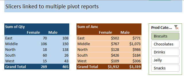
Linking multiple slicers to same Pivot report
You can add any number of slicers to a pivot report. When you add multiple slicers, each of them plays a role in telling the pivot table what sub-set of data to use for calculating the numbers.
Linking one slicer to multiple pivot tables
You can also link a single slicer to any number of pivot reports. This allows us to build very powerful, cross-filtered & interactive reports using Excel.
To connect multiple pivot tables to single slicer, follow these steps.
- Optional: Give names to each of the pivot tables. To name the pivot tables, click anywhere in the pivot, go to Analyze ribbon and use the pivot table name field on top-left to give it a name.
- If you don’t name your pivot tables, Excel will give them default names like PivotTable73. This can be confusing once you have more than a few pivot tables.
- Right click on the slicer and go to Report Connections (in Excel 2010, this is called as PivotTable connections).

- Check all the pivot tables you want. Click ok.

Now both pivot tables will respond to the slicer. See this demo:
Linking slicers to more than one chart
You can use the same approach to link one slicer to more than one chart (pivot chart or regular one).
See this demo:
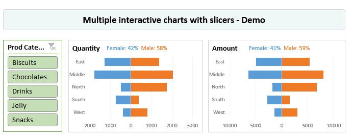
You can examine this chart in detail in the Slicer Examples workbook.
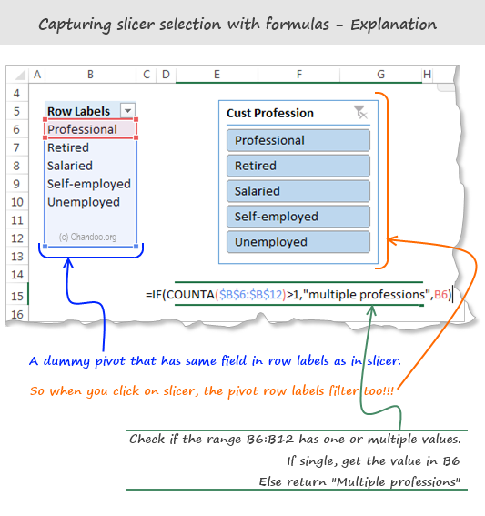
Capturing slicer selection using formulas
While slicers are amazing & fun, often you may want to use them outside pivot table framework. For example, you may want to use slicers to add interactivity to your charts or use them in your dashboard.
When you want to do something like that, you essentially want the slicers to talk to your formulas. To do this, we can use 2 approaches.
- Dummy (or harvester) pivot table route
- CUBE formulas route
Dummy pivot table route
This is the easiest way to capture slicer selection into a cell. Using a dummy pivot table, we can find out which items are selected in slicers and use them for some other purpose, like below:
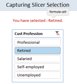
The process is like this:
- Let’s say you want to know which profession is picked up in the slicer (so that you can use it in some formulas or charts).
- Create another pivot table.
- Add the profession field to row labels area.
- Link the slicer to this new pivot table as well (using report connections feature of slicer)
- Now when you click on the slicer, both original pivot and this new dummy pivot change.
- Access row labels like regular cells in your formulas to find out which slicer item is selected.
See this illustration to understand how to set up the formulas:
CUBE Formula approach:
This is relevant only if your slicers are hooked up to a data model thru something like Power Pivot, SAS Cubes or ThisWorkbookModel in Excel 2013 or above.
To find out slicer selection, we need to use CUBERANKEDMEMBER() Excel formula like this:
=CUBERANKEDMEMBER(“ThisWorkbookDataModel”, Name_of_the_slicer , item_number)
Let’s say you have a slicer on Area field, and its named Slicer_Area (you can check this name from Slicer properties)
To get the first item selected in the slicer, you can use CUBERANKEDMEMBER formule like this:
=CUBERANKEDMEMBER(“ThisWorkbookDataModel”, Slicer_Area, 1)
This will return the first item selected on slicer. If there is no selection (ie you have cleared the filter on slicer), the Excel will return “All”.
Bonus tip: You can use =CUBESETCOUNT(Slicer_Area) to count the number of items selected in slicer.
Bonus tip#2: By combining CUBESETCOUNT and CUBERANKEDMEMBER formulas, you can extract all the items selected in the slicer easily.
Please download Cube Formula Slicer Selection example workbook to learn more about this approach.
Note: this file works only in Excel 2013 or above.
Formatting slicers
Slicers are fully customizable. You can change their look, settings and colors easily using the slicer tools options ribbon.
Here is a quick FAQ on slicer formatting:
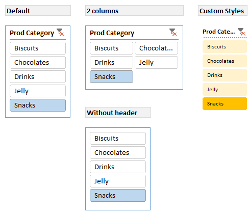
Q. I have too many items in slicer. How to deal with this problem?
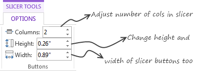
Simple. See if you can set up your slicer in multiple columns. You can also adjust the height and width of slicer buttons to suit your requirements. If your slicer is still too big, you can adjust the font size of slicer by creating a new style.
Q. I don’t like the blue color of slicer. What do I do?
You can switch to another color scheme. Just go to Slicer Tools Options ribbon and pick a style you want.
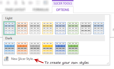
Pro tip: You can create your own style to customize all aspects of a slicer.
Q. I don’t like the title on slicer. Can I get it rid of it?
Yes you can. Right click on the slicer and go to “Slicer Settings”. Uncheck display header option to remove the header & clear filter button.
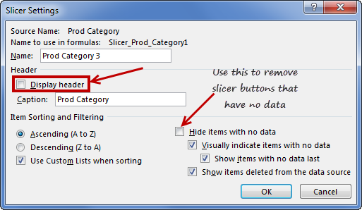
Q. My slicer keeps showing old products (or categories etc.) that are no longer part of data after refresh. What do I do?
Simple. Right click on the slicer and choose “Slicer settings”. Check Hide items with no data option.
Q. I want to make my slicers look good. But I don’t know where to start…
Here is an inspiration for you.
Slicers vs. Report Filters
In a way slicers are like report filters, but way better. (Related: Introduction to Pivot Table Report Filters)
There are few key differences between both.
- Report filters are tied to single pivot tables. Slicers can be linked to any number of pivots.
- Report filters are clumsy to work with. Slicers are very easy to use.
- Report filters may not work very well in a touch screen environment. Slicers are great for touch screen UIs.
- Report filters take up one cell per filter. Slicers take up more space on the worksheet UI.
- Report filters can be automated with simple VBA. Slicers require a bit more code to automate.
- You can access report filter values using simple cell references. Slicer values can be extracted using either dummy pivot tables or CUBE formulas, both of which require extra effort.
Slicers vs. Timelines:
If you have a date field in your data, you can also insert a “timeline”. this is a special type of slicer, that works only with date values.
Here is a quick demo of Timeline slicer.

You can also customize the look & feel of Excel Timelines.
The download workbook has an example of timelines.
Slicers & Compatibility
Slicers are compatible with Excel 2010 & above versions of Excel. You can also use Slicers with Excel Online.
If you create a workbook in Excel 2010 (or above) with slicers and email it to a friend using Excel 2007, they will see an empty box where slicer should be.
Slicers work on desktop & web versions of Excel in the same way.
Download Slicer Examples Workbook
Please click here to download slicer examples demo workbook. It contains all the examples shown in this post and a fun surprise too.
Also download the Cube formulas approach for slicer selection extraction workbook to learn that technique.
Additional Resources to learn about Slicers
If you like slicers and want to learn creative ways to use them in your work, check out below examples:
- Create a fully dynamic dashboard using Pivot Tables & slicers
- Use slicer as scenario selection mechanism
- Slicers + charts for awesome user experience – case study & one more
- Related: Introduction to Excel Relationships & Data Model
- Related: Introduction to Excel Pivot Tables
- Related: Introduction to Excel Report Filters
- Related: Advanced Pivot Table Tips & Tricks
Do you use Slicers? What are your favorite tips about slicers?
As mentioned earlier, slicers are one of my favorite features of Excel. I use them liberally in my dashboards, charts & workbooks.
What about you? Do you use slicers? When do you use them? What are your favorite tips when it comes to using slicers? Please share in the comments area.


7 Responses to “Project Dashboard + Tweetboard = pure awesomeness!!!”
I would like to see actual hash-tagged DM tweets go out to the specific information consumers. That would be an interesting way to communicate the key daily data to interested parties.
A Twitter-like secure application like Yammer might be a good fit with this.
For example, how about daily tweets to selected user groups (secure) that would display sales, bookings, cash receipts, cash disbursed and a second version that would show the same info for MTD, QTD or YTD figures.
@Dan, it would be great. I did not taught about implementing it on this dashboard because twitter is blocked to the whole intranet here. However, there's a discussion here about how can we send these tweets to blackberries (probably through e-mail) automatically. (I'd like to see this implemented on a jabber restricted network as well, but here it'll probably not happen)
The wrap-up versions you mentioned doesn't apply to my particular scenario, but on a sales tweetboard it would be a great tool indeed - choosing who will receive which message according to hashtags. I'll think on something, thanks for the advice. 🙂
(Ah, btw, I'm Fernando... 🙂 )
@Dan: That is a fun idea. Instead of tightly integrating twitter functionality with a dashboard, i think it would be cool if we have a "tweet this" button that users can click after selecting a range of cells. We can easily show a dialog with the concatenated output of the selected cells and ask user to edit the text and eventually "send to twitter".
For eg. you can select the annual sales figure cell and click on "tweet this" button upon which a dialog will show the value. Then you can pre-pend it something like "DM @boss look at our sales this year: "
@Aires.. thanks once again.
Wow it looks really good. Not sure though how much the tweet facility would help in real world project management, but certainly having a dashboard on a project should be a key deliverable when learning how to manage a project
The other use of this is during the software development life cycle especially when you have parallel streams of development and testing going on. Using a dashboard is a quick way for everyone on the team to see where the project is at and how it all fits together.
Regards
Susan de Sousa
Site Editor http://www.my-project-management-expert.com
Hi Chandoo,
I purchased the project management toolkit but the dashboard shown above with the imbedded scroll bars. Is it included in the project pack??
Thanks
Sue
The gantt chart section of this dashboard is similar to one I have recently created: http://xlcalibre.com/hr-dashboard-gantt-chart-traffic-light-reportIt has a similar approach with scroll bars, but has a couple of additional features. I've tried to incorporate a traffic light report element, and also allow the timescale to adjusted so that can view it by days, weeks or months.I really like the other tables that you've incorporated, I may well try to replicate them to improve my version!
I am a monitoring and evaluation consultant in international development, and one of the services I offer is to help non-profits and foundations develop performance dashboards. I often advise them to develop dashboards for ongoing programs, rather than for one-time or pilot projects, because of the time involved. I am trying to find out from a few people how long it takes you to develop a project management dashboard, and to what extent the indicators vary from one project to the next.