
Today, lets talk about an interesting extension to the idea of in-cell charts. Adding average or target markers to the chart.
Here is what we are going to create:
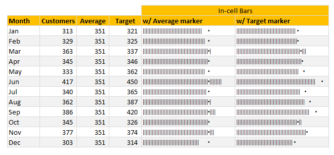
PS: this chart is inspired from an email from Brian Coetzee.
In-cell what? A quick re-cap
If you have never heard about in-cell charts, read this quick re-cap section.
In-cell charts are light weight charts generated to fit inside a single cell. Example in-cell charts are
- sparklines
- conditional formatting data bars
- bar charts generated with REPT formula.
First 2 options are very straight forward. It is (3) that is exciting because it opens up a lot of possibilities for us. See below, an introduction to in-cell charts.
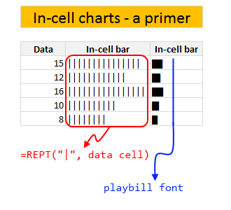
For more on in-cell charts, refer to resources section at the end of this article.
In-cell charts with markers – how to?
Adding a marker (like average or target or last year value) can enhance your charts greatly and provide more context. Lets understand how to add marker symbols to in-cell charts.
For simplicity sake, assume that,
- A1 has data value
- B1 has average value
Now, the marker can be in 2 places.
- Inside the bar
- Outside the bar
The basic formula for generating an in-cell bar with markers is,
=IF(A1<B1, REPT("|", A1) & REPT(" ", B1-A1) & ".", REPT("|", B1) & "." & REPT("|", A1-B1))
How does this formula work?
First we check if we should print the marker outside the bar or inside the bar with IF(A1<B1 portion.
Then, if we need to print the marker outside,
REPT("|", A1) & REPT(" ", B1-A1) & "."
- Print | symbol A1 times
- Print SPACE (B1-A1) times
- Print the marker symbol
Else
REPT("|", B1) & "." & REPT("|", A1-B1)
- Print | symbol B1 times
- Print marker
- Print | symbol A1-B1 times
Download in-cell chart template
Click here to download example workbook. It contains in-cell charts with markers. Play with the formulas to learn more.
More resources & examples on in-cell charting
Don’t keep your cells empty and boring. Load them with impressive analysis & charts. Learn from below resources.
- In-cell bar charts, revisited
- Use playbill to make better in-cell charts
- Murders vs. Suicides – Interactive chart
- In-cell charts + pivot tables
- Survey results – in-cell dotplot
- In-cell sales funnel chart
Do you make in-cell charts?
In-cell charts are one of my favorite charting techniques in Excel. I use them often in my reports or dashboards, when I want something quick & light-weight. They are easy to make & can look super awesome when you sprinkle a bit of conditional formatting on top.
What about you? Do you create in-cell charts? What are your favorite tips & techniques for working with them. Share your thoughts in comments.


15 Responses
Another piece of awesome article. Really impressed by how you connect the dots to create a beautiful picture.
This is inspiring! 🙂
Thanks Chandoo for the beautiful light weight chart idea.
Thank you so much for sharing.
Wow, this is so elegant and yet simple.
Chandoo, I love the way you think outside the box and produce such stuff that I could never conceive in a million years!
It might be useful to extend this concept to date ranges in a growing list, and have MYD and YTD cells.
For w/Target marker it’s better to switch markers and use dot for bar and pipe for target.
cant Download the Example workbook
Nice post! Only comment I have is that due to the division factor you use, you can end up with the dot coming at the end of the string, suggesting you did not reach the target while in fact you did. See e.g. the row for February.Try setting the division to 1 and the dot appears before the end of the string, as it should. I guess a simple conditional format of the column such as a red font for below target could solve this. It’s a pity you can’t color part of a cell, or can you?
You can color part of a string in a cell, but not when it comes from a formula result.
Any macro suggestions on how to color target marker?
Nice, elegant and simple, but wrong.
I guess, some people are waiting for a correction.
It is not wrong as such, as long as you are aware of the limitations.
Nice Info, tutorial how to make a nice graph is amazing
Hello Chandoo,
I used to use in-cell chart to report at monthly, but some of the numbers sometime under 1, for example 0.01456 or 0.249. In that case, how to use incell chart to report.
Thank for your time.
Duong