
This is interesting, I am in Columbus to meet one of my college friends. I remember him as a very meticulous person from college days. So it is no surprise when he showed me his massively impressive finance tracker last night. He has been tracking expenses, income, credit card payments and gas (petrol) consumption since 2008. Very impressive indeed.
Then out of blue he said, he has a problem with his spreadsheet. In this own words,
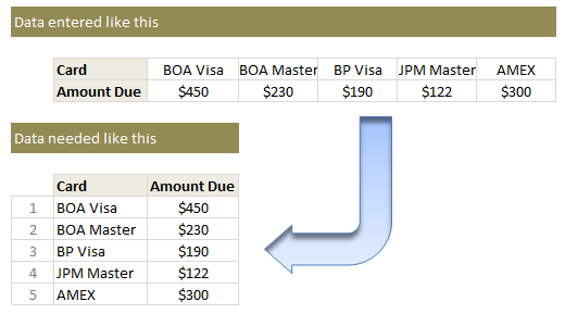
When entering data for credit cards, I use one column per card. But in my report view, I want to show credit card details in rows. How do I do this?
Something like this:
Transposing values in a row to column using formulas
If it is a one time process, my friend can use Paste Special > Transpose feature and be done. But this is no one time business. So lets understand which formula helps us do this.
- Lets assume original data is in $F$4:$J$5. Row 4 has card names & Row 5 has amounts.
- Wherever you want the out put, just list running numbers (1,2,3….) in a column. Lets say these are in cells D10:D14.
- To get the first card name, you can use the formula =INDEX($F$4:$J$4, $D10)
- To get the first amount due, use the formula =INDEX($F$5:$J$5, $D10)
- Now drag both these formulas down and you are done!
This is good, but I don’t like the extra column…
If that is the case, you can use the ROWS() formula to generate these running numbers for you on the fly. For example,
=INDEX($F$4:$J$4, ROWS($A$1:A1)) would work perfectly.
Learn more about: using ROWS / COLUMNS formula to generate running numbers.
Play with this formula
See the embedded Excel workbook below. Play with the formula.
(alternatives: download the example file or view it online)
How do you transpose values?
I love using INDEX formula. I use it for transposing values, tables, getting a cell value (or reference) from a large table, use it along with MATCH etc. It is a very versatile formula and I keep learning new uses for it.
What about you? Do you transpose values often? What formulas do you use? Please share using comments.
More on transposing your data:
If you like to transpose, wrestle or arm twist your data often, then you are at right place. Chandoo.org has tons of tutorials, material and tricks on this. Start with these:
- Transpose a table of values in Excel
- Transpose a table quickly with this simple trick
- Transpose data in charts
Also, check out more quick tips.


23 Responses to “How to transpose a values in a row to column using formulas… [Quick tip]”
Can we use it in this way?
=INDEX($B$1:$F$2,COLUMNS($B$4:B4),ROWS($B$4:B4))
Copied across B4:C8
Data from A1:F2
Why not just use TRANSPOSE(F4:J4) array entered over say F11:F14
If the ranges are going to remain constant in size, i agree with Sam: use an array TRANSPOSE formula as it does the job abd array formulas come with all sorts of protection!
Duncan
Try a pivot table
sam beat me to it.
That said, it's still a great example of how to use INDEX() - a function I should never have lived without for so long!
- juanito
I've opened my mouth and been wrong before. So, at the risk of that happening again here, I believe the the formula above is missing a comma at the end. It should be:
=INDEX($F$4:$J$4, ROWS($A$1:A1), )
Well, no that's wrong what I said. Don't listen to me.
I get lost on the formulas, so I use a macro:
Sub Links_TransposeLinks()
'---------------------------------------------------------------------------------------
' Procedure : Links_TransposeLinks
' Author : SNB remake of a Jomili Macro
' UpDated : 01/29/2013
' Purpose : To allow copy/Transpose paste links
'---------------------------------------------------------------------------------------
'Get the range to copy (need both the Worksheet and the area to copy)
With Application.InputBox("Select the Range you want to copy", "Range Selection", , , , , , 8)
c00 = .Parent.Name
c01 = .Address
End With
'Get the range to copy to (need both the Worksheet and the area in which to paste)
With Application.InputBox("Select the Range into which you want to copy", "Range Selection", , , , , , 8)
c02 = .Parent.Name
c03 = .Cells(1).Address
End With
'Exit if no beginning or ending range is chosen
If c00 = "" Or c01 = "" Then Exit Sub
'Redimension the c01 range to 1 less
ReDim sn(Range(c01).Cells.Count - 1)
'counting from 0 to the upper limit of c01-1, put in a formula
For j = 0 To UBound(sn)
sn(j) = "='" & c00 & "'!" & Range(c01).Cells(j + 1).Address
Next
'Paste it into the target sheet, transposed, formatted as general
With Sheets(c02).Range(c03).Resize(UBound(sn) + 1)
.NumberFormat = "general"
.Value = Application.Transpose(sn)
End With
End Sub
Dear Sir,
Sample file link shows error message
http://chandoo.org/wp/2013/05/14/how-to-transpose-a-values-in-a-row-to-column-using-formulas-quick-tip/%3Cbr
Please correct it
DIFFICULT. HOW WITH PIVOT TALBLE?
This topic was my first post on Chandoo.
http://chandoo.org/forums/topic/how-to-move-horizontal-data-vertically-to-another-page-via-formula
Thanks to NARAYANK991 I got my answer in no time. 🙂
The file doesn't exist under speedy any longer but if you need it I can add it again.
Kind regards.
Ahmet.
I also use this often, so i simply record the Paste Special > Transpose feature, store it on my personal macro workbook & use it as a keyboard shortcut 🙂
Sub PasteValueTranspose()
'
' PasteValueTranspose Macro
'
' Keyboard Shortcut: Ctrl+e
'
Selection.PasteSpecial Paste:=xlPasteValues, Operation:=xlNone, SkipBlanks _
:=False, Transpose:=True
End Sub
I typically just use the transpose array formula
How would I go about doing the same but the other way around?
Meaning: If I have the data in 2 columns, and would like to present them in 2 rows:
Example:
Data Column B4 to B10
Data Column C4 to C10
and I want it represented in another sheet as Row B2 to H2
and Row B3 to H3 respectively.
Thank you in advance!
Hi Panchi... Welcome to Chandoo.org and thanks for your comments.
To transpose a table, see this: http://chandoo.org/wp/2013/02/01/transpose-table-excel-formula/
Works very nice!
Thank you very much!
Dear Chandoo,
Thanks for the tricks.
I wanted to know is it possible to put any formula to get a answer in second column as well. In this case we need to put another formula or need to copy and change the cell reference for data. I looking the answer simply dragging or copying the first forula.
Thanks,
Vijayendra
I copy the row/column, then 'paste link' to where I want the transposed data. Then I use a macro to convert each cell to "absolute" values, then I copy/"paste transpose" those values. Then delete the original "non-transposed" values.
Here is the absolute-relative macro I use:
Sub Change_Cells_To_Absolute_Relative()
Dim RdoRange As Range, rCell As Range
Dim i As Integer
Dim Reply As String
Reply = InputBox("Change formulas to?" & Chr(13) & Chr(13) _
& "Relative row/Absolute column = 1" & Chr(13) _
& "Absolute row/Relative column = 2" & Chr(13) _
& "Absolute all = 3" & Chr(13) _
& "Relative all = 4")
If Reply = "" Then Exit Sub
On Error Resume Next
Set RdoRange = Selection.SpecialCells(Type:=xlFormulas)
Select Case Reply
Case 1
For Each rCell In RdoRange
If rCell.HasArray Then
If Len(rCell.FormulaArray) < 255 Then
rCell.FormulaArray = _
Application.ConvertFormula _
(Formula:=rCell.FormulaArray, _
FromReferenceStyle:=xlA1, _
ToReferenceStyle:=xlA1, ToAbsolute:=xlRelRowAbsColumn)
End If
Else
If Len(rCell.Formula) < 255 Then
rCell.Formula = _
Application.ConvertFormula _
(Formula:=rCell.Formula, _
FromReferenceStyle:=xlA1, _
ToReferenceStyle:=xlA1, ToAbsolute:=xlRelRowAbsColumn)
End If
End If
Next rCell
Case 2
For Each rCell In RdoRange
If rCell.HasArray Then
If Len(rCell.FormulaArray) < 255 Then
rCell.FormulaArray = _
Application.ConvertFormula _
(Formula:=rCell.FormulaArray, _
FromReferenceStyle:=xlA1, _
ToReferenceStyle:=xlA1, ToAbsolute:=xlAbsRowRelColumn)
End If
Else
If Len(rCell.Formula) < 255 Then
rCell.Formula = _
Application.ConvertFormula _
(Formula:=rCell.Formula, _
FromReferenceStyle:=xlA1, _
ToReferenceStyle:=xlA1, ToAbsolute:=xlAbsRowRelColumn)
End If
End If
Next rCell
Case 3
For Each rCell In RdoRange
If rCell.HasArray Then
If Len(rCell.FormulaArray) < 255 Then
rCell.FormulaArray = _
Application.ConvertFormula _
(Formula:=rCell.FormulaArray, _
FromReferenceStyle:=xlA1, _
ToReferenceStyle:=xlA1, ToAbsolute:=xlAbsolute)
End If
Else
If Len(rCell.Formula) < 255 Then
rCell.Formula = _
Application.ConvertFormula _
(Formula:=rCell.Formula, _
FromReferenceStyle:=xlA1, _
ToReferenceStyle:=xlA1, ToAbsolute:=xlAbsolute)
End If
End If
Next rCell
Case 4
For Each rCell In RdoRange
If rCell.HasArray Then
If Len(rCell.FormulaArray) < 255 Then
rCell.FormulaArray = _
Application.ConvertFormula _
(Formula:=rCell.FormulaArray, _
FromReferenceStyle:=xlA1, _
ToReferenceStyle:=xlA1, ToAbsolute:=xlRelative)
End If
Else
If Len(rCell.Formula) < 255 Then
rCell.Formula = _
Application.ConvertFormula _
(Formula:=rCell.Formula, _
FromReferenceStyle:=xlA1, _
ToReferenceStyle:=xlA1, ToAbsolute:=xlRelative)
End If
End If
Next rCell
Case Else
MsgBox "Invalid Number Entered!", vbCritical
End Select
Set RdoRange = Nothing
End Sub
[...] How to transpose a values in a row to column using formulas [...]
A very useful tool enjoy the macro in the comments above
Hi guys,
some quite simple function, which solves this problem (Ramanan's comment -top - uses similar idea with Index() )
Assuming example given by Chandoo, data table begins in E4.
We want to start transposed table in for example B20. So:
=OFFSET($E$4;COLUMNS($B$20:B20)-1;ROW()- ROW($B$20:B20)-1)
or (to be more clear)
=OFFSET($E$4;COLUMN()-COLUMN($B$20);ROW()- ROW($B$20))
(Note: In my version of Excel, I use " ; " as separator, you need to change to "," in your version probably).
Then copy this formula till you get zeros. It's good to first copy only for labels in both dimensions, so you know ,where is the end of table.
If you see any error in this idea, please comment.
Cheers
Lukas
Hi guys,
Sorry , 1st formula should be:
=OFFSET($E$4;COLUMNS($B$20:B20)-1;ROWS($B$20:B20)-1)
Cheers
Lukas