
Imagine you have a worksheet with lots of charts. And you want to make it look awesome & clean.
Solution?
Simple, create an interactive chart so that your users can pick one of many charts and see them.
Today let us understand how to create an interactive chart using Excel.
PS: This is a revised version of almost 5 year old article – Select & show one chart from many.
A demo of our interactive Excel chart
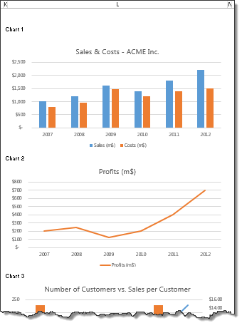
First, take a look at the chart that you will be creating.

Feeling excited? read on to learn how to create this.
Solution – Creating Interactive chart in Excel
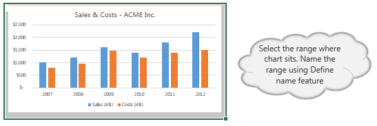
- First create all the charts you want and place them in separate locations in your worksheet. Lets say your charts look like this.
- Now, select all the cells corresponding to first chart, press ALT MMD (Formula ribbon > Define name). Give a name like
Chart1.
- Repeat this process for all charts you have, naming them like
Chart2,Chart3… - In a separate range of cells, list down all chart names. Give this range a name like
lstChartTypes. - Add a new sheet to your workbook. Call it “Output”.
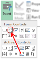
- In the output sheet, insert a combo-box form control (from Developer Ribbon > Insert > Form Controls)
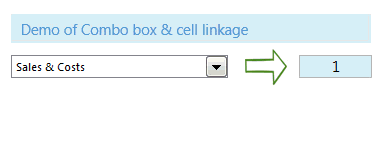
- Select the combo box control and press Ctrl+1 (format control).
- Specify input range as
lstChartTypesand cell link as a blank cell in your output sheet (or data sheet).
[Related: Detailed tutorial on Excel Combo box & other form controls]
- Now, when you make a selection in the combo box, you will know which option is selected in the linked cell.
- Now, we need a mechanism to pull corresponding chart based on user selection. Enter a named range –
selChart. - Press ALT MMD or go to Formula ribbon > Define name. Give the name as
selChartand define it as
=CHOOSE(linked_cell, Chart1, Chart2, Chart3, Chart4)
PS: CHOOSE formula will select one of the Chart ranges based on user’s selection (help). - Now, go back to data & charts sheet. Select Chart1 range. Press CTRL+C to copy it.
- Go to Output sheet and paste it as linked picture (Right click > Paste Special > Linked Picture)

- This will insert a linked picture of Chart 1.
[Related: What is a picture link and how to use it?] - Now, click on the picture, go to formula bar, type =selChart and press enter
- Move the image around, position it nicely next to the combo box.
- Congratulations! Your interactive chart is ready 🙂
Video tutorial explaining this chart
Watch below tutorial to understand how to make this chart.
(or watch it on our Youtube channel)
Download Interactive Chart Excel file
Click here to download interactive chart Excel file and play with it. Observe the named ranges (selChart) and set up charts to learn more.
More Examples of Dynamic & Interactive Charts
If you want to learn more about these techniques, go thru below examples.
- Interactive sales analysis chart using Excel
- Use analytical charts to make your boss fall in love with you
- Making a dynamic chart with checkboxes
- How to make your charts & dashboards interactive – Detailed how to guide
- Lots of examples, tips & downloads on interactive & dynamic charts in Excel
Do you use interactive charts?
Dynamic & interactive charts are one of my favorite Excel tricks. I use them in almost all of my dashboards, Excel models and my clients are always wowed by them.
What about you? Do you use interactive charts often? What are your favorite techniques for creating them? Please share your tips & ideas using comments.
Want to learn more? Consider joining my upcoming Dashboards & Advanced Excel Masterclass
I’m very excited to announce my upcoming Advanced Dashboards in Excel Masterclass in USA.
Chandoo.org & PowerPivotPro.com will be hosting this two day, intensive hands-on Masterclass. Enhance your Excel skills to create interactive, dynamic and polished looking dashboards your boss will love. Don’t miss out, this is a one-time opportunity to attend my live workshop in Chicago, New York, Washington DC & Columbus OH in May and June 2013. Places are strictly limited.
Click here to know more & book your spot in my Masterclass
Above article is a preview of the tips and tricks you will be learning in the Masterclass.


109 Responses
Nice technique. I use linked images a lot but I tend not to use charts with them because often the graphics are distorted, or at least for me they often seem to be. I prefer to use VBA to set the .Visible property of all the charts based on the combo box selection. It lags a fraction more than this method though.
What great timing! I had just been asked to produce a report with appropriate charts to display various metrics and was pondering how I would approach it – Bingo! your blog on interactive charting.
I, like PPH, usually favour the more technically proficient approaches but sometimes I forget that quick and ‘dirty’ solutions, in this case using Pivots, with a handful of ‘subtotal’ formulas and Chandoo’s interactive technique, are all that are needed.
Thanks Chandoo.
LeonK
HI Chandoo,
Yesterday i posted one doubt regarding the same.
http://chandoo.org/forums/topic/picture-link-is-not-working-properly-for-dynamic-charts.
Actually i am using excel 2007. I think linked Picture you mentioned above and Picture Link in 2007 is same. Did you face any updating issue while reopening the excel file.
Regards
Sreekhosh.AP
= CONCATENATE (“A”,”W”,”E”,”S”,”O”,”M”,”E”)
I am getting a “Reference not valid” error when trying to set the linked picture formula to “=selChart”, even though I have set up the named range correctly (checked range selection when changing selection in combo box). Any ideas?
@Daniel… try using Sheetname!selChart as reference.
Hi Chandoo,
Thanks a lot for explaining this. But, like Daniel even I have the problem. I even tried your solution and still it is not working. Can you please help me regarding this?
I was stuck on this for a really long time. I know this seems silly, but I would press enter before typing out the entire name of the reference (=selChart). Try typing it all out or clicking on it, it will not autofill, even though it may be giving you the impression that it will.
Chandoo: I am having trouble to grasp the steps (11 thru 17); I would really appreciate if a supporting video is uploaded.. Thanks.
Linked picture unactive. how to activate it?
How to copy this type of graph to Pwerpoint? Thx.
Hi, chandoo..
nice and interesting tip, i am stuck in step 12. once i select chart1 range and the paste where in out put sheet ?
Can this technique be used wiht Pivot Charts? I’m getting an “Excel cannot complete this task with available resources. Choose less data or close other applications” (with Excel 2010).
Deniz, I got this same error. “Excel cannot complete this task with available resources” Everything works out fine, but this message keeps coming all the time.
I’ve fixed this error by just changing the formating of the output sheet. Apparently it doesn’t like borders around the graphs…
@Filipe
What version of Office are you using ?
@All… thanks for your comments.
If you have trouble implementing this technique, watch below video
http://youtu.be/rPwzdmTqJrc
cant see video 🙁
@Carlos
Try a different internet browser
It works fine in Win 7/Firefox
Thanks it was my office firewall…
and to chandoo.. GREAT VIDEO!!!.. i was not getting it and afther that i was able to do it.
Great Tutorial, video really helps too.
Will this still work if the file is placed in a SharePoint 2010 Excel WebPart?
Hi Chandoo
Is this technique applicable for excel 2007 or its is for Excel 2010 alone
Kindly clarify am not able to a linked picture of a graph in excel 2007
Regards
Hi Srini,
We can use this technique in excel 2007 also.
Instead of Step No13.mentioned above, You can follow below Steps.
After copying the range Paste it as Picture Link (Home->Paste->As Picture->Paste Picture Link).
Rest all are same mentioned above by our great Master.
Regards
Sreekhosh
Hi Sreekosh
Before posting here , i tried the same step , but in excel 2007 for Graphs not able to paste as a picture link , try it and do let me know
Regards
Hi Srini,
It will work 🙂 I am using the same in some of ma reports. I think you may did a wrong approach.
Are u copying graph for pasting as Picture Link?
You just please see the tutorial again. In that we can see he is copying the range where our chart occupies instead of chart.
For example:
If your chart is in B5:H10 you can copy the B5:H10 Range and paste as Picture Link.
Regards
Sreekhosh
Hi chandoo,
When i am trying to printout the picture linked graph it will disappear after Printing (after Print Preview also) and not displaying the chart. If we select another chart from combo box it will not update. If we look at the Data & chart sheet we can see some charts are missing there.
Regards
Sreekhosh
Regards
Sreekhosh
Hi Chandoo! The same as Daniel, I am getting a “Reference not valid” error when trying to set the linked picture formula to “=selChart”, even though I have set up the named range correctly (checked range selection when changing selection in combo box). I’ve tried to name the reference as “Sheet name!selChart” but it is still not working. Your assistance please. Thanks.
Hi
Thanks this is great although how do i change the font size in the combo box?
Hi Kerry,
If you want to change the appearance of a combobox or any other control, you need to use the ActiveX rather than the Form controls.
Regards
Sreekhosh
Really helpful. Thanks a lot
Hello and thanks for the guide. I have a problem in Excel 2007; my pictures are distorded in the Output sheet and not nearly as “pretty/smooth” as the real charts?
What can I do to remedy this?
Excellent, this works really well. thanks.
This works great but when the file is closed and reopened the charts don’t update unless you manually select all the charts and then they update. I’ve tried using some VBA code to select the charts automatically but this does not resolve the issue…anyone else getting this problem?
I have had the same issue, also tried some VBA. Would appreciate any thoughts people have had for resolving this issue.
Having the same issue, did anyone ever figure out why?
Hi Gregorie & all.. this seems to be a bug with Picture links in certain versions of Excel. My suggestion is either run a macro on workbook open that refreshes the picture link or just scroll up and down as you open the file.
Hey, I just tried the tutorial and I came to the end.
But when I save it as an .htm file, it wont allow me to select anything in the dropdown box in the browser…
What am I doing wrong?
Great video, very much thank you. Everything works fine when I work it thru. After I save and reopen I can not see graphics. They are outlined but nothing is there. Please help I am using Microsoft 2007
followup, If I go to my chart sheet and highlight the chart, not change it just reselect it with my cursor it then shows it on my master sheet.
Having the same issue, tried using VBA to re-select but didn’t work.
Many thanks, what a great tutorial. i will book on excel school, today.
having the same problem: Great video, very much thank you. Everything works fine when I work it thru. After I save and reopen I can not see graphics. They are outlined but nothing is there. Please help I am using Microsoft 2007
@Helia: this seems to be a bug with Picture links in certain versions of Excel. My suggestion is either run a macro on workbook open that refreshes the picture link or just scroll up and down as you open the file.
I wrote the following VBA code, thats how i solved teh problem:
Sub Rectangle2_Click()
Sheets(“charts”).Select
Application.Goto Reference:=”CHART1″
Application.Goto Reference:=”CHART2″
Application.Goto Reference:=”CHART3″
Sheets(“OUTPUT”).Select
Sheets(“charts”).Select
ActiveWindow.SelectedSheets.Visible = False
End Sub
Hi Helia and Chandoo,
First of all, great tutorial Chandoo!
I’m having the same problem regarding the graphics not showing, and would like to run a macro that refreshes the picture link.
I tried to use the macro Helia suggested above, but I can’t seem to make it work as I’m fairly new to this kind of stuff. Would one of you be able to explain which sheet to assign the macro to, and what variables the code references to? Thanks in advance, and please let me know if you need more info!
Best, Robert
Nevermind, I figured it out. Thanks anyway
Hi Chandoo,
I hit your website while searching for some excel solution and after that I am fallen in love with your website.
I am learning new new things everyday.
Thanks a lot for sharing this with everyone.
Regards,
Chaithali
Hi Chandoo:)
i really like you web site. it’s help me allot.
i craeted the Interactive chart it’s amazing.
i have one question:
how can i make bigger the text of the list.
it’s so small
Tzipi
Can you post a sample of your file for us to review
Refer: http://chandoo.org/forums/topic/posting-a-sample-workbook
hi, i don’t know how to uploded the excel.
if you roll up this page under explanation number # 9
in this page of Chandoo.
you will see the combo box – the text there is small.
whan i craeted the interactive chart the combo box text is small and i want to make him bigger, i hope i was clear.
thanks:)
@Tzipi
You cannot re-size the combo box
Change the view factor to say 100 or 125%
How can i apply this to text?
Thanks Chandoo ! It worked perfectly fine for me !!
Thank you for the tutorial! i can really use this in my work! Thank you!
Great Tutorial
When I tried it on Excel 2007, the image is a lot more ‘fuzzy’ compared to the sample file, especially the axis and title.
Can someone please explain why?
Thanks
Hi Chandoo, Just a? quick Question, How can we put up a Null for a start up, Like the no Picture for Non selection or when we Load the Excel File no Screen only Combo Box???
Will this work with PivotCharts?
Is it possible to paste the dynamic chart into PPT to present on the data without having to go into excel?
@Chandoo Great tutorial! But I have a question. Is it possible to add another dropdown to this? Say you want to choose “Profits” and then just 2008 data/
It works great… thank you
Thank you, Chandoo! This is really helpful! Hope to learn more from you…
Hello, great post btw but I’ve found an alternative method that for me works better (I noticed that the image quality of the charts when using this method wasn’t as good as the original, and in spite of me spending time trying to figure out why I couldn’t make them look exactly as the original did).
I’ve used the following VBA code to display a chosen chart from a drop down. All it does is bring to the front whichever chart has been selected, and I’ve simply created and then overlaid several charts on top of each other:
Private Sub Worksheet_Change(ByVal Target As Range)
Application.ScreenUpdating = False
If Range(“valChartType”).Value = “Chart 1” Then
Shapes(“Chart 1”).ZOrder msoBringToFront
Else
If Range(“valChartType”).Value = “Chart 2” Then
Shapes(“Chart 2”).ZOrder msoBringToFront
End If
End If
Obviosuly change the “Chart 1” and “Chart 2” values to whatever you want to call the charts, and then just add however many more you require to the code
Kenny
End Sub
Could you please explain step 10. I have no idea what to do here?
Thanks!
Hi Chandoo,
I found this really interesting and helpful, but I am having a problem when I am pasting Chart1 as a linked picture. Basically, excel keeps crashing at this point – I’m using 2010 version, so it can’t be this that is causing the problem. Any help would be appreciated. Mike
Chandoo: I have 369 stores that work with, I loved this interactive chart video. I tested it with only 3 stores and it works excellent. However, now I need to do it for my 369 stores showing over time trending, does this mean that I need to make 369 charts? I will do it, but I am afraid of the file capacity or size . Would you have any suggestions? I use Excel 2010
Thanks in advance
Lina
@Lina
There are other techniques you could use if you have 369 sets of data
especially If the data is in one spreadsheet
Would you like to send me a copy of a small part of the data and I can advise a possible solution?
@Lina.. see this example. I will be writing an article explaining the same next week.
http://img.chandoo.org/c/interactive-chart-with-lots-of-data.xlsx
@ Hui
Thank you, can I drop the file here?
@ Chandoo , thanks I followed the link and I see it is with vlookups to read the large data. I might have some questions.
Chandoo: I tried your link it this is just AMAZING!!! worked so well 🙂 BUT another question: how can I add a horizontal line to the chart to show the target value on the chart??? I am trying to add the horizontal line that is the baseline of my over time for each of my 369 stores. Thanks so much!!! THANKS SO MUCH
Chandoo: When I re-open my saved file, I cannot see the charts. I have to click somewhere on the tab where I housed the orginal charts, then when I go back to original page, I can view/select my charts.
How can I correct it?
Chandoo and Hui, NEED HELP PLEASE!!! :'( I got the charts to work with multiple sites, but for some reason the vlookup formula does not read some of the data while it does read the majority, same cell position same formula, as shown in your link. Any Idea please? Thanks so much
@Lina
So we can see your problem
Can you post a sample of your data here or a link to a file
Refer: http://chandoo.org/forum/threads/posting-a-sample-workbook.451/#post-73705
@Lina
Looking at cell F424
I would remove the VLookup() and replace it with a Match() function
ie: Change F424
from:
=IF(VLOOKUP($G$422,Table82[[Supervisor]:[12-27-14]],5,FALSE), SUMIF(Table82[Supervisor],$G$422,Table82[9-7-13]),”0 “)
to:
=IF(MATCH($G$422,Table82[Supervisor],0), SUMIF(Table82[Supervisor],$G$422,Table82[9-7-13]),”0 “)
This is because your table isn’t sorted by Supervisor
But I wouldn’t even use that formula
I would use something like
in cell F424:
=SUMPRODUCT(($G$4:$G$399=$G422)*($K$4:$AS$399)*(Table82[[#Headers],[9-7-13]:[12-27-14]]=F$423))
You can now copy this right across without having to edit each formula individually as you have done
to allow for errors add an Iferror() function
=IFERROR(SUMPRODUCT(($G$4:$G$399=$G422)*($K$4:$AS$399)*(Table82[[#Headers],[9-7-13]:[12-27-14]]=F$423)),0)
Also a lot of the supervisors have spaces on the end of their names
eg: “Charles” is Actually “Charles ”
Hope the above comments help
@Hui, Thank you very much. I was not even close to that formula you provided me. I understand now why it was not taking the function I had. I will download and I greatly appreciate your help, this has been great and I am greatly thankful.
@ Hui,
Thanks for your reply, I have uploaded my file using dropbox. I sent the confirmation of the file to you both ways: email and also from the dropbox share link option. Thanks in advance. Lina
Hi Chandoo,
Great tutorial, easy to follow. Thank you.
I just have issue though when i paste picture link, the screen starts to flickers. You do not have that in your video.
Can you please help? I want to have a nice presentation but if the the file keeps on flickering it might be annoying for the people who will recieve it.
Thank you so much in advance!
aivee (NL)
Dear Sir,
Your Creativity is awesome. But i have some doubt same thing (Interactive Chart ) can we do in PPT ?
If possible plz reply, how i can do in .ppt ?
I was amazed. thanks!
I was trying again and again and finally it worked!
however, I am not sure i have the deep understanding how its actually works
I think the key for understanding is the choose formula.
I am trying to play with that formula regardless of the combo box and my experiment doesn’t work:
I built a 1,2,3 list and a shape for each integer and when I apply the formula to get the shape it doesn’t work
any suggestion?
Has anyone attempt to protect the worksheet after setting this up? It works perfectly and makes my dash look slick but I have other information with formulas on it that I do not want users to edit.
When I do protect the worksheet and use the combo box, I receive this message: “The cell or chart that you are trying to change is protected and therefore read-only”.
I’m allowing the user to be able to do the following:
– Select unlocked cells
– Format cells
– Sort
– Use AutoFilter
– Use PivotTable reports
– Edit objects
– Edit scenarios
Any advise is appreciated!!!
Hi Gabe
The combo box links to a cell in the worksheet, right click on the combo box and go to the Properties, you can then see which cell it links to. Most likely this cell is locked so by unlocking the cell you can then use the combo box when you pritect the worksheet.
I am having a lot of problems with this one. When I download the sample files and play around, only the first two charts show up. And when I tried it on my charts (there are 18 charts), the first time through the first chart will show up and the 9th chart will show up, but all the others show blank areas. I am running the most up-to-date version of Excel2007 on a Windows7 box. I also had a lot of issues setting up the combo box as it kept making excel crash as soon as I clicked format control so recreated a new file with all my data on one sheet at 100% size, etc. But I still can’t figure out why my chartspace is blank. Been working on it for two days now and am ready to pull my hair out. Any ideas why its not working?
@Twyla
Can you post a copy of your file somewhere for us to review
Unfortunately its got proprietary data on it so I don’t think I can. However since its the same issue I am experiencing with the downloaded file (only the first two charts show), I am wondering if its got something to do with Excel itself.
@Twyla
The download file works fine
What version of Office are you using ?
Can you randomise some of the data and send to me
Click on Hui… above
my email is at the bottom of the page
Firstly I’d like to say awesome technique! I’ve got it to work almost perfectly with the 12 charts I’m using in Excel 2007, however I notice that whenever I save my document, charts 4-12 won’t appear when they are selected from the combo box, 1-3 will work no matter what however.
The only I have found to fix this is to go to the Name Manager, go to the last chart, and click the ‘Refers To’ box to show the cells. Then I exit the Name Manager, scroll back to my combo box and reselect the chart I want displayed. Is there anyway to fix this issue?
i have to insert many active x combo box in a sheet with list fill range fixed to all and linked cell is that one in which they inserted.please help me to that easily , thanks
Great tutorial!
I’m having the same problem regarding the graphics not showing, and would like to run a macro that refreshes the picture link.
I tried to use the macro Helia suggested above, but I can’t seem to make it work as I’m fairly new to this kind of stuff. I also have 6 different sheets that contain the charts.
Would somebody be able to write a code that basically just automatically scrolls through the appropriate sheets so the graphs show?
Thanks in advance, and please let me know if you need more info!
Great tutorial!
I had successfully done my interactive chart… now my challenge is how to have it in .ppt… can you as well show how it is done?
Thanks a lot!
Hi,
I have used this and it works perfectly most of the time. My graphs that are linked into my output page are changed by a dropdown menu to change the data. Sometimes the linked chart changes and sometimes it doesn’t. If I go into my Charts tab, the charts there are properly updating by my linked one isn’t. Any suggestions?
Thank you
Hi…
Its nice tutorial… I have tried this in excel 2007… I don’t have a option as Paste Special–>Linked picture… When i type =selectedChart, it leads to error…. I need to create a dashboard for a larger data…i.e., Based on the company, the chart should vary… it should not use any VBA code.. Its just based on Pivot table… i m using Excel 2007.. so i could not use slicers also…. Give me any suggestions?????
Awesome Tuts !! thanks a lot 🙂
I’ve followed the instructions and the mechanic for pulling through the chart works fine however, the linked picture keeps resizing itself when I open the document each time.
Any ideas?
Hi,
I am trying this but not getting success. How can I do this successfully, please revert.
Nice tip.
I created a table from the data and now the charts “grows” with the addition of new data.
Some users may find this an added feature for specific charts.
Seaspray, Australia
Hi,
When I copy the chart range and special paste it.. It does not paste the Chart but the table (chart range). in a way that I can see 3 tables and not the charts.
Note: I hope chart range means the chart table from which you get the charts.
Need a help.
Thanks.
Regards,
Prajakta
@Prajakta
That is how it should behave?
If you want to copy the chart simply select the chart and Copy (Ctrl+C)
Move to where you want to paste the copy and Paste (Ctrl+V)
If this isn’t what you wanted can you please be more specific.
I know may people are having the same issue
im running 2007 and it works perfectly, however once I save file and reopen it the pictures no longer show up unless I select the ranges of each chart
is there a quick fix besides running a macro that will refresh the links?
Hi all!
I’m trying to replicate this kind of interactive chart, but with a few dependent comboboxes. How can I do this? I’m a little bit stuck at the CHOOSE function because of the dependent comboboxes.
Any help would be greatly appreciated!
I’m getting a “reference not valid” error when I’m trying to select the define formula after copying the first chart.
Any advice?
What if we want the combo box to show the chart itself with all its functionalities and not the linked picture so that we can use the checkboxes etc, that we have placed in the chart, in the output sheet itself rather than going back and changing it in the original file?
Hi Everyone, I am facing the same issue as Derek
When I re-open my saved file, I do not see the charts. I have to click somewhere on the tab where I housed the orginal charts and scroll once across my charts, then when I go back to original page, I can view/select my charts.
Please help me with a solution / VBA code to resolve this issue.
Apparently I am using five Charts named “Chart1”, Chart2 and so on.
My interactive chart is in sheet “Output” and sheet where my charts are named charts..Please help
Hi Everyone,
First of all thanks a lot for the info. It is amazing! But…I have a “problem”, the mechanism works really well but I find that I loose a lot of quality in my graphics, we could say that the resolution is really poor.
Why could it be? Anyway for solving this problem? I have seen that in the example it doesn’t happen.
Thanks a lot for your support!
Hi Chandoo,
This is really awesome. I managed to create the interactive chart using the technique that you have put in your article.
However, I do have a question. Is there any way that I can import the drop down menu and associated charts to Outlook 2010 ?
Thanks in Advance.
Regards
Prem
Hi Chandoo,
I am facing an issue with this. When I close the file & re-open it, the linked images resize themselves to the size of the first chart. This is distorting the other charts. Please help!
Regards,
Apy
Just found out that they re-size according to the graph I leave last on top before saving. Please help!
YOU DROVE GOD-D**N NUTS BY NAMING YOUR RANGE AS lSTCHARTTYPES. IT LOOKED LIKE 1STCHARTTYPES. OF COURSE WHEN I TRIED TO REPEAT THE WORK ON A SECOND WORKSHEET BY USING 2NDCHARTTYPES I WAS TOLD TO ENTER A VALID REFERENCE.
IT TOOK ME A WASTED HOUR TO GET PAST YOUR CUTE LITTLE MISLEADING TRICK.
It’s been a while but I thought it’s good to point out that it’s a common practice to name your ranges tbl_xxx, lst_xxx if they are tables or lists. There’s no need to get so upset when you have a free video to watch but are not familiar with the naming convention.