HR managers & department heads always ask, “So what is the vacation pattern of our employees? What is our average absent rate?”
Today lets tackle that question and learn how to create a dashboard to monitor employee vacations.
What do HR Managers need? (end user needs)
There are 2 aspects tracking vacations.
- Data entry for vacations taken by employees
- Status dashboard to summarize vacation data
Based on my interaction with few HR managers, the below questions are asked most often when it comes to vacation tracking:
- What is the absent rate of our employees (in any year or latest 3 month period)
- What are the vacation patterns for individual employees (or teams)
- On which dates most employees are absent?
- Who is taking most (or least) vacation days?
A look at the completed Vacation Dashboard
Take a look at the completed dashboard (click to enlarge).
Constructing Employee Vacation Dashboard
The construction process can be broken in to 3 steps:
- Vacation tracker for entering dates & types of vacations.
- Calculation engine
- Dashboard design & formatting
Step 1: Creating a tracker for vacations
The best way to create a tracker is to use Excel tables. Set up one with 4 columns – Employee name, vacation type, start date & end date, like below:
![]()
By using tables, we can continue to add more vacation data (or remove older data) and all our formulas continue to work seamlessly.
Additional tables required…
Apart from the main vacations table, we need below tables:
- Employees table – to keep the names of employees
- Vacation types table – to keep the type of vacations
- Holidays table – with official holiday dates
Step 2: Calculation engine
There are 3 portions in our dashboard and each of them requires certain calculations.
- Date logic
- Employee view
- Calendar view
For all the views, the main driver is latest date, which is the maximum value of end date column in vacations table (=MAX(Vacations[End Date]))
Tip: Use Max to find latest date
Although the calculations are not very complex, explaining each of them can be very tedious. So let me summarize them with a diagram.

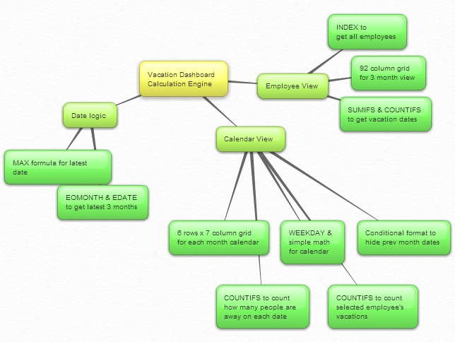
Important formulas used in the calculations:
The key formulas & ideas used are,
- Range lookup formula
- SUMIFS formula
- Calendar formulas
- EDATE, EOMONTH, WEEKDAY, NETWORKDAYS Formulas
- The lovely INDEX formula
Step 3: Dashboard design & formatting
This dashboard is an excellent example of synthesis – combination of multiple Excel features to create something very simple and easy to use.
Excel features & ideas used:
There are many Excel features & ideas used in this dashboard. First take a look at the illustration below.

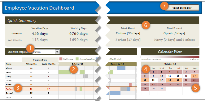
- Combo box form control to select an employee to highlight their vacations
- Conditional formatting & cell grid to show vacations in a gantt chart like view.
- Highlighting selected employee’s vacations again using conditional formatting.
- Calendar view created by picture links
- Heat map of number of people away on each date using conditional formatting (similar example).
- Header section with references to calculations & cell formatting.
- Hyperlink on a rounded rectangle shape to link to tracker sheet.
Formatting the dashboard:
The basic layout of dashboard is just 3 boxes – a big summary box on top, a large employee view box (70%) and a small calendar view box (30%).
The fonts are Calibri & Cambria default fonts in Excel 2007 or above.
I used variations of Tan color in most areas of dashboard (headers, box backgrounds, buttons etc.) and shades of pink, blue, green & gray for marking the vacations. Orange is used to highlight selected employee’s vacations.
Although there is a lot of data, I designed this dashboard with minimal clutter. It is very easy to use (there is only one input control).
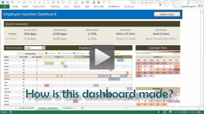
Download Employee Vacation Dashboard
Click here to download the employee vacation tracker & dashboard workbook. Play with it to learn more.
How do you like this dashboard?
I have thoroughly enjoyed the process of building this dashboard. I especially loved how picture links, conditional formatting heat maps (color scales) & simple calendar logic all have blended in to create a stunning calendar view.
What about you? Do you like this dashboard? How would you have designed it? Go ahead and share your feedback, ideas & suggestions for improvements in comments. I am eager to learn from you.
Want to learn more about this dashboard?
If you want to learn how this dashboard is constructed in a detailed fashion (along with 6 other dashboards & ton of material on dashboard design process) then please consider joining in our Excel School Dashboards program. Just today, I have uploaded a lesson (35 mins) on Employee Vacation dashboard to our Excel School website. You can use it and 32 hours more of video instruction to become awesome in Excel.


12 Responses to “29 Excel Formula Tips for all Occasions [and proof that PHD readers truly rock]”
Some great contributions here.
Gotta love the Friday 13th formula 😀
Great tips from you all! Thanks a lot for sharing! bsamson, particularly you helped me on a terribly annoying task. 🙂
(BTW, Chandoo, it's not exactly "Find if a range is normally distributed" what my suggestion does. It checks if two proportions are statistically different. I probably gave you a bad explanation on twitter, but it'd be probably better if you fix it here... 🙂 )
Great compilation Chandoo
For the "Clean your text before you lookup"
=VLOOKUP(CLEAN(TRIM(E20)),F5:G18,2,0)
I would like to share a method to convert a number-stored-as-text before you lookup:
=VLOOKUP(E20+0,F5:G18,2,0)
@Peder, yeah, I loved that formula
@Aires: Sorry, I misunderstood your formula. Corrected the heading now.
@John.. that is a cool tip.
Hey Chandoo,
That p-value formula is really great for a statistics person like me.
What a p-value essentially is, is the probability that the results obtained from a statistical test aren't valid. So for example, if my p value is .05, there's a 5% probability that my results are wrong.
You can play with this if you install the Data Analysis Toolpak (which will perform some statistical tests for you AND provide the P Value.)
Let's say for example I've got two weeks of data (separated into columns) with the number of hours worked per day. I want to find out if the total number of hours I worked in week two were really all the different than week one.
Week1 Week2
10 11
12 9
9 10
7 8
5 8
Go to Data > Data Analysis > T-Test Assuming Unequal Variances > OK
In the Variable 1 Box, select the range of data for week 1.
In the Variable 2 Box, select the range of data for week 2.
Check "Labels"
In the Alpha box, select a value (in percentage terms) for how tolerant you are of error.
.05 is the general standard; that is to say I am willing to accept a 95% level of confidence that my result is accuarate.
Select a range output.
Excel calculates a number of results: Average (mean) for each week's data, etc.
You'll notice however that there are two P Values; one-tail and two-tail. (one tail tests are for > or .05), the number of hours I worked in week two is statistically equivalent to the number of hours I worked in week one.
So here’s a way you might want to use this. You put up a new entry on your blog. You think it’s the best entry ever! So you pull your webstats for this week and compare it to last week. You gather data for each week on the length of time a visitor spends on your website. The question you’re trying to prove statistically is whether there’s an average increase in the amount of time spent on your website this week as compared to last week (as a result of your fancy new blog post). You can run the same statistical test I illustrated above to find out. Incidentally, it matters very little to the stat test whether the quantity of visitors differs or not.
Anyhow, the Data Analysis toolpack doesn't perform a lot of stat tests that folks like me would like to have access to. In those cases I have to either use different software, or write some very complicated mathematical formulas. Having this p-value formula makes my life a LOT easier!
Thanks!
Eric~
Fantastic stuf..One line explanation is cool.
Thanks to all the contributors
OS
Take FirstName, MI, LastName in access (you can fix it to work in excel) capitalize first letter of each and lowercase the rest and add ". " if MI exists then same for last name:
Full Name: Format(Left([FirstName],1),">") & Format(Right([FirstName]),Len([FirstName])-1),"") & ". ","") & Format(Left([LastName],1),">") & Format(Right([LastName],Len([LastName])-1),"<")
I teach excel, access, etc etc for a living and i have my access students build this formula one step at a time from the inside out to show how formulas can be made even if it looks complicated. Yes I know I could just do IsNull([MI]) and reverse the order in the Iif() function but the point here is to nest as many functions as possible one by one (also I illustrate how it will fail without the Not() as it is)
Extract the month from a date
The easiest formula for this is =MONTH(a1)
It will return a 1 for January, 2 for February etc.
if in a column we write the value of total person for eg. 10 if we spent 1.33 paise each person then how we get total amount in next column and the result will in round form plzzzzz solve my problem sir................... thank u
@Anjali
If the value 10 is in B2 and 1.33 paise is in C2 the formula in D2 could be =B2*C2
If the values are a column of values you can copy the formula down by copy/paste or drag the small black handle at the bottom right corner of cell D2
kindly share with me new forumulas.
How to convert a figure like 870.70 into 870 but 871.70 into 880 using excel formula ? Please help.