
Here is something fun, personalized and delicious to start your new year. A Picture Calendar built in Excel!
Printable 12 Month Picture Calendar
Using this you can print a 12 month calendar with your own photos. Its fun to use, easy to set up and looks great. See this demo to understand how it works.
Download Picture Calendar Template
Click here to download the picture calendar template. Enable macros to use it. [6mb]
How to use this?
This is a very simple Excel template. Just follow these instructions.
- Once you download the file, you would find 4 sheets inside.
- Go to the Monthly Calendar tab and play with the calendar. If you want to change colors, fonts etc. do that.
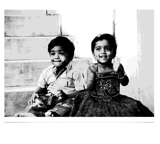
- Now, go to Pics tab. Here we have 12 pics (preloaded with some cute cats & dogs)
- Remove all the pics and add your own.
- Once you added the pics, resize them so that they can fit in Column B (800 px). Each photo should take up 2 rows (total 600 px maximum)
- Once you have added the photos, arrange each photo in 1 cells, starting from B2 (thus 12th pic will be in B24&B25)
- That is all, go back to Monthly calendar to check out your own personalized picture calendar.
Bonus: Click on the “Make 12 month PDF” to generate 12 month-wise calendars pdfs.
How does this work?
This calendar uses some of my favorite techniques,
- Picture links – to display picture for any given month
- OFFSET, INDEX formulas – to drive the calculations
- Macros – to change the month
To help you understand how this works, I have made a short video explaining the template, the VBA code & formulas. Go ahead and watch it below:
(Watch it on our Youtube Channel)
Do you like this template?
How do you like this template? Are you planning to use this? Please share your comments, ideas with us. Go ahead and comment.


24 Responses
super-liked the photos used… wishing you many more crowns this year and many more to come!
Lovely Chandoo…
Keep it up !!!
Regards,
Saran
lostinexcel.blogspot.com
hi very nice and good to see the formulas, i think only thing could have been added is displaying of month (ex: January, Feb..) when converted to pdf file which seems to be missing.
@Stef@n & all… sadly this template wont look as good or work as well in Excel 2007. You can fix the macro error by assigning the color, however, the picture links cannot be pushed back in Excel 2007 (afaik).
Hey Chandoo,
all the best for the new year !
one little question:
if i change the month “MonthlyCalender” (grey dots)
VBA shows me a mistake No 438
and the code stopped in the line
.ForeColor.Brightness = -0.150000006
and also in the line
.ForeColor.Brightness = 0.349999994
Do you have an idea ?
Regards
Stef@n
i use excel 2007
Like it !
This template is awesome, the explanation is awesome, this site is awesome and Chandoo is totally awesome. Thanks for your inspiration. Wishing you a wonderful 2012!
Hello Chandu..
Thanks for the Calender… It is really Good one…and Video is Quite Explanatory…
However When i Downloaded the file it is giving me an Error!!!! Run time error ‘438’ – Object does not support… Although i have enabled the Macros… Well I could not decode the macro…
Thanks in Advance…
And Yes… A Very Happy and Prosperous New Year….
Chandoo ROCKS!!!!
Fantastic !!!!
I can have a customised calender for my kids !!!!
Thanks a lot
Saji
Hi chandoo, thanks for your continuous support in sending excel specials to me
wish you a happy new year 2012
Hi, wish u a happy new year to ur entire
smiling family. thnx for a calender gift 🙂
Hi Chandoo!
Impressive and very grateful for sharing your knowledge with us.
My best wishes to you and your family many blessings!
hello great and easy calendar project! howerver pdf macro did not work. did anyone else encounter this problem?
Hi Chandoo,
First of all wish you and your family a very happy new year. I am sure you will come up with many more innovations and ideas in Excel. Best of Luck.
This Picture Calendar Template is just brilliant. I have just 1 question here. In the Monthly Calendar sheet, why do the pictures appear in GreyScale even if you Insert colored pictures ??
Sridhar
@Sridhar… I have applied Gray scale effect on the picture link. Just select the picture in calendar, go to format ribbon and from “Color” button, choose the regular color instead of Gray scale.
Hi Chandoo,
I tried opening the file but it would show me an error- “Run time error- 438” “Object doesnot support this property or method”. Am I missing something??
Ankit
Chandoo, the calander is an amazing idea, I got around with the 438 error by commenting out the code ‘.ForeColor.Brightness = -0.150000006’. Thank you for the new year gift, wishing you, hui, Vijay and your families a very happy new year!!
The calendar looks really nice. Will use it and let you know how it works out. Have to learn a lot in excel.
Hello Chandoo,
I am updating my excel skills and discovered your site. What a gift! Your videos and examples are very user friendly. Thank you for your efforts and sharing of your knowledge.
Blessings to you and your family.
Hi Chandoo, What a fantastic spreadsheet! And amazing technical work to ensure the end user can use it easily.
I have a query, can we change the year from 2012 to 2013..
I think it is restricted to work for year 2012 as when i change to 2013 , there are no changed as dependent on the “Mini Calendar ” I have modified it to work for 2013 .BUT i do not know how to attache the file in this forum even after login in .
HI how to create same calender for 2013 it’s realy awesome