
Splitting an Excel file in to many is easier than splitting bill in a restaurant among friends. All you need is advanced filters, a few lines of VBA code and some data. You can go splitting in no time.
Context:
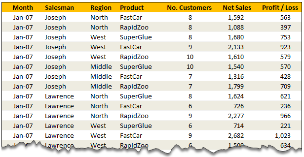
Lets say you have lots of data like this in a file. And you want to split this in to multiple files, one per salesperson.
Solution – Split Data in to Multiple Files using Advanced Filters & VBA
The process of splitting data can be broken down to 4 steps.
- Identify the split criteria and list down all values in a small range. In our case, we list all the salespersons names in a named range lstSalesman.

- Set up advanced filters so that we can filter the data by one salesman at a time.

- Now, for each salesman, apply advanced filters and set it to copy the filtered values elsewhere.
- Copy the filtered values
- Add a new workbook and paste the copied values there.
- Save the new workbook with a unique name
- Repeat the above 3 steps for each salesman
- That is all! You are done splitting.
Video Lesson on Splitting Data using Filters & VBA
Since splitting data in to multiple files requires a bit of macro code & advanced filter knowledge, I have created a short lesson explaining how this works. Watch it below.
[If you are not able to see the video, watch it on our Youtube Channel]
If you are new to VBA, take our crash course.
Download Split Data Example Workbook
Click here to download the split data example workbook.To use this,
- Save the downloaded file to any folder.
- Open the file and enable macros.
- Examine everything and when ready, click on “Extract” button.
- Check the folder where you saved the file and you will fine 4 new Excel workbooks named after the salespersons with the data extracted for them.
You can find the macro code in Module 1.
How do you Handle Splitting Situations?
In my work, I rarely had to split data. And whenever I had to split data, I usually copy paste the data after filtering what I want. But I can imagine many real life scenarios where you need to automate the splitting part.
How do you split data? What techniques and ideas you use to speed up the splitting process? Please share using comments.
More on Splitting & Consolidation
If you are in to splitting or combining things, we have a selection of tips & examples to help you. Check out these articles.
- Consolidating Data in Excel – a collection of techniques & tips
- Split Text on new line using VBA
- Combining Data using Excel’s Consolidate Feature
- Using 3D References to Consolidate Data
PS: Heck, we have even have an Excel tip to tell you how to split expenses among friends 😛
PPS: You can use Pivot Table Report Filters if you want to split data in to multiple sheets.


45 Responses
Great. But instead of a fixed salesman-list I would copy the salesman-column to a new sheet, remove duplicates and use that as “lstSalesman”, so it will be more dynamic.
I may have got this one entirely wrong, but… wouldn’t be easier to set up either a PivotTable or a Sumproducts table?
Ok, maybe easier is not the best word here, nut you know what I meant !!!
If performance is an issue for this type of activity i will typically use a combination of scripting dictionaries and arrays.
The scripting dictionary takes the form of Category (Sales person name in your example) as the key, in the item in the dictionary is an array of data.
The program flow will loop through each row…. adding new sales people to the scripting dictionary as they are encountered, then adding the data to the appropriate array.
Once all the data is captured, loop through the dictionary creating a file for each entry then paste the array into the workbook.
Not nearly as general purpose as the solution you have outlined above, but it will be a fair bit faster.
I have done something similar for sales rep, but they are going from one summary sheet to individual customer worksheet on the same workbook. Each sales rep has a portfolio of companies which has multiple contact persons. So it was a simple linkages and vlookups.
This is fantastic!
I am wondering how to split data charts to individual xls files?
Nice tools….i using this in my work everyday for listing compare, filtering…
This is really amazing tool. Thanks for sharing it. I have used it in one of my project but it is getting into loop for me. The excel sheet contains lakhs of data. It shows me it is processing but it never ends. I have to abruptly log off from the system to come out of the loop. Please help me on it.
This works Great.. I wish this VBA script is further enhanced to automatically sent the file through mail to concern person. Kindly let me know if that is possible.
Thanks for the example. I have a spreadsheet with 209,592 records relating to account numbers. There are 593 unique account codes. I was wondering how to split this one worksheet to many other work books based on the account code field.
I have tried using the example you provided, but it seems to be taking up the memory and the destination workbooks come up empty.
Also, is this possible in Access?
hi Abdul Aziz,
was you able to replicate the code? I also need to split huge amount of data with ~300 unic codes, but the path does not work for me. I tried to switch the row data and get results for 4 first values, any clue how to expend the range?
thanks in advance for hint!
Hi Guys,
Have succefully implemented this code in my reward spreadsheet. However need help.
I have Business Units and these business units have various Accounts. I want a code that can populate a business unit sheet and related accounts on individual sheets within the business unit workbook. I hope I have explained myself well.
Please help.
Rana
The code does not paste formulas in the new spreadsheet. Can you please help me paste formulas?
Sub breakMyList()
‘ This macro takes values in the range myList
‘ and breaks it in to multiple lists
‘ and saves them to separate files.
Dim cell As Range
Dim curPath As String
curPath = ActiveWorkbook.Path & “\”
Application.ScreenUpdating = False
Application.DisplayAlerts = False
For Each cell In Range(“BizU”)
[BU] = cell.Value
Range(“myList”).AdvancedFilter Action:=xlFilterCopy, _
criteriarange:=Range(“Criteria”), copyToRange:=Range(“bizextract”), unique:=False
Range(Range(“bizExtract”), Range(“bizExtract”).End(xlDown)).Copy
Workbooks.Add
ActiveSheet.Paste
ActiveWorkbook.SaveAs Filename:=curPath & cell.Value & Format(Now, “dmmmyyyy-hhmmss”) & “.xlsx”, _
FileFormat:=xlOpenXMLWorkbook, CreateBackup:=False
ActiveWindow.Close
Range(Range(“bizExtract”), Range(“bizExtract”).End(xlDown)).ClearContents
Next cell
Application.ScreenUpdating = True
Application.DisplayAlerts = True
End Sub
This almost did my job… but i wanted further classification…
like there will be a file for JOSEPH which will have worksheet containing data for NORTH WEST AND MIDDLE.
Can you please guide…
Here in my work we are doing the Budget 2013 per salesman, so it was very useful.
But now, I need a code to collect all the files.
What string have I to change to do it?
Very Thank you.
This example is fantastic. Thanks a lot Chandoo.
I have one additional question:
I would like to use this example as a template. So what I would like to do is:
1. Defining the Advance Filter & the VBA Code in a seperate Excel code (as template excel)
2. Everytime when I obtain a new Source excel which will be every two weeks, coping the source file to the same folder like the template one and spliting it from the Template excel.
The reason is:
I do not want to define the Advance Filter & VBA over and over. Therefore, instead of that. I would like to use the:
1. Template excel as TARGET
2. SOURCE File
3. The Template file reads the Data from Source File and Split it to multiple excel files.
I hope you can help me with that.
Thanks in advance.
Benny
Thanx a lot man…it really saved lot of my time…thnx
Nice video. Very clear and concise. I’m very new to VBA but I like your solution. Another option, would be to save the excel data as a csv file & then grep for each name and direct contents to another file.
Thanks
Thank you 🙂
i am new to Macro; and this is working for me well and would like to know if the below listed things are possible
1. I want to add the pivot table into separate tab after splitting the file
2. I do not want to have date and time in my file name
Pls help me
thanks a lot in advance
Sundar_ Shammu
Hi My Question is a bit complicated – I have watched the video at http://chandoo.org/wp/2011/10/19/split-excel-file-into-many/
but I can’t make it work for my specific problem (below)
I have a forecasting spreadsheet containing input from 25 people. Each month I take a master spreadsheet and divide it up into separate files for each person based on the name of the sales person in column A from rows 8 to 1000 in the “input” tab
The VBA macro I am looking for will copy all rows which contain an individual sales person in the “input” tab, paste them into a template I have created on my C drive, name the file according to the sales person name and loop through repeating the process for each sales person then close the master spreadsheet
I would like for the data not to remove the cell formatting when it is pasted into my template. Can anybody help please?
I’m a VBA novice and so any help would be appreciated
Thanks
656jamie656
How will i have to change the copy location?
Hi. This is exactly what I need to do. How did you create lstSalesman in your spreadsheet? I tried to use your code, but am stuck on this. Did you make it a Table? How did you name it?
Thank you for any help you can give, I am just starting to create Macros.
Thank you for this. You saved me hours of work. Such a simple and straight forward solution.
Cheers
Great stuff. A few quick questions I was hoping somebody could assist with:
1). Is there a way to automatically name the tab without going into the file?
2). Is there a way to autofit the column size of the generated files without going back into the file?
3). Is there a way to keep adding tabs to the same workbook if you’re working with multiple data sets? For example you have 3 salesman data sets and want each file you’re sending in the to the salesmans to have the three different tabs.
Thank you for the help.
Hi,
Tried to use the formula. It doesn’t work for me. Formula is not copying desired data. It copies only one line. Anyone has the same issue and how to fix this?
It’s great. But it export only one sheet of workbook. I want multiple sheet of a workbook will split based on row value. Please help.
somebody please please help
After split the file, can we send each splitted to file to specific person via email using macro.
In this case,
We would like to send the report to Joseph’s email. Right after the file splitted. Can we do it? please help.
I have been in need of doing this exact thing for several years, and today my google search lead me to your video and website. I’m not quite sure how I haven’t found it sooner!! Regardless, I’m eternally grateful that I did!! I am forever in your debt :)!! You have just made my job so much easier!!! There is so much about Excel that I still have to learn, and I now know from whom I’ll be learning it!! Thanks again for this very valuable lesson!!
Dear All,
There are “Fixed Criteria Range” used in this macro
That force you must use 4 salesman’s name in “lstSalesman.” Named range
If you require just 3 or 2 Salesmans’s data..this process goes to Error..
Or All salesman data generated …
Is there are way to give “Dynamic Criteria Range” ?
Like CriteriaRange:= _
ThisWorkbook.Sheets(“sheet1”).Range(Cells(1, “J”), Cells(Rows.Count, “J”).End(xlUp)), Unique:=False
So we can generate files for only required buyers.
Regards,
Chirag Raval
it was great experiance this is so much useful
on regularly am working on excels i need more information about VBA scripting so can u share ur number so that we can discuss more
i want to take training from you
Really enjoyed this code. Makes monthly reporting very quick now as I can pull a single consolidated list of all customers and then create individual reports for each. Two questions that I have..
1. Is there a way to add totals to columns that are exported
2. Is there a way to run a report for two salesmen at the same time? (Joseph and Maria)? I have tried a few things but no luck.
Thank you
This is really amazing tool. Thanks for sharing it. I have used it in one of my project but it is getting into loop for me. The excel sheet contains lakhs of data. It shows me it is processing but it never ends. I have to abruptly log off from the system to come out of the loop. Please help me on it… ….IT IS VERY VERY VERY USE FULLL…. THANK YOU……
I want to paste the data in a specified location instead of cell A1 and add some values to other cells and then save it …Also do some formatting can anyone help?
Hello,
Great… Thank you so much chandoo…
I want the same split macro, but need some modifications. Will you plz help me in this…. ?
Can you share me your mail id so that I can share u my data..
Hi Chandoo,
I have a variation on this. Below is a VBA that I have been using for a while to split and save worksheets as different books. My needs have changed however. I would like to only save the active sheet as a new book. I have tried to change the part that says “For Each sht In ThisWorkbook.Sheets sht.Copy” to “ActiveSheet.Copy” and removed the “Next sht” argument but I get an error.
Could you tell me what I’m doing wrong?
Sub Splitbook()
MyPath = ThisWorkbook.Path
For Each sht In ThisWorkbook.Sheets
sht.Copy
ActiveSheet.Cells.Copy
ActiveSheet.Cells.PasteSpecial Paste:=xlPasteValues
ActiveSheet.Cells.PasteSpecial Paste:=xlPasteFormats
ActiveWorkbook.SaveAs _
Filename:=MyPath & “\” & sht.Name & “.xls”
ActiveWorkbook.Close savechanges:=False
Next sht
End Sub
Hi Chandoo,
I am saving my activeworkbook as xlsx files according to the values in column N. It is working fine except for not closing the last file formed.
What have I done incorrectly.
Sub SaveAsString()
Dim i As Integer
Dim lRow As Integer
Dim sPath As String
Dim sFileName As String
Dim wb As Workbook
sPath = ThisWorkbook.Path
lRow = Sheets(“Sheet1”).Range(“A” & Rows.Count).End(xlUp).Row
Application.DisplayAlerts = False
Application.ScreenUpdating = False
For i = 2 To lRow
sFileName = Range(“N” & i).Value
ActiveWorkbook.SaveAs filename:=sPath & “\” & sFileName & “.xlsx”, FileFormat:=xlOpenXMLWorkbook, CreateBackup:=False
Next i
Application.ScreenUpdating = True
Application.DisplayAlerts = True
End Sub
Please share me the VBA/MACRO code to seperate sheets
@Subhash
What does Separate sheets mean?
Please elaborate
Hi Subash,
Here is the code I was able to figure it out.
[code]
Sub SaveAsString()
Dim i As Integer
Dim lastRow As Integer
Dim sPath As String
Dim sFileName As String
Dim oFilename As String
oFilename = “zMaster” ‘ Change “Book1” to the name of the original workbook
sPath = ThisWorkbook.Path
lastRow = Sheets(“Sheet1”).Range(“A” & Rows.Count).End(xlUp).Row
Application.DisplayAlerts = False
Application.ScreenUpdating = False
For i = 2 To lastRow
sFileName = Range(“N” & i).Value
ActiveWorkbook.SaveAs fileName:=sPath & “\” & sFileName & “.xlsx”, FileFormat:=xlOpenXMLWorkbook, CreateBackup:=False
Next i
Workbooks.Open fileName:=sPath & “\” & oFilename & “.xlsm”
Workbooks.Open fileName:=sPath & “\” & sFileName & “.xlsx”
Application.ScreenUpdating = True
Application.DisplayAlerts = True
ActiveWorkbook.Close
End Sub
[/code]
Your functionality of one workbook to create many is awesome just need one more support, The code does not paste formulas in the new spreadsheet. Can you please help me paste formula too.
i want to add a common dropdown list for all these excel sheet that i will make after clicking extract button is there any way to code it ?
Thanx a lot man…it really saved lot of my time…thnx
but Dear sir, i want to save as PDF Fixed Files these split excel files,please suggest how can i do this…
my file contains multiple sheets need to split all sheets how can it be done please help
I have a file with multiple excel sheet & wants to split entire excel file with the same multiple sheets based on a columns of different sheets…