
Last week we learned how to create dynamic hyperlinks in Excel. Today, I want to show you something even cooler. An interactive dashboard based on hyperlinks, like this:

Isn’t it impressive?
Well, to create something like this, you don’t need a degree in advanced cryogenics. You just need a bunch of data, a chart, a one line macro code and some pixie dust (go easy on pixie dust).
5 Step Tutorial to Create Interactive Dashboard using Hyperlinks
Step1: Setup your data
It is no wonder that any good chart or dashboard exercise must begin with data setup. So, the first thing we need to do is, to set up our data.
If you observe carefully, you will realize that we just have one chart and we are changing the chart’s source data based on which option user selected.
So, assuming you have 4 series of data – sales, expenses, profits & number of customers, we will add fifth series. This will always show data for the series that user selected. Like this,
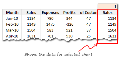
Lets call the series name in fifth column as “valSelOption“. Lets assume that we will use some sort of magic to change the series name.
Note: Using this series name, we can fetch the position of the series out of 4 with MATCH formula. Once you know the position, You can fetch corresponding values using INDEX() formula.
Step 2: Create a chart from the series 5
This is very simple. Just create a chart from the data in 5th column as above. You can format this as you want.
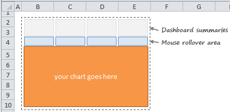
Step 3: Create the dashboard area
This is a bit tricky, but easy too. Just set up 4 column area (since we have 4 charts) such that you can place your chart and mouse-over cells for selection. like this,
Step 4: Create Roll-over effect
Now comes the magical part. We need a simple macro or UDF to change the series based on where user pointed the mouse.
But how to activate that UDF on mouse rollover?
This is where we can use Hyperlinks.
Do you know that you can use a UDF as source for hyperlink.
Just like we can write =HYPERLINK(“http://chandoo.org/”,”Click here”)
we can also write =HYPERLINK(myFunction(),”Click here”)
And Excel would run your function when user clicks on the link.
But, there is more to it.
Excel would also run the function, when you place your mouse on the link. No need to click!
But, seasoned VBA programmers would know that Functions are not allowed to change values in other cells or format them. Well, that restriction does not apply if you use a function from Hyperlink!!!
So, we would write a one line function – highlightSeries(seriesName as Range) and put this code in there.
Public Function highlightSeries(seriesName As Range)

Range(“valSelOption”) = seriesName.Value

End Function
This function would take the series name as a variable and assigns it to named range valSelOption. As the valSelOption changes, so does the data for our chart and then we get new chart.
Now, we just write this hyperlink formula in all the 4 cells, like this:
(Assuming the series names in B3:E3)
=IFERROR(HYPERLINK(highlightSeries(B3)),"6")
Why this formula works?
- While using a UDF inside HYPERLINK() works the trick, Excel would also throw up a #VALUE! error. To fix it, we use the IFERROR()
- The number 6 is the down-arrow symbol in webdings font
- So, change the cell’s font to webdings!
Now, drag this formula sideways to fill in all 4 cells.
Note: Word-wrap the hyperlink cells so that the link works when you hover anywhere on the cell, not just the down-arrow symbol.
Step 5: Add Conditional Formatting to highlight selected series’ name etc.
This is optional, but just as awesome. Once you add conditional formatting, the dashboard feels slick and interactive.
That is all. Your interactive dashboard is ready.
Download the Example Workbook
Click here to download the interactive dashboard workbook and play with it. Examine the technique, formulas and UDF code to see how it is weaved together.
Special Thanks to Jordan:
Many thanks to Jordan, who blogged about this technique on his OptionExplicit VBA blog. He reviewed my file and gave me few suggestions too. He made an interactive snake application using this technique. You can download that file from here.
How do you like this technique?
I like the possibilities of this technique. However, it is also a bit tricky to explain. So I will use it with caution. (Also, I am not sure if this would slow down Excel, but in my experience it did not)
What about you? Do you like this idea? Are you going to experiment with it? Please tell me how you are planning to use it thru comments.
More techniques for Dashboard Makers & Analysts
If you work with Dashboards or data analysis, then you are at the right place. We have a wealth of information, tutorials, examples & ideas for you. Please check out a few below:


205 Responses
Dear Team, this is what I was excatly looking for! Thank you so much for such a cool blog!
I think this is the most awesome site on Excel! Best regards – Aniket
Chandoo, another inspiring post. Thanks.
I dig. I really do. One of the things I don’t like about the dashboards I do is that the UI can be pretty ‘bleh’. Tricks like this give me more options to make the UI work really well.
Okay, that’s just straight-up awesome!
A cool little trick that delivers some excellent results. Easy to do and especially easy to adapt for your own needs…. it doesn’t need to be charts, you can use it to highlight columns too! So i can now scan data in tables so much easier… great!
Hey, this looks familiar lol. Just a little extra thing to add: your function will continuously write to the named range so long as your mouse hovers over the hyperlink. But if you place this in your code:
.
If Range(“valSelOption”) = seriesName.Value Then
Exit Function
Else
Range(“valSelOption”) = seriesName.Value
End If
.
You should notice a slight speed improvement. If you don’t notice it now, you will notice it when there are several more hotspots.
Is it possible to add a second series in this chart?
Hey Jordan, I noticed the difference. I was a bit concerned about the speed as I am usually an impatient person.
Thanks Chandoo for posting this. I was using the dropdown list but this is more convenient.
Very cool…I’ll have to try this!
Hi
Just wondering if there is a excel 2003 workbook version available for this?
Thanks
I’m having problems downloading your file. Is it 2003 compatible?
Rich,
You can open it in 2003 (assuming you can normally convert other 2007 files).
Just rename the file extension to .xlsm and it should work.
I love this interactive dashbaord and I’m looking to implement on a few sheets wheere I normally apply filters as a drop down choice. Thanks for sharing.
I downloaded the file and opened it with a converter to 2003 and the page was blank.
Rich I think you and I are having the same issue. I am wondering if this will only work in 2007 and up.
@Rich You need Excel 2007 or above as the file has .xlsm extension.
ok, Chandoo, did you correct the link? when i go to open file, it shows .xls not .xlsm
That. Is. Awesome.
Chandoo: Can you simlify step 4. ‘m battling to get it right.
This is awesome!
I am seriously struggling with step 4, how to get the hyperlink to worK.
Please help, i followed all instructions and then it says “Cannot open the specified file”
Dear Chandoo
thank you, Its really awesome, this could add more value to the dashboard…. its is really going to help me lot… thank you once again.
We expect more from Chandoo,,, with biz schedule I always find a time to visit chandoo, as I have trust that, Chandoo will come up with awesome ideas always.
Guys: If you manage to get step 4 to work, please post the easiest steps to follow.
Please guys.
Chandoo, this is wasome, I always smile when I see a new post in my inbox.
Love the dashboard!
Personally not a fan of array-formula’s, so i removed those.
Guys
Can someone please post the steps to execute STEP 4 on Chandoo procedure.
I can’t get the Hyperlink to work. Please guys, someone assist with this.
Hey guys, if you get an “Cannot open the specified file” error, ensure the following:
1. Within the first argument of the Hyperlink formula you’ve spelled the name of your UDF correctly.
2. The first argument is NOT in quotes. Correct: HYPERLINK(highlightSeries(B3)),”6″); INCORRECT: HYPERLINK(“highlightSeries(B3))”,”6″)
3. Your function is specified as PUBLIC and is in a module!
I love the dashboard! I follow all the steps and check the formula I’m still getting the “Cannot open the specified file” error.
I am not getting any value for the “valSelOption” cell either.
Did I miss something?
I’ve got the same problem. I copied “highlightSeries” from macros and pasted it to cells with arrows and it works! Keep trying
Hello Chandoo
I learn a lot from you.
Thanks for sharing your expert knowlege.
You are my excel guru.
Best
Thanks Jordan Goldmeier. I’ve been waiting patiently for someone to post. My mistake was on step 3, It got after I put it in module.
Thanks Jordan Goldmeier, I’ve been waiting patiently for the help. Mys mistake was on step 3 on your explanation.
Thanks once again.
Helloo Mr. Chando!!!
It’z awesome! Can it be linked to web page with all it’s interfaces! I’ve found a challenge in mrexcel and it’ll be too good for them.
Another excel colleckal.
Me likes it a lot!!! Going to try in in a dashboard I’m working as we speak 😀
Is something in Step 1? How is valSelOption important? Where are you using it?
You lost me at “magic” 🙁
“Lets call the series name in fifth column as “valSelOption“. Lets assume that we will use some sort of magic to change the series name.
Note: Using this series name, we can fetch the position of the series out of 4 with MATCH formula. Once you know the position, You can fetch corresponding values using INDEX() formula.”
Is something missing in Step 1? How is ‘valSelOption’ important? Where are you using it?
You lost me at “magic” 🙁
“Lets call the series name in fifth column as “valSelOption“. Lets assume that we will use some sort of magic to change the series name.
Note: Using this series name, we can fetch the position of the series out of 4 with MATCH formula. Once you know the position, You can fetch corresponding values using INDEX() formula.”
Thanks Jordan!
Works a charm!
@Chandoo. Here’s my idea: users can roll over a graph (which has a hyperlinked cell underneath) and the camera tool “zooms” in on it.
Take a look: http://kvisit.com/Ssoq3AQ
@All… if you have trouble understanding this tutorial, see this video: http://www.youtube.com/watch?v=T7eDQqPZOm8&feature=channel_video_title
@Jordan: Very cool indeed. The camera tool based zoom.
I may have missed it, but how do you disallow scrolling by the user. That’s a good thing because it makes it makes it work more like an application. I just don’t know how to do it.
Thanks Chandoo for taking time and creating a video demonstration. You really go out of your to help your followers. Thanks again.
@Jordan: Keep it up.
I thought this was amazing.. At work, I used the same concept and it works wonderful !
Gr8 going Chandoo.. Goes to say Excel is an ocean and provided we use it right, we can achieve the results we want.
@Bobby Bluford
This is a creative use of the Freeze Panes option found in the Views menu.
Is there a reason the array formula was used. I don’t think it’s necessary, right?
Very nice, Chandoo! I think this technique is amazing! Thank you!
Message génial, il m’a vraiment aidé beaucoup.
What about those of us stuck with Excel 2003. Any options? (We will upgrade someday. But, just when that day will come is an open question . . .) Thanks.
Brilliant!
Inspiring…now I wanna change like a 100 reports.
One of the best Excel-related items I have seem in a long time.
Many, many thanks.
Hi Chandoo:
Sweet!
Been playing around with it. But it appears that the charts have to tracking the same thing, such as numbers. I tried to create one of the graphs as a percentage, but the Y axis then for some reason changes in the other charts. Any idea why this?
@Russ
It is the same chart in all 4 cases,
It is the data that is being changed behind the scenes by the process.
@All, Russ
I have uploaded a small modification to Chandoo’s original file which allows for the display of different chart types and even pictures.
You can find it here: http://chandoo.org/wp/wp-content/uploads/2011/07/rollover-hyperlink-with-Pics-demo.xlsm
It uses the same Camera Tool with a linked formula using Indirect technique to retrieve different Charts, Refer http://chandoo.org/wp/2008/11/05/select-show-one-chart-from-many/
Enjoy
Hui…
Hi Chandoo / other Excel MVP’s
I have used this in Excel 2003 and it works fine, I have a second table and chart to add this to within the same workbook, I have used cell name valSelOption 2 and highlightseries2
For Example:-
=IF(ISERROR(HYPERLINK(HIGHLIGHTSERIES2(E47))),”6″,HYPERLINK(HIGHLIGHTSERIES2(E47)))
I can not get this to work, can anyone see what I am doing wrong?
Best regards
Ajay
@Ajay
The VBA associated with this workbook is only setup to return a value associated with 1 range/area
Can you post/email your file and I’ll look at a work around
Hi! Jordan–when I put in your code—
If Range(“valSelOption”) = seriesName.Value Then
Exit Function
Else
Range(“valSelOption”) = seriesName.Value
End If
Everything breaks. Actually, whenever I change the function from anything but what is there, the hover over and highlights series function doesn’t seem to work. Any advice? Thanks.
Hi !
How do you make this work if you have to protect the sheet ?
I just built this an it works great…. I am hoping for some additional help though. On the one I built, my second column is gross margin %. Is there away for the graph to adjust the format of the numbers on the left access to whichever type of data is selected? So if I hover over sales, the format is % but when I move over gross margin %, it changes the format to %? As it is, my gross margins are all less than $1.00
@Dustin
Have a read of my comment 46)
Thanks Hui… I did consider that but didn’t take it all the way to completion. Based on your workbook, it looked like the pictures were not as clear as the actual graphs. Is that just me or are you seeing the same thing? Is there a way to avoid a lower quality graph?
@Dustin,
That’s is a limitation using this technique
I am not sure if this has been asked but at work they have excel 2003.
Is there a 2003 version, can I do this in 2003?
Unfortunately I can only use what work provides.
@Zilla37
Can you try this: http://chandoo.org/wp/wp-content/uploads/2011/07/Rollover-hyperlink-demo-97.xls
Please let us know if it works or not.
I have the same problem –
i am running excel 2003 and the rollovers work great for a few minutes
then the down arrow is replaced by a bunch of webding characters, and the spreadsheet flickers….seems there is an error with the
hyperlink
formula perhaps?
also – the webdings character 6 doesn’t look like a down arrow from what my version shows.
Please reply to my email as well.
Steve
Hi Hui
Yes the link works except for one thing.
The down arrow for the YTD (webdings size 11 ) doesn’t appear. What shows is several webding icons not just the single down arrow. I think its picking up all the text from the formula. Is there a way to correct this?
Thanks Chandoo. Excellent stuff and easy tutorial.
Thanks for this trick .. but i faced a problem when i was using this ….
I have below mentioned formulas in my excel sheet .. previously it used to work properly .. link to the correct cell & value in the cell How!U12 used display.
=HYPERLINK(“#” & CELL(“address”,How!U12),How!U12)
but after implementing the above trick in my worksheet …. now its displaying
“#'[R17954_System Testing Testlog vGraphs.xlsm]How’!$U$12 ” instead of the value in the cell How!U12
Please help me if im doing anything wrong …
But if i go to formula bar & Hit Enter without changing anything.. its working fine …
I have saved the example workbook which works perfectly – however, I tried to recreate this effect myself in my own spreadsheet simply to see if I could do it myself. I have checked every formulae/function and named range and everything ‘appears’ to be an exact replica of the example workbook but the only thing that does not work is the hyperlink, when I hover my mouse over any of the hyperlinks nothing changes. When I set up the chart, it accurately reflects the initial value(s) of 4 in the MATCH cell (i.e. it accurately picks up the values of the ‘No. of Customers’ column), but it never updates when I hover my mouse over any of the other hyperlinks.
My “MATCH” formulae cell is in O15 with value =MATCH(valSelOption,$K$16:$N$16,0)
As you can probably tell from the formulae above, my column headers are in range K16:N16
My data range is in K17:N28 and the array formulae is set in range O17:N28 thusly {=INDEX($K$17:$N$28,,$O$15)}
My chart header range is B3:E3 and my hyperlink formulae is set in range B6:E6 like so =IFERROR(HYPERLINK(highlightSeries(B3)),”6″) (obviously, the reference to B3 in the hyperlink code is incremented accordingly across to E3)
I have checked my function code and it is appopriately coded as in the Chandoo’s article (straight copy & paste). But nothing happens when I hover the mouse over the hyperlink cells. When I manually change the number in the MATCH cell (O16) the data in range O17:O28 updates accordingly but the chart does not.
Any ideas? Am I missing something REALLY obvious?
Cheers for any help or advice in advance!
Did you change the Named Formula ValSelOption ?
=’Interactive Dashboard’!$AC$18
to reflect your data
Thanks for your help Hui – yes I did change the named range valSelOption, although in my case I changed it to;-
=’Interactive Dashboard’!$O$16 – Because my named range is O16
This seems to be picking up the correct value from the value returned by the ‘MATCH’ formulae (in this case a value of 4 = “No. of Customers”, however this value does not update when I hover over any of the hyperlinks. If I change this value manually (to say 3) the chart and the values in my array range (O17:O28) change accordingly, but the conditional formatting does not change and the value of the named range in O16 does not update to “Profits”.
Does this make sense? Hopefully I have explained this ok?
Many thanks
Did you copy the VBA code from the worksheet object in VBA
It is only 3 lines?
Public Function highlightSeries(seriesName As Range)Range(“valSelOption”) = seriesName.Value
End Function
Yes I did, exactly as it appears in Chandoo’s article above – completely unedited.
OK, thanks hui – the email should be winging its merry way to you now! Cheers
@Alex
In your UDF retype the 2 ” around valSelOption yourself using the keyboard Shift ‘
Don’t copy/paste from here
Voila
Notice that the Chandoo’s Blog changes the ” to something that looks like a ” but isn’t
THIS!!! OH MAN!!! I’ve been working this problem for hours!!! Thank you so much!!!
Aha! Thanks very much Hui! Works like a charm now – I was scratching my head wondering where I had gone wrong but could not see any obvious errors. Who’da thunk it would be something as simple as that!
Cheers for your help
Best regards
Alex
Hello Chandoo, this post is awesome !!
but I’ve a problem. I’d like to insert 2 differents graph with the same technique, how can I do it ?
@Shakeel
The chart is a simple chart looking up some data over in X17:AC32
This data is connected to Data in Col AC via an index which retrieves data into column AC
The index uses AC17 as the offset value when retrieving the data
You can have any number of charts all looking up different data but using the offset Value from AC17
Have a look at the same chart as above with a second set of data connected
https://rapidshare.com/files/3221111701/Rollover_hyperlink_demo_Hui.xlsm
Hi Hui
I like the before and after graph.
Is there anyway to have the previous and new numbers side by side in the same graph?
Hi
Is there any way to use this technique to filter a Pivot Table that then feeds a chart. I’ve tried extending the sub to include PivotItems.visible methods etc, but excel doesn’t play ball.
Any ideas?
Did you ever figure out how to use this with a pivot table?
I have been having fun with this little trick for a while now and it’s been working lvoely, however I have been experiencing the same problem as post 59 above;
============================================
59) r3n September 7, 2011
Thanks for this trick .. but i faced a problem when i was using this ….
I have below mentioned formulas in my excel sheet .. previously it used to work properly .. link to the correct cell & value in the cell How!U12 used display.
=HYPERLINK(“#” & CELL(“address”,How!U12),How!U12)
but after implementing the above trick in my worksheet …. now its displaying
“#’[R17954_System Testing Testlog vGraphs.xlsm]How’!$U$12 ” instead of the value in the cell How!U12
Please help me if im doing anything wrong …
60) r3n September 7, 2011
But if i go to formula bar & Hit Enter without changing anything.. its working fine …
========================================================
To reiterate, I have a hyperlink formulae in my worksheet which hyperlinks to another worksheet cell, based on cell value in cell “O1”.
For example; Cell “O1” has a formulae which returns the value “[QDC Summary 11-12.xlsb]”!$A$1″ (variable depending on item being viewed) and I have a hyperlink referencing this cell =HYPERLINK(O1,”Edit”).
Now, the formulae and hyperlink work great, however, whenever I hover my mouse over the tabs triggering the highlightSeries/valSelectOption, these hyperlinks keep changing the “friendly name” in the hyperlink (in this case “Edit”) to the hyperlink value of “[QDC Summary 11-12.xlsb]”!$A$1″.
Although the hyperlink still functions perfectly fine, it is annoying have to keep activating the cell (F2) to set the “friendly name” back to “Edit”.
I hope I have explained this properly!
Just noticed that if I place my mouse on any cell and hit delete (even on a blank cell) the hyperlink “friendly name” appears again.
There are several online tools available that can help you create comprehensively designed flowcharts and graphs within few mins. These could be flash animated charts that could go in to a ppt slide..
Read more here.. http://askwiki.blogspot.com/2011/09/best-of-online-graphs-and-charts.html
Hi again folks
Sorry to be a pain, I notice there hasn’t been any activity on this for a while, but has anyone got any ideas on how to solve the hyperlink “Friendly Name” issue above (post 72)? I can make the “Friendly Name” appear successfully again (manually) by selecting a blank cell and then hitting “Delete” (I have also created some vba to do this with the selection change event), but when the mouse hovers over the “highlightSeries” UDF hyperlink above, it does not reset the “Friendly Name” automatically.
Any ideas?
Hey Alex – I’m trying to recreate the problem you’re talking about, but I’m having trouble. Would you be able to put your file up for us to download?
Jordan, I am having the same issue where I’ve added the Else and it breaks.
Also, is there a way to make it activate on a Click (MouseUp or MouseDown) as opposed to a hover?
@Ryan – Did you copy and paste the code directly from this messageboard? If so, the quotation marks the message board uses ( “ ) are actually different from what vba uses ( ” ). Take a look at your code and see if there are slanted quotation marks.
Second, you do not need the hyperlinks for click effect. Chandoo has a good post here on how to do it: http://chandoo.org/wp/2011/02/22/the-grammy-bump-chart-in-excel/
@Alex – I see the problem you are describing. My best guess is that the way the way Excel is programmed, anything that “points” (as in a memory pointer) to a cell will automatically change as well. However, what might work is if your Hyperlink formulas instead said HYPERLINK(INDIRECT(O1)). This will change whatever you hyperlink to, to the VALUE of the cell being referenced in O1. Specifically, if what’s being referenced in O1 brings the user to a title of a column, you could always place a cell to the left O1 that says “Edit:” and the title of what they want to edit will show up. I Hope that makes sense. You can email me (jpo645 at gmail) if you need more explanation.
@Ryan – just to clarify. if there are slanted quotations in your code (because you copied it directly from chandoo), go ahead an retype those quotations.
Thanks Jordan,
I think I follow what you say, however, I have tried using an “INDIRECT” reference within the hyperlink but this still changes the “Friendly name” to the formulae value rather than the “friendly” value.
Essentially what I have is one Worksheet called “” which is where (as you would have guessed from the name) all my data is stored, I then have an “Indicator” Worksheet which is where the menu resides (Chandoo’s excellent highlightSeries/valSelOption code).
I have set up a search function in my “Indicator” Worksheet which allows the user to search for a particular “Performance Indicator” – the results appearing in a range of cells below the “Search” cell with a summary for that particular Indicator (the user able to switch between different Quarters (Q1/Q2/Q3/Q4) using Chandoo’s Function).
Next to the “Search” cell (in cell “G2”) I have an “Edit” button which contains my hyperlink as below;-
=HYPERLINK(LEFT(RIGHT(CELL("filename"),LEN(CELL("Filename"))-SEARCH("[",CELL("Filename"))+1),SEARCH("]",RIGHT(CELL("filename"),LEN(CELL("Filename"))-SEARCH("[",CELL("Filename"))))+1)&"''!"&O1,"Edit")
Cell “O1” referenced in the Hyperlink formulae above contains the hyperlink to my “” tab which takes the user to the correct location for the currently selected Indicator and allows them to edit the data.
Everything works like it should, with hyperlinks going to the correct location for each specific indicator etc.
However, the problem is that when I hover the mouse of each of the Quarters, again everything works as it should and the relevant data is displayed accordingly, but the “Edit” button changes from it’s “friendly name” to the value hyperlink value of the formulae above, which in my case is “[QDC Summary 11-12.xlsb]”!A$1″, rather than the “friendly name” of “Edit”
I hope I have explained this properly, but please let me know if I have confused you and any advice or help would be greatly appreciated.
Thanks, Alex
Sorry, my post above seems to have been truncated somehow, my first worksheet is called Database2 (between a lower than symbol), but I don’t think this website likes using those symbols in a post?
Also, my formulae posted above is cut off so i will try and split it;-
`=HYPERLINK(LEFT(RIGHT(CELL(“filename”),LEN(CELL(“Filename”))
-SEARCH(“[“,CELL(“Filename”))+1)
,SEARCH(“]”,RIGHT(CELL(“filename”),LEN(CELL(“Filename”))
-SEARCH(“[“,CELL(“Filename”))))+1)&””!”&O1)`
Sorry for the double post
Hi,
thanks for same. Can u share Example file on this….
Please….
@Alex. Here is the solution that I’ve come up with. Instead of using a cell with a hyperlink formula to link to the original data, use a shape and a macro. First, insert a rectangle or a textbox – I inserted a shape called Rectangle1 and typed “Edit” into its textbox. Then I right clicked the shape, clicked “Assign Macro,” and assigned it to the sub Rectangle1_Click. In the code I wrote something like this:
–
Public Sub Rectangle1_Click()
Range(Sheet1.Range(“O1”)).Activate
End Sub
–
So here’s what’s going on. In cell O1 you said that you were storing the address of the column whose data was currently being displayed on the chart. Here you’ll have to change O1 to simply show the address in a way the VBA will understand (taking out the brackets and stuff) so for each column header it only shows the worksheet tab and address (with the filename removed). When you click on it your “Edit” rectangle, Excel will read the location stored in O1 and then “Activate” it. When it activates, it moves the Excel window so that the location is on screen. I hope that helps. Feel free to contact me if you need an example file. In the mean time, I look forward to Chandoo’s post on how to better format my comments 😛
Thanks for your help once again Jordan, unfortunately I have tried this method to no avail.
All the macro does (for me at least) is move the cursor to cell “O1” but it does not activate the hyperlink in “O1” it just selects the cell. My current hyperlink value in cell “O1” is returning `#’Database2′!$C$171` (this will change dynamically according to the currently displayed data). The formulae I have in cell “O1” is;-
`=HYPERLINK(RIGHT(VLOOKUP(P2,$E$100:$F$200,2,0),
LEN(VLOOKUP(P2,$E$100:$F$200,2,0))-2))`
I hope this helps explain things a little easier.
Make sure you’re reading the information from within cell O1. That is – Range(Range(“O1”)).activate – *NOT* Range(“O1”).Activate. Would you be able to send me your worksheet?
Hey, Alex. I think you bring up an intriguing functionality that should be discussed more at length. I’ll do in article about your question for my blog (either tonight or tomorrow) and let you know when it’s posted. I’ll include examples as well.
Thanks Jordan,
Actually, I see where it’s going wrong! If my link in “O1” is to a location on the current worksheet (where the Hyperlink and “Edit” button reside) then the Rectangle “Edit” link works fine. However, if my link in “O1” is to a location on another worksheet, that is when the hyperlink fails.
I have tried various combinations for the hyperlink value such as ;-
`#’Database2′!$C$171
‘Database2′!$C$171
[QDC Summary.xlsb]’Database2′!$C$171
#[QDC Summary.xlsb]’Database2’!$C$171
But none of them work “Activate method of Range class failed”.
As stated above, if my link above is pointing to a location on the current worksheet $C$171, then the Rectangle link works perfectly.
Thanks again, sorry for being a pain!
Any more ideas on the Hyperlink “Friendly name” issue above? Jordan, you still there?
I notice there hasn’t been any activity for a few days now so either everyone has gotten bored of me asking the same question over and over (understandably) or the whole Universe has imploded and everyone has been sucked into a supermassive black hole. However, since I am typing this, I don’t think the latter has happened, yet, unless I am now in some kind of weird alternate Transcendental Universe.
I digress – I am still experiencing the same problem as above, where, if the hyperlink is to a location on the current worksheet, the Hyperlink “rectangle” work-around that Jordan gave me works a treat, but if the hyperlink is to a location on another worksheet, I get the error `“Activate method of Range class failed”`
Any ideas?
@Alex. I finally got around to posting the article that answers this question. You can click the link on my name to see it. But, if you want to save time, you’ll really need to keep track of two things for the edit button: (1) the tab that holds the data; and (2), the address of the data. Once you are keeping track of those things all you need to do is activate both. First, activate the worksheet only. Next, activate the range. You must go in that order.
Hope that helps!
Thanks Jordan
I have successfully used your code posted on your blog;-
`Dim wsCurrent As Excel.Worksheet
Set wsCurrent = Worksheets(“Database” & Range(“valSelOption”))
wsCurrent.Activate
wsCurrent.Range(“B2”).Activate`
However, I have adpated it slightly as some of the code was not relevant to my particular situation (I reference Database2 solely, so had no need to pull valSelOption into the link.
My code is thus;-
`Dim wsCurrent As Excel.Worksheet
Set wsCurrent = Worksheets(“”)
wsCurrent.Activate
wsCurrent.Range(Sheet2.Range(“O1”)).Activate
ActiveWindow.ScrollRow = ActiveCell.Row`
The only problem is there are still other Hyperlink formulaes on my worksheet/workbook that suffer from the “Friendly Name” phenomena mentioned above and although i have created a workaround for this (using the Workssheet_SelectionChange) event, so that as soon as the link is fired using Jordan’s hyperlink code above, it selects an empty cell and deletes it so that the “friendly name” appears as normal.
Now, although this is perfectly functional and works as it should, it just “feels” clunky. Does anyone know of a better way of achieving this? I know I could remove all hyperlinks in my workbook and use Jordan’s code above (using a link via a rectangle/shape), but I would have to replicate this down the entire workbook, creating individual shapes/code for each shape for the number of records I have (hundreds) and although this would work fine, it would take an age and the thought of doing this is just too much to bear!
Also, I’ve noticed that when I use this code via the code attached to the shape/rectangle, the `ActiveWindow.ScrollRow = ActiveCell.Row` code does not fire. Can anyone help me with this also?
Cheers guys and thanks once again jordan.
Alex
Jordan
Please ignore my post directly above regarding the `ActiveWindow.ScrollRow = ActiveCell.Row`, I had forgotten that I had written another bit of code so that when the “ tab was activated, it locked the currently selected section of worksheet in place to prevent scrolling to areas I did not want people to see. Unfortunately I only had the code to “unlock” the sheet firing when the current sheet was deactivated.
Now, I have injected code into your original code above to temporarily disable the “lock” code, run the hyperlink code, then re-enable the “lock”;-
‘Sub Rectangle2_Click()
Dim wsCurrent As Excel.Worksheet
Set wsCurrent = Worksheets(“”)
wsCurrent.Activate
‘This is the code to “unlock” the scroll area
ActiveSheet.ScrollArea = “”
wsCurrent.Range(Sheet2.Range(“O1”)).Activate
ActiveWindow.ScrollRow = ActiveCell.Row
‘This is the code to “lock” the scroll area to the current view
ActiveSheet.ScrollArea = ActiveCell.Resize(26, 15).Address
End Sub`
The hyperlink code now works like a well-oiled machine. I still have the “friendly name” problem on other hyperlinks, but this can be worked around.
Thanks very much for your continued help and the code on your blog `http://optionexplicitvba.blogspot.com/`, it is much appreciated!
Alex
Hi Chandoo & Friends,
Thanks for awesome tips in excel. This one rollover hyperlink technique is good one.
I am having a doubt, In this code, is it possible to show all 4 chart bars,( now showing individually) if scroll a particular cll marked as ALL.
Thanks & Regards,
PM
Just wondering if its possible to have the graph do multiple columns at one time? So using the example above I’d like to plot both Sales & Expenses on one graph, profits on another and customers on the third. So there would be 3 tabs in total.
I think its a great tool – but limited if you can only display one series on each graph.
Thanks, Sam
Is this possible to add this Chart in PPT?
If yes, please let me know how it is?
Thank you – your work is elegant!
I’m having some difficulty gettng it to work when setting up from scratch and have a technical question as well.
As far as the difficulty I can’t get the rollover effect to work, where do I paste that code for the USD?
Second, if I wanted to bread it down further and differentiate between say 4 sales people, How do I sort through them and then use the graphs as you have set up? I thought that the filter function would work for this, but not so much.
Update, I got the sorting to work so you can ignore my second question above, and I fixed a number of the other bugs, but still have two issues.
I can’t get the UDF code to work in my workbook (but if I import my worksheet into your workbook it works fine), and I can’t get the chart title to change with the rollover.
Unrelated I was wondering if you know what type of function I would need to plug enterred data on one sheet into another sheet. So say with your file you got new data in for the next year and wanted to have someone add it without worrying about the integrety of the existing data. Is there a way to add it on another sheet and have it imported to the bottom of your columns where the current table ends. (I’m also assuming you’d have to add several rolls to the match formulas to have it auto read the additional info)
@Jeff
You will have to save the file as a *.xlsm or *.xlsb file type, not a *.xlsx file type
did that already, its xlsm
Perhaps I’m putting it in the wrong place…..
I’m hitting alt+f11, code and pasting it in there. Is that correct?
The error it gives me is that I cannot open the file.
Also if I have two different tables it is pulling from, is there a way to use if/then or some other command to switch the formula depending on which table is used?
Jeff, I had the same issue. It’s the ” in the code in the VBA module, type them yourself and it ought to work.
Question: Is this possible without using macros at all? Especially if I don’t really care about the mouse roll over part – assuming I am fine with users clicking instead of simply rolling over ?
I have been building dashboards without macros, if I can help it. Too much hassle getting everyone at work “enabling” macros since my dashboards are passed around quite a bit. Possible?
Hi Hui
Is there anyway to have the previous and new numbers side by side in the same graph?
if you’re asking what I think you are, you could add a second data series to the graphs data selection.
I am having trouble adding a second series.
Can anyone upload a version with two series in the upper graph for me please.
This is great, I am not that great in Excel do you think someone can help me a templet format for this.
This is great, is it posible to do this chart with 2 series? Please HELP
I successfully edited the data and was able to add in a new column of data to the dashboard, but the chart area is not working exactly.
Really just the tan color section of the chart. Now that I added in a 5th data set, when I roll over that selection the chart shows the data but there is a white column at the end not all tan like the others.
Just move the chart and it’s simply cell formatting underneath.
Thank you!
It took me awhile to figure out how to alter it to be able to show YOY collumns so I could compare two years (ended up just doing IF formulas rather than the Index formula)…once I did however it was very slick and will be great to use for reporting.
Thanks Jon….
now Would u again please help me how we can put Graph name in above chart. As I forgot to add name. As I tried a lot,but still not able to update this automated name…..
Please help in this issue…..
This works fine.
My next question is what about if you wanted to have multiple data sets on one sheet.
For instance multiple charts on one page.
Hello,
We can use this same login for Multiple iteams also. but, for same we have to give range as chart title.
Whats the protocol to have multiple charts using different data values.
It’s awesome. But, If I protect the worksheet, It will not work. How can we overcome this problem
Many thanks
I got a solution, just unlock the necessary cells (series data, valseloption). Anw, many thanks for this masterpiece
I showed this to my boss and he loves it!
He was wondering if I could graph 2011 data into it. For instance have both 2012 and 2011 revenues displayed side by side for each month displayed?
Is this possible?
@Mike & U R
I have made up a sample with 2 series
Refer: https://www.dropbox.com/s/u2ybryrjhyaznxr/rollover%20hyperlink%20%282%20series%29%20demo.xlsm
I will let you examine it first and come back with questions
It works fine in Excel 2010 and 2013.
Do you need a 2003 version?
Hi Chandoo and Hui:
Your site is phenomenal!!!! I have been knocking socks off left right and center since I discovered your blog/site.
Here’s a question…I am creating a dynamic dashboard using hyperlinks and 2 series. I am running into trouble because I want to transpose the position of the dashboard summaries so that they go down my worksheet in rows or a single column, rather than across the top (I hope that makes sense), because I have several. BUT…I can’t get this to work in terms of the conditional formatting and highlighting. Can you please help by way of sending me an example of what I am doing wrong?
I would really appreciate your help. Thank you!
@Linwe
Converting to a vertical format is quite simple
Simply select each cell and drag it by dragging its boundary to its new location. All the formulas adjust automagically
Or even simpler is to see the sample file in a Vertical Format below: https://www.dropbox.com/s/7bwgw9riw345lvx/Rollover%20hyperlink%20%282%20series%29%20Vertical%20Demo.xlsm
Thanks SO much. I was over complicating things and couldn’t see the forest through the trees.
You are the BEST!
Hi Hui
This link does not work anymore, would be very interested in seeing your example.
@Ajay
The link works fine?
Can you retry or have someone else check it
Hui,
It worked perfect! Thank you so much!
In my original I was trying to assign the series in the macro to series1 and series2.
This one blew my boss away!
Msquared
Thanks a ton Chandoo!
hi
I have a very basic doubt . I tried to do exactly how it is shown in the video link
http://www.youtube.com/watch?v=T7eDQqPZOm8&feature=channel_video_title
I am unable to replicate the changes done by hovering of a mouse . This is essentially a problem i face while doing any macro code .
Can some one please go thorugh the attached file and be so kind to guide me on how to do this ?
Any help will me much appreciated .
Link to the file below
https://docs.google.com/open?id=0B_ROIRDr5-DSS2w3QTRjektEbHc
i love this code and in fact I plan to use it displaying energy tracking. I would like to use multiple charts on one page. I have created the multiple charts and it works however they work together in sync. I would like to use them as separate charts. Can you help?
Steve – try making an additional user defined function for each individual chart. For example, if you have two charts, you might add another rollover function in your module called highlightSeries2 which uses range valSelOption2. Then reference highlightSeries2 in a separate Hyperlink formula. Now you’ll have two different rollover mechanisms going at once.
Thank you so much, this worked like a charm!
Thanks a lot, it’s been very useful to hear from you Mr. Chandoo.
Is there any way to draw 2 lines in each graph? I need a year-on-year comparation.
Can this be linked to ppt?
Regards,
Garcia
Sorry, I read replies in this post and did a year-on-year analysis.
What about this type of interactive graph in ppt? Thanks.
Please Help, can you make this interactive dashboard for portfolio candlestick chart so I can see different chart of company like this one. Please help Chandoo.
Hi All,
I have got this Rollover working well now and have it set up on multiple tabs. Its fantastic.
Like most dashboards though the purpose is to asses quickly the performance of X against Y. What I am really struggling with (and I am not entirely sure this is possible) is to have 2 inputs into the graph (Eg 2 lines in a line graph).
1 for Actual results
1 for forecasted results
Currently I can only get it to focus on one line column of numbers. If I could use this dash board for this type of comparison on 1 rollover but it would be the icing in the cake if it is possible. I have tried a few things but it goes wrong very quickly.
I am not sure I explained it well, do you understand what I am getting at ?
thx
Neil D
man, you’re GREAT !!!
that’s exactly what I have looked for a long long time. You saved my day
laloune
Thank you for this code! I had a major issue with screen flicker. When hovering over the down arrows the chart begins to flicker wildly. This would occur only when clicking between tabs or when using hyperlinks between worksheets. I spent a day or two just on that but could not resolve the issue. By accident today I found the code below resolves this issue.
Private Sub Worksheet_Activate()
Application.SendKeys (“{ESC}”)
End Sub
Thank you for the tutorial! This is awesome.
Is it possible to use this technique to show/trigger a message box or a text box on a chart? For instance, I have a pie chart with plot base on 4 regions (east, midwest, west, south). The pie chart only shows the total of each region, is there a way when a user hover over/mouse over the data label, and it will recell/show a box indicate what the total $ is coming from. So east total is $150 = it comprises of carolinas (30), florida (40), boston (80).
Having it show up directly over the pie could be done but its very tricky because of how much the slices shift. If you don’t mind a slight change then..
To do this, first create what you would like your popup to look like somewhere else. This may require you to use some formulas that dynamically show/calculate cities and totals based on what region is being set in some named range.
Second, copy this popup area and paste it anywhere on the chart page as a linked image.
Finally, set your legend up externally from the chart (meaning don’t use the legend feature of the chart, make 4 cells with colored shapes as a custom legend), and use the hyperlink function to work in the 4 cells being used as a legend for the 4 regions. It should feed the named range that the popup is based off of above. The code should adjust the location and visibility of the linked image so that it shows up and arrives at a location based on your currently selected region in the legend.
Can this work with more than 4 series of data? I have 10 but there is not that much data within them. Any ideas?
Thanks,
Steve
Awesome Chandoo!
Thank you very much for sharing this with us.
This is fantastic, I’ve used this within my dashboard and it offered me great flexibility. I have a question about data labels in the graph. Numerically I have different types of data which either need a £ sign or not. For example:
AVE which is £x,xxx,xxx
Volume: x,xxx
Cost per transaction: £x.xx
Within the match function, the numbers are formatted correctly but when I create a graph – it doesn’t show properly. The numbers are all the same type (without the pound sign and the CPT rounds the number up). Is there any way of having unique number formatting within excel graph data labels?
Thanks
Lucy
This is very simple yet innovative. Thank you for sharing
hi guys
I have managed to do this sucessfully in a different spreadsheet, however I am currently trying to add this to a different dashboard and having problems with my hyperlink formula
Everytime I enter the formula =IFERROR(HYPERLINK(highlightSeries(B39)),”6″)
it automatically defaults the “S” in series to display
=IFERROR(HYPERLINK(highlightseries(B39)),”6″)
therefore the entire chart does not work (I am assuming this is the issue)
does anyone have any ideas why the spreadsheet would do this? i have done this numerous times in other workbooks and not come across this problem, any advice would be appreciated! 🙂
Thanks for the post
I made this successfully in excel 2010 but 2013 doesn’t seem to like it? Anyone else found this?
This doesn’t work in excel 2013! Anyone else finding this/solution?
OK, I love this website, thank you for all the great tips, however, I cannot get this to work and it is driving me crazy, I cannot figure out why. If anyone is still monitoring this project let me know and I can send the file over that I created for you to point out my silly mistake. Thank you in advance, because I am pulling my hair out!
@Nick
Yes, All posts are monitored nearly all the time
You can email me or post the file on a sharing site like dropbox
Hui…
Hello all, thanks in advance for the question I am posting…
After reading through each of the comments, I haven’t seen a solution for the cells that have the “6” arrow w/in it, in which the text is to be altered to “Wingdings”. What is currently displayed is the formula in Wingding text as opposed to just the arrow. Any thoughts on my error? I am using version 2003. The Interactive Dashboard is working & this is the only thing I need to resolve. The code in the cell is:”=_xlfn.IFERROR(HYPERLINK(highlightSeries(B2)),”234″)” Many thanks, M.C.
It is working now; apparently a bug that I evenutally bypassed. Took the code out saved, put the code back in,…viola!
For those of you that are struggling w/ this, backtrack & make sure that you are doing EVERYTHING to a “T” as the instructions demonstrate & this works wonderfully. It took me a couple bits of backtracking to see what was missed and/or misunderstood. Good luck, M.C.
Hello,
How easy would it be to have the chart show two columns worth of data? For example, the sales tab of this dashboard shows actual sales by month from January – December 2010. Would it be possible to show budgeted sales next to actual sales for those periods?
Thanks,
Jim
Sorry, found my answer in the above comments.
Thanks,
Jim
@Chandoo: I’ve tried to do the dashboard as you given first..But, the user-defined function valSelOption is not working..Please suggest..
Many Thanx,
MK
Thank you for this aweson report, i use it to create a YTD Report
This is supercool! I have successfully replicated it in my dashboard. Now, I am trying to see if I could use these hyperlinks to switch sheets. I.e., by calling a macro that switches the sheet based on the value of the Named Range within a Worksheet_Change event. However, this is not working. The end result, if you help me make this work, will be a dynamic dashboard where sheets get activated with just a mouse over. Thanks for looking into it
Thanks Chandoo. This is really an amazing post.
And thanks Jordan, Your comment with 2 chart thing helped a lot
Anas
Chandoo this is an amazing technique but I ran into a little trouble.
I have a hyperlink/rollover in a workbook. The function is supposed to change a field in a pivot table. The function will ClearAllFilters on the pivot table and even clear the filters on a slicer. However I cannot get excel to put a new value in the pivot field to filter the pivot table. The code will run without error but will not update the pivot table. I can use the same code in a normal function and it works so I’m sure it’s not the code. Can you give me advice?
This is amazing! It has served as an inspiration for my first dashboard at work.
I have a small problem, however. My dashboard is saved on an OpenText Content Server, where I have added a couple of List Boxes to help highlight another data series on a line graph.
The List Boxes work beautifully when the workbook is editable. However, for those users that are accessing the workbook in read-only mode (the only option they have), Excel asks whether the workbook should be reopened when an option is selected in the List Box.
I have tested this by saving the workbook locally instead of on the server and the List Boxes work correctly then. Therefore the problem seems to be with the server, but can anyone give me any pointers as to what could be causing this message to appear?
Hi Chandoo,
This is amazing and my boss was impressed when I used this on my first dashboard. But I was wondering whether it would work on touchscreen devices i.e. you can rollover using your finger instead of your mouse.
Thanks for the posting this technique. It is very cool.
I ran into a problem though and wonder if you have solutions if I still want to use hyperlink : in your example the data ranges are close. But what if I have one set of data in thousands while the other one needs to show %? I don’t know how to change axises if it’s possible to change in this case.
Thanks again for all the amazing tips!
April
I am having trouble creating the valselOption, it will not reflect any column values to the left of the fifth column. Is valSelOption a formula inside of name manager or an index formula or match formula?
@Jon
ValSelOption is a Named Formula
You need to set it up in the Name Manager
Hi
Can I publish the same to a PDF file with the same effect?
Ok, I have a fromula =HYPERLINK(“#A100”) that activates the cell A100. How to combine it with =HYPERLINK(highlightSeries(A100)) to get same result, i.e. just hover over the link and then activate cell A100?
@Tom
Have a look at the techniques discussed here:
http://chandoo.org/wp/2011/07/20/interactive-dashboard-using-hyperlinks/
You should be able to adapt them to your needs
Ty for replay. I read comments. I tried to adopt but I can’t achieve desired effect.
@Tom
Can you please ask the question in the Chandoo.org Forums
http://forum.chandoo.org/
Please supply a sample file to make the solution more relevant
Great it is… But its not working on locked sheet (as Dashboards) even leaving those hyperlinked cells unlocked. please suggest..
Hi Anhsu, leave your linked Cell unlocked , In this case is “AC17” above of the “ValSelOption”. And it will work
Hi – awesome technique
A very quick question- With chandoos example where he shows the number 6 down arrow – is it possible to wrap the formula so it shows the right arrow number 4 when i hover over the cell and i move away from the cell and not hovering over that cell then show the number 6 which is diwn arrow on webdings?
Dear Sir,
please tell me i m trying f2 hyperlink formula but showing in special character how to be possible in excel.
regards
vijay
For a new example, with some unexpected features, see: https://dhexcel1.wordpress.com/2017/09/15/highlighting-words-in-an-excel-list-using-the-hyperlink-rollover-method/
Hello this is great, is it possible to do same thing in Powerpoint?
What is the conditional formatting done over here? I tired many different ways, but was not able to find the conditional formatting. Thanks
My valseloption column is only displaying my first 12 items correctly. Everything after this displays the value that was in the 12th row. Please help.
Hi, how can we use this for a two column data, for eg last year and this year
Hi Chandoo
I know this is 10 years after you have posted this so really hoping this gets through somehow..
Developing a massive headache. Have got this working well in my scripts
However if I actually want to click on the cell and create a link via e.g.
Private Sub Worksheet_SelectionChange(ByVal Target As Range)
then it will fire some of the code but things like activating a tab or activating another cell don’t work or fire an error
Is there a way to have the cake and eat it too?
e.g. have the hover link style but also have the links work ?
@Rob
Can you ask the question in the Chandoo.org Forums
https://chandoo.org/forum/
Please attach a sample file to assist in getting a quick response
Not sure if this is possible. May be I am wrong.
One other option is use hyperlinks for hover and a small textbox / shape next to it for another click action.