
Slicers are my new favorite feature in Excel. Introduced in Excel 2010, Slicers are like visual filters.
A simple example of slicers:
Let us say you have a sales report (pivot) for multiple salespersons. Since you want to show the report by one person at a time, you used report filters in pivot tables to display this. But you find that switching between regions is a pain using the report filter.
Enter slicers.
Now, you can just click the region name to show the report for that region, like this:

Using Slicers to Switch between Scenarios Dynamically:
Now, we can use slicers creatively to make an interactive scenario manager in Excel, some thing like this:
This technique gives the same outcome as the Display and Select Scenarios using VBA article, but easier to implement
How to use slicers to switch between scenarios?
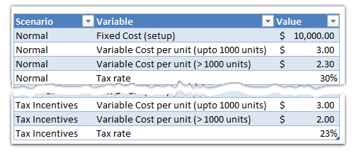
Step 1: Set up various scenarios in a table
You need to define various scenarios in a table, like this:
Step 2: Create a pivot table from your scenario data
Select the table you created in step 1 and insert a pivot table. Use variable name as row label and variable value in value field area.
Step 3: Insert a slicer for the scenarios
Select anywhere inside the pivot. Now, from options tab, click on Insert Slicer button. Click on Scenarios field to insert a slicer.

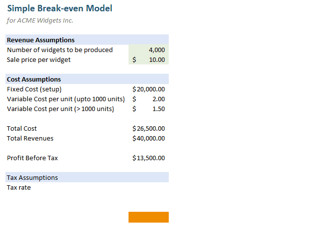
Step 4: Create your model, in our case a break-even model
I will skip the explanation of model creation as that is not relevant here.
Once the model is set up, just refer to the pivot table for each of the variable values.
Step 5: Move slicer to Model
Go to the pivot table worksheet and Select the slicer, click CTRL+X to cut it.
Go back to your model worksheet and paste the slicer.

Step 6: Format the slicer
Excel slicers by default show an option to remove the filtered slicer. You can get rid of this button by,
1) Right click on the slicer
2) Go to slicer settings
3) Un-check Display Header option
See aside.
Step 7: Use the slicer to interactively switch scenarios
That is all, our smart scenario switching slicer is ready. Now, you can extend this in many ways. For example, you can write some clever formulas to handle selection of multiple slicers. You can compare between one scenario and another when more than one option is chosen from the slicer. So much more is possible. But I will let your imagination run wild.
Download Example Excel File:
I have made a simple example to demonstrate this technique.
Please download the file and open it in Excel 2010.
Examine the worksheets “Scenario Pivot” and “Model” to understand how the slicer is setup and how this works.
Do you slice?
As I said, Slicers are my new favorite feature in Excel. I have been using them as much as possible because they are simple to use and very powerful.
What about you? Do you slice often? What is your experience like? Please share your ideas and tips using comments.
More examples on Slicers & Pivot Tables:
1) Creating a Dynamic Dashboard in Excel using Slicers
2) Creating a Dynamic Chart using Pivot Table Report Filters
3) Remove Duplicates and Sort a list using Pivot Tables
4) More on Pivot Tables & Modeling


35 Responses
Chandoo,
Great article on slicers.
Your readers may also like to know that slicers, just like tables, can have custom styles.
Just select the slicer and click the Slicer Tools Options tab from the Ribbon.
Then you can select a existing style, or right-click one of these and select Duplicate. Then you can tweak a huge number of style settings for the slicer.
Cheers,
Daniel Ferry
Excel Hero Academy
Nice work done Chandoo! Slicers seem to be a powerful tool to play with dynamic charts. Will use it. Thanks for such a nice blog- it had helped me a lot with my excel skills!
can it be donwloaded to 2007?
@Jose
Slicers are new to Excel 2010
and so no it won’t work in 2007.
.
I have modified this model to work without slicers, see link: Demo without Slicers
My query is excel 2003 as below:
i want a formula which specify my month addition:
EG:
my date is June/02/11 in one cell
i want date month addition eg.: August/01/11
this for my shelf life of my product
Kindly suggest
@Sujit
=EDATE(B2,2)
will add 2 months to your date if the date is in B2
@hui
i tried this not working
@Sujit
In Excel goto Tools, Addins, and Tick the Analysis Toolpack option
or you can use a formula
=DATE(YEAR(B2),MONTH(B2)+2,DAY(B2)-1)
Thnks
i want an excel format for Sales review
Could anyone help me for the same
@Sujit: Just a polite request of NOT TO hijack the thread. Please post your requests in the forums. You can be assured of a response.
@ Sujit, elaborating on Hui’s first solution
=edate(B2,2)-1
Hello Chandoo,
How do you make those images which show your screen?
http://chandoo.org/img/pivot/using-slicers-to-select-scenarios-demo.gif
Very cool they look. Why tool allows you to capture that into an animated image?
Thanks,
Santosh
@Santosh
The animated pictures at Chandoo.org are Animated GIF’s. They can be made with a number of programs but Chandoo uses Camtasia Studio 7 to capture and process them.
.
Still pictures are PNG Bitmap files which can be captured by a number of packages including the free Snipping Tool provided with Win Vista and Windows 7.
Hi,
Can you give me some basics on how can i measure my sales team performance through a dash board.
Best Regards
Kiran Agarwal
Hi Purna, Your blog is awesome, helps to a great extent for beginners
Purna Chandra Pratapaneni
Value Criteria Category
22 0-25% 0
42 26%50% 0.1
53 51%75% 0.2
79 76%100% 0.3
101 100% + 0.4
I req formula stating criteria [0%-25% output will be 0, 26%-50% output will be 0.1, 51%-75% output will be 0.2, 76%-100% output will be 0.3 & 100% + output will be 0.4]
Please help
I hope the vlookup with relative match by selecting 1 instead of 0 may give u the necessary results
B c
0 0
26 0.10%
51 0.20%
76 0.30%
100 0.40%
=VLOOKUP(B10,$B$3:$C$7,2,1)
Hi Sujit,
=SUMPRODUCT((A1>{0.25,0.5,0.75,1})*0.1)
will give you what you want.
@Kyle
Neat formula!
@ Kyle is not wrking
@Sujit
The formula works great and answers your question as presented
.
Can you clarify not working ?
Error messages?
What input did you use ?
The formula expects that your input is in % or 0.x
eg: 55% = 0.55, not 55
Chandoo,
I just found this article. Great job.
Can you clarify how I could use slicers to compare two scenarios. I have a pivot table showing weekly metrics. How can I use slicers to show the difference between 2 selected dates?
Thanks,
Richard
Hi Chandoo, Can you clarify how to make the slicer filter appear left to right instead of top to bottom?
*M
Very good and useful. I would never have thought of doing that so I am grateful to you for firing my imagination!
duncan
Hi, I have created a brill ( in my opinion 😉 ) dashboard with thanks to this site. My next challenge is, how do I lock down all cells in the dashboard, but still allow use of the slicer and scroll bar?
hoping you can help me !
Very Good Article
Very nice article !!!
I have an issue with pivot table… my date is keep changing month over month. I have table which references the pivot table. How do I not miss any new value added in next month without reviewing. For instance:
Month of Jan – Yankee team scored 12:
Month of Feb – Yankee team Scored 10:
Month of March – Yankee team Scored 1
Month of April – Mets Team Scored 2
Now Mets is new in the list of teams to score and I did not reference in my table.
Suggestions?
thanks, Manu
Hello,
After removing the header….is there an easy way to clear the filter and return all data all over again?
Thank you,
Chandoo rocks, super useful.
Can Controls be tied to Slicers or Pivot Tables in General? For example using a Radio Button to switch between Sum and Count in a Pivot Table Chart. As near as I can tell this can’t really be sliced easily. In a Pivot Table itself its easy enough to do, but my Dashboard has an audience (and its mainly the type of audience that thinks I’m a geek for enjoying sites like Chandoo).
Hi Chandoo
Please give me a lesson to make a dashboard
Hello Chandoo,
I was wondering if there is a method for deciding which variables should become the slicers of a dashboard. Does it vary depending on the business case the Dashboard wants to present?