
 Today is the first anniversary of Excel Conditional Formatting post (Don’t worry, I am not going to make anniversary posts for all the 150 odd excel articles here). This is the most popular post on PHD. The post has 100 comments and bookmarked on delicious more than 700 times. It is truly a rock star post on PHD.
To celebrate the 1 year of teaching conditional formatting to you all, we have a series of posts, the first of which is “What is excel conditional formatting & How to use it?”
What is excel conditional formatting ?
Conditional formatting is your way of telling excel to format all the cells that meet a criteria in a certain way. For eg. you can use conditional formatting to change the font color of all cells with negative values or change background color of cells with duplicate values.
Why use conditional formatting?
Of course, you can manually change the formats of cells that meet a criteria. But this a cumbersome and repetitive process. Especially if you have large set of values or your values change often. That is why we use conditional formatting. To automatically change formatting when a cell meets certain criteria.
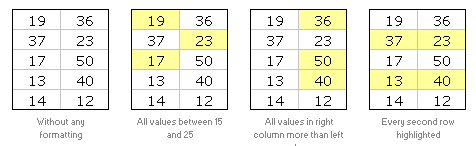
Few Examples of Conditional Formatting
Here are 3 examples of conditional formatting.
So How do I Apply Conditional Formatting?
This is very simple. First select the cells you want to format conditionally. Click on menu > format > conditional formatting or the big conditional formatting button in Excel 2007.
(we have used excel 2003 in this tutorial, but conditional formatting is similar in excel 2007 with lots of additional features)
You will see a dialog like this:
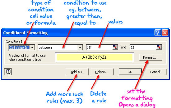
There are 2 types of conditions:
- Cell value based conditions: These conditions are tested on the cell value itself. So if you select a bunch of cells, and mention the condition as between 15 and 25, all the cells with values between 15 and 25 are formatted as you specify.
- Formula based conditions: Sometimes you need more flexibility than a few simple conditions. That is when formulas come handy. Conditional Formatting Formulas are slightly complicated and can be difficult to learn or use if you are new to excel. But they are very useful and intuitive and if you use them once you get a hang of it.
What are the limitations of Conditional Formatting?
In earlier versions of Excel you can only define max. of 3 conditions. This is no longer true if you are using Excel 2007 (read our review of excel 2007)
However, you can overcome the conditional formatting limitation using VBA macros (again, if you are new to excel, you may want to wait few weeks before plunging in to VBA)
Also, you can only use conditional formatting with cells and not with other objects like charts.
Ok, Enough Theory, Time for your First Conditional Formatting
Go ahead, open a new workbook and try few conditional formats yourself. See how easy and intuitive it is. Use it in your day to day work and impress your colleagues. Learn 5 impressive tricks about conditional formatting.
If you have trouble getting started, download the conditional formatting examples workbook.
Tell us how YOU use Conditional Formatting
Share with us how you use CF in your work. I am sucker for conditional formatting and use it wherever I can. What about you?
This post is part of our Spreadcheats series, a 30 day online excel training program for office goers and spreadsheet users. Join today.


82 Responses
My favorite use of conditional formatting is dynamic color banding of rows. I use the formula =ISEVEN(ROW()) as the condition and pick light color for the fill. The result is alternating bands of color, but what is nicest feature is when a row is moved (or inserted), the color adjusts dyanmically so I do not have to reformat the banding manually.
@Steve – Yes, the popular zebra stripes.
I use conditional formatting often to show outliers or potential numbers that are a potential issue. For financial numbers, a negative would be formatted to be highlighted in yellow or bold.
In the past I setup a control total sheet that would alert the reader to a potential issue if a calculated value was outside of a given tolerance. This is one of the less popular but highly effective functions in Excel, in my opinion.
I use conditional formatting in almost each worksheet just to compare which value in two columns is bigger (as shown above). But one thought, more than any other, keeps me awake most nights… Why is not possible (in Excel 2003) to change the font size using conditional formatting? Every time I want to do so (change the font size) I am forced to use macros.
@Steve: I like the zebra stripes very much. However with the new excel 2007 table layouts makes it much more easy to stripe tables of data in whatever format we want.
@Tony: Another very popular use, highlighting outliers, specific set of values…
Once I set up an excel sheet that would play a sound when a particular condition is met (see: http://chandoo.org/wp/2008/08/04/play-sound-when-cell-value-changes/)
@Struzak: yes, that would have been fantastic… but alas, for font sizing you have to rely some script like excel tag cloud…
Hi,
This is a good introduction to conditional formatting in Excel. I was inspired to write something similar after a recent course I presented. Check it our here to learn a more advanced application of conditional formatting and VBA.
http://blog.corality.com/2009/03/vba-and-conditional-formatting-in-excel/
@CHandoo: If you like Zebra stribes, have a look at this cross-cursor application:
http://www.navigatorpf.com/training/tutorials/dynamic-cross-cursor-in-excel-vba
Cheers,
Rickard
I am trying to create a time sheet in Excel that will calculate several different elements of time and cumulate them along the way.
I have figured out the formulas for the DISPLAY, but it still requires me to enter hours even though these are not displayed. I want to be able to ENTER only minutes and seconds, but have it display cumulative time.
If you have a formula or other helps, it would be greatly appreciated.
NEED HELP:
How to do this in excel.
If A1 = 1 then display B2=(20 to 100), if A1=2 then display B2=(50 to 100).
@Kumar: Use a simple CHOOSE formula, like this,
=CHOOSE(A1,”(20 to 100)”,”(50 to 100)”)
It throws an error if the A1 has more than 2.
Hello Fellow PHD’ers,
I write to ask for help with an, hopefully, easy problem to solve. The how to has beaten me I am afraid.
I am using excel to create a project Management tool. I would like our CF friend to highlight any date that has past ( the deadline has been and gone – and its now into overtime!). The colours I can do (pink, much to the distain of the managers); the date I cannot fathom.
I have tried =>Date() -1, >= dateadd(“d”, date(), -1), <Date(), <Now() and nothing seems to work.
I hope what I am trying to do is not unreasonable.
Any help, advice, chocolate will be more than appreciated.
@Marcie… Thanks for visiting PHD and asking a question.
Assuming the project deadline date is in cell C1, select the cell you want to highlight, go to “conditional formating” and select “formula is”, now type =today()>c1 and set the pink color.
Thank you ever so for the response Chandoo :o)
I have tried this in varying ways now
But alas!! It dosn’t seem to work for me.
I have done the following
Conditional Formatting>>New Rule>>Use formula – and entered the info as above.
Although I have more pink than before (which is achievement in itself!), the pink highlight is a weenie bit random. It has highlighted dates such as 15/01/10 and 20/03/10 along with historic dates.
Col D is my date col, and the data rows are 6 to 96. Date format is dd/mm/yy, the dates range from 30/10/09 (ddmmyy) to 31/06/10.
Oh, and I am using Excel 97 if that helps.
Again, any and all help it is welcome – thank you for reading
Kind regards
Marcie
@Marcie.. did you remove the previous conditional formatting rules?
Yes, as this is the only CF I need after each attempt I remove it and start again to avoid any troubles.
🙂
Hello again!
I think I was having a “senior” moment – its all working fabulously now Chandoo, thank you.
However…..
I now have another brain teaser….
Can you set conditional formatting based on another cell referance.
Eg:
I would like Col A to highlight IF Col B has “Task Complete” in it.
I have had a quick scout on the forums – if this already exists my sinecest aoplogies.
Wishing EVERYONE a VERY Merry Christmas – and a lucky 2010!
Marcy xx
Hi there,
I’m attempting to create a conditional formatting time tracker. I would like to track the number of times an event happens at different parts of the day. My team will gather data at various times and enter the times when they were gathering. I want to create a simple means of viewing the data to see what “holes” are left in a 24 hour day. So for example, my column A would be Begin time. Column B is End Time. At the bottom of my sheet I’d like a row labeled 12:00pm, 1:00pm, 2:00pm, etc. for a 24 hour period. I want that row to be conditionally formatted so that as my team enters begin and end times for when they were gathering data, the appropriate cells would be shaded to show that there was data for that time. This way, i could easily locate which time periods in a 24 hour day had data gathered and which didn’t. how should I go about doing this? thanks!
@Marcy.. you can do that using conditional formatting – formulas. Here is a post showing 5 good examples to get started. http://chandoo.org/wp/2008/03/13/want-to-be-an-excel-conditional-formatting-rock-star-read-this/
@Kevin: You can use the gantt chart technique shown in http://chandoo.org/wp/2008/03/13/want-to-be-an-excel-conditional-formatting-rock-star-read-this/ to achieve this. However, you may need to have an additional helper row to calculate some intermediate values.
Hi,
I like CF but I have some doubts.
If you have 10 records, from 1 to 10 and if you apply the Icon set conditional formatting (3 colors), you have from 1 to 3 in red, 4 to 7 in yellow, and the rest in green.
At this point I can assume tha excel takes the 33 % from the values and paint with some color the cell.
But when I change the values (random numbers) I dont understand the criteria that Excel use to decide wich cell use some specific color.
For example: 4,5,5,5,5,6,7,8,9,10
From 4 to 5 is red (5 Cells)
From 6 to 8 is yellow (3 Cells)
From 9 to 10 is green (2 Cells)
Could you explain please the criteria that excel use ?
Thanks
@Trevor: If you go to the conditional formatting > edit rules section, you can findout the basis for icons. By default excel uses 0-33, 34-66, 67+ percentiles (not percentages) to mark the icons. But you can change these to whatever you prefer.
hi there, such great stuff here, thanks! Q – i had a condit format in excel 2003 that is not translating in 2007. i want all dates that are before todays date to be red & bold. i had this format code & tried to paste into a 2007 doc but its not working now 🙁 and i am not smart enough to dissect the whole code myself. this is the code its showing that was in there:
=AND(ISNUMBER(D8),D8<=TODAY())
can anyone help???
thanks!
I am very new to Excel. I am studying Microsoft Step by Step Microsoft Office Excel 2007. I have been studying Excel for about a week now. I appreciate your helpful information/tutorial.
Floyd
Tracy
Have you tried
=D8<=TODAY()
and make sure that the cell D8 has a valid date in it
Hi,
I use CF to highlight the cell that contains the date for reaccuring health(audiogram) and qualification(firewatch) expirations in my health and training matrix.
I have a total 20; and the data set reads (5,10,15,19,1, 10) I need a formula which will highlight the numbers that sum to the total number =”20″. There are different combinations so first it should point out the combinations
Hi Chandoo,
I have Excel 2010 and am having difficulty using conditional formatting to format rows based on the value in a cell. For example, I have data in columns A1:D7, and in column D1:D7 I have numbers that can be positive, negative or zero. What I want to do is highlight each row based on the value in column D. The only way I’ve found that works is to right CF for each column but it seems there must be an easier way. Can you show me another more efficient way?
Thanks, Grace and Peace,
JRM
@Jeremiah
Select the area A1:D7
Goto the Home Tab, Conditional Formatting (CF) and Clear Rules, Clear rules from Selected Cells
Got the Home Tab, Conditional Formatting (CF), New Rule, Use a Formula
Enter the formula =$D1=1
Set your format
Apply
.
You can add other formats by following the last 4 steps
.
Goto the Home Tab, Conditional Formatting (CF), New Rule, Use a Formula
Enter the formula =$D1=2
Set your format
Apply
.
etc
.
remember you can use the >, < and + to make other combinations of ranges
eg: Enter the formula =$D1<=0 to huighlight all rows where D1 etc is <=0
.
Excel will automatically adjust the CF for the Ranges in rows 2:7
Thank you so much. Your help was invaluable to me. I poured over this and was not getting anywhere. The Excel help didn’t do an adequate job of explaining this feature either. Again, I thank you for your help.
Column A=Sales Rep, Column B=Items, Column C=Sold Qty
I need individual record (each Sales Rep, each item ,total sold qty)
@Abdulali
Have you tried a Pivot Table
http://chandoo.org/wp/2009/08/19/excel-pivot-tables-tutorial/
Thank You,
Exactly Sir, but i need report from multiple sheets
I using issuing material in sheet 1,receiving materials in sheet 2 then i need what is the balance materials should be received from issued party
Thank You …..Mr.Hui,
Last 15 days I asked several people watched online no one told exact answer. You told about pivot table I made something …wow I got exactly what I expected……Thank You So Much…Mr.Hui
abdul ali
Cell A2:A10,If value is greater or lesser than zero cell colur should be changed
I too have a favorite use for conditional formatting.
I track my stocks and options gains and losses using conditional formatting to color the row either Green for gains and Yellow for losses. It works great.
Grace and Peace,
JRM
Hi JRM,
I know you know the answer to my question.
Column A has a % and Column B has a %
If the number in column A is greater than or = to 10% below the number in column B then the cell should be yellow
If the number in column A is = or greater than the number in column B the cell should be green
If the number in column A is 11% below the number in column B the cell should be red
I’m new to the advanced features of Excel. I appreciate your help. Believe it or not if you can answer this question you will be saving a lot of tax dollars, I appreciate your time and expertise.
J
Your faith in my Excel abilities is scarey knowing those tax dollars are at stake.
Anyhow, here’s my best shot at answering your question:
These conditions are my understanding of what you asked –
Assume that the data in column A begins in row 2 (for no particular reason).
A2 >= 0.9*B2, color the cell yellow if this is true
A2 >= B2, color the cell green if this is true
A2 < 0.89*B2, color the cell red if this is true
I believe you should have set the third condition as follows,
A2 =0.9*B2
=A2>=B2
=A2<=0.89*B2
If you want, I can send you an example file where I played around with all types of variations of conditional formatting. You can reach me at jminifie@yahoo.com
Sir,
I am trying to highlight dates that are older than six months in a column. Please assist? Thank You!
Select the Column, I’ll assume it is Column A
Goto Conditional Formatting
New Rule
Use a Formula
=AND(A1>0,A1<=TODAY()-182) Select a Format Apply
Hi guys,
I have a conditional format for a GANTT chart that I can’t seem to manage… I tried, but would appreciate if someone could show me my error. Any possible takers?
Thanks!
A1=9
B1= -4
CI= 9
That means if the cell value of AI,Bi or less than 0, consider as o value
@Abdulali
I’m not sure i follow your requirements but I assume you want something like:
=If(or(A1<0, B1<0, C1<0),0,a1+b1+c1)
Hai Mr Hui,
That is correct,but I need exact value
A1=5
B1=7
C1= -4
D1= 12
Please support me
regards
ali
Hai Mr Hui,
That is correct,but I need exact valueA1=5B1=7C1= -4 N1= 12….. Sum(A1+B1+C1) Please support meregardsali
@Sali
So rearrange the formula I gave you
=If(and(a1=5,b1=7,c1=-4,n1=12),sum(a1:c1),0)
Inconditional format ,If the cell value is less then 0,consider as 0.
Exp
A1=7
B1=8
C1=-5
Di=sum(A1:C1)
Exact Value is 10
But I need..15..Please solve my problem
Okay, I have a question. I need to compare six columns H9:M9 and the one with the most recent date, I need that field to turn yellow. The columns can also be blank or contain NA, which can be ignored. Can anyone tell me how to do this? Thanks!
Help! I’m having difficulty with my conditional formatting. I have two rows of data, both of which have come from sources outside of Excel. I’ve applied the Highlight Cell rules to try to find duplicate data, but nothing shows up even though there are definitely duplicates. I’m sure this is a formatting issue…any suggestions?
@Danielle
Check two cells that look similar
Select the cells and check for leading or trailing spaces
If they are number increase the decimals to say 10 or 15 decimal places
Can you post a sample file: http://chandoo.org/forums/topic/posting-a-sample-workbook
would like to see an example of conditional formatting using REAL date NOT the today(), Date(), Now()
If $a2 > 05/22/2012
Every manual, help page, book only shows comparing to TODAY which most of us never do because we need to highlight something specific.
Thank you
Hi, trying to make the gannt chart, did it and works perfect for one set of star end data. However I have multiple start end data, will you please help me add other sets of data. thanks.
Hi, great source of knowledge! I’m having a couple of issues with Conditional Formatting that I need help with. I’m trying to identify the outliner for M3, O3, Q3, S3 (N, P, R are hidden fields contaning text) and change color of field according to the following rules:
1 std dev above average for =$M$3:$S$3
1 std dev below average for =$M$3:$S$3
My questions are:
1. Why does a row with M3, O3, Q3, S3 all containg the value 5 flag as above average?
2.How can I effectively format hundreds of rows? I have tried numerous methods and the only one working is Format Painter row by row.
Thanks,
@Andy
can you post or email me a sample file ?
Hi,
Great stuff about CF, every time i visit Chandoo.org i get very new things.
Thanks Chandoo
I need to conditionally format a due date field so it appears as red, yellow, or green base on today’s date vs due date
Can any body help in solving below problem .
Example:
Items: Contractor Rate : Estimated Rate : % below/Above(estimated)
Brick : 6000 : 5600 : 7.14 % (above)
Cement: 600 :900 : 33% (below)
No what i need that applying conditional formatting in such a way that cell color appears read if percentage in below/above 15% and no color if it is not the case
@Kalim
Please ask a question at the Chandoo.org Forums and attach a sample file at:
http://chandoo.org/forum/
HI All,
I need help on the below scenario.
I have values in a column LIke 2500 5400 1700 6300
and i have value like 7900.. i need to find out this 7900 belongs to which total of the values in column(2500+54000)
Please help me on this.
Have a data in the form given below
Last Year Current Year
A 50 51
B 45 42
C 53 58
D 41 45
State Avg 47.25 49
Need to apply conditional format using 4 rules:-
Current year below state average below last year
Current Year below state average above last year
Current year above state average below last year
Current year above state average above last year
what r the advantage & disadvantages of conditional formatting
Hi
I am struggling a bit to find the appropriate formula for my Risk Management document. Let’s say I want to Change the Risk Level (Low = Green; Medium = Yellow; High = Red; Very High = Black) based on the Likelihood (Highly Unlikely; Unlikely; Likely; Highly Likely) in combination with the Severity (Minor; Moderate; Major; Critical), for different Risk entries, HOW do I put together a formula for that?
E.g. (1) Highly Unlikely & Minor should indicate a Green cell with a Low result… (2) Highly Likely & Critical should indicate a Black cell with a Very High result… etc.
Can you PLEASE assist me?
Hoping someone can help me? I have a staff roster that I’d like to work out how to do conditionally formatting in. Its a matrix – dates across the top, shifts down the left, staff ID number in the intersecting cell, signifying the shift they are rostered for.
Our team has grown significantly, so the roster has also. I would like to put a field at the top of the roster where staff type in their ID number and it highlights every occasion they are rostered for.
How do I do this??
@Mika
Can you please ask your question in the Chandoo.org Forums
https://chandoo.org/forum/
Please attach a sample file to get a better solution
It’s fun to know in what all ways Excel helps us in analyzing our data. I also read in an article about the If Statement and the VLOOKUP function of Excel and must say that there is a lot that Excel offers us and a lot to learn and practice.
Thank you for sharing this article. Keep up the great work!
Hi
I am presently using conditional formatting to Highlight Rows and Columns from the Active cell position to set lengths.
This is working fine, but there are times when I just want no Highlighting which I can switch off using a No Format and stop if true setting.
What I am having a problem with is to just have either the Row or the Column Highlighted. There are times when I just want the Row Highlighted, and times when I just want the column highlighted.
I have searched and have tried so many ways of doing this but to no avail.
Maybe you have a way.
John
Sir, I want to learn enter into data analytics career stream, am an MBA graduate with Marketing as primary subject, though am MBA non technical person learned digital marketing and working for google as of now as a associate with cognizant payroll. Now am currently looking for career change, I want to learn data analytics. am seeking an advice for my career change, will moving into data analytics career do I need to learn R and Python ?
Can I get jobs in future without R and Python in this career stream please advice me.