
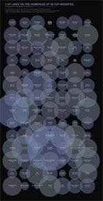
 In How Many Links are Too Many Links, O’Reilly radar shows us this unfortunate bubble chart. (click on the image to see a bigger version)
I say unfortunate for the lack of a better word without sounding harsh.
Just in case you are wondering what that chart is trying to tell (which is perfectly fine)
Nick Bilton, who constructed this chart, got curious and went to the top 98 websites in the world and found out how many links they have on their home page. Then he used charting tools like processing to create the bathing bubbles you are seeing aside.
The conclusion ?
Too many bubbles can drown you. And also, top web sites have lots and lots of links on their home pages.
But seriously, apart from looking really pretty, does this chart actually provide that conclusion?
I think Nick and the O’Reilly radar team could have much better with a simpler and fortunate chart selection.
A histogram of # of links on popular home pages
like the one below would have been very easy to read and get the point.
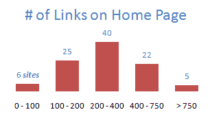
I showed some dummy data in the histogram, but when you create 2 histograms, one for popular sites (ranked below 5000) and one for not-so-popular sites (>5000) you can easily make the point and use the bubbles for a warm bath.
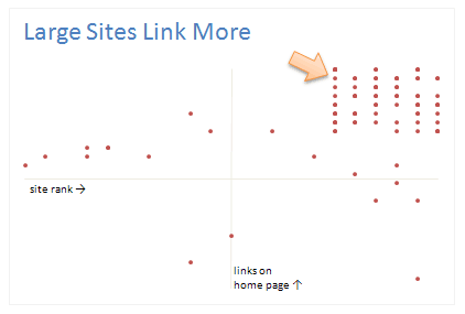
A better alternative is to show a scatter chart
with site rank on one axis and # of links on home page on another axis, that way a conclusion like Top Sites Links More can be easily established.
Even a bar chart with number of links on each home page
could have been better than umpteen bubbles
You could easily add a bar with “avg. number of links on non-popular sites” to contrast the linking behaviour of large sites wrt small sites.
But alas, we are treated to an unfortunate bubble chart that does nothing but look pretty (and ridiculously large)
What do you think ? How many bubbles are too many ?
Recommended Reading on Bubble Charts: Travel Site Search Patterns in Bubbles, Good Bubble Chart about the Bust. Olympic Medals per Country


8 Responses
Oh, the irony, it says this on the drown me chart, “the data set explores the online information overload we face on a daily basis.” By that, I imagine Nick means the information overload from bloated infographics suchs as Nick’s masterpiece on information overload.
@Jimmy: you bet.
@Jon: I Did, there are other faults too, like the lack of meaning of the position of the bubbles or overlap or why they are colored so. but then I could rant forever 😀
Did you notice the bubble chart sized its bubbles by diameter, not by area?
Even zillions of bubbles can add value, if they supply a little lagniappe in a scatter chart whose two axes are already used. The creator of this chart did nothing with the two dimensional space available, except arrange the names in alphabetical order in a rectangle. That’s a waste of two good dimensions, for a premature resort to what should be the third, optional, dimension.
Jon, sized by diameter *and* using “Alabama first” sorting? Were they trying to demonstrate every bad graph cliché in one graphic?
Remember “How high is too high!”? LOL
Is this list the top 98 news websites? I do not see a lot of websites I would expect to see (Facebook, YouTube, Google, Yahoo…etc). http://www.alexa.com/site/ds/top_sites?ts_mode=lang&lang=en
Your alternative histogram seems a bit misleading because the group sizes are not consistent. Every group should be 100 links, for example: 0-99, 100-199, 200-299….etc. I would favor the histogram approach.
Thoughts?
@Abdulazzi: I agree, this is not the 98 sites, but just 98 of the top 5000 or so sites. And a very good suggestion on the histogram. I agree that link counts should be in meaningful groups for the histogram to make sense. I will keep this in mind 🙂