Market Segmentation Charts using Conditional Formatting

Share

Facebook
Twitter
LinkedIn

Trust Peltier to come up with solutions for even the most impossible looking charts. Today he shares a marimekko chart tutorial.

What in the name of unindented VBA code is a Marimekko Chart ?

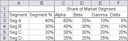
It is a variable width stacked chart. It is a good way to depict how various segments have performed wrt a set of products, essentially a market segmentation chart. See a sample chart that Jon created to the right.

I couldn’t sit still after seeing his post. So here comes market segmentation charts or marimekko charts using, <drum roll> conditional formatting.

See it for yourself, a market segmentation chart drawn in a 20×20 range of cells.

Here is a brief tutorial on how I created this. With little time and a strong coffee you can build a market segmentation chart too.

1. Adjust the data of your market segments and products

While Jon’s data (image) is oriented such that products are in columns and segments are in rows, I created the below structure as it directly maps to how the chart is drawn (segments in columns and products in rows)

Product and Segments Data for your Market Segmentation Charts

I have derived the below table using formulas. It uses the number 20 (which is the size of one side of our conditional chart) and some rudimentary formulas to derive the numbers 0,8,14,18 from 40%,30%,20%,10% and so on. How ? Now would be the good time to take a sip of that strong coffee and think hard looking out of the window.

2. Create a simple 20X20 grid and start writing formulas

Ok, this is the tricky part. Ideally when the chart is ready we want to have 4 colored regions in each of the 4 segments (this can change if you have more products or more segments). Imagine you were to just write numbers in that grid such that for first product we write number “1” in each segment cells and second product, number “2” so on. Then, color all 1s, 2s, 3s and 4s differently using conditional formatting, then this is how it would look.

Market Segment Chart - Raw

Now, we need to just figure out a simple formula that can automatically determine whether to output 1 or 2 or 3 or 4. ENTER THE STRONG COFFEE (or your favorite drink), slurp, slurp…

Ok, did you see those running numbers in the first column and row ? Good, We need to use those numbers to figure out certain things for us.

I have written the following formula in first cell in the 20×20 grid and copy pasted it all over the range.

=CHOOSE(MATCH(I$4,$C$13:$F$13,1), MATCH($H24,$C$14:$C$17,1), MATCH($H24,$D$14:$D$17,1), MATCH($H24,$E$14:$E$17,1), MATCH($H24,$F$14:$F$17,1))

What is it doing ? It is checking which segment the current cell belongs to by matching the top-row number with derived table’s first row (0,8,14,18). So for cell 1 this would be 1, for cell 12 this would be 3. Then, CHOOSE formula uses this information to determine which MATCH formula to run, there are 4 match formulas, each for one segment. All of them check the first-column running number with product-wise start numbers derived in the table 2 above. Slightly lost? Well, me too. Sip once more and read from beginning until it makes some sense.

3. Finally, apply the conditional formatting

Ok, now select the 20×20 grid and apply conditional formatting. Since I have created this in Excel 2007, I could define 4 rules, one for each number. But You can do similar using Excel 2003 (just define 3 rules, one for each number and apply 4th color to the entire range)
Conditional Formatting Rules - Excel 2007 - Market Segmentation Charts

Custom Format Code for Making Cells Invisible - Microsoft Excel
Also, hide the cell contents in the 20×20 grid by applying custom format code like this.

Thats all, you are now all set to show off your market segment chart. Go flaunt.

Download the market segment charts template and play around. [Excel 2007 File]

Facebook
Twitter
LinkedIn

Share this tip with your colleagues

Excel and Power BI tips - Chandoo.org Newsletter

Get FREE Excel + Power BI Tips

Simple, fun and useful emails, once per week.

Learn & be awesome.

Welcome to Chandoo.org

Thank you so much for visiting. My aim is to make you awesome in Excel & Power BI. I do this by sharing videos, tips, examples and downloads on this website. There are more than 1,000 pages with all things Excel, Power BI, Dashboards & VBA here. Go ahead and spend few minutes to be AWESOME.

Read my storyFREE Excel tips book

Overall I learned a lot and I thought you did a great job of explaining how to do things. This will definitely elevate my reporting in the future.
Rebekah S
Reporting Analyst
Excel formula list - 100+ examples and howto guide for you

From simple to complex, there is a formula for every occasion. Check out the list now.

Calendars, invoices, trackers and much more. All free, fun and fantastic.

Advanced Pivot Table tricks

Power Query, Data model, DAX, Filters, Slicers, Conditional formats and beautiful charts. It's all here.

Still on fence about Power BI? In this getting started guide, learn what is Power BI, how to get it and how to create your first report from scratch.

31 Responses to “Beautiful Budget vs. Actual chart to make your boss love you”

  1. Harry says:

    Would be considerably easier just to have a table with the variance shown.

  2. Jomili says:

    On Step 3, how do you "Add budget and actual values to the chart again"?

    • Chandoo says:

      There are a few ways to do it.

      Easy:
      1) Copy just the numbers from both columns (Select, CTRL+C)
      2) Select the chart and hit CTRL+V to paste. This adds them to chart.

      Traditional:
      1) Right click on chart and go to "select data..."
      2) From the dialog, click on "Add" button and add one series at a time.

      • Neeraj Agarwal says:

        One more way to accomplish it is just select the columns into chart. Press Ctrl+C and then press Ctrl+V

        Regards
        Neeraj Kumar Agarwal

  3. TheQ47 says:

    Unfortunately, this doesn't seem to work for me in Excel 2010. The "Var 1" and "Var 2" columns cannot combine two fonts to display the symbol and the figure side-by-side.
    Secondly, there is no option to Click on “Value from cells” option when formatting the label options. The only options provided are Series Name, Category Name or Value.

    • Chandoo says:

      @TheQ47... the emoji font also has normal English letters, so if you use that font, then you should be ok. I am assuming your computer doesn't have that font or hasn't been upgraded for emoji support.
      Reg. Excel 2010, you can manually link each label to a cell value. Just select one label at a time (click on labels, wait a second, click on an individual label) and press = and link it to the label var 1 or var 2.

  4. Neeraj Agarwal says:

    I am using excel 2010, please explain how to apply Step 12

    Regards
    Neeraj Kumar Agarwal

  5. mariann says:

    Hi Chandoo,

    I just found your website, and really love it. It helps me a lot to be an Excel expert 😉

    Currently I am facing with a problem at step 11:
    Var1 Var2
    D30%
    A5%
    B0%
    B4%
    B7%
    C10%
    C13%
    D27%
    I42%

    Though at mapping table, I used windings, here formula uses calibra. How I can change it? I am able to change only the whole cell. In this case numbers will be Windings too.

    Thanks for your help!

    • Chandoo says:

      Hi Mariann... Welcome to Chandoo.org and thanks for your comment.

      If you wanted to use symbols from wingdings and combine them with % numbers, then you need to setup two labels. One with symbol, in wingdings font and another with value in normal font. Just add the same series again to the chart, make it invisible, add labels. You may need to adjust the alignment / position of label so everything is visible.

  6. […] firs article explains how you can enhance your charts with symbols. You can simply insert any supported symbol into your data and charts. To some extend you can […]

  7. Franciele says:

    You're a good person, thank you to share your knowledge with us, I will try to do in my work

  8. Ali says:

    Great visualization of variance. My question is that is this possible in powerbi?

    How would you go about it?

  9. NARUTO says:

    HELLO, WHY CANT I FIND VALUES FOR LABELS IN EXCEL 2013

  10. Amol says:

    Dear chanddo sir,

    What to do if we have dynamic range for Chart. How this will work. can you able to make the same thing works on dynamic range.

  11. Ricardo says:

    Sir Chandoo,

    Good Day!
    First, I'd like to say that I am very grateful for your work and for sharing all these things with us.

    I tried to do this chart but it seems that the symbols don't work with text (abs(var%),"0%") unless we keep the Windings font style.
    The problem is, it converts the text into symbol as well and you wont see the 0% anymore. I'm using Windows 7.

  12. MF says:

    WOW - Segoe UI Emoji
    This is the greatest discovery for me this month 🙂 Thanks for sharing.

    Here's my two-cents:
    https://wmfexcel.com/2019/02/17/a-compelling-chart-in-three-minutes/

  13. Renuka says:

    Sir This is awesome chart, and very easy to made because of your way to explain is very simple , everyone can do. Thank you

    one problem i am facing, I hv made this chart , but when i am inserting data table to chart it is showing two times , how can i resolve this

  14. renuka says:

    in this chart when i am adding new month data for example first i made this chart jan to mar but when i add data for the apr month graphs updated automatically but labels are missing for that new month

    • Chandoo says:

      Hi Renuka,

      Please make sure the formulas for labels are also calculated for extra months. Just drag down the series and set label range to appropriate address.

  15. Justine says:

    So I am playing with the Actual chart here - but amounts are bigger than your - you have 600 as Budget - my budget is 104,000 - is there a way to shorten that I am unaware of

    thank you - I LOVE YOUR SITE

  16. Arvind says:

    Thanks for the tips and tricks on Excel. In the Planned versus Actual chart examples, you use multiple values (ex. multiple Categories in above). How can this be done when we have only 1 set of values? For example if I have only this:
    Planned Actual
    SOW Budget 417480 367551

    How can I create a single bar chart like the one above?

  17. JEREMIAH KOOL says:

    Thank you Chandoo.
    This one is just perfect for my Quarterly Review presentation on Operational Budget against Actual Performance for the Hospital I'm currently working with.

    Just Subscribed today (10 minutes ago)

  18. Shawn says:

    Is there a way to make the table of data into a pivot table to be able to add a slicer for the graph due to many different categories and months?

  19. Mihail says:

    Hi, I tried to modify you template with something appropriate for me, and I found a problem. this template was modified by me started with excel 2010, then 2016 and finally 2019. Same thing - somehow appear an error - or didn't show the emoticons for positive percentage or doubled the emoticons for some rows. I suspect to be from excel. if is need it I can sand you my xlsx for study. Please help if you can.

  20. Saidatta Pati says:

    Hi Chandoo,
    Could you please check the Var Formula in Step1. You have mentioned budget-actual and when i did this i got different values but when reversed like actual-budget i got the actual value what you have demonstrated in step1.
    Please share your view.

  21. Dan says:

    This is a great chart (budget vs. actual). However, in trying recreate it, I cannot color in the UP Down bars individually, and they all become formatted with the same color. I'm using Office 365. Look forward to the feedback.

    Thanks.
    Dan

  22. sathik says:

    pls explain in detail step 7

  23. Arun says:

    While in the Excel sheet you have used following formula for Var
    Var = Actual - Budget
    But
    in the note, you have written
    Var = Budget - Actual

  24. aye myat maw says:

    Good Presentation and Data information.thank you so much chandoo.

Leave a Reply