
One of the annoyances of charts is that they all look like boxes (except for pie charts, they just look wrong). Boxes might be ok when you are making 1 or 2 charts. But a whole dashboard of boxes can look little rigid. So how can we make the charts peppy without loosing any effect? Like these charts below:
![Use Shapes and Images make Prettier Charts [Dashboard Tricks]](http://chandoo.org/img/c/pretty-charts-with-shapes.png)
Very simple, we use drawing shapes in MS Excel to draw whatever we want and overlay the chart on top.
See this 3 step tutorial.
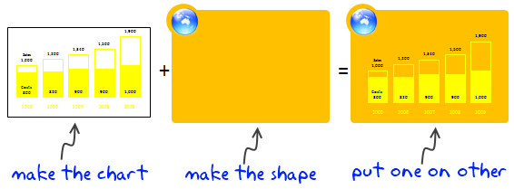
Step 1: Make the chart
This is simple, just make the chart and remove the background color. Also adjust series colors so that they look good when you combine the chart with drawing shape.
Step 2: Make the drawing
Go to Insert > Shapes (in excel 2003, select drawing toolbar and draw a shape) and insert some shapes. Arrange them so that you get desired effect.
Step 3: Put Chart on top of Drawing
This is simple. Just drag the chart on to the shape (s). If needed “send shapes to background”. That is all.
Download Example Charts
Click on these links to download example charts – Excel 2007 | Excel 2003
There are millions of possibilities when using shapes. Try something new for your next dashboard or report.
Note: Shapes can add clutter if you overdo them. Remember, the purpose is to let readers focus on the chart, not on shapes.
Additional material on excel dashboards.


6 Responses to “Using Lookup Formulas with Excel Tables [Video]”
H1 !
this is my very first comment.
Can you use same technique with Excel 2003 lists ?
thanks 😀
Thanks, Chandoo! I like seeing the sneak peak of what's to come on Friday too 🙂
@Damian.. Welcome to chandoo.org. Thanks for the comments.
Yes, you can use the same with Excel 2003 lists too.
@Tom.. You have seen future and its awesome.. isnt it?
[…] Using Tables – Video 1, Video 2 […]
[…] Using Tables – Video 1, Video 2 […]
Hi, is there a vlookup formula for the second example (IDlist)? I used a similar formula to look up the ID for the person, but the reverse way (look up the person with the ID) comes up N/A.