
During a recent training program, one of the students asked,
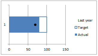
Thermo-meter charts are very good to show how actual value compares with target (or budget). But how can we add another point for say Last Year value to the chart with out cluttering it.
Something like this:

Sounds interesting? Read on.
Step 1: Create a bar chart from your data
Assuming you have data like this,
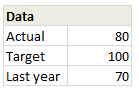
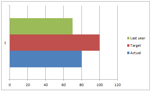
Select and create a bar chart from it. We need 3 bars (in different colors). If needed, use the Switch Rows / Columns button from Chart > Design ribbon. Once done, you should have something like this:
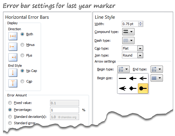
Step 2: Add Error bar to Last year series
Select the last year series & Add % error bar. Now, select the error bar and press CTRL+1 to format it.
- Set error percentage to 1% (for smaller chart sizes, you need 2 or 3%)
- Remove error bar caps.
- Go to line style and set begin style as a dot
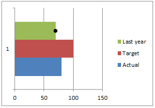
At this stage, your chart should look like this:
Step 3: Overlap series & Remove fill colors
This is easy. Select any series and press CTRL+1 to format it. Set series overlap to 100%.
Then select last year series and set its fill color to none.
Select Target series & set fill color to none.
Set outline to the same color as actual series and make line thickness as 1 pt.
Step 4: Clean-up
Finally, remove legend, grid lines, axes and re-size the chart.
Congratulations! you have just made a custom thermo-meter chart.
Download thermo-meter chart template
Click here to download the workbook & play with it. Examine how the chart is made and see what additional customizations can be made.
Do you use Thermo-meter charts to compare actual with targets?
I think thermo-meter charts are the easiest way to compare actual with target. I use them often in my dashboards & reports.
What about you? what kind of charts do you use to compare actual with target (or budget) values? Please share your techniques and ideas using comments. Go!
Compare Actual with Target values? Check out these
Please see these articles to learn how to compare actual with target values.
- Best charts to compare actual vs. targets
- Budget vs. Actual charts – 14 variations
- Using form controls to interactively compare
- World education rankings – interactive comparison chart


54 Responses to “6 Tips for Writing Better VLOOKUPs”
Hi, I am loving the VLOOKUP series this week. 🙂
Could you please expand a little on why you don't recommend using 1 or 0 in place of true or false? I am in the habit of doing this.
"You can even omit the last argument if it is 0"
Excel's default for the last argument is TRUE. Because of this, it's dangerous to omit the last arguement. I would use either FALSE or 0. Never omit if you want an exact match.
Nice series, Chandoo!
.
Your readers may be interested to know that the quickest formula method to do lookups in Excel is an array-entered INDEX.
.
This is one of the many topics covered in the Excel Hero Academy:
Excel Hero Academy
.
Regards,
Daniel Ferry
Excel Hero Academy
Dear Daniel,
I had used index-match with absolute reference for the ranges but when I am resorting the table the formula is not recalulating the lookup value combination.
Regards,
Anish Menacherry
@Anish
Can you post the question at the Chandoo.org Forums
http://chandoo.org/forum/
Please include a sample file so we can review the issue
1. Never use VLOOKUP/HLOOKUP - Always use Match /Index
2. Sort your data before performing a Loookup
3. Use 1/-1 option Match as it is at least 10 times faster than the 0 option- But modified to perform an exact match rather than an approximate match as described below
a) A Column containing a Match Fucntion to Find the Position with the 1/-1 option
b) A Status column containing a Index to check the status (present/not present)
c) Multiple array entered Index colums to pick
In tip number 5 you state, "you can even omit the last argument if it is 0" which is not correct. If you omit the last argument, Range_Lookup, is TRUE, as Mike Alexander points out.
Excellent series - Need some help from the expert. how easy it is to add/expand a named range in a lookup formula?
@Mike & Gregory: I am sorry for the confusion. The formula =VLOOKUP(value, range, column #) assumes last argument as TRUE.
Where as the formula =VLOOKUP(value, range, column #, ) assumes last argument is blank or empty which internally gets treated as 0.
And that is what I mean by you can even omit last argument. I state that "Remember, you must place a comma (,) after the column number if you are planning to use this." otherwise, this will not work.
@Andrew: I suggest not using 0 or 1 as they are more cryptic and lead to confusion when your spreadsheet gets to someone else's hands.
@Daniel: Thanks for that.
@Sam: Good tips. I would just add that using VLOOKUP / HLOOKUP is ok as long as they solve the problem you have and do not take too much time. The performance improvements you get with array entered index or other techniques are minimal when dealing with small and moderately sized data sets.
@Sundeep
Very easy
Have a read of: http://chandoo.org/wp/2009/10/15/dynamic-chart-data-series/
Particularly Point 3. Create a new named range and type OFFSET formula
@Hui - Thanks.
If I have a large workbook with many Vlookups and if I change the range to named range...is there an easy way to change all the formulas? It is more of wishful thinking than a question 🙂
@Sundeep... You can use Apply names from formulas ribbon to apply names to a selected range. This technique works when the ranges are mapped to static references. Dynamic refs. thru OFFSET are bit more tricky.
You can use the find / replace to automatically replace all $A$1:$C$1000 with dynamic range lstData. See this: http://chandoo.org/wp/2009/02/17/spreadsheet-formulas-edit/
@Sundeep
On the Formulas Tab, Click on the Drop Down on the Define Name button and select Apply Names
Select one or all Named Ranges and apply
Excel will go through your worksheet/s and change the Ranges for Named Ranges.
i cannot believe i missed the new to 2007 formula "IFERROR". your mention of this will help reduce the number of characters in many formulars i use (with "ISERROR") by at least 40% along with commensurate reductions in spreadsheet size and calculation speed... not to mention future reduction in typing and debugging time in formulas. thank you. and thank excel.
Newbie here.
I am not able to understand the Tip#1. Use of "val", "tbl". I tried and it kept on giving error.
Chandoo's Tip#1: =VLOOKUP(valSalesPerson,tblData,3,FALSE)
Does it need column headings? And how do you l lookup the value I am looking.
Thanks in advance.
[...] 6 VLOOKUP Tips [...]
[...] VLOOKUP, INDEX, and MATCH: Useful for looking up any text values [...]
I need some help with creating a formula. I have a list of names on tab 1. (About 20) On tab 2 I have a list of names and there total sales (About 3,500) I created a name range for both the first list of names on tab 1 (Producer) and a name range for the second list on tab 2 (Agent_List) The sales on tab 2 for each producer is in the 7th colume.
I need the formula to identify name of Producer (Tab1) from the Agent_List and then choose the total sales for that producer.
This is the formula I put together and I only get #REF!
VLOOKUP(PRODUCER,AGENT_LIST,7,FALSE)
@JimH
I assume you are adding a column next to the Agent_List on Tab 2 and looking up values from the Agent_List and retrieving values from the Producer list
.
So the format for your equation will be:
=VLOOKUP(A2,Producer,7,FALSE)
or
=VLOOKUP(Agent_List,Producer,7,FALSE)
.
Note that the named range Producer must be at least 7 columns wide, not just Column A or you will get the #REF! error also
Hi
Can anyone please help or this totally impossible in excel? I am trying to do a vlookup with a range of cells that contains "comments" in them and unsuccessful.
Thank you
@Lala
You cannot search within comments unless you use VBA
My tips are:
Pay attention to data types - no fly if mixing text and numbers. I run into this problem a lot with files downloaded from access that have a tendency to mix data types on me when it hits excel.
Pay attention to $ - If pulling from the same workbook, $ won't auto fill on your range and you will potentially miss hits.
Yeah, the data type mixing has bitten several folks I work with in the rear.
EG: I work at a company where marketing source codes are 10-alphanumeric. But, some codes are like "12345" while others are "123abc". When access or sql dumps to excel, the numerical ones convert to numbers while the text ones stay text.
So, what I do is create a reference column next to them in which I do a =TRIM([column]). Trim not only removes front/back spaces, it converts a value to text data type. This is useful, b/c sometimes sql db admins will store data with a fixed string length (eg: a column may get stored as char(50), which means it will have 50 chars no matter if it has to add extra spaces at the end to pad it out.) When you dump this to excel, the extra spaces remain at the end. So, the Trim command not only converts numbers to text, it removes padded spaces at the end. Very useful when working with sql dumps.
I have two sheets, in first sheet i have given a criteria of month (like jan, feb), then on another sheet i have month wise sheet like
jan feb mar
a 2 5 8
b 5 9 8
c 9 12 89
now i need in first sheet if i give criteria jan then answer is 2+5+9, or if i give feb then answer is 5+9+12 and like that, how to get that??
I am pretty well versed in VLOOKUP but I have a challenge I can't figure out. When I complete the VLOOKUP in one cell, it works fine. When I drag the formula down (using $ where necessary) the value from the first LOOKUP populates in the new cell. If I double click on the cell and hit 'enter' then the correct value is pulled in from the vlookup. Any suggestions why the formula isn't executing correctly until I hit enter?
@Nicole
It sounds like Calculation is set to Manual
Goto the Data Tab Calculation and set it to Automatic
Absolutely FANTASTIC!! Thank you so much. Slight variation on my version of Excel. I had to go to Formulas Tab then to Calculation sub-tab, Calculation Options, change setting to Automatic. Thank you thank you thank you. Saved me hours of more frustration!
[...] than maybe sorted, which it usually is anyway).Use COUNTIF or MATCH to speed up calculationAs many others have pointed out, VLOOKUP returns #N/A if the lookup value is not found. Instead of using a [...]
I have more than 2 columns in a table I'm so confused cuz the results i get is #N/A =(
I have a 2-sheet database. Sheet 2 has a list of Accronyms in column A and their description in column B. On sheet 1, column A is where you input your Acronym. In column B, the formula takes Acronym from column A, looks it up on sheet 2, and displays it on column B.
After some research, I found how to make custom text if there is not a match on the Acromyn. The question i have is, is that when there is no text in comumn A, sheet 1, column B, sheet 1 displays my custom text "ABBREVIATION NOT FOUND". I'm trying to write a forumla that leaves column B blank unitl there is an input in column A.
This is my current forulma:
=IF(ISNA(VLOOKUP(A4,Description!A:B,2,FALSE)),"ABBREVIATION NOT FOUND",(VLOOKUP(A4,Description!A:B,2,FALSE)))
Any help out there?
Thanks,
Jerome
Hi Jerome... Thanks for your question. Try this formula instead:
=IF(A4<>"", IFERROR(VLOOKUP(A4,Description!A:B,2,FALSE),”ABBREVIATION NOT FOUND”), "")
Works in XL 2007 or above. For older versions use this:
=IF(A4<>"", IF(ISNA(VLOOKUP(A4,Description!A:B,2,FALSE)),”ABBREVIATION NOT FOUND”,(VLOOKUP(A4,Description!A:B,2,FALSE))), "")
Btw, to learn more about IFERROR see this: http://chandoo.org/wp/2011/03/11/iferror-formula/
I have 2 worksheet, the first one is like this:
A B C D
1 DOG 1 BROWN
1 DOG 2 WHITE
2 CAT 1 SMALL
2 CAT 2 MEDIUM
2 CAT 3 BIG
THE SECOND WORKSHEET IS LIKE THIS:
A B C D
ENTER# fORMULA 1 WITH VLOOK ENTER # FORMULA 2
(RETURN ANIMAL) RETURN TYPE
FOR EXAMPLE i NEED WORKS LIKE THIS:
2 CAT 2 MEDIUM
FIRST FORMULA IS EASY NOT PROBLEM. bUT FOR THE SECOND i DO NOT FIND HOW TO DO IT. PLEASE HELP.
This would be how I would handle your second formula, in your first worksheet, I would insert a column between C & D. In that column I would have a formula to concatenate the values in column A & C (example =concatenate(a2,c2)) which would result in:
A B C D E
1 DOG 1 11 BROWN
1 DOG 2 12 WHITE
2 CAT 1 21 SMALL
2 CAT 2 22 MEDIUM
2 CAT 3 23 BIG
Then in the second worksheet formula 2 would be:
=vlookup(concatenate($a2,$c2),AnimalType columns D&E,2,false)
Great Stuff Chandoo
In your 6th post you say use SUMIF instead of VLOOKUP as it runs faster.
What if you have a spread sheet with repeated data and you only want to pull one value back?
would it be best to use a simple VLOOKUP
or something like: IF(COUNTIF < 2, SUMIF, VLOOKUP)
I have set COUNTIF < 2 (not just = 1) to take advantage of the fact that if COUNTIF = 0 you won’t get an error
Now if only you could use the column header name instead of the column index number in the VLOOKUP function.
Scenario: I have a list/table in one spreadsheet that I use to lookup values in other spreadsheets. If I insert columns in my list/table, I have to go into the other spreadsheet(s) and increment the VLOOKUP formulas' column index number to capture the right column of values.
Example: if I inserted a column in Table1, my formula:
=VLOOKUP(A1,Table1,2,FALSE) would have to change to:
=VLOOKUP(A1,Table1,3,FALSE),
it would be so much better if you could code something like:
=VLOOKUP(A1,Table1,Table1[price],FALSE)
If my lookup result is numeric data I could use sumif as suggested and use the list/table references; is there a similar function I can use for alphanumeric data lookups that uses list/table references?
[…] Read more – 6 VLOOKUP tips […]
tip:
you can use dynamic column reference for your look up if you want to pull multiple column values from another sheet with the same row reference without having to rewrite the the formula, e.g.
range a1:d1 = "header", 2 , 3, 4
b2 = vlookup($a2, LookUpRange, b$2, 0)
c2 = vlookup($a2, LookUpRange, c$2, 0)
b3 = vlookup($a3, LookUpRange, b$2, 0)
the above will bring back the value two columns away from LookUpRange in b2, 3 for c2 and 4 for d2 for the same reference, a2. By freezing just the column for your lookup reference value and just the rows for your column reference, you can drag your forums both down and right while keeping all reference both constant and dynamic... as oxymoronic as that sounds.
my TIP, building on what Andy says above re using a dynamic refrence: if you use the column functon in the header row - should someone add extra columns to the source sheet your lookup will adapt and still return the right result.
With the below formula I am getting "too many arguments for this function. any help?
=IFERROR(VLOOKUP(RIGHT(M3,7),notes!A:A,1,FALSE),"Failure to process correctly",IFERROR(VLOOKUP(RIGHT(n,2),notes!A:A,1,FALSE),"Failure to process correctly"))
Chaz - IFERROR only requires 2 arguments, you have entered 3 (the vlookup, the error message, the 2nd IFERROR).
Change your formula to the following:
=IF(isERROR(VLOOKUP(RIGHT(M3,7),notes!A:A,1,FALSE)),”Failure to process correctly”,IFERROR(VLOOKUP(RIGHT(n,2),notes!A:A,1,FALSE),”Failure to process correctly”))
Ian
Hmm, I'm not sure my formula will return the required output.
This tests if there is an error in the 1st vlookup, then checks the 2nd, and only returns the error message if both vlookups are errors. Is that what you wanted to do?
=IF(isERROR(VLOOKUP(RIGHT(M3,7),notes!A:A,1,FALSE)),IFERROR(VLOOKUP(RIGHT(n,2),notes!A:A,1,FALSE),”Failure to process correctly”),VLOOKUP(RIGHT(M3,7),notes!A:A,1,FALSE))
I am trying to use a vlookup with a named range for the lookup array. This works fine. However now I would like to replace this named range with a cell reference (which obviously contains the name of the named range) but get a N/A error message. Is this really not possible?
vlookup ( A1, named range, 2, 0 ) . This works
vlookup ( A1, F1, 2, 0 ) . Where cell F1 contains the the text with named range. This does not work.
Any tips or thoughts would be appreciated. Thank you in advance
@Erik
Use: vlookup ( A1, Indirect(F1), 2, 0 )
Works like a charm. Thank you!
Some opinions on the pros and cons of using named ranges on http://www.excelvlookuphelp.com along with a few other hot tips
Hello,
Chandoo,
Can u explain me how to use vlookup formula in 2 sheets in one excel workbook.
Hi am Using Index match function to overcome the limitation of Vlookup. But I am failed to get the same result as i get in Vlookup. in vlookup as we can expand the Columns of Vlookup in one single shot. Like Vlookup($A4,A1:G9,3,0) but same Result i Not get in Index match Function. Please help
@Satish
I will suggest that your list is unsorted and it is possible that VLookup is returning a wrong answer
Can you post a question at the Chandoo.org Forums
http://chandoo.org/forum/
Post a sample file and someone will review
I want to upload a Sample file Contain my Question. but i can't see and upload file button on the page. Please Tell how to upload the File
@Satish
You can't upload a file here
But you can on the Forums
Goto:
http://chandoo.org/forum/
Select a Forum
Start a New Thread
Upload a File, is at the Bottom next to the Post Button
Refer: http://chandoo.org/forum/threads/posting-a-sample-workbook.451/#post-73705
thanxx... Soon i will Upload It.
Dear Excel super-users,
Sourcing data from different sheets.
I'd like to specify in the vlookup formula which sheet to source data from.
This source sheet will change depending of the name of the person selected in a specific cell C1 on the sheet where the vlookup formula is being run from.
I'd be grateful for any tips to achieve this.
Regards,
Sean
dear sir /madam
please proved me lookup formula
and exp--------- insert picture formula attched excel sheet
Us the Column formula in place of the 3rd argument will save you time when you want to bring in all data columns!