
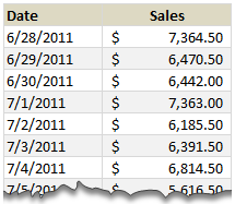
Lets just say, you run a nice little orange shop called, “Joe’s Awesome Oranges“. And being an Excel buff, you record the daily sales in to a workbook, in this format.
After recording the sales for a couple of months, you got a refreshing idea, why not analyze the sales between any given 2 dates? for analysis sake.
So you entered 2 dates, Starting Date in cell F5 and Ending Date in cell F6
How would you sum up the sales between the dates in F5 & F6?
This is where use the powerful SUMIFS formula.
Assuming the dates are in column B & sales are in column C,
we write =SUMIFS($C$5:$C$95,$B$5:$B$95,">="&$F$5,$B$5:$B$95,"<="&$F$6)
to calculate the sum of sales between the dates in F5 & F6.
How does this formula work?
- $C$5:$C$95 portion: This is the range of cells where our Sales values are recorded. We want these to be summed up based on the conditions as below.
- Condition 1: $B$5:$B$95 >= $F$5: This condition tells SUMIFS to check Column B for any dates on or after F5
- Condition 2: $B$5:$B$95 <= $F$6: This condition tells SUMIFS to check Column B for any dates on or before F6
- When combined, the SUMIFS formula checks for both conditions and adds sales only for dates between Starting (F5) and Ending (F6) dates.
- Learn more about SUMIFS syntax & how to use it.
What formula you should use in Excel 2003?
As you may know, SUMIFS formula does not work in earlier versions of Excel. But you don’t have to shut your orange shop because of that. We can use the all powerful SUMPRODUCT formula for this.
For example, =SUMPRODUCT(($B$5:$B$95>=$F$5)*($B$5:$B$95<=$F$6),$C$5:$C$95) would work the same.
Learn more about SUMPRODUCT formula & why it is awesome.
We can even use SUM & OFFSET formulas if …,
We can also use SUM & OFFSET combination to perform this calculation, provided dates are in smallest first order and all dates are entered. For the example, see download file.
Download Example Workbook:
Click here to download example workbook & play with it.
How would you sum up values between 2 dates?
In reporting situations, showing summary of values between 2 dates is a common requirement. So I use either formulas like above or Pivot Tables to do this.
What about you? How would you sum up values between 2 dates? Please share your ideas & tips using comments.
Learn More Date Related Formulas:
- How to find if 2 sets of dates overlap?
- Extract Quarterly Totals from Monthly Data
- Automatic Rolling Months in Excel
- How to Clean-up Dates in Excel
- Calculate Elapsed Time in Excel
- More on Date & Time
Want to Learn More Formulas? Join Our Crash Course
If you want to learn SUMIFS, SUMPRODUCT, OFFSET and 40 other day to day formulas, then consider my Excel Formula Crash Course. It has 31 lessons split in to 6 modules and makes you awesome in Excel formulas.
Click here to learn more about this.


13 Responses to “Gantt Box Chart Tutorial & Template – Download and Try today”
Hi Chandoo
As one of your students I have followed your detailed example through with great success. However, Excel is acting in an unexpected way and I wonder if you could take a look?
http://cid-95d070c79aef808e.office.live.com/self.aspx/.Public/Gantt%20Box%20Chart.xlsm
On my version, I have to type 40239 (Which equates to 2 Mar 2010) to get the chart to display 31 May 2010 (which should be 40329)!!??
Have I done something wrong or is Excel acting up?
Thx
Oli
PS Your example file in 2007 displays correctly.
Hi,
I like this idea a lot, but I agree the name is a little drab.
As an American I may just be seeing things, but to me the combination of lines and bars on your chart looks like a bunch of cricket bats.
Maybe you could work that into a catchier name. 🙂
Cheers!
Here is some code I use to keep the axis synched.
It may be useful to some of your readers
It is based on a comment I saw on Daily Dose of Excel.
Function SynchGanttAxis(Cname, lower, upper)
'Sets the X min and X max for Category axis
Application.Volatile
On Error Resume Next
'
'Top Horizontal Axis
With ActiveSheet.Shapes(Cname).Chart.Axes(xlCategory, 1)
.MinimumScale = lower
.MaximumScale = upper
End With
'Bottom Horizontal Axis
With ActiveSheet.Shapes(Cname).Chart.Axes(xlValue, 2)
.MinimumScale = lower
.MaximumScale = upper
End With
End Function
Function SynchVerticalAxis(Cname, lower, upper)
Application.Volatile
On Error Resume Next
' Excel 2007 only
'Right hand vertical axis
With ActiveSheet.Shapes(Cname).Chart.Axes(xlValue, 1)
.MinimumScale = 0
.MaximumScale = upper
End With
End Function
@Oli.. Can you check your file again.. I see 40329...
@Dave: Even I saw things.. the bars actually looked like lollipops. How about calling this lollipop chart - now that would be yummy and goes along the tradition of naming charts after eatables (bar, pie, donut...)
@Bob: Superb stuff... thanks for sharing 🙂
Hi Chandoo
This looks really good and I think it can also be applied to show project phases / milestones.
Question: Thinking further could this be amended to display a project lifecycle (Idea through to Implementation say 7 phases) on one bar / row? Just imagine 20 projects within a programme all on one chart one bar each showing their respective lifecycle stages i.e. on one page.
Idea: As the Gantt Box Chart this is quite intensive to set up re formatting etc how about the added extra of once you have completed this to "Save as template" i.e. saves the formatting and layout of the chart as a template so you can apply to future charts. Simple to do and will save the time formatting etc again and again and again.
Therefore tip: Click on your chart demo and then click on Save As template icon (2007) - edit file name and click on save. Ready to use / apply via Templates in Change Chart Type window.
Thanks and be very interested if the lifecycle question can be resolved
Mike
How embarrassing.
I was obviously suffering from numerical dyslexia. I was one of those days.
@Mike H: You can easily make this chart to work like a generic project lifecycle plan chart. All you have to do is,
1. in a separate sheet define the steps of lifecycle and various dates in a table (with 5 columns for each of the projects you have).
2. now use a control cell to input the project name you want to show in the chart
3. based on the input, use OFFSET Formulas to get the correct data
4. Rest is same as the tutorial above
For more info on the dynamic charting visit http://chandoo.org/wp/tag/dynamic-charts/ and http://chandoo.org/wp?s=OFFSET
Your solution is really smart but in the en Excel isn't meant to do stuff like this. I, as a former PM, always thought is was frustrating that you had to do stuff like this for something simple like a Gantt chart. So I built Tom's Planner. And would like to plug it here. I think it really solves the problem you are trying to solve in the most efficient way. Check out http://www.tomsplanner.com for a free account or play around with the demo.
Hi there,
Chandoo - this is really a very nice and helpfull chart - I adopted it, so I can report a forecast or the delay of a certain task (coming from my role as an auditor for projects).
One topic I´m currently struggeling with: I do have a project lasting for lets say 12 month. For a management reporting, I want to have kind of snapshot, lets say one month back and 2 month in the future. I tried with the offset formula, but failed. Any idea?
Thx
Lopi
[...] Ein viel geliebter Klassiker ist die Erstellung von GANTT-Diagrammen mit Excel. Wir hatten das Thema wiederholt schon hier. Chandoo.org hat sich mal wieder mit einer neuen Variante hervorgetan: Das GANTT-Box-Chart. [...]
[...] [...]
Hi Chandoo - fantastic xls. One thing I can't figure out how to do is adjust the alignment of the vertical axis. I would like to left align so that I could indent to represent sub tasks. Can that be done? Or is there a better way?
I've been trying to work out if there's a way to show weekends on the graph. The closest thing I've got is to add them on a secondary axis, but then I haven't been able to keep both axis lined up together! Any ideas?
Following on from this - is it possible to show things like holidays?