
Excel 2013, the newest version of Excel as of writing this has many great features like data modeling, improved pivot tables, power view, flash fill etc. But one thing that I find very annoying is the Open & Save experience. Any time we open a file or save a workbook (which happens a lot everyday), we must navigate the painful backstage screen to select our favorite folders. You see, Excel 2013 supports cloud saving. So that means, by default it will show your Office 365 or OneDrive or SkyDrive or whatever fancy new name Microsoft has for these things. But I am not so much in to clouding. Heck, I see a passing cloud in the sky and I almost run into my house. So what to do?
Simple. We can turn off these features.
We can save & open files faster by using below trick (I am cursing myself for not learning this earlier).
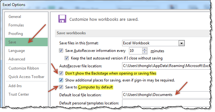
- Go to Excel options (this will be visible only once you open any file, even a new one) from File menu.
- Click on Save
- Enable “Dont show backstage when opening or saving files”
- Enable “Save to computer by default”
- Optional: Add a default save location for your workbooks
- You are done.
Now that I have turned on these features, I no longer pay the extra click tax to Microsoft whenever I save my files.
What about you?
More on working with Excel faster
- Customize Excel to maximize your productivity
- Learn a few shortcuts, you will become superhero at work


23 Responses
I recently disabled all unnecessary animations (when possible). That’s pepped things up a bit.
https://www.ablebits.com/office-addins-blog/2013/07/11/disable-animation-excel-2013/
Thank you!
I had Office 365 forced upon me a little while ago & this has been my biggest annoyance so far.
Lovely! I grumbled every time I saw that Save window. Gonna poke around the Options and see what else can be fixed.
Love it Here’s a good companion shortcut! F12 goes straight to Save As!
‘Extra Click Tax’. I like. That’s going in the book…
Chandoo – I’m an F12 guy, so I never see backstage when saving. The only time I’d want to do the above is if I could set that ‘Default File Location’ to the Recent Places list, so I could instantly choose one option directly from the list that populates, rather than having to click on the ‘Recent Places’ icon first.
thanks dude.
I love your way of approaching the problems… 🙂
Chandoo, different question this time: how do you do the screen copy with the raffled edging?
Thanks so much
Hi Anne ,
It’s called torn paper edge ; putting these in Google gives you all the information you need ; one of the results is :
http://www.myjanee.com/tuts/torn/torn.htm
What a straight forward option. Shows you that when we go into the Options in excel we never look closely. Thank you Chandoo for solving this problem. I will now also stop paying the double click tax to Microsoft.
I am also interested in the answer to Anne’s question.
You can also add file New, Open, Save and Save As to your Quick Access Toolbar. I have all my old favourites on my Quick Access Toolbar
Awesome thank you!
I have been using 2013 for more than a year now and thought this was just not possible to avoid. Just made the change, it will be SOOOO much quicker now thank you !!!
Hi thanks for the excellent post. however the link to “Learn a few shortcuts, you will become superhero at work” is not working. it says “Sorry, but I cant find the page you are looking for.”
Please do look into it.
Thanks for telling me about this. I have fixed the link.
Please try this – http://chandoo.org/wp/2010/02/22/complete-list-of-excel-shortcuts/
Nice tip, I really love it. Thanks Chandoo.
Oh my God, by chance I came to this post and this resolves my biggest annoyance so far as we were forced to Office 2013 in office. Thank you so much!
Has anyone encountered checking the “Don’t show the Backstage when opening or saving files” and Excel 2013 still shows the Backstage screen? Microsoft acknowledges the issue but isn’t calling it a bug they plan to fix.
nice!!
thank you for the great tips i would like to get more information on new tips my mail id is rahgav@q8living.com
Thank you
love excel