
Nothing like a weekend making fun of something worthless. So we will pick on some of the plump, overloaded and visually disgusting pie charts featured on various extremely popular websites.
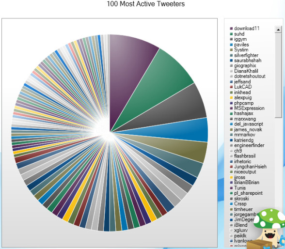
Top 100 Twitter Users in a Pie Chart
The first pie chart comes from readwriteweb. Although they did not make it, they shared it with the world. The real crime is committed by Archivist, a desktop application for archiving your tweets. See this yourself.
How average American spends their paycheck?
The next pie chart comes from visualeconomics. It is a giant complex oval donut that will tell you how you are spending your money. If time is money, then interpreting this chart will cost you a lot.

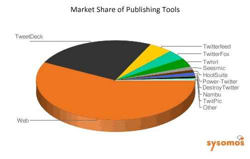
Market share of twitter publishing tools
The third and final pie chart is featured on techcrunch. It shows the market share of twitter publishing tools. Obviously the people behind this chart must think James Bond is reading this chart. How else can we know what is what percentage? And most importantly who uses the “destroy twitter” application to tweet?
A pie chart on the use of pie charts
After seeing all these really bad charts I had to make a pie chart that represents the pie chart menace while the chart itself being bad. My excel nearly crashed when I attempted it. So I hand-drew the below pie chart on state of pie-charts.

Go have a great weekend now. I am planning to eat ice cream, watch District 9 and may be run 10 kilometers. What are you upto?


One Response to “Easily Convert JSON to Excel – Step by Step Tutorial”
Great guide! You mentioned that "Power Query in Excel offers a quick, easy and straightforward way to convert JSON to Excel." This is very true for simple structures. For those dealing with deeply nested JSON that Power Query struggles with, I've found a few tips helpful: 1) Flatten the JSON structure before importing if possible, 2) Use Python for more complex transformations as you suggested.