Finding Nearby Zipcodes using Excel Formulas

Share

Facebook
Twitter
LinkedIn

Finding nearby zipcodes using Excel 2013 Web formulas

Recently, I had a peculiar problem. I have a list of zip codes and I wanted to find out nearest zip codes for each of them.

Now, If I wanted to find out near by zip codes for one area, I could go and search in Google. But, how to do it for dozens of them?

Today, lets understand how you can use Excel (that’s right) to do this automatically. We will be using Excel 2013 for this.

Excel 2013 Web Formulas - an overview

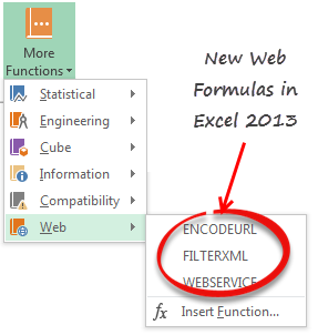
A little background – Excel 2013 Web Formulas

In Excel 2013, Microsoft has introduced 3 powerful new formulas. These will help you fetch & parse XML / HTML data from web. The formulas are,

  • ENCODEURL: to encode web URLs (replaces special characters in URLs with % codes like space becomes %20, / becomes %2F etc…)
  • WEBSERVICE: connects to a webservice / website and fetches response as XML / HTML.
  • FILTERXML: extracts a portion of XML/HTML using specified XPATH.

Using these formulas and web services, we can quickly fetch near by zipcodes for any input value.

Step 1: Find a web-service that can tell us near by zipcodes

I am sure there are many web sites that can offer a service like this. After searching a while, I came across a website called as geonames.org which has many webservices around address / zip code search. The service I have used is,

Find nearby postal codes.

This service is available as XML & JSON. Since Excel 2013 formulas only process XML data, I went with XML service. The service API url is this:

http://api.geonames.org/findNearbyPostalCodes?postalcode=ZIPCODE&country=US&radius=15&username=UNAME&maxRows=10

ZIPCODE is where you enter the zipcode from which you want to find nearby zipcodes

UNAME is where you enter your user name for geonames.org. Click here to register with geonames.org.

Step 2: List all original Zip codes in a column

This is simple. Just paste all original zip codes in a column.

Step 3: Write WEBSERVICE Formula

First enter the API URL in a cell like B1. (Make sure your user name is included in the service url)

Now write WEBSERVICE formulas so that we can fetch XML listing for each of the zip codes. Assuming zip codes are in A3:Ax, in adjacent column write =WEBSERVICE(SUBSTITUTE($B$1,”ZIPCODE”,A3))

And drag it down to fill down the formula for all zipcodes.

Step 4: Write FILTERXML formulas

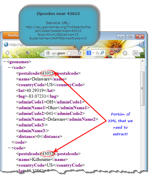
Now that we have full XML corresponding to each zip code, we need to parse this XML to extract the nearby zip code numbers. The original XML looks something like this:

XML output provided by geonames.org - Finding nearby zip codes using Excel 2013 Web formulas

To extract the zipcodes alone, we need to use FILTERXML formula.

FILTERXML takes 2 inputs – XML text, Xpath.

XML text is what WEBSERVICE has generated.
XPATH will tell Excel, which portion of XML to extract.

What is XPATH?

If you imagine XML as a tree, then XPATH is the language you use to tell how to navigate to a certain node in that tree. Since XPATH is a complex world, I think explaining all the syntax & nuances can be hard. So I will leave you with 2 useful links.

So what is the XPATH for nearby zip code.

As you can see in above image, the response from geonames has 10 code nodes, each containing one zip code (in the postalcode child node).

If we write =FILTERXML(b3,”/geonames/code/postalcode”) we will get all the postalcodes as an array.

Since Excel cannot show arrays in cells, it will show one of the 10 values.

So we need 10 cells to show these 10 zip codes. Once you have 10 cells, you can use either INDEX formula or alternative XPATH syntax (/geonames/code[1]/postalcode for first code, ../code[2]/.. for second code etc.) to extract all the 10 zip codes.

Things to keep in mind

Web formulas (WEBSERVICE formula to be specific) can be really slow depending on your net connection and webserver speeds. Since for most data, we do not need a live connection once the data is fetched, it would be good idea to replace WEBSERVICE formula with results once you have the XML.

Also, working with XPATH can be frustrating if the source XML is not correctly formatted or you are not familiar with right XPATH commands. In such cases, use SUBSTITUE or Text formulas to strip away un-necessary portions of webservice text before feeding it to FILTERXML.

Last but not least, Web formulas are compatible only with Excel 2013 or above. So you need to replace all formulas with results when emailing the workbooks to colleagues who are using older versions of Excel.

Download Example File – Finding Nearby Zipcodes

Click here to download the Excel workbook. Play with it to understand how the formulas are working. Please note that this file is protected as I do not want you to use my username for geonames.org.

Do you use Excel Web formulas?

Although Excel 2013 includes only 3 web formulas, they can let us do several interesting things. I am playing with them often to see what additional uses we can put them to.

What about you? Have you used Excel 2013 web formulas? What is your experience like? Please share using comments.

More on using Excel to get data from web

If you often need data from external websites for your Excel analysis work, check out below articles too:

Facebook
Twitter
LinkedIn

Share this tip with your colleagues

Excel and Power BI tips - Chandoo.org Newsletter

Get FREE Excel + Power BI Tips

Simple, fun and useful emails, once per week.

Learn & be awesome.

Welcome to Chandoo.org

Thank you so much for visiting. My aim is to make you awesome in Excel & Power BI. I do this by sharing videos, tips, examples and downloads on this website. There are more than 1,000 pages with all things Excel, Power BI, Dashboards & VBA here. Go ahead and spend few minutes to be AWESOME.

Read my storyFREE Excel tips book

Overall I learned a lot and I thought you did a great job of explaining how to do things. This will definitely elevate my reporting in the future.
Rebekah S
Reporting Analyst
Excel formula list - 100+ examples and howto guide for you

From simple to complex, there is a formula for every occasion. Check out the list now.

Calendars, invoices, trackers and much more. All free, fun and fantastic.

Advanced Pivot Table tricks

Power Query, Data model, DAX, Filters, Slicers, Conditional formats and beautiful charts. It's all here.

Still on fence about Power BI? In this getting started guide, learn what is Power BI, how to get it and how to create your first report from scratch.

33 Responses to “Show Months & Years in Charts without Cluttering”

  1. eladberko says:

    Very CooOOOoool 🙂

  2. JP says:

    Would it work if I merely change the display format for the dates, or do they actually need to be retyped in that format (Nov, Dec, etc)?

    ps- it's only about 34 donuts per month, or slightly more than 1 per day. Yum!

  3. Jon Peltier says:

    To make it work automatically when you create a chart, delete the labels above the Year and Month columns, but keep the label above the Y data (Donuts). The blank cells tell Excel that the first row and first two columns (indicated by the blanks) are special, so it uses the first row for series names an the first two columns for X axis labels.
     
    This is better than the other kind of donut chart, but you'll soon be carrying a big donut around your midsection.

  4. Erin Smith says:

    First off, thank you Chandoo for being respectful and taking out the "Jesus" comment. Not that I'd threaten to kill you, or start world-wide riots, or make you go into hiding if you didn't (as OTHERS would; wink, wink, nudge, nudge)... I just really appreciate your respectulness and consideration; so thank you. I was meaning to write you about it, but when I came to your site you'd already made the edit... so again, thank you!

    Secondly, I wanna say I think there's an easier way to do what you are demonstrating. I've got a pivot chart with months of data and all I had to do was right-click the x axis and then select "format axis", under "Axis Options" there's a check-box that says "Multi-level Category Labels". The chart I was able to do this on was a pivotchart however so maybe it wouldn't be that easy for a non-pivotchart.

    Anyway, love the site. Keep up the good work. Thanks also for being so open about your success, it's very encouraging and motivating.

    God (aka Jesus) Bless. 🙂

  5. Terry Dukes says:

    Hi Chandoo - great site! Another option to save space is to simply rotate the orientation of the text by 90 degrees, so the dates read vertical rather than horizontal. However, I like the elegance of your solution also.

  6. Kien Leong says:

    Hey Chandoo -- Great tip. Only yesterday I was working through some strange behaviour with formatting dates in PivotCharts. Seems the axes never want to cooperate. This is a neat and elegant solution I hadn't thought of using. May need to abandon pivotcharts to use formulas like that, but if we use dynamic named ranges, no big sacrifice.

    BTW, whatever did you do to get your site blocked in China? Never heard of regime change by a grass-root spreadsheet movement. Maybe your ISP is hosting some problem sites. Chandoo.org is certainly worth it for me to fire up the VPN, but I'm sure you would lose a lot of other visitors from the middle kingdom.

  7. Kapil says:

    Chandoo ... pls help.. the link is blocked over here... pls can you put the regular link... 🙂

  8. Chandoo says:

    @JP... Excel Axis formatting is linked to cell formatting by default. So you can just have the dates which are formatted to look like months (mmm).

    @Erin: It was not my intention to mock anyone's faith or religion. I just used the word as it is quite common. I decided to remove it as I got 2 emails from readers requesting for the same.

    Also, the pivot charts take pivot table groupings by default, so you need not do any of the above while making charts from pivot tables.

    @Kein: I am not sure why Chinese authorities decided to block my site. I wish they would actually look at the content instead of blocking sites based on simple text matching rules.

    @Kapil: The file is mirrored here: http://chandoo.org/img/d/date-axis-months-years-trick.xls

  9. Prateek says:

    Cool, really cool...

  10. SS says:

    Nice one Chandoo,

    Also would like to mention abt useful method while creating dynamic charts.

    In any chart where in the months keep on adding - instead of changing the range for the chart every time we add a month, we can actually format the months as dates (probably 1st of every month) still keep the format as "mmm" AND while selecting the data, we can select a huge rows (date column) once and for all, and the chart adjusts automatically with the data that we entered. So next month when I enter Dec's data, I need not change the source data of the chart, however it automatically adjusts.

    Hope I made sense.!

    Regards,
    SS

  11. Tom says:

    Thanks, Chandoo! This is a great tip - one that I will definitely put to use. I typically have an axis with mmm yy format, aligned vertically, but this will definitely look a bit cleaner (except in cases where the chart is too small for the axis labels to be displayed horizontally, even without the mmm yy on one line). Thanks again!

    Tom

  12. Josh says:

    Chandoo,
    Thank you for the posts you are very diligent not to mention very helpful. I would like to know how to get the separation lines on the axis? For example your candy sales chart has longer lines separating east and west how do you format that?

    Thanks for being very awesome!
    -Josh

  13. Alvaro says:

    Hi Chandoo, we can look the formulas because there is a message:"Unsupported features".
    Could you send a diferent Link ?
    Thanks.

  14. Matt says:

    @SS But what if you've got formulas in the data block (i.e where you would enter static data for the month of december)? My chart now shows #N/A #N/A in the axis with no data for all future dates.

    Chandoo, I've got a dynamic range set up showing #N/A errors for future dates. The MMM-DD date format format in row works fine, but when I use YYYY and MMM in two rows, the axis shows #N/A #N/A for all future dates with no data. How would you go about keeping those future months hidden?

  15. Jon Peltier says:

    Matt -

    In order for the axis to automatically extend to the dates within the range and ignore #N/A at the end, you need a date-scale axis, and for this you need to use one column with the complete date, not two columns with year and month.

    If you want to use two columns, you need to generate Names in the worksheet which define ranges only as long as the number of months. I have a review of dynamic chart approaches in http://peltiertech.com/WordPress/dynamic-chart-review/ and a whole category on my blog at http://peltiertech.com/WordPress/category/dynamic-charts/. Chandoo also has examples of his own on this site.

  16. Ethan says:

    How do you make a dynamic chart out of this?
    I can't get the axis labels range right.
    I tried something like this:
    =OFFSET(REPORT!$H$10:$I$10;0;0;COUNTA(REPORT!$H$10:$I$100);1)

    Any idea?

  17. Jon Peltier says:

    Ethan -
     
    Your offset formula defines a range 1 row in size, but the technique here requires 2 rows. Your definition should end with
     
    ;2)
     
    instead of
     
    ;1)

  18. Ethan says:

    Thanks Jon,
    Got it working now

  19. Neal says:

    Great! Now, is there any way to do this directly in Powerpoint? I don't like having linked excel files, so I create the graphs right inside Powerpoint, any way to do this there? I tried and was unsuccessful.

    Thanks.

  20. Joe says:

    Cool tip Chandoo......thanks

  21. [...] extract year and month from dates to avoid a mess in our stock chart. Chandoo has a great post: Show Months & Years in Charts without ClutteringIn cell B2:=YEAR(D2)In cell B3:=IF(YEAR(D3)=YEAR(D2), "", YEAR(D3))Cell C2:=IF(TEXT(D2, [...]

  22. Bilal says:

    Hi there,
    I have got a data ranging for 3 years. I want to show a chart which shows Jan of 2011, 2012 and 2013 together side by side; then Feb11, Feb12 and Feb13 side by side, then Mar11, Mar12 and Mar13, and so on until December.
    Please help. Thanks.

  23. Down With This Sort Of Thing says:

    Hi there

    Very good solution this. I have another question on it, though. How do you format the X-axis with monthly gaps (ie, with labels "Jan 2012", "Apr", "Jul", "Oct", "Jan 2013", "Mar", etc), when you're dealing with a data series with weekly or daily data points? The Axis Options dialogue box doesn't appear to offer "Date axis" as an option under the "Axis Type" section.

    I've managed to do it in one case with weekly data by setting the interval between tick marks at 13 -- the approximate number of weeks in a quarter -- to get 3-month intervals. But this wouldn't work if I wanted to show 1-month intervals, or had a more detailed daily data series to work with.

  24. Herro says:

    Any luck getting the dates to work on a scatter graph? I'm only getting numbers. Works fine on line graphs though.

  25. Apoorve says:

    How can we do the vice versa? i.e. on the x-axis showing year on the level 1, and months on level 2.
    I wanted to build these kind of axis labels for 5 years, with year on top and months at the bottom, but it should form in such a way that the seperating lines should seperate the entire data set only at December of each year, and no lines in between any month.

  26. Carlos says:

    Like!!
    Three times already today I have used this website and saved a ton of work time in researching excel tricks.

    Suggestion: Why not have a "like" or "this article was useful to me" button. That way you can see what is most useful by your users and maybe generate more content based on those "likes".

    Just saying. Thanks again and you're doing a great job!

  27. Haj says:

    Thanks for the tip. However, I couldn't download your file. The link is broken.

  28. JeteMc says:

    Thank You for taking the time to post this tip. I hope that you have a blessed day.

  29. Tom says:

    The link does not work properly and I'm not sure how to actually get the graph to display like this, its frustrating me a tonne. I cant work out what to google either to find an answer elsewhere! 🙁

  30. parag says:

    Is this possible with waterfall chart. Data hereunder -

    Years Abbrevation Amt

    2020 BEG 2,006
    REV 1,950
    EMP 1,058
    DM (3,244)
    OOE 1,078
    OPMT 182
    AB (638)
    END 2,392
    2021 REV 8,534
    EMP 67
    DM (2,142)
    OOE (3,120)
    OPMT 510
    AB 1,008
    END 7,249

Leave a Reply