
This is a guest article written by John for our Excel Dashboard Week.
Executive Review Dashboard using Excel
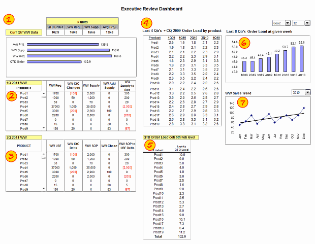
Snap-shot of the dashboard:
Purpose of the dashboard:
This Dashboard was constructed for a number of reasons, one of which was to reduce the number of reports produced with the same data ( up to 6 separate files ). As we all know, when it comes to senior management and reports / files the more information they can get on one report / file the better for them. So, with this in mind I created the Dashboard to show the data they need to see “quickly” each week.
How this Executive Review Dashboard is made?
I used various functions / formulas to help me construct this Dashboard, this isn’t the first one I have created, but I think this is the best one I have done so far and it is all thanks to the hints and tips and assistance I get form Chandoo’s site as well as Excel User *(Charley Kyd was the first inspiration for me to get involved with Dashboards ) and also a shout out to Clearly and Simply, another great site.
[Note by Chandoo: I have added numbers 1 to 7 on the snapshot to help you understand below portion.]
The top left corner (1) has data that shows what is happening right now, i.e. QTD Order volume, WW Requested supply, WW Available supply and the Avg projected orders ( based on historical analysis ). This table format is then supported by a simpler bar chart below it.
Below that I have used Scroll Bars (2 & 3) to allow a lot of data to be shown in a small space, scroll bars do this very nicely. The data in here would be a list of all the products within the current range of orderable parts ( the detail behind the table and bar chart above ). [Related tip: How to create a scrollable list in Excel Dashboards?]
The middle table (4) ( Last 4Qtrs + CQ 2009 Order Load by product ) shows the historical data for each of the current products ( and perhaps their predecessors ) with a bar chart to the right of it (6) showing the overall volume of those products and the table and bar chart are controlled by the drop down menus above the bar chart.
The Line Chart below (7) that shows the overall Sales Trend by month with a drop down menu to enable you to choose each year separately.
To the left of that there is a table (5), which is a snapshot using the picture link function, of the current order load status by product and again supports the data on the left hand side of the Dashboard.
Final Notes:
If anyone would like to leave a comment or ask questions about this Dashboard or indeed need help with anything ( even if I don’t know the answer I am sure Chandoo and his growing community would be able to help ) please feel free to ask.
Just a note to close. Since I started utilizing Chandoo’s site I have now started my own community internally within the company I work for and I am now teaching other people about Excel ( albeit 2003 level for now ) and encouraging them to expand their own knowledge of Excel and perhaps share what they learn with their colleagues and I fully intend to point some of these people to Chandoo’s site and will encourage them to sign up for Excel School.
Download Executive Review Dashboard Workbook:
Click here to download the executive review dashboard workbook & play with it.
Added by Chandoo:
What I liked in this Dashboard:
Techniques used: John used a variety of techniques like formulas (SUMPRODUCT, OFFSET), dynamic charts, scrollable lists and picture links which help us in analyze lots of information and present the results in minimal space.
Dynamic Dashboard: The dashboard lets us analyze and understand information for any quarter or region which is very good.
What can be improved in this dashboard:
Layout: Ideally, if a dashboard is in a rectangle or square layout, it would be easy to read and understand. The current setup suggests that it is incomplete.
A little more visualization: There are lots of numbers in this dashboard. I would suggest adding few more visualizations like showing indicators or applying conditional formatting or replacing a table with a chart. This would reduce the comprehension time. Of course, you can always add hyperlinks to detailed data so that if an executive is interested to drill-down, she can do so.
Spell out key messages: This dashboard would become even more effective by adding a small comment area at the bottom or top where key messages can be highlighted. [Related: Tweetboards as an alternative to Dashboards]
Thanks to John
Thank you very much John for sharing your work with all of us and showing us what is possible. I really appreciate your effort in writing this guest article and spreading good word about Chandoo.org and Excel School.
Say thanks to John
If you liked this dashboard, say thanks to John. Also, feel free to share your views on this dashboard. How would you have designed an executive review dashboard if it were up to you? Please share using comments.
Contribute to Excel Dashboard Week:
You can contribute tips, screen-shots, excel workbooks or links that I can share with our readers on Friday (25th March).
Click here to send your tips & files for Dashboard Week
PS: The link to Excel user site is affiliate link, meaning if you click on it and purchase anything from the site, I get a small commission. I do this because I think Charley’s products are awesome.


41 Responses to “Calculate Elapsed Time in Excel [Quick Tips]”
Hi Chandoo,
To calculate time lapses in excel I usually use the DATEDIF function. Even though is undocumented by MS there is a great explanation of its use in Chip Pearson's site :
http://www.cpearson.com/excel/datedif.aspx
Is pretty easy to use and has great flexibility.
See you and keep Excelling!!!
Another great article, I will be linking to it on my blog.
Oliver:
Yes, I think that DATEDIFF do it better.
Great post! This a fantastic tutorial on calculating elapsed time in Excel that could be helpful even to a novice user. Keep up the useful tips!
Also, the Office community on Facebook could really benefit from you knowledge! Check it out at http://www.facebook.com/office
Cheers,
Andy
MSFT Office Outreach Team
hi, Chandoo !!!
for elapsed time , we can use this unique formula either for hours, minutes or seconds : NOW()-A1)
but using respective special number formats
for hours : [h] ==> 46553
for minutes : [m] ==>2793212
for seconds : [s] ==> 167592763
We can also use mean duration for years (orbital period of the Earth around the Sun : i-e tropical year) which is : 365.25 days
and mean duration for month : 365.25/12 days
be Excelent !!!!
@Oliver... Thanks for the pointer to datediff(). I will update the post with information about this as well.
@Glen... thanks for the linklove 🙂
@Andy... Welcome. Thanks for telling us about the office community on FB.
@Modeste ... that is very cool. I will remember these formatting codes for an upcoming article on number formatting codes 🙂
Great tip Chandoo! I use the formula to calculate years elapsed all the time. It can seriously help save a ton of time with calculations. Also, NETWORKDAYS is one that helps and can seriously impress a boss. Keep up the great work here!
No problem! I will definitely be directing people with tough Excel questions to your blog. Keep up the great posts!
Andy
MSFT Office Outreach Team
Hi,
always great posts and a good way to start my day
but regarding the elapsed time calculations: have you never noticed that there is a result difference between using =TODAY()-A1 and using =NETWORKDAYS(A1,TODAY())?
try it for A1= a Monday such as 21sep09 and "today" is e.g. a Thursday; you get 3 or 4 respectively as a result, depending on the formula used; this is because formula =networkdays() always includes both the startdate and the end date and not only the time between these 2.
This is easily corrected/compensated bij always adding a -1 to the =networkdays() formula because the majority of us will count startday as day 0 and then the result will be consistent across the different formulas.
However, you then get into trouble if you calculate the networkdays for a date further in the past and where either the start or end date falls in a weekend.
just thought to point this out as to me these formula's are not interchangeable just like that!
have a great day!
Paul
=DATEDIF([DOJ],TODAY(),"Y") & " Y, " & DATEDIF([DOJ],TODAY(),"YM") & " M, " & DATEDIF([DOJ],TODAY(),"MD") & " D"
This will fix your 30 Days problem
I calculated the time diff between two date+ times by subtracting 2 cells & custom formatted it to "d hh:mm" format.
E.g.
Cell A1 04-Jan-12 6:00 PM
Cell A2 05-Jan-12 4:45 PM
Cell A3 0 22:45 (formula: =A1-A2)
Wat shud i do 2 not display the "zero" values i.e. no. of days in this case is zero hence the cell shud display " 22: 45" and not "0: 22: 45".
@Amol
Try the Custom Format code:
[
<1] hh:mm ; [>=1] d “d” hh:mmHi Chandoo,
If possible to compute the interval of time and date in one column.
In column C I would like to compute the total days and hours . What formula ? Please help
Example.
Column A Column B
2/13/12 3:30 AM 2/14/12 12:00 AM
In referenc to Elapsed time in months
To calculate the elapsed time in months, we can use the formula =(NOW()-A1)/30. This returns the value in 30 day months.
I use to apply formula =ROUND((TODAY()-A1)/30,0). Today, I faced a peculiar situation, A1 has date 01-Mar-2009, and today being 01-Mar-2012, it should be 36 months, but it is showing 37 months!!
Any suggestions to avoid such errors?
Regards,
Prasad DN
All I want to do is add up a series of times and receive a reply that gives me a total. What I used to do was subtrace the end time from the start time and format the result as [hh]:mm but this doesn't seem to work anymore. How has Bill Gates confounded me?
@Pete
I use Excel 2010 and it still works
The times must be entered as times in the format hh:mm:ss or hh:mm without seconds
Adding up times is as simple as =Sum(Range) or =Sum(A2:A10)
then using a Custom Number format as you have mentioned [h]:mm
If this isn't working, 2 ideas
1. Check your times are times and not text
2. Can you share your data or file with us?
My hospital tracks times from patient arrival to various procedures or treatments. When those times cross over midnight, the regular formulas (2nd time minus first time) don’t work because the result is negative and Excel (2007) won’t show a negative number in time format.
I couldn’t find a solution here (chandoo.org) but found one elsewhere that worked and it’s very simple. I would like to share it.
Assuming 1st time in A1 (column for patient arrival time) (11:00 PM), and 2nd time in B1 (column for x-ray given) (12:30 AM)). Should be 1:30 elapsed time.
=B1-A1+(B1<A1) [This comparison is the key to the solution.]
=12:30 AM – 11:00 PM + (12:30 AM < 11:00 PM)
=0.0208 – 0.9583 + (True)
=-0.9375 + (1) [This is the key! If it is false, Excel adds 0. If it’s true, Excel adds 1 and that is what corrects the negative number. Now Excel can interpret the number as a time.]
=0.0625
Converted to hh:mm = 1:30
I wrapped this formula inside an IFERROR one to alert my data entry person if she messed up and applied it to lots of different columns and it has worked wonderfully. No more complaints from the data entry person who just plugs in times from medical charts.
Very interesting solution. Thank you so much for sharing it with all of us.
HI,
I am working on a Xl application..
I want to capture time between two clicks.
Ex, in my application during run somewhere I press OK button and then I click Cancel.. I want to measure time between these two clicks... Is it possible??
Pls help on this...
@shashidhar
The answer is Yes
You will have to add an appropriate VBA event to start and stop a timer.
There are techniques which can time to the millisecond so maybe look those up on the net
WOW!!!!!! I truly love your excel time format program! WHOOOO! I am very interested in how the time formats "update" (manually on a physical keyboard) that "updates" the time into its respective decimal time formats, such as:
YYYY.yyyy, HH.hhh, etc...
How do those formulas or equations work if not in Excel mode? Example: TI calculators, Word, or any other computer language programming? Just wanted to see how it works. E-mail me at Ultra64848689Ti@gmail.com.
Thanks again for an EXCELLENT Excel program into decimal time formats!
Here's an idea: how about creating an APP for iOS and Android? Just wanted to point that out. =-D
Regarding the elapsed time in months:
I made this function to determine the time elapsed since a date using the number of days in each respective month. It's a simple subtraction and I think it works very well:((Year Today-Year A1)*12++(Month Today - Month A1)+(Day Today/Days in Month Today)-Days A1/Days in month A1)
Here's the function:
=((YEAR(TODAY())-YEAR(A1))*12)+(MONTH(TODAY())-MONTH(A1))+(DAY(TODAY())/DAY(DATE(YEAR(TODAY()),MONTH(TODAY())+1,0))-DAY(A1)/DAY(DATE(YEAR(A1),MONTH(A1)+1,0)))
Have a Merry Christmas everyone!!
I need the ability to calculate how much progress we have made between two dates and I want to represent that as a percentage.
I am thinking this would be a combination of today, networkdays & dividing the days elapsed vs the total days. Then it should be as easy as formatting my cell. Any help would be greatly appreciated.
@Christian
Your correct
dates are just numbers and so you can use simple math to derive the percentage
=(Date Now-Start Date)/(End date-Start date)
that will give you a number between 0 and 1
which you can format as a %'age
is there a way out to calculate the productivity for an employee
The day start is at 08:00 and day end is 20:00
The start date / time is recorded and end date / time is recorded
I want to calculate the timelapse taking into consideration the day begin and dayend time.
If the work begins and ends the same day, a simple formula b1-a1 would compute the productivity.
But if the process remains incomplete and is carried over to the next day, then timelines to be computed accordingly
to clarify,
if start time of an activity is 03/15/2015 18:00 hrs and end time is 03/16/2015 11:00 hrs, then the resultant formula should be 5 hrs (ie 18:00 to 20:00 hrs on day1 + 08:00 to 11:00 hrs on day2) ie 2+3
please guide.
Venkatesh, try (b1-a1)-0.5
This will subtract the fixed amount of time between shifts, 12 hours. If the time between shifts varies, then you could reference other cells that contain the variables.
Please help. when I use the networking days formula I get a date (2-may-00) I want actual number of days. I managing projects and I need to know how many days have passed since we received a project to the current date. Please help Thanks
@Aria: Just format the cell as general or number. that will fix the problem.
You rock! I looked at 17 other sites and they all did not work. Yours did. Thanks!
Hi folks ...
calculating age in years , months and days
=text(now()-a1,"yy")&" y " &text(now()-a1,"mm")-1 &" m "&text(now()-a1,"dd") & " d"
Hi, the Elapsed time in days [ =TODAY()-A1 ] works great however, if I do not have a date in A1, it shows 42157. Anyway to get it to display 0 or a Null value?
@Dan
=If(A1="",0,TODAY()-A1)
I get #NAME? and the formula does not work.
Hi Chandoo,
This might be a challenge - I am looking to calculate elapsed time between two columns
Start date Complete date
9/9/2015 7:21 10/2/2015 11:01
I need to take into account the following:
1) The employee works 7:00-3:15 pm each day
2) Std Work hours are 7hrs 45 min each day
3) Need to take into account all holidays in between start and end date
4) Work week is Mon through Friday.
Can you help?
Thanks!
Hi, i have a certain name (wilium) in column A and against this name i have 2 option, 1 Done and 2 Inprogress. i want that i count done again wilium and count inprogress against wilium separately. which formula will work for it??
Hi, i have a certain name (wilium) in column A and against this name i have 2 option, 1 Done and 2 Inprogress in column C. i want that i count done again wilium and count inprogress against wilium separately. which formula will work for it??
Year, month, day results for DoB.
The formulas I have found on the net and the datedif function do not work. This is what I came up with using a Microsoft support paper dated April 1997 with some modifications:
IF(OR(A2>$A$1,ISBLANK(A2)),"",IF(YEAR($A$1)=YEAR(A2),0,IF(MONTH($A$1)>=MONTH(A2),YEAR($A$1)-YEAR(A2),YEAR($A$1)-YEAR(A2)-1))&" years "&MONTH($A$1)-MONTH(A2)+IF(AND(MONTH($A$1)<=MONTH(A2),DAY($A$1)<DAY(A2)),11,IF(AND(MONTH($A$1)=DAY(A2)),12,IF(AND(MONTH($A$1)>MONTH(A2),DAY($A$1)=DAY(A2),ABS(DAY($A$1)-DAY(A2)),DAY(EOMONTH(A2,0))-DAY(A2)+DAY($A$1))&" days")
Check it out...
Hi, Augustin
what about :
calculating age in years , months and days
=YEAR(NOW()-DoB)-1900 & " y " & MONTH(NOW()-DoB)-1 & " m " & DAY(NOW()-DoB) & " d"
Hi Chandoo,
I am looking for help with the elapse time formula. I have a recruitment tracking sheet where we track the number of days the positions are opened, and when they are finally closed.
The opened positions will have a running turnaround time (TAT) formula and I am using this formula:
=NETWORKDAYS (start_date, TODAY (), Holidays2018)
Now, without disrupting the running TAT formula, how do I then get the TAT to stop when we have a final end date? All the information below is row:
- start_date --> Cell A
- TODAY () --> cell B
- end_date --> Cell C
Hope you are able to help. Thanks!
Interesting question. Try this:
Thank you for this helpful article. I was trying for days now to figure it out. Now the only issue I have is that if I do not have a value inputed for =TODAY()-[@[Date Precured]] Date Precured then it shows 44055. How can I get it to leave it blank if there is no data? Thanks again!!!