
This is a guest post by Myles Arnott from Clarity Consultancy Services – UK.
In this and next 3 posts, we will learn how to make a Dynamic Dashboard using Microsoft Excel.
At the end of this tutorial, you will learn how easy it is to set up a dynamic dashboard using excel formulas and simple VBA macros.

[Click here for large version of the image]
Introduction:
The dashboard also demonstrates the standard approach I use in all of my models which is to incorporate three key sheets in addition to the data and analysis tabs.
These are:
- Home page
- Inputs (or drivers)
- Helpsheet
The dynamic dashboard can be downloaded here [mirror, ZIP Version]
The dashboard file works in Excel 2007+. Pls. enable macros to get it work.
The plan is to break this dashboard tutorial down into four parts over the next four weeks. If further topics fall out as a result of discussions either Chandoo or I will pick them up and if necessary post further parts.
- Part 1: Introduction & overview
- Part 2: Dynamic Charts in the Dashboard
- Part 3: VBA behind the Dynamic Dashboard a simple example
- Part 4: Pulling it all together
I would like to take a quick opportunity to give credit for some of the elements of functionality in the model:
- Boxcharts – Chandoo [Link]
- Scrolling report – Chandoo [Link]
- Competitor analysis – Chandoo [Link]
- Use of camera tool – Chandoo [Link]
- In cell microcharts – Chandoo [Link]
- Helpsheet – John Walkenbach
Okay so lets get started with an overview:
What is the objective of the report?
The Dynamic Dashboard is intended to provide pertinent summary information to aid management decision making. Combining a high level of flexibility within each report and then allowing the user to choose which reports to include and where to position them allows an enormous amount of flexibility over the message to be communicated.
What does this Dynamic Dashboard do?
The dynamic dashboard allows the user to select a report from the range of reports within the model and decide where to position it on the page. The user can select “hide” to hide a report that they do not want to see or select “view” to preview it prior to choosing its position.
- Clicking on either the hyperlink name or the report image will take you to the report.
- Each report is highly flexible allowing the user to cut the data in many ways to show management the most pertinent information.
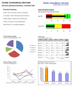
Overview of Dashboard Tabs:
Home Page
I always include a homepage in my models and often set an auto_open routine to select this as the first page seen on opening. The Home page is designed to present the contents of the model to the user and provide links to each page for easy navigation.

The Dynamic Dashboard
This is the main tab for pulling together the dashboard and will be covered in parts 3 and 4.
Inputs
This is the page for all validation lists and drivers.

Help Sheet
Once again a sheet that is in all of my models. This user form based help sheet provides the user with a quick help function and complements the accompanying user notes. I find it helpful to lay it out in tab order.

This is how the Help user form looks once opened. The user can either choose the topic from the dropdown or by clicking next.

Chart 1 and 2 : Flexible pie charts
Dynamic pie charts with the option to select the KPI, period and product/salesperson to be analyzed. These are covered in part 2.

Chart 3 & 4: Flexible line charts
Dynamic line charts with the option to select the KPI, period and product/salesperson to be analyzed. These are also covered in part 2.

Chart 5: Box Chart
Details on how to create these box charts.

Chart 6: Scrolling Report of KPIs
Chandoo’s blog on how to create this scrolling report can be found here. Micro charts which is of my favorite blogs from Chandoo are covered here.

Chart 7: Scrolling Comparison Chart
Details on how to create this scrolling chart.

Chart 8 : Executive Summary
A simple executive summary. Please see Chandoo’s article on a twitter board for an alternative view.

So that was an overview of the model and its main tabs.
What Next?
Next week we will look at Part 2 of this series and learn how to construct dynamic charts.
Download the complete dashboard
Go ahead and download the dashboard excel file. The dynamic dashboard can be downloaded here [mirror, ZIP Version]
It works on Excel 2007 and above. You need to enable macros and links to make it work.
Added by PHD:
Myles has taken various important concepts like Microcharts, form controls, macros, camera snapshot, formulas etc and combined all these to create a truly outstanding dashboard. I am truly honored to feature his ideas and implementation here on Chandoo.org. I have learned several valuable tricks while exploring his dashboard. I am sure you would too.
If you like this tutorial please say thanks to Myles.
Related Material & Resources
- Excel Dashboards – Tutorials & Templates Section of PHD
- 6 Part Tutorial on Making KPI Dashboards in Excel
- Recommended Product: Jorge Camoes’ Dashboard Training Kit
This is a guest post by Myles Arnott from Clarity Consultancy Services – UK.


11 Responses to “Use Alt+Enter to get multiple lines in a cell [spreadcheats]”
@Chandoo:
One more useful trick.......
In a column you have no. of data in rows and need to copy in the next row from the previous row, no need to go for the previous rows but entering Alt + down arrow, you will get the list of data, (in asending order), entered in the previous rows...
This is another great tip. I use this all the time to make sense of some *very* long formulas. As soon as the formula is debugged I remove the break.
Great tip Chandoo!
I use this feature often and it has even gotten the, "how did you do that" response.
Thanks!
@Ketan: Alt+down arrow is an awesome tip. I never knew it and now I am using it everyday.
@Jorge, Tony: Agree... 🙂
[...] Day 1: Insert Line Breaks in a Cell [...]
how can we merge a two sheet.
excellent idea. Chandoo you are genious
Hi chandoo,
I have used ctrl+enter to break the cell. But I did not get the result.
Please tell me how can i break the cell in multiple lines.
Hi, Ranveer,
Its not Ctrl+enter to break the cell, use Alt+Enter to make it happen.
hi Chandoo....
how we can use Alt+Enter in multiple rows at the same time please reply hurry i have lot of work and have no time and i m stuck in this. 🙁
Alt+J worked once 🙁
So I found another more reliable way:
=SUBSTITUTE(A2,CHAR(13),"")
Where A2 is the cell that contains the line breaks which the code for it is CHAR(13). It will replace it with whatever inside the ""