
HR managers & department heads always ask, “So what is the vacation pattern of our employees? What is our average absent rate?”
Today lets tackle that question and learn how to create a dashboard to monitor employee vacations.
What do HR Managers need? (end user needs)
There are 2 aspects tracking vacations.
- Data entry for vacations taken by employees
- Status dashboard to summarize vacation data
Based on my interaction with few HR managers, the below questions are asked most often when it comes to vacation tracking:
- What is the absent rate of our employees (in any year or latest 3 month period)
- What are the vacation patterns for individual employees (or teams)
- On which dates most employees are absent?
- Who is taking most (or least) vacation days?
A look at the completed Vacation Dashboard
Take a look at the completed dashboard (click to enlarge).

Constructing Employee Vacation Dashboard
The construction process can be broken in to 3 steps:
- Vacation tracker for entering dates & types of vacations.
- Calculation engine
- Dashboard design & formatting
Step 1: Creating a tracker for vacations
The best way to create a tracker is to use Excel tables. Set up one with 4 columns – Employee name, vacation type, start date & end date, like below:
![]()
By using tables, we can continue to add more vacation data (or remove older data) and all our formulas continue to work seamlessly.
Additional tables required…
Apart from the main vacations table, we need below tables:
- Employees table – to keep the names of employees
- Vacation types table – to keep the type of vacations
- Holidays table – with official holiday dates
Step 2: Calculation engine
There are 3 portions in our dashboard and each of them requires certain calculations.
- Date logic
- Employee view
- Calendar view
For all the views, the main driver is latest date, which is the maximum value of end date column in vacations table (=MAX(Vacations[End Date]))
Tip: Use Max to find latest date
Although the calculations are not very complex, explaining each of them can be very tedious. So let me summarize them with a diagram.
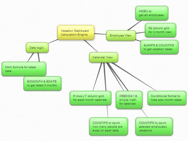
Important formulas used in the calculations:
The key formulas & ideas used are,
- Range lookup formula
- SUMIFS formula
- Calendar formulas
- EDATE, EOMONTH, WEEKDAY, NETWORKDAYS Formulas
- The lovely INDEX formula
Step 3: Dashboard design & formatting
This dashboard is an excellent example of synthesis – combination of multiple Excel features to create something very simple and easy to use.
Excel features & ideas used:
There are many Excel features & ideas used in this dashboard. First take a look at the illustration below.
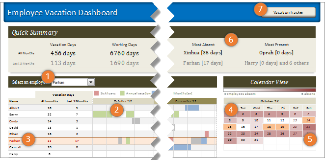
- Combo box form control to select an employee to highlight their vacations
- Conditional formatting & cell grid to show vacations in a gantt chart like view.
- Highlighting selected employee’s vacations again using conditional formatting.
- Calendar view created by picture links
- Heat map of number of people away on each date using conditional formatting (similar example).
- Header section with references to calculations & cell formatting.
- Hyperlink on a rounded rectangle shape to link to tracker sheet.
Formatting the dashboard:
The basic layout of dashboard is just 3 boxes – a big summary box on top, a large employee view box (70%) and a small calendar view box (30%).
The fonts are Calibri & Cambria default fonts in Excel 2007 or above.
I used variations of Tan color in most areas of dashboard (headers, box backgrounds, buttons etc.) and shades of pink, blue, green & gray for marking the vacations. Orange is used to highlight selected employee’s vacations.
Although there is a lot of data, I designed this dashboard with minimal clutter. It is very easy to use (there is only one input control).
Download Employee Vacation Dashboard
Click here to download the employee vacation tracker & dashboard workbook. Play with it to learn more.
How do you like this dashboard?
I have thoroughly enjoyed the process of building this dashboard. I especially loved how picture links, conditional formatting heat maps (color scales) & simple calendar logic all have blended in to create a stunning calendar view.
What about you? Do you like this dashboard? How would you have designed it? Go ahead and share your feedback, ideas & suggestions for improvements in comments. I am eager to learn from you.
Want to learn more about this dashboard?
If you want to learn how this dashboard is constructed in a detailed fashion (along with 6 other dashboards & ton of material on dashboard design process) then please consider joining in our Excel School Dashboards program. Just today, I have uploaded a lesson (35 mins) on Employee Vacation dashboard to our Excel School website. You can use it and 32 hours more of video instruction to become awesome in Excel.


132 Responses
Chandoo,
An excellent example to summarize various Excel concepts learned over a period of time that has been put to use for a very useful and common place purpose. Thank you.
Subbaraman
I have tried to download and open the vacation tracker and dashboard.xls twice and asked a colleague to try also. Both of us were able to download a ~158k file but it would not open. He has Excel 2010 and I have 2007. Help?
Hello Chandoo,
I condiser myself as a pretty good Excel user but here I want to point out this is really a good and pretty example of what Excel can offer to common adminstrative tasks. By pretty, I mean it is clear, efficient and truly easy to understand and use.
Thank you for this brilliant communication
Ludovic
Congratulations, Chandoo,
I’d like to thank you that you’ve shared this excellent tool including tons of innovative solutions for the whole community.
Thank you again
Andras
I like this very much, but I’d like to have a vacation planner version for the manager to use.
3 months at a glance is fine, but I’d like to choose the range to be able to see the future planned vacations.
I’d like to see the fixed holidays shown for all employess in a separate color on the dashboard.
I’d like to somehow see the date when I click or highlight a cell
I’d probably setup a calendar template on another sheet and have the 3 month view use offsets with a scrollbar in order to scroll across the entire calendar.
Very interesting approach chandoo, very good one. I have done another tool in my way, but it is in french… sorry
We can see it :
– http://tssperformance.com/fiche2.php?id=48
– http://www.tssperformance.com/fiche2.php?id=46
– http://www.tssperformance.com/fiche2.php?id=21
Thank you again chandoo
hmm… i wonder how partial days could be integrated here. for example, pto taken in half days or in increments of 2 hours?
Hello Krissy,
That´s a very good point. Anyone can comment?.
Thanks a lot,
Suomi
Hi – Could anyone figure out how to include half-day leaves in the tracker?
I would also like to know if this option could be integrated
There is a free tool available here which allows you to specify half day holidays.
http://excel-macros.co.uk/free-excel-tool-for-recording-and-tracking-employee-vacations/
Perhaps have a data input form, of whatever sort, to input all leave types as hours, with a series of buttons to identify which of the (default?) 8 hours were taken. The buttons will tag each hour with the leave type.
eg: All, First half, second half, first quarter, 8th hour, etc.
The search for hours on any day will function by summing each type of leave within each date, rather than the current method of simply finding the one (ie full day) entry.
At least, that’s how I’d experiment. You’d have to be familiar with Data Forms, but they’re easy enough. If you need more than 32 fields (the MS default, I think) then you’ll need a custom-made data form. Again, straight-forward but you’ll need some time to get the VB syntax working.
I would help with this, as I have done similar things in the past… but a bit busy at present.
Has anyone figured out how to incorporate half-days into this tracker?
Many request on how to integrate half day vacation but no winner yet, hope to see something soon.
Okay here is the formula to calculate partial day
=((NETWORKDAYS(D1,D2,F1)-1)*0.375+MOD(D2,1)-MOD(D1,1))*24/8
Where D1 is 2/1/14 08:00AM
D2 is 2/1/14 5:00 PM
F1 is 1/1/14
source http://www.linkedin.com/groups/I-have-date-time-question-3843467.S.199994069?qid=c1440fe3-6bc4-45fb-a99a-9f8db0ff2846&trk=group_most_recent_rich-0-b-ttl&goback=%2Egmr_3843467
I am still not able to get half days incorporated in the template. Please help!
Just add another vacation type, e.g. “half day leave” or “2 hours leave” etc.
Hi Chandoo,
I have been reading your posts for a while now and I have to say that you are one of the most generous people I have seen online. Everything you write here is pure gold and really useful for so many people. And you do all this without charging anything. I’m not even required to login or sign up for a newsletter (even though I just did).
With your help my excel skills have grown excessively in just a few months time. I went from hating to start up excel and facing these dreadfull CSV’s with no formatting to having excel open all the time and using every minute I can to turn boring data into visually inspiring dashboards and worksheets. Thanks very much for dedicating your time to help us. Keep up the good work!
I have find dashboard, infact, application of excel command
Chandoo..!! Your latest dashboard on Employees Leave Tracking, very nice one.
I learn many things from your online portal especially with excel and your words in the portal are very clear in explaining the functions and formulas used.
Keep up your good work. Many people like me who wish to do self-learning getting practical solutions to the problems through your wp.
Man, your creativity is amazing. I hope to have this graphical aptitude one day. Thank you for the content, you are helping many people rise above Excel noob-ness to elite-ness!
Hi Chandoo,
The previous students who took part in the Excel School and Dashboard course, can they get to download the video tutorial on this dashboard. I was a student, and would be interested in how this dashboard is created.
Mustafa
This is very close to what I want to build, a vacation calendar where I can input vacation requests based on availability to a maximum of people that are allowed to be off in a given day per department. Need also a running percentile on vacations hours taken (which solves partial days taken) against the total number of entitlement by each department or shift.
Rey,
I’m in the process of finishing a file where I can track vacation taken on a particular date or dates. However, I’m struggling with partial days taken such as hours. Perhaps, you have created that we both could combine. Let me know if you like to know if you would like to work together in this project.
Regards,
Kwatzuro
i have a question
is it possible to change the weekends in excel formelas like WEEKDAY OR NETWORKDAYS
my weekends are on Friday and Saturday not Saturday and Sunday??
i should have mentioned that i use excel 2007 so using excel 2010 functions is not an option for me 🙁
Hi I would be interested to add weekends please
great stuff.. very inspiring!
I need a formula, macro, etc. which will take a starting address and an ending address and compute the miles between them. I want the result to be available to place in an Excel cell. I don’t care how the address components are formatted, but a columns for house number, street address, city, sate and zip should work.
Any ideas?
Hi Chandoo.
Have you done a video on this dashboard. It will be fantastic if you have. This is really good and comes in so handy in my line of work. I use a T&A but this will help me pull so much data out of it.
Once again THANK YOU
If you want to learn how this dashboard is constructed in a detailed fashion (along with 6 other dashboards & ton of material on dashboard design process) then please consider joining in our Excel School Dashboards program. Just today, I have uploaded a lesson (35 mins) on Employee Vacation dashboard to our Excel School website. You can use it and 32 hours more of video instruction to become awesome in Excel
Hi Chandoo
i really liked your vacation tracker so gave it to the HR person to use … she wonders how to improve it so it calculates a sick leave and annual leave balance which accrues every two week pay period …
Hi Chandoo,
First of all I want to let you know that I have been a fan of yours for a long time. I deeply appreciate the time that you dedicate to your website and to your followers. In addition to that, I love every work that you do especially the dashboard to track employee vacations. You are the guru of Excel!
Chandoo, would it be possible to deduct partial hours from an employee accrued vacations like Krissy says? Currently our employees are allow to take a vacation days which corresponds to 8 hours of vacation; however, there are time, and our company allows it, when employees want to take 2 or four hours of vacation instead 8 hours. Can this be possible in your dashboard to track employee vacations? If so, I have created an Excel file that I can deduct vacation day(s) from a date or dates, but I am not able to deduct hours from accrued vacation days from employees. I would truly appreciate If you could modify your file to be able to accomplish this task or I can email you my file, so you can take a look at it and modify as you please.
Again,
Thank you very much for sharing your knowledge and passion for teaching others.
Hi Chandoo,
I am currently enrolled for the excel school but cannot see the tutorial of the above dashboard. Can you please point me to the right direction?
Hi Chandoo,
Hi I’ve always been amazed at your creativity and your ability to think outside the square. I’ve tried to download the employee vacation dashboard above but I can’t open it, would it be possible to email the workbook to me please? Would love to see how this one works!
Many Thanks!
@Brian
I’ve emailed the file to you
Would love to see a version that works in 2003. My employer is reluctant to upgrade
This is really slick but here’s a challenge. How would you use the SUMIFS formula if the vacation types along with the associated start/end dates were stored in multiple columns instead of a single column? Assume there are 4 distinct columns of data for the 4 vacation types. Can the entire spreadsheet work with a simple adjustment?
Thank you very much for the great work, this is a great tool for managing the employees leave, you have no idea how thankful i’m right now for leaving it free and unprotected. keep up the great work!
Greetings from Afghanistan
Excellent! What if I want to add designation to this?
Thanks and regards,
Pradeep D
Excellent! What if I want to add Emp# & designation to this?
Thanks and regards,
Pradeep D
this is anamazing dashboard .. however I want last 5 months view ….can you please guide me ?
Also if I enrol for option I, will I not get tutorials for similar dashboard creations?
Hi there. Love this dashboard, but is there a version that shows all 12 months of the year so that it can be printed out as a wallboard?
Hi Chandoo,
i m confused with start date and end date, when i put data in both colomn but the result is not correct,(total day)
please help to use this sheet for my 48 staff
Like I said in an early post YOU ARE A GENUIS!
hi
i am trying to make an excel spreadsheet for tracking employee rotation, so that i will just look at the sheet in 3 months and know who is on rotation or who is available
pls its urgent nd am stuck
I REALLY love the look and use of this leave tracker. I would love to have something similar for managing holiday etc at my work. I have even tried to get something created myself but it never seems to work……. Is there a complete version of this file somewhere that I can “aquire” that will enable me to use straight away after loading up current holidays…….. I am even willing to paypal donate to get this up and running……. Only issue I have with the demo is it only shows 3 months…… I would need to get it to show January 1st to December 31st……….. 🙂
i think you update some calculations in sheet3…:)
@Shand359
Insert 274 Columns in the two worksheets at the same location
say before Column AA
Then copy Column Z across to fill the gap
You will need to check the ranges of the Conditional formats
everything else should be ok
274 = 366 – 92
366 days in a year
92 existing columns of data
Thanks for this reply, very helpful – however, surely for it to work properly and with current 2013 dates some other information would be needed? Does anyone know how this can be achieved, please?
Need to maintain annual leave tracker for a year from Jan 2015 to Dec 2015. Unable to do so in this excel sheet. Please help.
I have just converted this file to use with Excel 2003 and changed the dates to 2015. I can email it to you.
This is really great stuff. I am the first time visitor to this site and the dashboard is really amazing…
Also it was good to read the comments above….
Great going!!
Hi, how do I see the beginning of the year? The display only shows the last 3 months. Where do I edit that formula?! Thanks!!
Extremely helpful tracker.but being a novice i need your help in one timy thing.. how do i incorporate ‘half days’ in this tracker.!!??
Looking forward to your responce
how can i change the callender for 2013?
Chandoo… I am impressed Great Work B’ddy…
I am looking for HR Employee Tracker where Emp Name ,Date of joining,Salary Amt, Emp Code, Emp Address , and Leave details it has to be in Excel.
I dont want to use excels two different files for one purpose.
If you have some thing Please let me know…
I’m over my head… How do I update the dates and keep them current?
This looks awesome, but when I try to download the spreadsheet I keep getting an error in Excel 2010 saying “The file is corrupt and cannot be opened” 🙁
@Shane
The download works ok?
I have emailed the file to you
@Hui – Just got your email then, seems to work fine. Not sure why it wouldn’t work for me from the website. Must be a security setting buried somewhere. Anyway, I’ve got a working copy now – Thanks a million!
Hi i’m having the same problem as well. Says it’s corrupt
Can I get it emailed?
@Asda
Right click on the link above and “Save Link as”
or use this link: http://img.chandoo.org/dashboards/vacation%20tracker%20and%20dashboard.xlsx
Hi Chandoo, Love the dashboard.
Is there a way we can modify the leave type names on the dashboard? I can see that we can modify on the tracker, however this does not update the dashboard.
Thanks
Simon
Chandoo – Any word on this please?
Hi Chandoo,
This dashboard is amazing. I did the download, but am unable to change the names of the vacation type table. Is it possible to have a copy emailed? I’m trying to make it work for the whole year (little success so far), but my company would pay for that. Thank you just for showing me what Excel can do if I keep learning! Sincerely, Rachael
I am not able to download the excel spreadsheet. When opening the zip file, only thing I see are the xml files. Please help or email the file to me @ dlsmith36@hotmail.com
Thanks!
I am not able to download the excel spreadsheet. When opening the zip file, only thing I see are the xml files
@Manish… the file is an XLSM file. Sometimes Windows mistakes it as ZIP file. Instead of unzipping, just open it in Excel. It will work.
Thanks Chandoo.
I started working day as 1 st jan 2014.
I am getting working days as -10
eventhough 10 reources are there in total it displays message as Manish [0 days] and 49 others most present
Chandoo,
What is the software used to map the process as shown in the step 2 above (calculation engine) ?
Regards,
Darly
@Darly… Welcome to Chandoo.org and thanks for your comments. I used https://bubbl.us/ for creating this mindmap.
Hi Chandoo,
Excellent site, thank you for generously sharing your extensive skills and knowledge.
Like Brian above, I can download the dashboard but it just refuses to open. Please would you kindly email me a copy too.?
Thanks & Regards
Apologies…
Ignore me… I found the other download link further down the page and now have a working copy…
Hi Chandoo,
Great work on this dashboard. I was wondering if it could be set up to should the entire year instead of just three months and how I might go about doing that. Since the 3 months are all based off of the latest date, I’m not sure how I would create something that simply shows me the entire year. Could you point me in the right direction, please?
Thanks,
Hi Chandoo,
Great templates!! but how do I change it to show a whole year calendar view? Appreciate if you can hint us on this. Thanks.
I am adding that to my copy of the template. It was easy to do on the calcualtion worksheet. Have to look at both the formulas and the conditional formatting. I also added more time off catergories. I am making the tempalte a tracker and planner for 12 months rolling time frame. Have not started on the dash board page exceprt for the 3 month format. The 12 month calcualtions are done and tested.
How can I change it to calculate 7 days a week work week.
We work 7 day a week here.
Thanks
Has anyone created the formula to calculate a 7 day workweek?
TIA
Just discovered your site looking for a vacation tracker. I studied your application yesterday and learned a massive amount of information. I am converting this to a time off scheduler/tracker to cover a 12 month rolling timeframe. I have added a 3 color heat map conditional format to fine tune the intensity of people with time off. I would love to have the calendar at the top and be scrollable with the employee data below. Right now I am struggling with that concept. I am going to try a dual picture link with transparency.
Thanks for the wonderful template.
Hi Ed,
Could you share the one you made to cover a 12 month rolling timeframe? I have tried but no luck. 🙁
Thank
Hi! Is there any way you could share this 12 month rolling timeframe? I’ve been trying to adjust this but still no luck.
Thanks!
Hi Chandoo,
Nice dashboard for tracking the leave.
I have got a situation where the organization allows one optional holiday for a particular associate in the whole year. Say if i allot that optional holiday for a person “X” in the month of July, then for all through out the year when i try to enter optional holiday for person “X”, it should say that the person”X” has taken optional holiday in the particular month. Please advise, it will be very helpful for us
It was a lot of value add listening to your podcast. One of the interesting thing was on Value.
Value is what customer decide not us . And value changes customer to customer . It also depends on the situation.
On the Calculations sheet, in cell C13, how is the employee number being pushed into there? There doesn’t appear to be a formula happening.
@Tom
Goto the Vacation Dashboard worksheet
Right click on the DropDown next to Select an Employee
Format Control
You will see the reference to Calculation!$C$13 in the Cell Link box
Hi Chandoo,
This is absolutely amazing! Would you be able to assist by telling me how to update this for 2015 and show 12 month view for Employee View and Calandar View if possible? If anyone has already done this, please share as I will be playing with this all weekend.
Keeping in line with what Pat said, the 2015 calendar seems to be off. How can we fix this? Thanks! this is an amazing tool.
@Pat, Rip
Can you be more specific about what is “Off”
The system works backwards 3 months from the highest date in the End Date column of the Vacation Tracker worksheet
It works ok in the file when I changed the dates to 2015 and deleted all data after March 2015
Beautiful!
I was looking for something JUST like this. But for representing hours/ days when staff is busy. Looking forward to seeing if I can tweak it…
Hi Chandoo Sir ,
I would like to add an leave accrual computation to this work sheet . Which will be from the the date of joining until today and a record of annual leaves availed earlier and what is his current accrual balance. Please help me with this , i would really appreciate any help i could get in this . I would also like to share with you my excel sheet what i prepared as a planner to get the employees preferred dates of Annual Leave
ThanK You
Please how do you add weekend as holiday as shift work working weekends and holiday at weekends?
Hi Chandoo,
Hi I’ve always been amazed at your creativity and your ability to think outside the square. I’ve tried to download the employee vacation dashboard above but I can’t open it, would it be possible to email the workbook to me please? Would love to see how this one works!
Many Thanks!
Chandoo,
This is an great template that is very user friendly. Do you have anything similar, but also includes vacation earned vs vacation taken?
This template is great! Just exploring its inner workings has given me a great insight into the depth of Excel.
Hi,
I am facing a challenge of similar sorts. In addition to above dashboard, I am required to present information about late-coming employees that shows each employee’s lateness record on daily, monthly and 6-month trend graph. However, mine is a group of 5 companies, with employees in 12 different deptts overall. I would really appreciate if someone could help me create a dashboard from where I could report the most habitual late-comers in descending order for current month, and on cumulative basis, besides incorporating the above info in my msg and the dashboard already presented above. And making a printer-adjusted report page for printing, based on whether the selection is an individual employee, a group company, or most habitual late-comers. Looking forward you early replies.
awesome, I just love this work 🙂
Nice idea, but not very practical. If I enter a vacation date which is a few months in the future, it doesn’t show the current months anymore, just the last 3 months before the last entry. A scroll bar would be required here I guess to show the months I want to see.
Andy
Hi Chandoo, I am taking your excel school with dashboards and VBA. This dashboard is interesting to me so have been working to create my own version that is applicable to our company. One of the items we want to show is accrued vacation days per year. I am running into one problem and hoping that someone can help or tell me if this isn’t possible.
We want the dashboard to be based on the calendar year, which yours is. However the # of vacation days we are allowed is based on our hire date. So, If I have an employee that started on June 1. Their accrual rate for the months of Jan through May will be one rate, then June through December will be another rate because the # of years they have been with the company has increased.
Every formula I try will “reset” the months of Jan through May to the higher rate that becomes effective in June. This is overstating the amount of vacation they have available.
Does anyone know of an option to accommodate this?
Hello, i am a complete novice when it comes to excel. This tracker would make my life so much easier except i have no idea how it was done. I was able to download the file but editing it, especially the names, seems to mess everything up. Please help!
Hi Max – Which tab are you editing the names on? Make sure it is the source data. I believe on this workbook it is the Vacation Tracker page. The data on the calculations page pulls from the Tracker and then the Dashboard pulls from the calculations.
Thanks
Am i limited to 50 employees? i entered more, but the dashboard only displays 50 names
Is there a way to expand the Calendar view to include 12 months, perhaps scrollable. Perhaps one month prior, current month, next month if not?
I am unable to download the example file for the vacation tracker. Would you be able to email it to me? Also, I need to track time in hours as the employees accrue their vacation time in hours. Is this possible in this file? thank you for all of you help. Your posts are so informative.
This is by far the best thing on the Internet (pertaining to work). Thank you for sharing the workbook!!! Works like a charm.
Hi,
I ‘m making an Excel format to request vacations. I´ve managed to calculate the days to which each employee is entitled according to their seniority and calculating only workable days (no holidays or weekends). But acoording to my company’s policies , the employee has three additional months (after serving each year in the company) to enjoy their vacations.
For example, if an employee´s date of admission is January 1, 2010 he gets 6 days of vacation starting January 1, 2011 and 8 daýs starting Juanuary 1, 2012. But if he only spend 4 days between 2011 and 2012, he can spend the remainig 2 days until April 1, 2012. So between January 1, 2012 and April 1, 2012 he has 10 days. Starting April 2, 2012 he only gets to have 8 days.
How I can make the automatic calculation to show me the outstanding balance of his vacations depending on:
– if he has days left from his last vacation period
– if those days are still available for him.
Hi .. I really loved this dashboard, But in order to use it I need the 12 months view.. please can someone help me? it’s very important..
@Aminah
Can you please ask the question in the chandoo.org Forums
http://forum.chandoo.org/
Please attach a sample file to give a more targetted answer
*you have a great blog here! would you like to make some invite posts on my blog?
This template is EXACTLY what I’ve been looking for!! However, is there a way to track accrued hours and used hours?
Interesting post , Incidentally if you have been needing a CO DORA CO SG 01 , my business found a fillable form here
https://goo.gl/BHQephJust discovered this dashboard. Its amazing!!! The only problem is we run a 6 day work week not 5 days and I cannot find where to change this calculation.
Thanks for sharing this Awesome Dashboard, really helpful .. Keep sharing.
You are amazing, that’s why i love you, and always follow your formats…….
i learned more & more from your formats.
thanks for to create this platform.
Chandoo,your post are always amazing and interesting!!keep up the good work.
Hi, Love this dashboard, using for personal use, but i can’t figure out how to track agianst days allowed? for example if i am allowed 10 business days a year how to i track against that? other than manually adding dates?
Emp ID from date End date Sttaus
A 19-Oct-17 20-Oct-17 Casual leave
A 22-Oct-17 23-Oct-17 Sick leave
B 19-Oct-17 20-Oct-17 Casual leave
B 22-Oct-17 23-Oct-17 Sick leave
Need Summary:
19-Oct-17 20-Oct-17 21-Oct-17 22-Oct-17 23-Oct-17
A Casual leave Casual leave NA Sick leave Sick leave
B Casual leave Casual leave NA Sick leave Sick leave
Need formula pls
this is sample one i have huge emp list
but need summary in emp wise date wise
i am asking lot of guys but no reply so pls tell me
Hello Chandoo,
I make online tutorial videos on Excel. Can i use these templates as a course on how to prepare them?
I would just use the layout. Data will be changed and more or less the concept would remain the same.
Thanks
Neil
Hello,
Is it possible to change the Vacation Type and have a color display for it in the Dashboard ?. Thanks (nice house in NZ, congrats.)
Hi Chandoo, Say we are adding vacation for the employee twice or more for a month. and that too in different vacation types like same person is sick or unpaid leave.. in such a scenario how do we tweak this sheet to give the accurate summary?
Very good work, Chandoo. Please keep it up and going. Thank you!
Hi Chandoo, I’m very impressed with this leave management system, good job 🙂
Hello Chandoo
Can you please let me know how can I add a language code to the Weekday formula added to the table. My current formula is this:
=WEEKDAY([@[the_row_title]];1), which takes out the weekdays in English. I want to use Greek (code[$-0408).
Thank you.
Gabriela
I like the vacation dashboard. I have a unique situation. Not only do i need to track PTO off. I have a need to also track the person covering the person on PTO and logging how many hours each individual covering PTO has worked. Use these hours to detrimine who has worked the least to detrimine who is going to work the next to cover PTO. Have to maintian coverage for any one on PTO.
Im trying to modify tis to work. not very good at this. Might consider paying for help. Appreciate any help.
Thank You