
Today lets take a stroll outside what Excel can do and make something fancy, fun and may be useful.
Nowadays, many newspapers, websites and magazines are featuring info-graphics. An info-graphic is a collection of shiny, colorful & data-full charts (or often pieces of text.) In many of these info-graphics, you can see threaded-donut charts. Not sure what that is..? It is not same as the blasphemy of spoiling a soft, sweet, supple donut with a piece of string. No one should be excused for an offense like that.
What I am talking about is this:
How to create this chart?
A word of caution
Before you smack your lips at the thought of stringy donuts, let me warn you.
- Go easy with these charts. Use them sparingly. As a rule a thermo-meter chart would be better (easy to make, takes less space, scalable) for situations like this.
Now that we have learned the ill-effects of donuts, let’s make & eat one, cause we are bad-ass like that.
Set up data cells
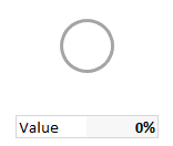
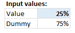 This is easy. We will use C4 to capture the input for donut size.
In C5, write =1-C4
This will give us the balance portion of donut where thread should appear.
Create a donut chart
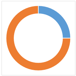
Select both cells and insert a donut chart.
This is what we get. Just the donut, no strings attached 🙂
Make 2nd slice of donut transparent
This is simple.
- Select the 2nd slice of donut (click on it once, click again)
- Fill it with no color, set no line.
- Your donut is transparent.
Adding thread to donut – 2 ways to do it
There are many ways to cook a donut.
Method 1: Placing a circle shape behind the donut chart
 Select plot area of the donut chart and make it transparent.
- Draw a circle shape (Insert ribbon > Shapes > Circle)
- Fill with no color, make the outline thick enough
- Align centers of chart & circle (select both, use Format ribbon > Align and then Align middle, Align center)
- Push the circle behind the chart using “Send to back” from Format ribbon.
- For extra safety, group the chart and circle together. This way they will stay together.
 Select plot area of the donut chart and make it transparent.
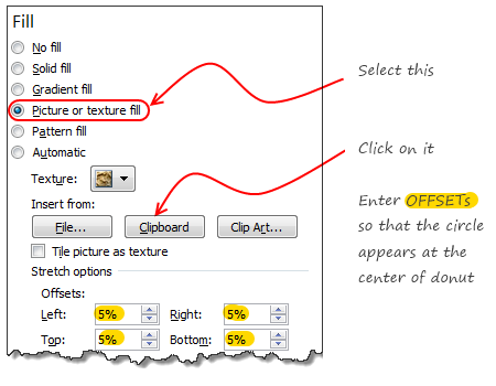 Method 2: Use circle as background image for plot area
This is my favorite.
- Draw a circle shape somewhere on your worksheet.
- Fill it with no color and make the outline thick enough.
- Copy the circle shape (Select it, press CTRL+C)
- Select Donut chart’s plot area
- Press CTRL+1 to format it (alternatively right-click > format plot area)
- Follow the steps in image aside.
Download Threaded Donut Chart
I wish we can download donuts, but that day is not here.
Click here to download the donut chart workbook. Examine chart settings to understand this technique better.
Should you use this chart?
We all know that donuts and pies alone cannot make a healthy diet. But once in a while, a donut adds variety. Same goes for charts too.
Go with tried and tested charts like,
- Bars & columns
- Line charts
- Conditional formatting icons
- Sparklines
- Scatter plot
- May be an area chart or two
They are easy to set up, easy to understand, scalable, fit in to any sized report and awesome.
That said, I would certainly experiment with stringy donuts in my future reports to see how they fit. A good example is to use this to depict % completion of a project or goal. Looks slick, easy to read and not too difficult to create.
What other charts work in this situation?
If you have a situation to show x out y is done, then consider these other charts too:
- Thermometer chart
- Bullet chart
- Budget vs. Actual chart (14 variants)
- Conditional formatting rating icons
- Best charts to compare actual with target values
What do you think?
When it comes to donuts, people have strong opinions. What about you? Do you like the stringy donut chart? Are you planning to use it any of your upcoming reports or dashboards? Please tell us using comments.


23 Responses to “I won’t eat donut with a thread inside, but lets make one anyway!”
Yeah, fun, variety, whatever, but really, why teach the trolls to make ineffective graphics?
@Jon
Because one day, somewhere, someone will have a legitimate use for this technique
Hui...
I won't hold my breath.
@Jon, does any of the theories solved real world problems..
@Jon
I'm absolutely with you! That was my first thought as well...
They look nice and it's always good to have a big arsenal of tools however, my first idea was: What does that chart tell me? And if I look further down the comments (seeing Chandoo's comment on Project 1, Project 2 etc.) I'll ask myself: Why do I need visualizations if I have the percentages already there? Isn't that redundant?
@Chandoo: Not meant to offend you of course, the tut - as always - is amazing
none taken. I love playing with ideas and this post like hundreds more here is just that. If I used project 1,2... visualization in any real report, I would have preferred these in the order.
1. Show thermo-meter charts
2. Show conditional formatting bars or in-cell bars
3. Show conditional formatting pie chart icons
4. Show raw percentages
5. Show the threaded donut charts
Except 4, I would not have included % column in all other cases.
chandoo,
thanks for your response. That exactly is the reason I love this blog so much 🙂
great post !!
In other way... we can create a single donut chart, and copy it,
paste it two more time, one upon one..
and then fill No Color for outer & Inner (Series 1 & 3, Point 1 & 3)
Will more flexible in case of re sizing chart area or Plot area.
I have tried to center the data label in this way:
http://i.cubeupload.com/4KnqIK.png
However whenever I change the value the data label seem to shift, is there a way to keep it centered. Using Excel 2013.
In a few of my workbooks I have VBA code that can take a minute or two to run. I've struggled in the past with finding an elegant way to communicate progress to the user. I think I'll use this technique.
Thanks!
The comments are probably too short to make this a clean post, but I'll try. Perhaps you can get the gist of this and show people in greater detail how it would work.
This visual representation is better created using a single XY chart. With thanks to the wizards at DailyDoseofExcel, you can try this.
1) Create a named range called Theta consisting of
=(ROW(INDIRECT("1:361"))-1)*PI()/180
2) Create a named range called _CIR1
=1
3) Named range of _CIR1X (worksheet range)
_CIR1*COS(Graphs!Theta)
4) Named range of _CIR1Y (worksheet range)
_CIR1*SIN(Graphs!Theta)
5) Create an XY scatter chart and add _CIR1X and _CIR1Y as the X and Y series of an XY Scatter lines no marker series. Adjust the line width and color to be the full circle with a grey color.
6) Duplicate steps 1-5 to create the partial line but this time Theta_2 should tie to a worksheet cell reflecting the % you want to chart. Since radians go counter-clockwise and you want the chart to increase clockwise, work the formula on the spreadsheet so you can specify what radian the chart will start on and subtract to get the end radian. For example, if you want to start the chart at radian 270 and show 10% on the circle, you would have ROW(234:270) in your Theta_2 definition (270-(360/10)). Your new X series would be _CIR1*COS(Graphs!Theta_2) and so on. Format the new series to be the color and width you like. Any data label you want to add can be placed at any point along the line.
You could have multiple concentric circles with this method, adding named ranges along with _CIR1 to have whatever increments of a radius you want and their associated segments.
I can't find the original post on DailyDoseofExcel where they went into this in more detail for a radial org chart, but I hope my explanation is sufficient to figure it out if I missed something.
Also, it's vital that the named range series you enter into the XY chart values are defined at the worksheet rather than workbook level, otherwise Excel won't recognize them when you try to assign them to the X and Y values. I'm not sure why this is, but perhaps others know why this is true.
I notice for my test Theta was defined at the worksheet ("Graphs") level but the other values were defined at the workbook level. Beats me what the naming standard is... all I can say is try it each way for the variables until it works!
http://dailydoseofexcel.com/archives/2013/04/28/draw-a-circle-in-an-excel-chart/
This is what happens when you post on a Friday evening!
Good suggestion GMF. I took the idea to create this...
I will post a video (or article) explaining the technique sometime soon.
One last oddity on this type of chart. If you try to add default Excel axes to the circle chart, at some point of adding ticks or labels it will almost certainly crash Excel (2010 and 2013). I'd wanted to use this model for polar charts but I can't seem to get it to be stable.
I did not use named ranges for the chart. I used a separate calculation sheet to get the numbers. This is easier and scalable. Plus no hassle of crashing excel or named ranges throwing confusing errors. As we don't have to pay for each cell we use, why bother with the in-memory named ranges at all?
True!
I like your style, as it's kind of a pie/sparkline showing what a thermometer-type chart would in a smaller space. I suppose a filled-in small pie might convey the same idea, like a clock.
But I'm thinking for your dashboard look it might be nicer to have 3 concentric circles. For example, we often want to see budget/schedule/scope ratings, and a concentric set of rings for each of your projects above might be a very quick way to see if they're in synch along with a radial line showing the budgeted progress. That's probably getting dangerously close to the gauge-style speedometer graphics that even I don't like, but I'll bet you could convince the nay-sayers with your skills!
It would probably generate as many comments as your Economist re-work!!
Thermometer-type charts need less room than donut or pie charts for the same resolution.
Three parallel bars sould be better than three concentric rings. One of the problems with concentric rings is that the differences in arc length for the same angle can be confusing.
Hi,
I can add some variations to this chart. I posted these charts after seeing them in a couple of dashboards just as you mentioned.
http://beatexcel.com/cool-gauge-chart-visuliations/
PS: Hope I'm not spamming..
Guys can anyone help me how to use or open the file after downloading Zip files from here I think its getting downloaded in HTML format or something
Dear Chandoo,
Currently you must be reading Times of India, Economic Times which is full of Election news. They have copied your donut charts. Every day I am seeing your chart in the newspaper.
Regards,
Raj