
Yesterday while checking my website analytics reports on Google analytics site, I have noticed a new beta feature called “Intelligence”. Out of curiosity I clicked on it. It took me to a an intelligence alert dashboard.
Ok, lets just back up for a minute and understand what “intelligence dashboard” is before moving on. In the web analytics world, intelligence means “is there something interesting happening on the site?”. This could be information like “300% more visitors from city of New York on 3rd November” or “Pages on Conditional Formatting received 50% less traffic than usual from search engines on Monday”.
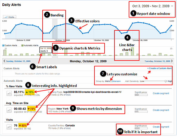
So, I clicked on the intelligence alert dashboard. And what a dashboard it is, very well thought out and designed. There are at least 10 dashboard best practices you can pick up from this and use in your day to day work. See it:
I have highlighted the important takeaways for us chart makers and story tellers.
- Use date windows so that end-users can change the date to see different report. This can be done in various ways. For eg. in our KPI Dashboards using Excel posts, we have used scroll-bars. If you have pivot reports, just add the date to “header” section. Otherwise, you can also use data filters to make your charts dynamic.
- Band / highlight selected dates to so that users know what they are looking. This can be done using simple formulas and a combo-box control. Here is an example of conditionally banding charts in excel.
- Use effective colors – Google uses simple but very effective colors. [Get 73 beautiful excel chart templates and make better charts]
- Use basic charts – Often we fancy ourselves to use some super-complicated-chart. Heck, Jon reviewed (more like lambasted) a 3d Square Pie Chart just yesterday. See how Google has used simple line and column charts to make the point. It is the same lesson every time folks – keep it simple.
- Use dynamic charts – We, humans like to play. That is the single most important reason to have dynamic charts in dashboards. See how google has used the dynamic charts in this dashboard (scroll down and see the video to understand how this dashboard works). Making Dynamic Charts in Excel – Comprehensive tutorials & examples.
- Be smart with data labels: While data labels can help understand the charts, often dashboards have too many charts and thus data labels make it look cluttered. A simple solution is to use data labels conditionally. Ajay at has another good example at databison on interactive data labels.
- Let your users customize the dashboard: This means ability to switch rows to columns, choosing how much information to see etc.
- Highlight important information: use different font (or font size), have special area on the dashboard to display key metrics etc.
- Show metrics by dimension: this is more common way to look at business intelligence reports. It might be a bit too much to do this kind of reporting from excel, but pivot tables can certain help you get there.
- A good dashboard tells what is important and what is not: While we can argue that dashboards should show “only” the important, a good dashboard lets user customize the contents and clearly tells what is not important if it ever shows up.
There is so much more beauty and design behind this google dashboard than what I can capture in a simple post. So I have recorded a small video (4 mins). Please take a look at it if you are keen to learn few more lessons on better dashboard design.
Watch it on Youtube if you are not able to see it here.
What do you think about the Google analytics intelligence dashboard?
Share your comments with us, what do you like about this dashboard? Do you find any mistakes in it? How would you use this lessons in your work?
Read more examples, tutorials and case studies on information dashboards


