
Analyzing competition is one of the key aspects of running a business. In this article, learn how to use Excel’s scatter plots to understand competition.
Recently, Kaiser at Junk Charts pointed to a very effective business chart that shows the dynamics of competitive land scape with ease.
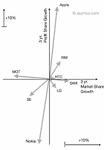
The chart shown aside originally appeared in Asymco, shows how mobile handset market has changed between 2007 & 2010.
What is so special about this chart?
I like this type of chart because it clearly tells the story of what happened in mobile handset market between 2007 and 2010. It shows how then leader, Nokia, kept loosing profit share despite a tiny loss in market share. It shows how new entrants like Apple have eroded the profit share for others. [related: good charts tell stories]
The chart instantly lets me ask important questions like, “So what did Nokia do wrong?”, “How come RIM is also in the same league as Apple (ie both market share and profit share went up) ?” etc. and explore for answers.
And that is what a chart should do. It should present a story and poke our curiosity to ask questions (or address problems).
How to construct similar chart in Excel?
Here is how you can construct similar business chart in excel.
Step 1: Get your data
In case of analytical charts like this, getting correct data is all important. For the sake of example, we will use the same variables – Market Share & Profit Share for 4 fictitious products – A,B,C & D. The data is shown below:

Step 2: Re-arrange the data, so we get first and last values
This is very simple. Use cell references to extract the data for just first and last periods. Now make starting values as zero and calculate ending values. Something like this:

Step 3: Make a scatter plot
Select the data and make a scatter plot. When you are done, it should look something like this:

Step 4: Format the chart
Do the following to format the chart:
- Add lines to scatter plot so that starting and end point are connected

- Set arrow symbol as the end-point style for these lines (new feature in Excel 2007 and above)
- Remove grid lines and legend
- Add data labels to either starting or end points alone.
- Add axis labels, position them accordingly
- Make axis and labels subtle.
- Add a descriptive chart title
And you are done. The chart should look something like this:

Bonus Step: Making a scatter plot of absolute values
As you can see, the above chart only shows changes in market share and profit share of products between Q1-2008 and Q2-2010. But a more descriptive option would be to show absolute position of each product at both times.
Like this:

To make this chart, all the steps are same as above, just change your data to starting and end points, not the calculated ones.
Download Competition Analysis Chart Templates:
I have prepared a simple excel chart template to help you create similar charts on your own. Click below links to download.
You can see the chart construction steps in the downloaded workbook.
What do you think about this chart?
As I mentioned I really liked how this chart lays out the dynamics of market place without complicating or animating anything. I think it is both simple and elegant [related: keep your charts simple]
What do you think? Please share your opinion and ideas thru comments. Also, tell us how you would have plotted same data?
More Excel Charts for Analysis:
Excel charts are powerful visual tools for analysis and exploration. We have posted several useful chart templates & ideas on chandoo.org. Please visit these pages for more resources on charting & analytics.


46 Responses to “6 Best charts to show % progress against goal”
Chandoo, thanks for another interesting post.
One thing I'm missing is the question: What is progress, what does one want to know exactly?
I'm asking the question because I think of progress as not the same as "state of completion." Percentages/bars, etc., as shown above, are great to communicate state of completion, but less so for progress.
That's because project progress is how state of completion *relates to* the resources spent so far. Resources can be things like dollars spent, hours spent or project time passed. For example, 5% would be "good progress" in the first week of a one-year project, but terrible progress in the last week of the project.
The way I prefer to report progress is as a simple line chart with time on the x axis, and maybe a marking for the end point (and maybe an "ideal"/"as planned" line).
If it really must be a single number, you could go a EVA-ish route and divide the current % of completion by the current % of project time passed, which gives you a schedule performance index (1 or bigger than 1 = good; smaller than 1 = bad). For this, your suggested charts should work great!
I avoid 'progress' except where I can objectively assess progress, such as counting bricks laid or concrete poured. For intellectual work, I don't think that its possible to measure progress to completion with any reliability or credibility. I prefer to update forcasts of completion date, because that's where the effect of completion on dependent activities, deliverables and outturn value of the project is felt. This is also referred to as the 0-100 method. An activity is set at 0 complete until its actually finished, when it is set at 100% complete.
Hi Chandoo,
Great post! I have a preference towards thermometer charts too mainly because of the target/actual comparison.
Just an FYI...seems like the the screen shot for the pies #4 are under the #5 heading. Also the pies conditional formatting is something that doesn't accurately portray completion since the pies are segmented into quarters.
AND also a little trivia...those "pies" are called Harvey Balls, named after Harvey Poppel...
Chandoo,
I wonder. Is there a trick to unzipping your files?
I always seem to end up with a series of XML files rather than an XLSX.
Thanks a lot. 🙂
Eric~
Hi Chandoo,
Thank you again for this amazing help you are so resourcefull to make us little bit more amazing everyday.
When I click on the link on the page "http://img.chandoo.org/c/best-charts-for-goal-progress-comparison.xlsx" it is always bringing me to a zip file with all XML files without the XLSX file. I tried with mozilla and IE.
Thank you
[…] http://chandoo.org/wp/2014/03/10/best-charts-to-show-progress/?utm_source=feedburner&utm_medium=… […]
@All having trouble with download file.
1. Download the file.
2. Rename the extension as .xlsx
3. Double click or open it in Excel
Doesn't make any difference Chandoo, still end up with a zip file full of xml related files/folders
@Ian H
Download the zipped file and rename it to *.xlsx
where * is the filename
ps: Great name!
Many thanks for your help Hui but not sure why you are repeating what Chadoo said and which I first posted to because it didn't work for me. I did as he said and it didn't work, hence my post.
Chandoo says:
March 11, 2014 at 1:52 am
@All having trouble with download file.
1. Download the file.
2. Rename the extension as .xlsx
3. Double click or open it in Excel
Also, please note that we are investigating an issue with our webserver settings that may be causing this behavior. Sorry for the inconvenience. I am hoping to get this fixed in next 48 hours.
I used thermometer chart & conditional formatting using traffic lights. I just recently completed a dashboard I hope you can take a look but don't know where to send it. Thanks.
The in-cell bar charts is very interesting. This is not to be used as one can easly do manipulations by changing fonts/ font size etc
Hi..this is really helpful..
but I hve one quick ques..is it possible to hve conditional formating for chart graph based on text value and not the numbers..if I take your example project one bar should be red...if data is project 2 then it should be blue..basically we mke chart based on countries n each countries are assigned specific color...so I want a way where I can use conditionsl formating and not do it manaually each month.
You can set up conditional formatting rules to do this.
See this... it may help
http://chandoo.org/wp/2010/04/01/incell-panel-chart/
Hi Chandoo,
Great article and will be very useful.
One question - is it possible to have in-cell bar chart and the percentage complete (similar to icons)?
Try something like :
=CONCATENER(REPT("|";A1*100);REPT(" ";25-A1*25);"|")
it's quite nice
Hi Chandoo,
I am a great fan of you since i stumbled upon your blog. Your blog is very informative and insightful. I liked the way you presented the 5 steps using thermometer chart. I was very much inspired by that and tried to make my own version with 20 tasks to complete. On and after 17th step it was going downward. So I wanted to ask you that is there any limitation to thermometer chart
[…] shows us the 6 best charts to use, when you want to show your progress against a goal. There’s a sample file to download, so you can experiment on your […]
Is there any xhart is available which can show achivement percentage it may 80% or 120% means more an set target.?
Hi Chandoo,
Love your site. I have a small question regarding plotting data that contains ranking. I have 2 fields - Country, Rank. Note that i don't have the absolute values from which the rank has been calculated. So what is the best way of showing this on a graph given only the above 2 fields. Appreciate it
Regds,
Ross
@Ross
I would assign a set of simple numeric values to your ranks
Even a simple 1 to 10 makes plotting relativities easy
Dear Chandoo Sir,
Really awesome post.
Thanks.
Vignesh.V
We can always rely on Chandoo to explain to us clearly things that perhaps we already knew but weren't putting into practice the best way.
A limit I never liked about data bars was that they are monochrome - one colour for positive values, one colour for negative. So a couple of weeks ago I sat down to figure out a workaround. If anyone's interested...
http://digimac.wordpress.com/2014/06/29/multicoloured-data-bars-in-excel/
Epic fail on my part! After three months I just found out that what worked on my machine, didn't work on others.
Problem solved, more functions added.
The link above at
To hide them use ;;; custom cell formatting code (how to).
appears to be incorrect. However, using the downloaded file and selecting a cell(s) from that example provides the easy answer.
I wondered if the pies could have a color other than black and white (which, of course, would raise the color-blindness issue that you referred to with the traffic lights example).
Hi Chandoo!
Thanks for the informative post!
I have managed to understand and replicate all of the progress graphs except one, the thermo bar. I read up on the tutorial of how to create them, and I understand almost everything about the look and use of the bar, but one problem I am having is that I cannot seem to "center" the bar into the cell like you did. The reason being that even though the highest input (progress) percent is 100%, the program automatically puts in another 20%, so instead of 100% stopping at the end of the graph, it stops 20% short and I have a huge space at the end because of it.
How did you counter that problem? I have been trying for hours to fix it
@Aden
Set the Axis limits to Minimum 0 and maximum 1
Thanks. I started running a project recently, and I found your charts to be really helpful in tracking it's progress. I'm glad I found your page.
Hi Chandoo!
Great stuff for my customized project moving forward. However, when I use the blue block bars, the %ages spark up to smt like 5000% and cannot lower them nor scale them. If I input manually such as 50% without formatting a column, the bar for 50% e.g., will fill the cell completely, so that's kind of odd... what to do?
Thanks!
I guess I have the same problem. When I put 50 and click on the percentage, it is giving me 500%. Can someone help us on this. Thanks in advance
[…] http://chandoo.org/wp/2014/03/10/best-charts-to-show-progress/ […]
Hey,
Thank you for making this page. I do have one problem with the thermo graphs. Whenever I try to drag the graphs from one cell to the cell beneath it, the data remains selected on the former.
For example, if I had a thermo with a target number in A1 and an actual number in B1 with my thermo in C1, when I drag my thermo into C2, C3, etc., all of the graphs show the results from A1 and B1.
Is there a way to have these graphs update automatically as I will be regularly working in an excel file with hundred of entries?
P.S. I removed the $ symbols from 'Select Data', but that did not fix the problem.
Thanks again!
@Lisa
Not sure but it sounds like the new cells have Conditional formats applied
Select just the new cells
Select Conditional formatting, Clear Rules, Clear Rules from selected Cells
Hi Chandoo.
I am charting on some defaulter data where greater than zero is not desirable. Problem is that I have to highlight zero as target and anything above as undesirable. Seek your help
Hi Chandoo
Great post!
But I am wondering why bullet chart is not on this list. Is there a reason for its absence?
Thank you for these instructions. The bonus 5 Step Progress Meter you included would be perfect for my project. Where can I find the instructions?
Hi,
Do you know of any simple way to reduce the Data Bars padding so that they fit within the cells?
Thanks and great posy!
Regards
Appreciating the dedication you put into your website and in depth information you
provide. It's good to come across a blog every once in a while that isn't the same out of date rehashed information. Wonderful
read! I've bookmarked your site and I'm including your
RSS feeds to my Google account.
With #1 and #2, how would you also apply a red amber green to the bars (is it possible within chart formatting or would you need to utilise CF)?
I'm thinking of an in cell bar of some kind which will show against a known goal end date how far along with the goal you are (this is to be used for 'how many of the X number of people that I need to train in X timeframe, have been trained and therefore which of each training group is on track to complete on time or falling behind'.
So there would be knowns of number of people, target end date but I'd want it to reflect accurately as some groups of trainees might only have 50 in so their 50% done would be different to a group of trainees where their group had 200 people in it - but 50% would still be the same. Somewhere there'd probably need to be something which noted that there was a different volume of trainees so it could but the remaining effort to train people into context?
Hope that makes some kind of sense, I could be waffling!
[…] charts. Its got things like “Best Charts to Compare Actuals vs Targets” and “Best charts to show progress“. I love me some charts […]
Thanks a lot my dear.
very Useful it for me.
Another great post, thanks for sharing.
Chandoo, I am just starting an Excel class, and everything in the class is new to me. I am learning how to use all of these great charts but don't know what they are all used for. Thank you for your post and I think I will be able to use this down the road throughout my business career
in the above charts , Chart #2: Conditional Formatting Data Bars
->Assume if we have completed 35% of work it is showing in Blue color ,in the same cell remaining 65% of work should shows in some color , how to show?
Hi Sir,
This is Rachit and I am a big fan of you and your work. This is to request you please make a video for Beverages Sales performance data analysis in Excel.
Regards,