
Back when I was working as a project lead, everyday my project manager would ask me the same question.
“Chandoo, whats the progress?”
He was so punctual about it, even on days when our coffee machine wasn’t working.
As you can see, tracking progress is an obsession we all have. At this very moment, if you pay close attention, you can hear mouse clicks of thousands of analysts and managers all over the world making project progress charts.

So today, lets talk about best charts to show % progress against a goal.
Please download example file and keep it handy while reading the rest of this tutorial.
Data for these charts
For all these charts, we will use below data:
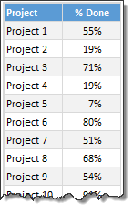
Chart #1: Conditional Formatting Icons + % values
This is my all time favorite. It is very easy to implement and works really well.
All you have to do is,
- Select the % completion data
- Go to Home > Conditional Formatting > Icon sets
- Select 3 traffic lights
- Edit the rule as shown below:
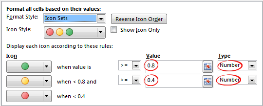
- Done!
Why you should use this?
- Very easy to set up.
- Scalable. Works the same when you have 20 or 200 or 2000 items to track.
- Looks great
Keep in mind:
- The traffic lights in Excel are not great for color-blind people.
- The traffic lights do not look good when printed in black-and-white (or gray scale)
Related: Never show simple numbers in your dashboards
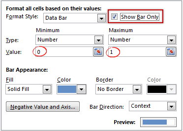
Chart #2: Conditional Formatting Data Bars
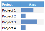
Another easy and quick answer.
- Select % completion data
- Go to Home > Conditional Formatting > Data bars
- Select Solid Fill if available.
- Done!
- Extra step: Adjust maximum bar size to 100% so that you can see relative progress better.
Why you should use this?
- Very easy to set up.
- Scalable. Works the same when you have 20 or 200 or 2000 items to track.
Keep in mind:
- By default the maximum value in your data takes 100% of the cell width. So make sure you set this to 100% for better depiction of progress.
Chart #3: In-cell bar charts
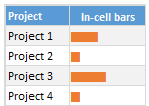
If for some reason you cannot use databars, then rely on in-cell bar charts. These are simple to setup and works great in many situations where conditional formatting may not be an option.
- Assuming your % data is in A1,
- In adjacent cell (B1), write = REPT(“|”, A1*100)
- You will get a lot of pipe symbols | in this cell.
- Select the cell and change font to Playbill
- Adjust font size and color if needed.
- Done!
Why you should use this?
- Very easy to set up.
- Scalable. Works the same when you have 20 or 200 or 2000 items to track.
- Can be handy when making dashboards or reports (where conditional formatting may have limitations)
Keep in mind:
- The font & size has impact on how in-cell chart is displayed. Use either Playbill or Script fonts.
Chart #4: Pies
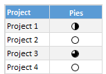
Conditional formatting pie charts are a simple alternative to show % progress data.
The process is same as traffic light icons. Make sure you adjust pie icon settings as per your taste.
Why you should use this?
- Very easy to set up.
- Scalable. Works the same when you have 20 or 200 or 2000 items to track.
Keep in mind:
- Pie chart icons have only 5 stops. So they are not really pies.
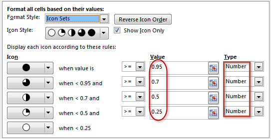
- Not everyone likes pie charts. Make sure your boss / customers dig them.
Chart #5: Color scales or heat maps
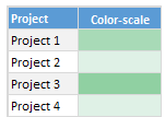
When you have a lot of items to track, your focus is really on which items are lagging (or leading). In such cases, a color scale (also known as heatmap) can work very well. It colors cells based on their value. For example, the darker a cell color is, the more that particular project is done and vice-versa.
Why you should use this?
- Very easy to set up.
- Scalable. Works the same when you have 20 or 200 or 2000 items to track.
Keep in mind:
- Make sure the color starting & end points are well contrasted. Else the color scale looks bland.
- By default color scales show the values too. To hide them use ;;; custom cell formatting code (how to).
Chart #6: Thermometer charts
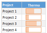
This is my favorite technique. It works very well for data like this.
Tutorial on how to create thermometer charts.
Why you should use this?
- Easy to understand
- Scalable. Works the same when you have 20 or 200 or 2000 items to track.
Keep in mind:
- If any value is more than 100% the chart may not explain it properly.
- Make sure the axis min & max are set to 0 and 1 respectively.
- You need a dummy column with 100% in it to show outline of thermometer.
Download Examples
Click here to download example workbook. It contains all these charts.
Special bonus for you:
As a bonus, the download workbook also has 5 step tracker to make you awesome in Excel. Go ahead and download now.
What is your favorite chart to show % progress?
My most favorite chart is thermometer. The next is traffic light icon-set.
What about you? Which of these 6 is your favorite? Please share your chart in the chart. If you use something else altogether, please tell me. I am eager to learn from you.
More on comparison charts

Just like my project manager, I am sure your manager too loves tracking & comparison. If so, please go thru below articles to learn few more tricks to impress her.
- Us vs. Them – compare one value with many using interactive chart
- Best charts to compare budget with actual values
- Indicating lower & upper bounds on a chart
- Customer service dashboard – a case study in comparison
- Exploring Flu trends in excel chart – a case study in heat maps for comparison
Now if you excuse me, I have to report to my new project manager: my wife. She is asking me about the progress of taking down Christmas lights. And I am still at 9%.


110 Responses to “Weighted Average in Excel [Formulas]”
Thanks Chandoo
[...] link Leave a Reply [...]
Hello Chandoo,
I use weighted average almost every day, when I want to compute the progress of my projects in terms of functional coverage :
1. I have a list of tasks during from 1 day to 20 days.
2. It is obvious that each task must be weighted regarding its duration.
3. My functional coverage is calculated with :
sumproduct ( total_duration_array * ( todo_array = 0 ) ) / Sum ( total_duration_array )
and all subsequent grouping you can think (group by steps...)
Regards
Cyril Z.
I use it to calculate the Avg Mkt Price Vs our Products.
Main difficultie: to place the calculation on a Pivot Table 😀
The use of array formulas does the trick for this calculation but, since I keep feeding new info to the file, it is getting way to "heavy" so I've started changing this calculation to a pivot table.
If I was the CEO of ACME.... Coyote would be armored like Iron Man !!!
Hello Chandoo
First - your site is excellent and very enlightning
Second - I find it easir to use an array formula
SUM(A2:A6*B2:B6/SUM($B$2:$B$6))
@Yair -
You can write your version of the formula with the SUMPROUDCT instead of the CSE SUM:
.
SUMPRODUCT(A2:A6*B2:B6/SUM($B$2:$B$6))
.
Why bother? SUMPRODUCT is about 10% faster than the equivalent array formula. I write about this on my blog:
http://www.excelhero.com/blog/2010/01/the-venerable-sumproduct.html
Regards,
Daniel Ferry
excelhero.com
And how would you calculate the MEDIAN of a data set that is presented as values and frequencies?
I have tried a couple of approaches, but could not come up with a solution that was elegant and scalable to data sets with an abritrary number of rows.
If I'm the CEO, I'd want to see how much money total is spent on payroll for each department. In which case, I'd just total payroll spending and divide by total # employees.
@Gregor
Have a look at
http://www.tech-archive.net/Archive/Excel/microsoft.public.excel.worksheet.functions/2008-06/msg02179.html
Thanks Chandoo, elegant solutions and helpful web site!
Small typo: both instances of $330,000 should be $303,000. You got it right in the image with the red circle around it, but the text is wrong.
"Now, the average salary seems to be $ 330,000 [total all of all salaries by 5, (55000+65000+75000+120000+1200000)/5 ].
You are a happy boss to find that your employees are making $330k per year."
superb For weighted avg
What if my weights are decline equally. Example Data to be measured with WMA A10:A20, weights 10,9,8,7, etc, starting with A20*10, A19*9, A18*8 etc.
Do I need to create a separate column with the numbers 10,9,8,7,6 etc?
Thanks!
@Joel
You don't need to use a seperate column for the weights, but it can be useful for clarity
.
If the weights are based as you say on a series you could use a formula like
say your in B20
=A20*(row()-10)
so as you copy this between B10 and 20 it will adjust automatically as you specified
That works nicely. Thank you!
Hi Chandoo,
Can you please guide me on How to calculate weighted average on the basis of Date...?
I wanna find out two things (1) Weighted average amount (2) Weighted average Date
Data:
Date Amount
01-Jan-11 1200
08-Mar-11 1000
05-Jun-11 1200
17-Mar-11 1500
30-Jun-11 1600
Kind Regards,
Krunal Patel
@Krunal
The average is (1200+1000+1200+1500+1600)/5 = 1300
When you say weighted average what other measure are you measuring against?
Typically you will have say a Weight, Mass,Volume or Time which your measure applies to
If I sort your data by date
`1-Jan-11 1,200 66.0
8-Mar-11 1,000 9.0
17-Mar-11 1,500 80.0
5-Jun-11 1,200 25.0
30-Jun-11 1,600
Total 238,200 180.0
W.Ave 1,323.3 `
In the above the 1200 units has lasted 66 days
the 1000 units 9 days
If I sumproduct the Qty and the days
I get 238,200
This doesn't include the 1600 units
I then divide the 238,200 units
by total days =180 to get 1,323 units per day
Hope that helps
Hi Hui,
Thanks for your reply.
I understand the concept but I dont understand why last date is not included. Instead it should have more weighted as compared to other.
Krunal
@Krunal
I have assumed that the 1200 units on 1 Jan applies from 1 Jan until the next period 8 Mar
If it is the other way around where data applies retrospectively, then your right except that we would leave out the Jan 1 result, see below
eg:
1-Jan-11 1,200 -8-Mar-11 1,000 66
17-Mar-11 1,500 9
5-Jun-11 1,200 80
30-Jun-11 1,600 25
.
Total 1,197 180
.
As I originally said weighting requires a second variable
Look at the fat content of Milk
it is expressed as %
So if you have 1000 litres at 5% and 4000 litres at 10%
in total you have 5000 litres at a weighted average of 9% (1000x5 + 4000*10)/5000
.
So in your case I have made assumptions about the usage of your product as you haven't supplied much data
If my assumptions are wrong let me know
Thanks Hui.
Run hr Produ prod/hr
1425.5 431380 302.61
873 290894 333.21
604 232249 384.51
If I take average of individual row, I find a prod/hr figure which is given in last column above. And while taking average of prod/hr, means (302.61+333.21+384.51/3), I find an average value 340.11.
And if I take sum of run hour (1425.5+873+604) and sum of produ (431380+290894+232249) and divide produ sum by run hour sum then I find a different average that is 328.8
Why this difference in average value though in totality it looks same?
May some one help me, pls.
Regards
Raju
328.86
@Raju
You cannot simply average the averages, because as you see each input has a different weighting. Your 604 hrs they worked very hard and in the 1425 hrs they slowed down.
What you've done by summing the Production and dividing by the sum of the hrs is correct
Hi. I have a series of prices, and I'm trying to develop a formula which gives me a projected price... So for example:
Prices (Earliest to Most Recent)
2.50
2.90
3.50
4.30
5.00
?.??
I want to see what the price is likely to be in the cell ?.??, and I want the most recent price to be more relevant than the earlier prices... so in this example, I imagine the value would be something around $6.30... the difference between the prices being .40, .60, .80, 1.00...
I really only need the results in one cell, taking into account something like a 5 day moving weighted average (if such a thing exists). I'm essentially trying to see if the price is trending upwards, estimating the price based on more recent sales data and working out if the difference between most recent price ($5.00) and projected price (?.??) is more than 5%.
Hi, i need some help creating a weight average for some account under me. we have 3 product lines (growing to 5 soon). I need to create a formula that shows a weight average to rank the account 1-50.
so product 1 goal is 50 product 2 goal is 3 and product 3 goal is 3. i would weight these based on importance at 80% product 1, 15% product 2 and 5% product 3. so how would i write this formula since averaging the 3 is not the correct way.
so here is a small example
Acct Name prdt 1 actual prdt 1 goal prdt1 % to goal
acct 1 25 50 50%
prdt 2 actual prdt 2 goal prdt2 % to goal
acct 1 1 3 33%
prdt 3 actual prdt 3 goal prdt3 % to goal
acct 1 1 3 33%
so the average % of the products is 38% thats not what i need i need the weighted average by acct on all three products using the weights 80, 15 and 5. Please help.
James
@James
.
Actual
=25*0.80 + 1*0.15 + 1*0.05
=20.2
.
Goal
=50*0.80 + 3*0.15 + 3*0.05
=40.6
Hi there, I'm trying to calculate a weighted average in Excel of products that are not in adjacent cells but cannot figure it out. For cells adjacent to each other I use sumproduct but can't find info on how to do it if the cells I need a weighted avg for are not next to each other.
IE
100,000(cell A1) units at $5 (cell B1)
150,000 (cell A5) units at $6 (cell B5)
Help!
You can use
=SUMPRODUCT(A1:A5,B1:B5)/SUM(A1:A5)
or
=(A1*B1+A5*B5)/(A1+A5)
or
=SUMPRODUCT((MOD(ROW(A1:A5),4)=1)*(A1:A5)*(B1:B5))/SUMPRODUCT((MOD(ROW(A1:A5),4)=1)*(A1:A5))
or
=SUMPRODUCT((MOD(ROW(A1:A5),4)=1)*(A1:A5)*(B1:B5))/SUM((MOD(ROW(A1:A5),4)=1)*(A1:A5)) Ctrl Shift Enter
(I've been waiting a while to use those techniques again)
refer: http://chandoo.org/forums/topic/i-need-idea-on-a-simpler-formula
I am trying to find teh weighted average score for a particular student name Dennis, Gina. How can I obtain this using the sumproduct formula if it's on 3 separate rows?
Agent Name ACD Calls Avg ACD Avg ACW Avg Hold AHT
Francis, Luis 951 139 29 13 180
Malave, Luz 910 143 28 86 256
Dennis, Gina 920 550 290 750 1590
Dennis, Gina 920 165 33 62 260
Sawyer, Curvin 1,536 236 4 60 299
Dennis, Gina 1,267 198 32 77 306
@Help Please
Assuming your data is in A1:G7
Try this for Column B:
=SUMPRODUCT((A2:A7="Dennis, Gina")*(B2:B7))/COUNTIFS(A2:A7,"Dennis, Gina")
Adjust for other columns
need help...i have a table that shows attach rates of each segment by quarter. i need to find the weighted avg of the last 4 qtrs
for example: segment 1 in qtr 1 is 60%, qtr 2 at 63%, qtr 3 at 48% and qtr 4 at 43%
@Ann
=Sum(range of the last 4 qtrs)/4
Hi. I'm having trouble finding the weighted average for the % of influence (which is related to the rated level). I need to find out what the weighted average % inluence is (the % column) and then to use that % to calculate the $ of the influenced spend overall. HELP
Spend A Level % Spend B Level % Total$(M)
$99,660,078.50 0 0% $3,886,439.82 1 15% $300
$393,235.39 3 100% $465,897.47 2 50% $ 4
In the First Semester Scores worksheet, in cell F17, enter a formula to calculate the weighted average of the first student’s four exams. The formula in cell F17 should use absolute references to the weights found in the range C8:C11, matching each weight with the corresponding exam score. Use Auto Fill to copy the formula in cell F17 into the range F18:F52.
Student Score Top Ten Overall Scores
Student ID Exam 1 Exam 2 Exam 3 Final Exam Overall
390-120-2 100.0 83.0 79.0 72.0
390-267-4 84.0 91.0 94.0 80.0
390-299-8 55.0 56.0 47.0 65.0
390-354-3 95.0 91.0 93.0 94.0
390-423-5 83.0 82.0 76.0 77.0
390-433-8 52.0 66.0 61.0 53.0
390-452-0 85.0 94.0 94.0 91.0
390-485-7 89.0 78.0 80.0 87.0
390-648-6 92.0 87.0 89.0 97.0
390-699-6 74.0 75.0 47.0 64.0
391-260-8 96.0 82.0 91.0 96.0
391-273-8 69.0 74.0 81.0 74.0
391-315-1 87.0 89.0 70.0 82.0
391-373-1 100.0 94.0 86.0 93.0
391-383-6 93.0 90.0 95.0 80.0
391-500-8 78.0 89.0 81.0 88.0
391-642-7 74.0 81.0 83.0 86.0
391-865-0 88.0 71.0 84.0 81.0
391-926-7 94.0 90.0 97.0 97.0
391-928-5 83.0 71.0 62.0 87.0
392-248-7 72.0 70.0 88.0 77.0
392-302-1 83.0 76.0 81.0 80.0
392-363-7 89.0 72.0 77.0 73.0
392-475-2 100.0 96.0 90.0 99.0
392-539-3 95.0 96.0 91.0 85.0
392-709-8 72.0 49.0 60.0 51.0
392-798-4 82.0 61.0 70.0 61.0
392-834-1 82.0 71.0 64.0 70.0
393-181-6 76.0 69.0 58.0 70.0
393-254-4 90.0 76.0 91.0 71.0
393-287-6 84.0 85.0 66.0 74.0
393-332-3 96.0 88.0 94.0 93.0
393-411-8 80.0 74.0 75.0 82.0
393-440-4 86.0 85.0 85.0 82.0
393-552-0 100.0 96.0 87.0 94.0
393-792-5 78.0 60.0 87.0 70.0
py the formula in cell F17 into the range F18:F52.
You rock! Thanks so much for this weighted average calcuation/formulas. They are dead on.
Hi, I am not sure if this falls under weighted average or how to figure this..
I have different payment terms for different vendors and am trying to figure out how to figure my average payment terms on a montly basis.
25 days = 5% of spend
30 days = 60% of spend
45 days = 20% of spend
60 days = 15% of spend.
Can you advise? Thanks!!
I have to compute weighted average for students exam scores. Let's say there are 5 exams.
But some of the students have only 3 or 4 exam scores... How can I do that?
Hi,
I was looking for a payroll dashboard.
Do you have one?
useful, but please change the $330k to $303k in the text
best
Great article! Very helpful example of weighted averages. Now to apply this to my ranking formula...
Hi, i have a typical problem where i have around 15 transactions which have different AHT's for each of the transaction. I would like to know what will be the weighted average of all these AHT & Transactions, can u pls help me out
Transaction Type AHT Per Day Tran
120 Sec Trans 120 3
180 Sec Trans 180 87
208 Sec Trans 208 2954
240 Sec Trans 240 354
293 Sec Trans 293 4
300 Sec Trans 300 79
120 Sec Trans 322 2464
380 Sec Trans 380 19
381 Sec Trans 381 229
120 Sec Trans 396 182
401 Sec Trans 401 655
480 Sec Trans 480 49
540 Sec Trans 540 33
987 Sec Trans 987 251
1080 Sec Trans 1080 47
@Manu
Assuming your data is in Columns A1:D16
try the following:
Weighted Ave. AHT per Day
=SUMPRODUCT(A2:A16,C2:C16)/SUM(A2:A16)
Weighted Ave. Tran
=SUMPRODUCT(A2:A16,D2:D16)/SUM(A2:A16)
Thanks Mr. Huitson, however need one clarity as to what should be the values in cells D2 to D16 ?
As in my earlier query, i have given the Transaction AHT in Column 'B' and daily average volume in Column 'C'
Please help
Manu
It is unclear what is in what column
It appears that you have 4 column
The formula is :
=Sumproduct( weight range, data range) / sum(weight range)
let me try this formula
COLOR DIFF :
CLARITY DIFF:
CUT DIFF:
POLISH DIFF:
SYM DIFF:
53.14%
SAME
65.22%
SAME
84.06%
SAME
48.79%
SAME
66.18%
SAME
24.64%
1 BETTER
28.02%
1 BETTER
7.25%
1 BETTER
48.79%
1 BETTER
26.57%
1 BETTER
15.94%
1 WEAK
5.80%
1 WAEK
8.70%
1 WEAK
2.42%
1 WEAK
7.25%
1 WEAK
4.83%
2 BETTER
0.48%
2 BETTER
1.45%
2 WEAK
0.48%
2 WEAK
hie how can i get overall average formula ols reply me as soon as possible
@Himanshu
Can you please post the file as this is difficult to understand
below is the snapshot as am unable to upload the excel
AHT is the time consumed for each of the transaction and the next figure is the daily count of transactions
(120 seconds, 3 transactions per day
180 seconds, 87 transactions per day
208 seconds, 2954 transactions per day)
AHT Per_Day_Tran
120 3
180 87
208 2954
240 354
293 4
300 79
322 2464
380 19
381 229
396 182
401 655
480 49
540 33
987 251
1080 47
@Manu
Assuming your data is in A1:B16 the weighted average is:
=SUMPRODUCT(A2:A16,B2:B16)/SUM(A2:A16)HI Chandoo,
I am wondering if I can use any function in excel to help me make a better purchase decision.....
for example, if I am looking for a product (say, a laptop computer) and I go on a shopping website and I find out following information.
1. Model number
2. number of reviews
3. actual review rating (out of 10)
Now, there may a case when one person rated product A 10 our of 10 Vs 100 people rated another product B 9 out of 10. Obviously, I am safer with going for Product B, but how can excel be of help?
To make it more complex, if there were attributes of user ratings(like ease of use, durable, design etc), how to see this complex picture as top ranking of 1 , 2 and 3?
Just was wondering.....................
thanks in advance..............
@Mahesh
Typically you will setup a number of criteria and then rank each criteria from say 1 to 10
Add up the criteria
and then examine the results
You may want to give some criteria differing importance and this can be done by giving such criteria a score of between 1 and 20 etc
You need to be careful about weighting scores on the number of responses
hello. i would like to know how can i use weighted average for statistical data analysis. i`ve collected data by using a likert scale type. number from 0 to 5
1
2
3
4
5
3
1
0
10
7
0
0
9
7
0
2
0
8
5
2
0
0
0
11
9
0
4
4
8
5
@Ouz
Can you maybe post a sample file with some field headers
I assume the 1st 1-5 are the question No's
But why are there values > 5?
I thought you would layout the data as:
Also what is the weighting factor in your data ?
Thank you so much for this. It was extremely helpful and just what I needed today to calculate the weighted average of some data.
I am trying to create a weighted average for a series of tests with some testing readministered on a second date. Not all tests are administered on each testing. The workaround I have been using is to use a second matrix with an if function, but I am curious if there is a more elegant solution. Sample data is below:
Weight Test 1 Test 2
10 90 105
25 85
20 100 100
avg 95 96.7
weighted 96.7 94
Using the SUMPRODUCT/SUM described without the matrix incorrectly yields a weighted average of 52.7 since the second test counts as a zero. Is there an easy way to get Excel to ignore particular cells if they are left blank (i.e. test was not administered rather than score was 0) while using the weighted average function described here? Thanks for your help.
@Jeff
Does: =SUMPRODUCT((A3:A5)*(B3:B5)*(B3:B5<>""))/SUMPRODUCT((A3:A5)*(B3:B5<>""))
Help?
That actually gives me a #DIV/0! error. I'm not familiar with the (B3:B5<>"") string. What does that indicate? Is there a way to upload a file? I would be happy to just put the whole thing up so it would be easier to see what I am doing. I can also always use the workaround I have, it just seems unnecessarily messy.
UPDATE: That equation does work, however, you have to identify the cell as a matrix calculation. When the equation is entered it will initially give a #DIV/0!. Highlight the cell and hit CTRL+SHIFT+ENTER. Then it calculates correctly. I am using Office 2010, so I am not sure if this applies in any other versions as well.
@Jeff
The formula should be entered normally not as an Array Formula
It will work equally as well in all Excel versions
My file using your data is here:
https://www.dropbox.com/s/z3lwro9fwwb3vyi/Jeff%20weighted%20Ave.xlsx
There are instructions on uploading files
Refer: http://chandoo.org/forums/topic/posting-a-sample-workbook
I am working on a spreadsheet that I input scores from a test. Some questions are 1 point and others are .5 points. My problem is that when I go to average these cells the percentage is off. I get 68.2% when the scores needs to be 81.25%. So the test is out of 8 points total and there is 6 problems that are 1 point and 6 problems worth 0.5 points. How do I get it to give me a correct average?
Sincerely,
Desperate Teacher
Sorry 5 problems are 1 point and 6 problems are 0.5 point.
@Desperate teacher... welcome to Chandoo.org
Write your scores & points like this:
Then, you can use a formula like,
=SUMPRODUCT(points, scores)/SUM(points)
See this example.
OK, so I have to come up with an average. I have 35 surveys with a 92% satisfaction and 9 with a 100% satisfaction. How do I write a formula to show me the average of all 44 surveys?
@Fred
=(35*0.92+9*1)/(35+9)
Hello - I am trying to find the average number of days it takes to complete a task. An example of my data is:
Column one=
0 days
1
2
3
4
Column 2 =
23
9
55
1088
1030
So I need the zero to be counted to represent the tasks that were done on the same day they were started... I cannot figure it out!! Please help!
Frustrated Analyst!!
Isn't it simply
=(23+9+55+1088+1030)/5
=441 things per day
So it really depends on the speed at what your doing things
If you have to make 2205 things
it will take 2 days at 1088 per day
but several weeks at 9 per day
Hi--I think my problem could be solved by a combination of lookup and sumproduct but I cannot figure it out. I have a group of different omelettes and a few of those omelettes roll up to a more general group (i.e., NY, PA, and NC Omelettes roll into East Coast). I need to do a weighted average of NY/PA/NC Omelettes for East Coast. I need the formula to first look into the Level column. If 1, find the price in the data sheet. If 2, go to column A and find OMEL in this case, find all the rows that have OMEL (however many rows) in the Code column, and do a sumproduct with the Category Mix % and Avg Price for those rows and put the weighted average in the cell. Thanks so much!
A
B
C
D
E
F
1
Item #
Omelettes
Level
Code
Category Mix
Avg Price
2
256
Colorado Omelette
1
25.0%
$6.80
3
378
LA Omelette
1
15.0%
$6.20
4
OMEL
East Coast Omelettes
2
30.0%
$X.XX
5
123
NY Omelette
1
OMEL
60.0%
$4.50
6
124
PA Omelette
1
OMEL
15.0%
$6.70
7
125
NC Omelette
1
OMEL
25.0%
$3.90
8
657
Texas Omelette
1
10.0%
$8.60
9
864
Arizona Omelette
1
5.0%
$7.30
10
395
Ohio Omelette
1
15.0%
$5.50
Hope this table is more understandable:
Item # Omelettes Level Code Category Mix Avg Price
256 CO Omel 1 25% $6.80
378 LA Omel 1 15% $6.20
OMEL East Coast Omel 2 30% $X.XX
123 NY Omel 1 OMEL 60% $4.50
124 PA Omel 1 OMEL 15% $6.70
125 NC Omel 1 OMEL 25% $3.90
657 TX Omel 1 10% $8.60
864 AZ Omel 1 5% $7.30
395 OH Omel 1 15% $5.50
Hello - I am trying to figure out how to create an average line on a graph. When I try to create it, the line always ends at the correct average but begins at zero. How do I make an automated average line that is completely vertical | ?
Thank you!
@Not Your Average Analyst
can you post a sample file?
Refer: http://chandoo.org/forums/topic/posting-a-sample-workbook
HUI: Hello, I use wtd grades for student grading. I was wonndering if there is a way to determine a students grade at a certain date along the program. For example, say Alex is mid way through the course and at this point, 60% of the total points for the course could be achieved. Using the template I have created, it gives me a skewed result for grades up until the final score is entered at the end of the course. For example, if Alex has recieved 90% on test A, 87% on test B, 94% on test C, but test D and E have yet to be administered. The 5 tests are worth a total of 100% of the overall grade, but since 2 tests have no scores available, the weighted grade percent will not reflect his actual grade at this moment. How do I use excel to calculate that? Thanks!
@Happy Healer
As you aren't weighting the individual tests,
Wouldn't it simply be the average of his scores to date?
=Average(90, 87, 94)
=90.33
ps: Sorry for the delay, I was traveling in April and obviously missed the post
Hi all,
Quick question.
What if some of the values are negative values, does the formula still work?
Thanks,
SF
@Saw-Fro
Yes, Negatives don't affect the answer except that they reduce the average
100 0.1200 0.2
300 0.3
400 0.2
500 0.2
Ave (weighted) 320
100 0.1
200 0.2
-300 0.3
400 0.2
500 0.2
Ave (weighted) 140
thanks for your prompt reply - I figured out what was wrong about it. The negative values were not negative initially - I made them using a custom number formula hence why I thought the formula was not working. After making each value negative manually it worked.
Thanks!!
It's really a great and helpful piece of info. I am satisfied that you shared this helpful info with us. Please stay us up to date like this. Thanks for sharing.
SEPT '12 SEPT '13
A 102 85
B 970 1,004
C 380 307
D 33 27
Grand Total 1,452 1,396
Hello,
can you help me calculate the weighted average between these two time period
@NM... I am not sure I understand this question. Can you tell me what you have in mind when you say "weighted average between these two time periods" ?
@NM
What field are you weighting on?
Can you explain your request maybe with an example?
2013 2012 Delta Weighted Change
Site A 1003 966 +3.8% 2.6%
Site B 307 380 -19.2% -5.0%
Site C 85 102 -16.7% 1.2%
Total 1,395 1,448 -3.7% -3.7%
Here is an example: with the weighted change previously calculated. Now I am trying to determine how to calculate the weighted change with these new figures below. My guess is Sept 13 should be the weighted field..
SEPT ’12 SEPT ’13
A 102 85
B 970 1,004
C 380 307
D 33 27
Total 1,452 1,396
@NM
I understand the Delta
But have no idea how Weighted was calculated
Typically when doing weighted averages, you have a second or more fields which are the weighting fields
Hi,
I intend to design a excel based rating system . How do i dervie a rating based on a) Target % b) Goal weightage.
Note- rating 1 ( best) , rating 5 (worst)
Goal weightage on scale of 1 to 5.
Weighted grade
48.07/70
68.94 what grade is that?
Chandoo,
Once again you have guided me along the path of correctness. Thanks for the help!
Hi Chandoo, in your example you have average salary of a department and you are trying to calculate average salary of an employee. for that you need to know "actual total salary" of each department and then use that in the weighted average formula, you have used avg. salary of the department instead. isn't this wrong ?
Very cool site.
Need help calculating weighted average yield on assets.
I have a spreadsheet with over 200,000 rows with assets totaling over $2.5 billion. Each row has about 120 columns with different stats for each loan. One of the columns is "asset amount" ($) and the other is "yield" (%).
I am using SUMIFS to filter the assets based on certain criteria (about 20 unique items), which generates a total dollar amount of assets out of the $2.5 billion that are in the entire spreadsheet.
I need to calculate the weighted average yield only on the filtered assets (which total well below the $2.5 billion). How can I create the weights for the resulting assets since the denominator changes every time I change the filters?
Thanks.
@JB
I'd suggest using a Sumproduct based formula
Can you post a set of data or email me ?
Thanks for this, i found it very useful.
I'm having problems finding a weighted average when dealing with time spent in a task, because each entry has its own time...
I don't know if I'm being clear on this, english is not my mother language, sorry.
For exemple:
I have 500 tasks, divided in 5 categories. But the time spent is always diferent (5m, 4m59, 5m05, 4m48, etc.), so I'm not able to group them in quantities for each category.
Can anyone help me?
@Claudia
Can you post a sample file in the Forums
http://chandoo.org/forum/
@Hui
Thank you for your interest in my question. I attached a file in the post http://forum.chandoo.org/threads/weighted-average.4256/
Sorry, the correct link is - http://forum.chandoo.org/threads/weighted-average-time-spent.18887/
Hello Chandoo,
I have company attendance data of employees in the following form which extract it from MS SharePoint 2010. I need to know that extract data is in the form of decimal value for e.g. clock in time is like 9.34 so do I consider it 9:31 AM, if not how to convert it in a time value.
Name Clock In Clock Out Status Time Spent
XYZ 9.16 20.30 Present 11.14
I need to calculate team attendance averages but some employees come late or even late which I think disturbs my average.
I have 60k+ of Sumproduct and it really slow in my recalculation. I read from your website too, 75-excel-speeding-up-tips. That I need to change my formula from Sumproduct to Sumif.
Do you mind show some light? Having trouble to find in the criteria.
@Kian
Depending on exactly what your doing there may be other functions that can be used as well
Please ask the question in the Chandoo.org Forums and attach a sample file
http://chandoo.org/forum/
How would you calculate the WEIGHTED MEDIAN of a data set that is presented as values and frequencies. The values are 1 to 5 of a likert scale.
How would I use this formula in a whole column, while keeping the same row of numbers for the sum? Here's an example:
=SUMPRODUCT(AC3:AO3, AC1:AO1)/SUM(AC1:AO1)
So I'd want to use this formula for different data in each row I have, but keep the weighted data "AC1:AO1" the same for each row. So the next row would have the formula:
=SUMPRODUCT(AC4:AO4, AC1:AO1)/SUM(AC1:AO1)
and so on. When I click and drag the formula to apply it to the whole column, I instead get this for the next row:
=SUMPRODUCT(AC4:AO4, AC2:AO2)/SUM(AC2:AO2)
Is there a way to keep the AC1:AO1 part of the formula the same.
Thank you so much for looking into this!
[…] Weighted Average in Excel – Formulas to Calculate Weighted … – Learn how to calculate weighted averages in excel using formulas. In this article we will learn what a weighted average is and how to Excel’s SUMPRODUCT formula […]
Looking for a running total in Excel with weights.
Assigned and Completed [weight*score]: .4*100 + .2*80 + .1*90
Not Assigned Yet [weight]: .3
How to get Excel to ignore Not Assigned Yet ?
I have a question. I am trying to calculate in a weighted average method where the value for corresponding weights is both in figure and percentage. How do i calculate the same if I do not have the total value from which i can convert the percentage into integers.
@Aveek
Can you ask the question in the Chandoo.org forums
http://forum.chandoo.org/
Please attach a sample file to clarify the question and get a more specific answer
I have Scores, Weight, Goal in my excel but I was wondering how to get the actual percentage. Can someone help me?
@Malyne
When you talk Percentage are you refering to percentage of the start weight, target weight or Percentage of the weight to be lost?
Can you post your question at the Chandoo.org Forums?
http://forum.chandoo.org/
Please attach a sample file to receive a more targeted response
Hello,
I have multiple tasks that I am measuring. I have the # of tasks that can be completed in 1 hour. I want to weight the tasks so that all are measured fairly.
Currently employees working the fast/easier tasks can process more per hour than those working slow/easier tasks and are achieving a higher tasks/hour rating.
How do I determined be the weights?
How do I apply the weights to the actual tasks each employee completes?
@Sherrie
I'd recommend asking this in the Chandoo.org Forums
http://forum.chandoo.org/
Attach a sample file with some data if you can
I am trying to calculate the variance between budget to actual for various departments so I can get a per unit. I was trying to use weighted average. At the end, I need to end up with a variance per unit$. How do I do it? here's the sample data:
Division Actual $ Actual Units Budget $ Budget Units
Division Actual $ Actual Units Budget $ Budget Units
1 $319,652 52,880 $294,416 57,124
2 $2,207,091 166,255 $2,267,253 173,708
3 $944,691 16,827 $881,216 17,321
$73,388 2,115 $87,738 2,512
$3,544,823 238,078 $3,530,623 250,665
Total variance per unit FOR ALL DIVISIONS
@KVM
You may be best to ask this question in the Chandoo.org Forums
http://chandoo.org/forum/
Attach a sample file to simplify the response
It's going to be end of mine day, but before finish I am reading this
enormous article to increase my experience.
I use sumproduct to analyze training evaluations. Participants submit their evaluation of training content, process, and trainer(s) via Qualtrics. The downloaded CSV file needs a lot of manipulation to get question averages, overall average for the training, and overall average for the trainer. Sumproducts makes the calculation SO MUCH EASIER!
Thank you for sharing the formula for "Weighted Average with Extra Conditions."
Please give examples of the following:
1. Weighted Average with 2 Conditions from the same column
2. Weighted Average with 2 Conditions from different columns
Thank you for sharing your expertise.
This is a great explanation of weighted averages in Excel! The step-by-step breakdown makes it easy to follow, and the formula examples are helpful. I appreciate the practical approach—a time-saver for complex calculations. Thanks for sharing this valuable insight!