
ABC analysis is a popular technique to understand and categorize inventories. Imagine you are handling inventory at a plant that manufactures high-end super expensive cars. Each car requires several parts (4,693 to be exact) to assemble. Some of these parts are very costly (say few thousand dollars per part), while others are cheap (50 cents per part). So how do you make sure that your inventory tracking efforts are optimized so that you waste less time on 50 cent parts & spend more time on costly ones?
This is where ABC analysis helps.
We group the parts in to 3 classes.
- Class A: High cost items. Very tight control & tracking.
- Class B: Medium cost items. Tight control & moderate tracking.
- Class C: Low cost items. No or little control & tracking.
Given a list of items (part numbers, unit costs & number of units needed for assembly), how do we automatically figure which class each item belongs to?
And how do we generate below ABC analysis chart from it?
![]()
That is what we are going to learn. So grab your inventory and follow along.
(related: ABC Analysis page on Wikipedia)
ABC Analysis using Excel – Step by step tutorial
1. Arrange the inventory data in Excel
Pull all the inventory (or parts) data in to Excel. Your data should have at least these columns.
- Part Name
- Unit cost
- # of units (if this is blank, just type 1 in all rows)
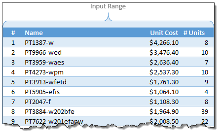
Once the data is in Excel, turn it in to a table by pressing CTRL+T. Lets call our data as inventory. You can set the table name from Design tab.
(Related: Introduction to Excel Tables)
2. Calculate extra columns needed for ABC classification
Now comes the fun part. Crunching the inventory data with formulas. Yummy!
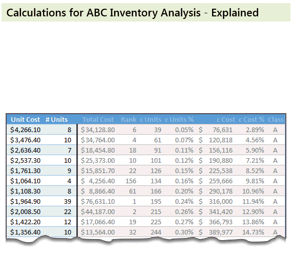
Total Cost: This is just a multiplication of unit cost & # of units columns
Rank: We need to figure out what rank each total cost is (in the total cost column). We can use RANK formula for this.
=RANK([@[Total Cost]],[Total Cost],0) will tell us the rank for each total cost.
Cumulative Units: Once we know the rank of each item, next we need to figure out how many total units are needed for items ranked less or equal.
For example, The number (#) of the third part (PT3959-waes) is 3. Cumulative units for this is 91. This means, 91 is the total number of units for first three ranked parts (parts # 8, 9, and 16).
The formula for this is, =SUMIFS(['# Units],[Rank],"<="&[@['#]])
Remember, [@[‘#]] refers to running numbers (1,2,3….4692,4693)
Cumulative Units %: This is a percentage of cumulative units in total. The formula is simply,
=[@[c Units]]/MAX([c Units])
[Related: using structural references in Excel – video]
Cumulative Cost & Cumulative Cost %:
These are similar calculations (instead of units, we calculate cost)
Explanation of these calculations:
See below animation to understand how the numbers are crunched.
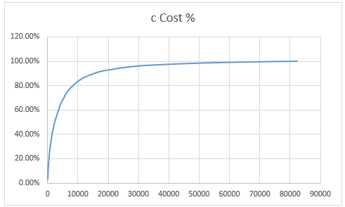
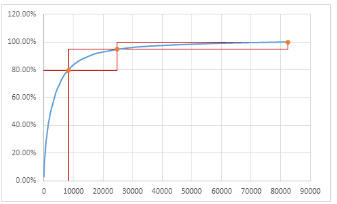
3. Create Inventory Distribution Chart
Select cumulative units & cumulative cost % columns and create an XY chart. Make sure cumulative units is on horizontal (X) axis and cumulative cost % is on vertical (Y) axis.
Our curve should look something like this.
4. Set up ABC classification thresholds
Now we need to decide what is the threshold for classes A,B & C.
For most situations, Class A tends to be top 10% of the items.
Class B would be next 20%
Class C would be the last 70%.
But these numbers may change depending on your industry, manufacturing settings.
Lets say, some where in our spreadsheet, user has defined the thresholds for the classes in a range like this:
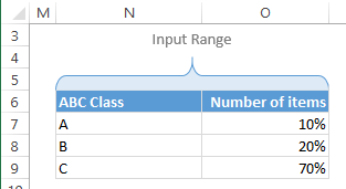
So $O$7:$O$9 contains the thresholds.
Next to this range, calculate additional numbers (for plotting A, B & C markers and boxes) like this:
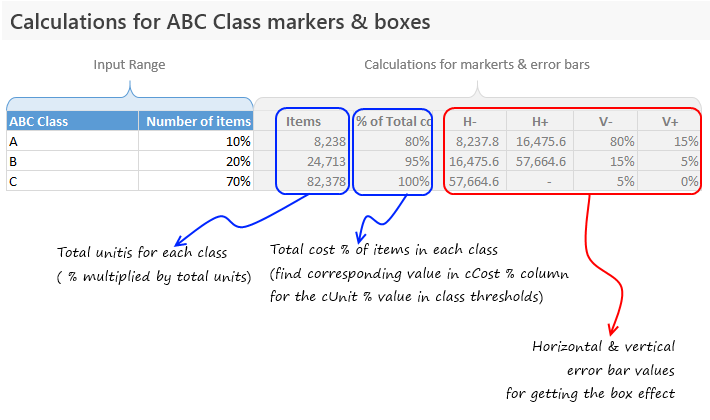
Examine the download file for exact formulas.
5. Add the ABC items & % total cost columns to chart
Add the extra data to the chart (by right clicking on chart and going to select data box & clicking “Add” button).
Once the new series is added, make sure you format it as markers only so that we get something like this.

6. Add Error bars to the ABC markers to get boxes
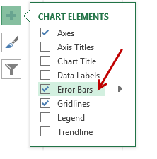 This step involves adding error bars to ABC marker series and customizing them.
In Excel 2013: Add error bars by clicking on the + button next to chart
In earlier versions: Do this from layout ribbon
Once error bars are added, customize them (select and press CTRL+1). Set error amount to Custom and select the calculated error values as shown below.
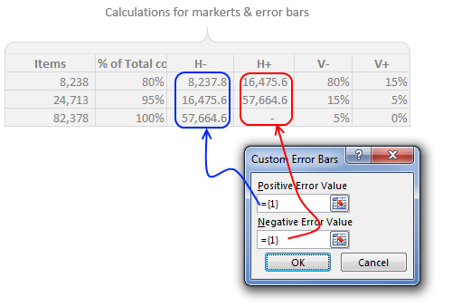
Once added, format the error bars to show no cap and change line color to something pleasant.
Now we have boxes on the chart.
7. Clean up the chart, add labels & titles
This is where get creative. After some clean up, we can arrive at something like this.
![]()
Download ABC Inventory Analysis Template Workbook
Click here to download ABC Inventory Analysis workbook. It contains sample data & chart. Examine the formulas & chart settings to learn more. Or if you are in a hurry, replace the sample data with your inventory details and get instant results.
Do you use ABC analysis for inventory tracking & control?
I will be honest. I have never worked as inventory controller in a super-car manufacturing plant. That said, I run a business and we do have inventory. Not physical but digital inventory. So I often use analysis like ABC or pareto to quickly figure out where I should focus my efforts.
What about you? Do you use techniques like ABC analysis to narrow down to a few items that matter most? How do you do it in Excel? Please share your tips & experiences using comments.
Add few more techniques to your inventory
Feeling low on your Excel skills inventory? Stock up with below goodies.
- Pareto Analysis in Excel – How to & tutorial
- Analyzing competition using charts – case study
- Track employee vacations & productivity [dashboard & tutorial]
- Track annual goals & achievements


44 Responses
This was also discussed at the E90E50fx site a while back:
https://sites.google.com/site/e90e50fx/home/customer-segmentation-dynamic-template-chart
Which was actually started here at Chandoo.org by Jeffrey Weir in the post:
http://chandoo.org/wp/2014/01/27/customer-segmentation-chart/
There is a great discussion about the techniques in the comments of this last post
meh; I don’t really ABC stuff I have on the shelf, instead abc is governed by value of usage or quantity of usage and application of that is what I use to look at the inventory which is more indicative of what’s moving.
Still though, cool chart, cool technique.
Shouldn’t the formula for Cumulative Units be
=SUMIFS([‘# Units],[Rank],”<="&[@[Rank]])
instead of
=SUMIFS(['# Units],[Rank],"<="&[@['#]])
and similar correction should be made to Cumulative Cost formula?
Either way the numbers in that array will be same (just shuffled). I am using running number as there is always a chance of duplicate rank.
@Pedo I could not either of those techniques to work. for Cumulative Units. any ideas what i am doing wrong?
Hi, if you put in the first row, a value of $0,00001 in Unit Cost and 1 in # Units, the clasification is A, and it must be C.
the correct formula is for Cumulative Units is
=SUMIFS([‘# Units],[Rank],”<="&[@[Rank]])
=SUMIFS([‘# Units],[Rank],”<="&[@['#]])
how compute the normal excel formula instead of using table format
You should also check out K-Curve, a more refined, and optimisable? technique
How would you do that if you should extend your chart with XYZ classification too?
you wouldn’t. It works because cost is the series and cost is how he’s breaking out abc.
stacked bars make more sense visually….
I also cannot figure out the calculation for “c Units”. If I add up the “# Units” for the first six parts I get 48. Not 36.
What specific numbers are being added together to get 36?
If you sum up units for parts that are ranked 1, 2, 3, 4, 5 and 6, you should get 39.
I’m sure it’s right in front of my eyes but I’m still not seeing it. If I manually sum the “# Units” for part numbers ranked 1 – 6 I come up with 134. Am I looking at this incorrectly?
#1 – PT3884-w202bfe – 39
#2 – PT7622-w201efanw – 22
#3 – PT1613-w202dbre – 30
#4 – PT9966-wed – 10
#5 – PT2019-w211esf – 25
#6 – PT1387-w – 8
Hi Stig,
It is cumulative units when sorted by ranks.
the c units in rank 1 is 39, and c units by rank 2 is 39 + 22 = 61.
The formula is referring to #,
In first cell, it is 1 and compares in ranks column to see where are ranks less or equal to 1, and fetches units. = 39.
In second cell, it is 2 and compares in ranks column to see where are ranks less or equal to 2, and fetches units, 39 and 22
resulting 61.
Regards,
Prasad DN
Ok. Now I understand it. Wow!!! Like I said, it was right in front of my eyes and I didn’t see it.
Thank you Prasad.
Prasad,
You are correct, but the description in the article is incorrect. It should be changed to indicate what you wrote.
The article says “For example, Rank of first part (PT1387-w) is 6. Cumulative units for this is 39. This means, 39 is the total number of units for first 6 parts.”
It should say “For example, The number (#) of the third part (PT3959-waes) is 3. Cumulative units for this is 91. This means, 91 is the total number of units for first three ranked parts (parts # 8, 9, and 16).”
This actually describes what the equation is doing. Chandoo probably had an intern write the descriptions which led to the erroneous explanation.
Hi Ron,
Thanks for the clarification. I wrote the article. I thought since we already used the word RANK in the sentence, the first 6 parts meant first 6 ranked parts. So deleted the ‘ranked’ part to make it concise. Obviously that confused many readers.
I am not clear about the ‘[@[‘#]’ in “c Units” column. For example, I found that the result it generates for ‘PT1387-w’ is 1 by using Evaluate Formula in excel. Could you please explain it in more detail?
Thank you show much!
Nice one, Chandoo.
Hi Chandoo,
Some days backmy Supply Chain Management team had asked me to do this analysis, so I developed the same, but with few differences as listed below:
1. I took the %age classification of 70%,20%, 10% based on total amount and not on no. of items.
2. I used VBA to find the ABC.
3. I used a tolerance limit in %age, eg. 70.01 should be treated as A or 69.9 is A and after that if cumulative %age is jumping to 72% than stop at 69.9% for A.
I cannot share the file now, but will soon share with sample data on your forum.
Regards,
Hi Somendra Misra, can you share your working data sample, so that I can try to work it with the same logic.
Vijay
Hi Vijay, Will do in a day or two.
Regards,
Somendra
Hi All,
I do not use ABC analysis as I am not from inventory management. At the same time I do like to see if I can interpret this in my work.
What I really could not understand is the conclusion part, I do get the point that A class we are spending XX amount, which is YY% of total cost, and ZZ number of units, but how am i going to take decision or manage with this info.
Pls throw some more light on this.
Regards,
Prasad
I’ll give it a try.
ABC analysis, as it relates to inventory management, is all about “order of magnitude” and inventory constraints. Typically a manufacturer will have reorder points for raw or semi-finished materials that are used to assemble a finished good. The reorder points are based on a build forecast and other supply chain constraints such as freight time, parts availability, etc. There is a specific calculation for reorder points and forecasting that you can look up on google.
The ABC analysis helps you understand what you need to be worried about. If a part is low quantity and high cost you don’t have much room for error if something bad happens such as damage in transit. You can use the ABC chart to prioritize your sensitivities and create backup plans that allow you to meet production forecasts and maintain high quality finished goods. If a part if high quantity and low cost you will be less sensitive and spend less time planning for unforeseen circumstances.
quoting this statement “We group the parts in to 3 classes.
Class A: High cost items. Very tight control & tracking.
Class B: Medium cost items. Tight control & moderate tracking.
Class C: Low cost items. No or little control & tracking.
Given a list of items (part numbers, unit costs & number of units needed for assembly), how do we automatically figure which class each item belongs to?”
I’m sure it could apply to our company
hi,
one question, I download the template, and observe that the sequesnce of inventory item list will impact the ABC classification, if some cheap or unimportant inventory items list more head than important items, the result of ABC maybe distort the actual situation.
please correct me if I am wrong.
Br,
Dany
Hi
Changing fórmulas for legend text to
O12 =TEXT(O7,”0.0%”)&” total items (“&TEXT(P7,”#.##”)&” items)”
O13 = =TEXT(O8,”0.0%”)&” total items (“&TEXT(P8-P7,”#.##”)&” items)”
O14 = =TEXT(O9,”0.0%”)&” total items (“&TEXTO(P9-P8,”#.##”)&” items)”
will add interesting info with respect to how big % items (specified with above mentioned formulas) are responsible for how big % costs (already detailled).
Br Martin
I applied all formulas as given above on my data but curve doesn’t looks smooth? Can anybody help?
Hello,
I wanted to thank you for this amazing, crystal-clear explanation!
I have just noticed a typo in the screenshot of chapter 4 of “marke(t)rs” 😉
Thanks again!
Hi,
For the input range & calculations you’ve created a single table. (how do i know this? when i convert the table into a range the whole range gets converted) my question is how did you format part of the table separately.
I know you didn’t just select the cells & changed the color. coz’ a unique feature of table is, when you copy & paste within the range the format want be changed.
Thnaks
Just checking, for units (cumulative and %) how can it be the sum of those less than rank 6? From manually calculating that seems to be ranked 1.
for example, for the first row you have rank 6 and 39, if we use your explanation that would mean that there are 39 units sold from rank 1-5. But if you were to look at the rows below, for example, rank 4, the “cumulative” units are 134. It wouldn’t make sense for there to be 134 units for ranks 1-4 while ranks 1-6 would have fewer units at 39.
I believe the correct explanation would be that the first row of cumulative would be the units for the first rank, 2nd row would be the cumulative sum of rank 1-2.
Please correct me if i’m wrong.
Really appreciate this, your excel skills are on a different level.
Also, the number of units in each level is incorrect, as the total number of units is 82,378 yet in the column of units next to C group (supposed to have 70% of 82,378) it shows 82,378.
You have different sku used in inventory for different product, for example: diesel (gallons, tons) and office paper (packages, kg). You can’t just add this unit in calculation and arrange according to their value. They’re incomparable.
Other then that -great.
my graph looks like this, https://imgur.com/a/IMGQz
is it normal? or something is wrong with it
@Jericko
Is that what you wanted?
If you wanted a decreasing left to right chart
Right click on the X Axis and select Format Axis
Tick Values in Reverse Order
i just followed the steps on this tutorial. what i want is to come up with a graph same on this article.
it seems like the formula for the the “class” is wrong. doesnt make sense on my calculations :/
When I calculate the % of total cost, it always ends up with 43% – 54% – 89%. I can’t seem to find what’s wrong. Shouldn’t this always be 80% – 95% – 100%? What could’ve gone wrong?
This is a nice technique but I was wondering if I wanted to use the data table for other calculations the line item does not line up with the ABC classification. Is my understanding correct that the graph ignores the relationship between a line item and its class and instead looks at cumulative totals/classification independently ?
Profesor, saludos desde Perú.
Me queda la interrogante de como hace los cálculos de las columnas “H” hasta la “L”.
Podría explicarlo en un tutorial de yotube?
Muchas gracias!
=SUMIFS([‘# Units],[Rank],”<="&[@['#]])
how formulate above normal excel instead of table
Assuming units is in A2:A10, rank in B2:B10 and # in C2:C10, use this formula
=SUMIFS($A$2:$A$10, $B$2:$B$10,”<="&C2) Hope that helps
Oh it is works , thanks ,, really help me
need do more a lot inventory analyst .
How are you getting ” % of total cost ” as 80% for class A ?