Today lets talk about how to build world-class dashboards.
What is a dashboard?
Dashboard reports allow managers to get high-level overview of the business and help them make quick decisions. A dashboard is usually a one page report that contains critical information for decision support.
How to make dashboards?
Excel is an excellent tool to make powerful dashboards that can provide analysis, insight and alert managers in timely manner. But creating a dashboard takes a lot of skill & practice. That is where a resource like Chandoo.org comes handy. In this site you can find more than 200 different dashboard examples, tutorials, samples and downloads – all designed to make you awesome.
A step-by-step approach to dashboards
Creating a dashboard is a time-consuming, tricky and intense process. To help you guide thru this process of envisioning and designing a dashboard, I have created 2 online courses – Excel School & Power Pivot class. In these courses, you learn how to,
- Structure data (using tables, data connections & SQL)
- Analyze data (using features like formulas, DAX measures)
- Gain insights (using features like charts, sparklines, pivot tables)
- Interact with reports (using slicers, form controls & VBA)
- Present results (by making amazing dashboards)
What dashboards?
In our course, we show you how to create dashboards with 11 different examples. The dashboards you will learn are (click on any image to enlarge),
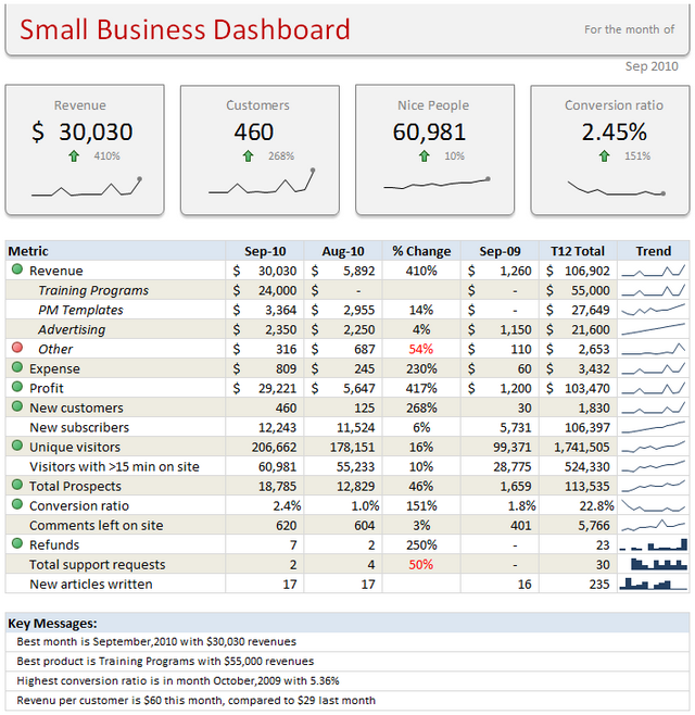
Small Business Dashboard
Dashboards that change every month • sparklines • tables • conditional formatting alerts • layout
KPI Dashboard
KPI reporting • dynamic charts • Showing more in less space • layout techniques
Website Dashboard
Layout techniques • mixing different formats • dynamic charts • using color & contrast
Website Dashboard – 2
Layout techniques • analyzing lots of data • using color • mixing charts
Real Estate Dashboard
Using maps • automating with VBA • advanced charting
On Demand Details Dashboard
VBA with charts & cells • conditional formatting • in-cell charts
Sports Dashboard
Picture links • using color & layout intelligently • advanced formulas & in-cell charts
Simple Kpi Dashboard
Simple layout • conditional formatting • quick dashboarding
Employee Dashboard
Using tables • conditional formatting • working with calendars • layout techniques and VBA
Store Performance Dashboard
Using DAX measures & pivots • slicers • conditional formatting
Product Performance Dashboard
Using DAX measures • Show / hide slicers • Advanced charting • Advanced DAX measures
Join now to learn…
We have re-opened our online classroom this Monday (10th of February) and more than a 100 analysts & managers have already enrolled in these powerful, practical and detailed courses. As you are reading this, they are learning how to do awesome things using Excel.
Click here to know more about these courses & join.
What do our students say about the class?
Oh they just love it. But don’t take my word. Read the testimonials:
– John Geiger
– Johan van Dyk
– Prashant Amara
More testimonials & love letters.
So go ahead and enroll now. Learn how to make world-class dashboards & reports using Excel.


11 Responses to “Learn how to create these 11 amazing dashboards”
Wow..some of the dashboards you've created here, I had no idea could be created using excel. Thank you for sharing such in depth information. Will be visiting back to learn more.
[…] Learn how to create these 11 amazing dashboards […]
Hi
Can I download the above dashboards?
I would like to try some out?
Fantastic dashboards!
[…] some inspiration? Go to Chandoo’s blog for some awesome examples of Excel […]
Hi Chandoo,
I am a big admirer of your work for a while now as well as used tips and tricks for my work as a data analyst.
I really like these dashboards you've done. My question is how to be able to download the source files? are they available in the excel school?
My other question is: with relevance to Dashboards which course would take priority? Excel School OR Power Pivot class??? (I can only take 1 at the moment)
Kind regards, Tom.
@Tomas.. thanks for your love and appreciation of our work.
Answers.
1. Yes, all these workbooks and detailed tutorials can be downloaded from Excel School program (except those marked as Power Pivot class)
2. For Dashboards, go for Excel School + Dashboards program.
Please visit http://chandoo.org/wp/excel-school/ to sign-up.
Hi Chandoo,
I have to say really useful webpage. I have a quick question. I have just build a dashboard but I stuck we a small problem.
In my dashboard I have a slicer with week nr. When select in slicer a week nr for example week nr 5 like to have compared with week nr. 4.
Current week 10
Chnage vs Previous Week 5 -50%
But I am not able to get the last weeks figure. Can you help me ?
Hi i am alireza i like nice dashboards
I've used sumproduct(subtotal(....)) formula on dashboard to dynamically calculate values form a table, by applying filters to the table on sheet2. I need to have filters(dropdown values of filters) on the dashboard, in order to avoid going to sheet2 for applying different filters and instead select a values from dropdown list and it automatically filters the related column in sheet2. I can share the sheet, anyone plz help me.
Very Awesome!
Please keep me updated of new excel and PowerPoint newsletters and tips pls