Whenever we deal with large amounts of data, one of the goals for analysis is,
How is this data distributed?
This is where a Box plot can help. According to Wikipedia, a box plot is a convenient way of graphically depicting groups of numerical data through their five-number summaries: the smallest observation (sample minimum), lower quartile (Q1), median (Q2), upper quartile (Q3), and largest observation (sample maximum) [more]
Quartile?!? What is that like?
When we say $ 39,000 is the lower quartile of salaries paid in Acme inc. it means, 25% of people make less than or equal to $39,000
Like that Median (Q2) means half the samples are lower than median & the other are more than median.
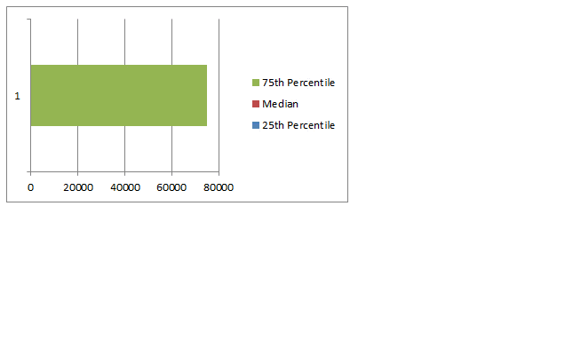
Example Box Plot
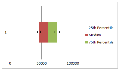
Here is an example box plot depicting salaries of all analysts in USA as per our recent Excel Salary Survey.

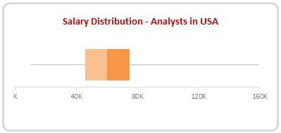
The box shows distribution of middle half of data (salaries) while the lines (called as whiskers) show minimum and maximum salaries.
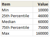
As you can see, 50% of the analysts make between $46,000 to $75,000 while the min is $10k and max is $160k.
Why use Box plots?
Box & whisker plots are an excellent way to show distribution of your data without plotting all the values. They are easy to understand. We can use them whenever we have lots of data or dealing with samples drawn from larger population.
Creating Box plots in Excel – 9 step tutorial
Despite their utility, Excel has no built-in option to make a box plot. Of course you can make a 3D pie chart or stacked horizontal pyramid chart. Lets save them for your last day at work and understand how to create box plots in Excel.
Step 1: Calculate the number summaries
Assuming your data is in list use formulas MIN, MAX & PERCENTILE to calculate summaries like below:

To calculate 25th percentile (Q1) use = PERCENTILE(list, 25%)
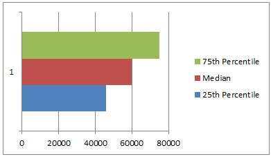
Step 2: Make a bar chart from Q1, Median & Q3
Just select the 25th percentile, median & 75th percentile values and create a bar chart.Make sure that your chart shows 3 different colored bars not 3 bars in one color.

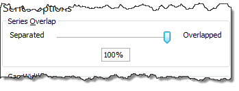
Step 3: Set series overlap to 100%
Select any bar, press CTRL+1 (right click > format series) and adjust series overlap to 100%

Step 4: Adjust series order so that you can see all the bars
If you cannot see all the bars, right click on chart, click on “Select data”.
Now, adjust the series order using arrow keys so that you can see all the bars. See this demo:

Step 5: Make 25th percentile (Q1) bar invisible
Select the bar corresponding to Q1 and fill it with white color. If you make it transparent, it will not work. So make it all white.
Step 6: Add error bars to Q1 & Q3 series
Just select Q1 (25th percentile) bar and add error bar (any type) from layout ribbon.

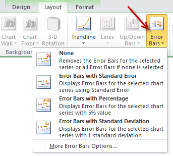
Repeat for Q3 series as well.

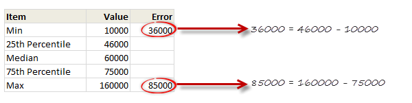
Step 7: Set up error values in your data
Add an extra column in your data area and use simple formulas to calculate error values, like below:

Step 8: Set up custom error values for Q1 & Q3

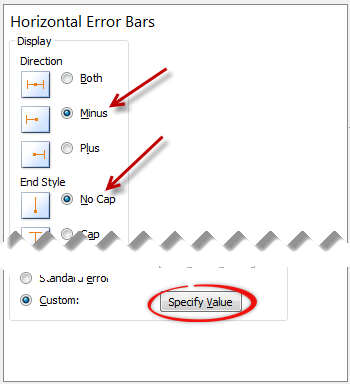
Select the error bar for Q1 (25th percentile) and,
- Press CTRL+1 to format them
- Enable only minus (negative) error bar with no cap.
- Select Custom as error amount and point to the calculated value.
Repeat for Q3, but choose positive error bar instead.
Step 9: Format the box plot to your taste
Remove any legend, axis, labels that you do not need. Change colors to suit your taste and mood. Make the whiskers subtle and knock off the grid lines. You are good to go.

Making Box plots interactive
Since box plots are very useful to understand distribution of values, we use them in dashboards etc. Naturally, you are interested to know how values are distributed for various things.
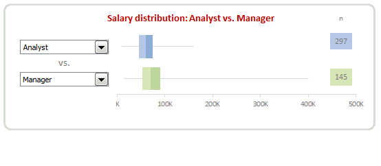
In this example, we may want to know how analyst salaries compare with manager salaries.
To make things complicated, we have 10 different job types, thus enabling 45 possible comparisons (10c2)
This is where interactive box plots can help. See this demo to understand:
Interactive Box plot in Excel – a Demo

How to make interactive box plot in Excel
Construction of box plot is same as mentioned above. The difference is in adding interactivity.
Step 1: Use combo box form controls to capture comparison criteria
Excuse the tongue twister. Using Developer ribbon > Insert > Form controls, add 2 combo box controls and point them to the list of job types.
Lets assume that these combo boxes are linked to cells D1, D2.
[Related: Introduction to Excel Form Controls]
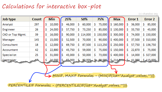
Step 2: Calculate 5 number summaries using MINIF, MAXIF and PERCENTILEIF formulas
Don’t rush to type the formulas yet. There is no such formula as MINIF (or MAXIF or PERCENTILEIF). Assuming your list of jobs are in joblist, write
=MIN(IF(joblist=”Analyst”, list_of_values,””))
and press CTRL+Shift+Enter
Using MAX(IF(…)) and PERCENTILE(IF(…)) you can calculate remaining 4 summaries.

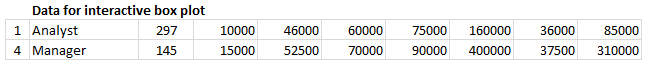
Step 3: Based on combo box selection, fetch any two sets of values
Using INDEX formula, we can fetch values corresponding to each combo box selection to a set of cells, like this:

Step 4: Connect these values to your box plots
That simple!
Step 5: Format and interact
Format the charts. Play with combo boxes to interactively compare one set of distribution with another. Show it to your boss or client and see them fall off a chair.
Download Box plot tutorial workbook
Click here to download the workbook containing these examples. Play with it. Check out various formulas and chart settings. Learn.
Do you use Box plots?
I love box plots. I have used them several times. Few examples are here: Excel age survey results, Gantt box chart and more.
In our Excel salary survey contest too, many people have used box plots to clearly compare compensation composition. Checkout the entries by Aditya, Allred, Anchalee, Anup, Bryan, Jeanmarc, Joerg, Kostas, Luke, Michael, Nathan, Sergey and Vishwanath. Especially Jeanmarc used interactive version of box plots to allow comparison on demand.
What about you? Do you use Box plots often? How do you prepare them? What is your experience like? Please share using comments.
Create Box plots often? Use Jon’s Add-in
If you need to create box plots often and find the above process tedious, then please consider getting a copy of Jon Peltier’s Box Plot add-in for Excel. It works like a charm and produces what you need. All in a few clicks. Click here to know more.
PS: Link to Jon’s add-in is an affiliate link. It means, when you buy it from Jon thru this link, I will get a few bucks too. I recommend it because I know it is awesome and perfect for box plots.


33 Responses to “Show Months & Years in Charts without Cluttering”
Very CooOOOoool 🙂
Would it work if I merely change the display format for the dates, or do they actually need to be retyped in that format (Nov, Dec, etc)?
ps- it's only about 34 donuts per month, or slightly more than 1 per day. Yum!
To make it work automatically when you create a chart, delete the labels above the Year and Month columns, but keep the label above the Y data (Donuts). The blank cells tell Excel that the first row and first two columns (indicated by the blanks) are special, so it uses the first row for series names an the first two columns for X axis labels.
This is better than the other kind of donut chart, but you'll soon be carrying a big donut around your midsection.
First off, thank you Chandoo for being respectful and taking out the "Jesus" comment. Not that I'd threaten to kill you, or start world-wide riots, or make you go into hiding if you didn't (as OTHERS would; wink, wink, nudge, nudge)... I just really appreciate your respectulness and consideration; so thank you. I was meaning to write you about it, but when I came to your site you'd already made the edit... so again, thank you!
Secondly, I wanna say I think there's an easier way to do what you are demonstrating. I've got a pivot chart with months of data and all I had to do was right-click the x axis and then select "format axis", under "Axis Options" there's a check-box that says "Multi-level Category Labels". The chart I was able to do this on was a pivotchart however so maybe it wouldn't be that easy for a non-pivotchart.
Anyway, love the site. Keep up the good work. Thanks also for being so open about your success, it's very encouraging and motivating.
God (aka Jesus) Bless. 🙂
Hi Chandoo - great site! Another option to save space is to simply rotate the orientation of the text by 90 degrees, so the dates read vertical rather than horizontal. However, I like the elegance of your solution also.
Hey Chandoo -- Great tip. Only yesterday I was working through some strange behaviour with formatting dates in PivotCharts. Seems the axes never want to cooperate. This is a neat and elegant solution I hadn't thought of using. May need to abandon pivotcharts to use formulas like that, but if we use dynamic named ranges, no big sacrifice.
BTW, whatever did you do to get your site blocked in China? Never heard of regime change by a grass-root spreadsheet movement. Maybe your ISP is hosting some problem sites. Chandoo.org is certainly worth it for me to fire up the VPN, but I'm sure you would lose a lot of other visitors from the middle kingdom.
Chandoo ... pls help.. the link is blocked over here... pls can you put the regular link... 🙂
@JP... Excel Axis formatting is linked to cell formatting by default. So you can just have the dates which are formatted to look like months (mmm).
@Erin: It was not my intention to mock anyone's faith or religion. I just used the word as it is quite common. I decided to remove it as I got 2 emails from readers requesting for the same.
Also, the pivot charts take pivot table groupings by default, so you need not do any of the above while making charts from pivot tables.
@Kein: I am not sure why Chinese authorities decided to block my site. I wish they would actually look at the content instead of blocking sites based on simple text matching rules.
@Kapil: The file is mirrored here: http://chandoo.org/img/d/date-axis-months-years-trick.xls
Cool, really cool...
Nice one Chandoo,
Also would like to mention abt useful method while creating dynamic charts.
In any chart where in the months keep on adding - instead of changing the range for the chart every time we add a month, we can actually format the months as dates (probably 1st of every month) still keep the format as "mmm" AND while selecting the data, we can select a huge rows (date column) once and for all, and the chart adjusts automatically with the data that we entered. So next month when I enter Dec's data, I need not change the source data of the chart, however it automatically adjusts.
Hope I made sense.!
Regards,
SS
Thanks, Chandoo! This is a great tip - one that I will definitely put to use. I typically have an axis with mmm yy format, aligned vertically, but this will definitely look a bit cleaner (except in cases where the chart is too small for the axis labels to be displayed horizontally, even without the mmm yy on one line). Thanks again!
Tom
Chandoo,
Thank you for the posts you are very diligent not to mention very helpful. I would like to know how to get the separation lines on the axis? For example your candy sales chart has longer lines separating east and west how do you format that?
Thanks for being very awesome!
-Josh
Hi Chandoo, we can look the formulas because there is a message:"Unsupported features".
Could you send a diferent Link ?
Thanks.
@SS But what if you've got formulas in the data block (i.e where you would enter static data for the month of december)? My chart now shows #N/A #N/A in the axis with no data for all future dates.
Chandoo, I've got a dynamic range set up showing #N/A errors for future dates. The MMM-DD date format format in row works fine, but when I use YYYY and MMM in two rows, the axis shows #N/A #N/A for all future dates with no data. How would you go about keeping those future months hidden?
Matt -
In order for the axis to automatically extend to the dates within the range and ignore #N/A at the end, you need a date-scale axis, and for this you need to use one column with the complete date, not two columns with year and month.
If you want to use two columns, you need to generate Names in the worksheet which define ranges only as long as the number of months. I have a review of dynamic chart approaches in http://peltiertech.com/WordPress/dynamic-chart-review/ and a whole category on my blog at http://peltiertech.com/WordPress/category/dynamic-charts/. Chandoo also has examples of his own on this site.
How do you make a dynamic chart out of this?
I can't get the axis labels range right.
I tried something like this:
=OFFSET(REPORT!$H$10:$I$10;0;0;COUNTA(REPORT!$H$10:$I$100);1)
Any idea?
Ethan -
Your offset formula defines a range 1 row in size, but the technique here requires 2 rows. Your definition should end with
;2)
instead of
;1)
Thanks Jon,
Got it working now
Great! Now, is there any way to do this directly in Powerpoint? I don't like having linked excel files, so I create the graphs right inside Powerpoint, any way to do this there? I tried and was unsuccessful.
Thanks.
Cool tip Chandoo......thanks
[...] extract year and month from dates to avoid a mess in our stock chart. Chandoo has a great post: Show Months & Years in Charts without ClutteringIn cell B2:=YEAR(D2)In cell B3:=IF(YEAR(D3)=YEAR(D2), "", YEAR(D3))Cell C2:=IF(TEXT(D2, [...]
Hi there,
I have got a data ranging for 3 years. I want to show a chart which shows Jan of 2011, 2012 and 2013 together side by side; then Feb11, Feb12 and Feb13 side by side, then Mar11, Mar12 and Mar13, and so on until December.
Please help. Thanks.
@Bilal
Do you want a number of charts next to each other as separate charts or the data next to each other in a single chart?
What type of chart were you thinking about?
Can you post your data for us to review?
Refer upload instructions at: http://chandoo.org/forum/threads/posting-a-sample-workbook.451/
Hi there
Very good solution this. I have another question on it, though. How do you format the X-axis with monthly gaps (ie, with labels "Jan 2012", "Apr", "Jul", "Oct", "Jan 2013", "Mar", etc), when you're dealing with a data series with weekly or daily data points? The Axis Options dialogue box doesn't appear to offer "Date axis" as an option under the "Axis Type" section.
I've managed to do it in one case with weekly data by setting the interval between tick marks at 13 -- the approximate number of weeks in a quarter -- to get 3-month intervals. But this wouldn't work if I wanted to show 1-month intervals, or had a more detailed daily data series to work with.
Any luck getting the dates to work on a scatter graph? I'm only getting numbers. Works fine on line graphs though.
How can we do the vice versa? i.e. on the x-axis showing year on the level 1, and months on level 2.
I wanted to build these kind of axis labels for 5 years, with year on top and months at the bottom, but it should form in such a way that the seperating lines should seperate the entire data set only at December of each year, and no lines in between any month.
@Apoorve
Just re-arrange the columns
You need to put a space in all cells where you don't want a year
See the attached file
http://chandoo.org/wp/wp-content/uploads/2010/11/Chart-for-Apoorve.xlsx
Unfortunately you don't get any control over lines its all or nothing.
Hello - the link seems to be broken:
http://cid-b663e096d6c08c74.office.live.com/view.aspx/Public/date-axis-months-years-trick.xls
Regards.
Like!!
Three times already today I have used this website and saved a ton of work time in researching excel tricks.
Suggestion: Why not have a "like" or "this article was useful to me" button. That way you can see what is most useful by your users and maybe generate more content based on those "likes".
Just saying. Thanks again and you're doing a great job!
Thanks for the tip. However, I couldn't download your file. The link is broken.
Thank You for taking the time to post this tip. I hope that you have a blessed day.
The link does not work properly and I'm not sure how to actually get the graph to display like this, its frustrating me a tonne. I cant work out what to google either to find an answer elsewhere! 🙁
Is this possible with waterfall chart. Data hereunder -
Years Abbrevation Amt
2020 BEG 2,006
REV 1,950
EMP 1,058
DM (3,244)
OOE 1,078
OPMT 182
AB (638)
END 2,392
2021 REV 8,534
EMP 67
DM (2,142)
OOE (3,120)
OPMT 510
AB 1,008
END 7,249