
This is a guest post by Myles Arnott from Clarity Consultancy Services – UK.
In this and next 3 posts, we will learn how to make a Dynamic Dashboard using Microsoft Excel.
At the end of this tutorial, you will learn how easy it is to set up a dynamic dashboard using excel formulas and simple VBA macros.

[Click here for large version of the image]
Introduction:
The dashboard also demonstrates the standard approach I use in all of my models which is to incorporate three key sheets in addition to the data and analysis tabs.
These are:
- Home page
- Inputs (or drivers)
- Helpsheet
The dynamic dashboard can be downloaded here [mirror, ZIP Version]
The dashboard file works in Excel 2007+. Pls. enable macros to get it work.
The plan is to break this dashboard tutorial down into four parts over the next four weeks. If further topics fall out as a result of discussions either Chandoo or I will pick them up and if necessary post further parts.
- Part 1: Introduction & overview
- Part 2: Dynamic Charts in the Dashboard
- Part 3: VBA behind the Dynamic Dashboard a simple example
- Part 4: Pulling it all together
I would like to take a quick opportunity to give credit for some of the elements of functionality in the model:
- Boxcharts – Chandoo [Link]
- Scrolling report – Chandoo [Link]
- Competitor analysis – Chandoo [Link]
- Use of camera tool – Chandoo [Link]
- In cell microcharts – Chandoo [Link]
- Helpsheet – John Walkenbach
Okay so lets get started with an overview:
What is the objective of the report?
The Dynamic Dashboard is intended to provide pertinent summary information to aid management decision making. Combining a high level of flexibility within each report and then allowing the user to choose which reports to include and where to position them allows an enormous amount of flexibility over the message to be communicated.
What does this Dynamic Dashboard do?
The dynamic dashboard allows the user to select a report from the range of reports within the model and decide where to position it on the page. The user can select “hide” to hide a report that they do not want to see or select “view” to preview it prior to choosing its position.
- Clicking on either the hyperlink name or the report image will take you to the report.
- Each report is highly flexible allowing the user to cut the data in many ways to show management the most pertinent information.
Overview of Dashboard Tabs:
Home Page
I always include a homepage in my models and often set an auto_open routine to select this as the first page seen on opening. The Home page is designed to present the contents of the model to the user and provide links to each page for easy navigation.

The Dynamic Dashboard
This is the main tab for pulling together the dashboard and will be covered in parts 3 and 4.
Inputs
This is the page for all validation lists and drivers.

Help Sheet
Once again a sheet that is in all of my models. This user form based help sheet provides the user with a quick help function and complements the accompanying user notes. I find it helpful to lay it out in tab order.

This is how the Help user form looks once opened. The user can either choose the topic from the dropdown or by clicking next.

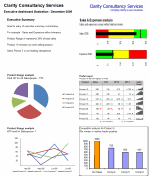
Chart 1 and 2 : Flexible pie charts
Dynamic pie charts with the option to select the KPI, period and product/salesperson to be analyzed. These are covered in part 2.

Chart 3 & 4: Flexible line charts
Dynamic line charts with the option to select the KPI, period and product/salesperson to be analyzed. These are also covered in part 2.

Chart 5: Box Chart
Details on how to create these box charts.

Chart 6: Scrolling Report of KPIs
Chandoo’s blog on how to create this scrolling report can be found here. Micro charts which is of my favorite blogs from Chandoo are covered here.

Chart 7: Scrolling Comparison Chart
Details on how to create this scrolling chart.

Chart 8 : Executive Summary
A simple executive summary. Please see Chandoo’s article on a twitter board for an alternative view.

So that was an overview of the model and its main tabs.
What Next?
Next week we will look at Part 2 of this series and learn how to construct dynamic charts.
Download the complete dashboard
Go ahead and download the dashboard excel file. The dynamic dashboard can be downloaded here [mirror, ZIP Version]
It works on Excel 2007 and above. You need to enable macros and links to make it work.
Added by PHD:
Myles has taken various important concepts like Microcharts, form controls, macros, camera snapshot, formulas etc and combined all these to create a truly outstanding dashboard. I am truly honored to feature his ideas and implementation here on Chandoo.org. I have learned several valuable tricks while exploring his dashboard. I am sure you would too.
If you like this tutorial please say thanks to Myles.
Related Material & Resources
- Excel Dashboards – Tutorials & Templates Section of PHD
- 6 Part Tutorial on Making KPI Dashboards in Excel
- Recommended Product: Jorge Camoes’ Dashboard Training Kit
This is a guest post by Myles Arnott from Clarity Consultancy Services – UK.


7 Responses to “Project Dashboard + Tweetboard = pure awesomeness!!!”
I would like to see actual hash-tagged DM tweets go out to the specific information consumers. That would be an interesting way to communicate the key daily data to interested parties.
A Twitter-like secure application like Yammer might be a good fit with this.
For example, how about daily tweets to selected user groups (secure) that would display sales, bookings, cash receipts, cash disbursed and a second version that would show the same info for MTD, QTD or YTD figures.
@Dan, it would be great. I did not taught about implementing it on this dashboard because twitter is blocked to the whole intranet here. However, there's a discussion here about how can we send these tweets to blackberries (probably through e-mail) automatically. (I'd like to see this implemented on a jabber restricted network as well, but here it'll probably not happen)
The wrap-up versions you mentioned doesn't apply to my particular scenario, but on a sales tweetboard it would be a great tool indeed - choosing who will receive which message according to hashtags. I'll think on something, thanks for the advice. 🙂
(Ah, btw, I'm Fernando... 🙂 )
@Dan: That is a fun idea. Instead of tightly integrating twitter functionality with a dashboard, i think it would be cool if we have a "tweet this" button that users can click after selecting a range of cells. We can easily show a dialog with the concatenated output of the selected cells and ask user to edit the text and eventually "send to twitter".
For eg. you can select the annual sales figure cell and click on "tweet this" button upon which a dialog will show the value. Then you can pre-pend it something like "DM @boss look at our sales this year: "
@Aires.. thanks once again.
Wow it looks really good. Not sure though how much the tweet facility would help in real world project management, but certainly having a dashboard on a project should be a key deliverable when learning how to manage a project
The other use of this is during the software development life cycle especially when you have parallel streams of development and testing going on. Using a dashboard is a quick way for everyone on the team to see where the project is at and how it all fits together.
Regards
Susan de Sousa
Site Editor http://www.my-project-management-expert.com
Hi Chandoo,
I purchased the project management toolkit but the dashboard shown above with the imbedded scroll bars. Is it included in the project pack??
Thanks
Sue
The gantt chart section of this dashboard is similar to one I have recently created: http://xlcalibre.com/hr-dashboard-gantt-chart-traffic-light-reportIt has a similar approach with scroll bars, but has a couple of additional features. I've tried to incorporate a traffic light report element, and also allow the timescale to adjusted so that can view it by days, weeks or months.I really like the other tables that you've incorporated, I may well try to replicate them to improve my version!
I am a monitoring and evaluation consultant in international development, and one of the services I offer is to help non-profits and foundations develop performance dashboards. I often advise them to develop dashboards for ongoing programs, rather than for one-time or pilot projects, because of the time involved. I am trying to find out from a few people how long it takes you to develop a project management dashboard, and to what extent the indicators vary from one project to the next.