
 Most of us think of mastering formulas, learning macros and being supergood with charts when we think of being productive with spreadsheets. But often learning simple stuff like keyboard shortcuts, using mouse and working with menus and ribbons can be a huge productivity booster for us. So as part of this installment of spreadcheats we will learn 7 very cool and effective double click tricks in excel. (as an aside, try saying double click tricks several times faster… 😉 )
Double Click on the Office Button / Logo to Close Excel
![]()
This is simple. Displays “do you want to save…” dialog if the workbook is not saved.
Adjust column widths by selecting multiple columns and double clicking on the separators
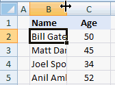
This is my favorite. You can use the same trick to adjust row heights too.
Double-click in the corner, just above scroll-bar to include a split
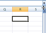
It is surprising that very few people know about split and freeze panes feature in excel. I have often seen colleagues struggling to freeze top row of a large workbook or include a split so that they can see 2 different things at a time.
You can also create a vertical split by clicking on the little bar shape next to horizontal scroll-bar near bottom right corner of the excel window.
(If you are wondering where the split would be created, it will be created at selected cell’s row (or column))
Double click on ribbon menu names to collapse ribbon to get more space

In MS Office 2007 you can double click on the ribbon menus to collapse the ribbon to one line. In Excel 2003, when you double click on the empty space in the toolbar area, it opens up the “customize” window (same as Menu > tools > customize)
Auto-fill a series of cells with data or formulas by just double clicking
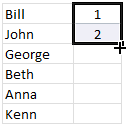
I have saved countless minutes ever since I learned this little trick. Lets say you have a table where in one column you have some data and in the next you have written a formula in the first row. Now how would you copy the formula and paste it in all cells in that column?
Copy the formula (ctrl+c), select all cells, paste the formula.
Well, no more. Just select the formula in first cell, double click in the bottom right corner and see the magic.
The trick works for formulas, auto-fills (of numbers, dates, what not) as long as the adjacent column has data.
Jump to last row / column in table with double-click

Just select any cell in the table and double click on the cell-border in the direction you want to go. See the screencast.
Lock a particular feature and reuse them with double-click

You can lock any repeatable feature (like format painter, drawing connectors, shapes etc.) by just double clicking on the icon (in Excel 2007 this works for format painter, but for drawing shapes you need to right click and select lock drawing mode). This can save you a ton of time when you need to repeat same action several times.
Now its time to test your clicking skills
Try clicking on these: excel keyboard shortcuts, excel mouse tips & tricks, excel productivity tips part 1 & part 2
ok, I am kidding, but you get the point.
What is your favorite double-click-trick?
tell me please…


137 Responses
Oh dear god! 9 o’clock in the morning and I’ve already learned about 3 new hitns. :-O Evertytime I start thinking that I know Excel quite well, somebody posts a article and persuades me that I do NOT. 😀
Btw, I use the mouse also to minimize and maximize the Excel window by double-clicking on the top of the window. Might be useful for somebody although it’s a well known trick. 🙂
Almost I use the Auto-fill to copy data on my work.
Thanks.
Since I found you can do it, I always double-click on a worksheet tab to rename it rather than right-click, select rename – much faster.
i have learnt “Jump to last row / column in table with double-click ” very first time. All the others tricks are in used.
May i request to put more such tricks which increase the productivity of the works. Many of such trocks have been informed by many users in comment forum. Also, new one will be posted by the users.
May i request to put all such tricks with appropriate heading and post for ever. All the new tricks will be put in the same post. Pls expore the possibility.
Thnx
I like the menu collapse trick. Nifty one that!
Favourite double-click…well…has to be the column width one then.
The “Jump to last row / column” is definitely my LEAST favorite double-click-trick – if I’m not accurate when double clicking a cell for in-cell-editing, this “trick” takes me places I don’t want to go, often far away from the cell I was working with, requiring a few seconds for finding my way back.
Does anyone know how to disable this “trick”?
@Jakob
Instead of double clicking cell to edit it, use F2 key for the same purpose.
Ooh, jump to last row is new to me ! That probably explains some of the random cursor movements I sometimes get 🙂
I am always amazed at what I can learn about a product I thought I knew much about. I most appreciate the minimizing the ribbon as I like to keep that out of the way most of the time.
One other double-click trick I use (and I learned this from a co-worker/faculty-member here at WCU) easily selecting words. If you have multiple words you need to select, double-click on the first word and then (while keeping the mouse button pressed) drag to select the remaining words. This works in many different apps, not just Excel. Hope this is helpful to someone.
HI.
i do not tested this right now, but usually: double click selects a “word” and triple click selects the “entire paragraph”.
Regarding the trick “Adjust column widths by selecting multiple columns and double clicking on the separators”, it’s also my favorite one and what I usually do is click the corner cell (without row & column name) then the whole sheet is selected, then double click the column separator or row separator. You will ahve each column or row coverred.
If you double click on a pivot table on any Data Cell (not on the column headings or row headings) a new Tab is created that includes only the data behind that number.
I use that a lot, is kind of a drill to detail functionality.
Great Site, Great Tips!
Thanks
Using a mouse with excel? Ha–peons!
As a follow up:
Adjust column widths by selecting multiple columns and double clicking on the separators
Alt-O-C-A
Double-click in the corner, just above scroll-bar to include a split
Alt-W-S
Auto-fill a series of cells with data or formulas by just double clicking
Ctrl+D
Jump to last row / column in table with double-click
Crtl+Right, Crtl+Down
Lock a particular feature and reuse them with double-click
1.) Copy (Crtl+C)
2.) Paste Formats (Alt-E-S-T)
Jakob,
This won’t disable the double-click to get to the end trick, but instead of double clicking to edit a cell’s contents, (I always have my left hand on the keyboard when mousing) I simply hit the F2 key to edit a cell.
That has helped me to prevent the problem you mention (accidently clicking the border and selecting a diff cell)
The Adjust column widths by selecting multiple columns and double clicking on the separators works in Open Office too! thanks for a useful tip
If the check box “Edit directly in cell”, in Tools.. Options.. Edit, is ticked, then double-clicking on a cell opens it for editing directly in the cell. I prefer to leave it unticked and use F2 to edit in the formula bar.
But if “Edit directly in cell” is unticked, then double-clicking on a cell selects all the cells in the current sheet that are referenced by the cell, for tabbing through and editing, just like Ctrl-[, provided the first reference is in the same sheet. If the first reference is in another sheet or another open workbook, double-clicking goes there instead. This is great for diagnostics and debugging.
I use this a lot.
i always uncheck the option to “edit directly in cell”.
🙂
and after this: F5+ENTER, to get back to the original data cell.
🙂
Double click on an embedded object (a shape or a chart element) to bring up the Format (This Object) dialog. Very helpful, and saves lots of time, so I guess that’s why they removed it from Excel 2007.
Highlight an entire table by clicking on any cell within the table and then press Ctrl + Shift + 8
About the auto-fill trick- this works with formulas too, however the dealbreaker was that it auto-incremented cell references too.
Until I learned another trick- when making a cell reference you don’t want to change, use a dollar sign to prefix the bit you want to keep the same e.g. $A$6 will never change the reference to cell A6.
some really useful tips,
i never knew theres a split option available,
and these are really very useful and will save alot of time
My favorite tip:
Auto-fill a series of cells with data or formulas by just double clicking
Very cool! I knew most of them, but there were 2 I hadn’t seen yet – the double-clicking to keep features on looks especially useful! No more going to the top to click again after I already just clicked.
Thanx for putting this up here.
@All.. thanks alot for sharing your favorite tips. Keep them coming. I will update the post with all these tips in the next week.
@Jakob: I am not sure how we can disable this trick. May be a workaround could be reduce the double click speed from mouse options in control panel. But this will affect the overall double-click performance. Also, see EEJ’s comments above.
@Ryan: I believe there is nothing wrong with using mouse with excel. Our objective is to get things done with least effort. There are a ton of things for which keyboard is very good. But there are a whole bunch of things that, if you use mouse, are damn easy to do. For. eg. the locking a feature for repeated use thing is practically not possible with keyboard. Of course format painter works as a case of paste special, but there are others that will not work that easy.
@JD: you can learn more about absolute vs. relative reference in formulas in the very first installment of spreadcheats here: http://chandoo.org/wp/2008/11/04/relative-absolute-references-in-formulas/
ya! very useful tips ,thanks for share~!
wow,. thanks for sharing 🙂
Hello,
All of them but mostly is “Adjust column widths by selecting multiple columns and double clicking on the separators”
Many Thanks as much as every hint
Regarding “Jump to last row / column in table with double-click”:-
Contrary to the general belief that Ctrl+up /down/left/right is always user friendly, there are certain advantages of using the double clicking trick on the edges of a cell:
1) if you use ctrl+down/right in a blank column / row, it will take you to last cell of the respective column / row which is very irritating sometimes, whereas if you double click the edges of any cell and if there is no non-blank cell in the column/row henceforward your cursor will not be moved
2) if there are blank cells around the selected cell and if you double click the edge, the cursor moves to the blank cell immediately preceding the next non-blank cell.
Great tricks, I have to use the mouse more…
Off-topic: Which animated gif-maker did you use for creating the (very effective) demos?
@Thomas: Thanks, I use camtasia studio 6 for making the demos. It is a fine software… 🙂
If you were truly efficient in excel, you wouldn’t use the mouse – you would use just the keyboard to get around. The mouse just wastes time.
jrl – Different people have different styles. If all you’re doing is navigating a worksheet and entering data and formulas, keyboard shortcuts are probably the way to go. If you’re using higher powers of thought and analysis, the rate limiting step isn’t keyboard vs. mouse, it’s neuron to neuron communication within the cerebral cortex.
I’m a reformed Mac user, so I use the mouse a lot, but I also grew up on a varied assortment of pre-PC boxes in the lab. So I’m probably a strong mix of mouse and keyboard.
@JRL: there is nothing wrong with using mouse. There is a reason for its existence and as smart users, we should try to exploit it as much as we would use keyboard. I used to be an avid keyboard only user, but I have learned that mixing mouse with keyboard can yield better productivity.
Excel has emerged from a simple spreadsheet software to a more complicated modeling, planning, tracking and ofcourse spreadsheeting software. There are a ton of functionalities that take forever to do using KB, but happen with a click.
Mouse? I’m typing this with my nose. Granted, other people in the internet cafe are giving me funny looks.
Whoops, just sneezed. Damn swine flu…
I have my mouse wheel set to page down and page up when I click it to the left or right. Holding ctrl and using this in Excel means I can quickly get around the workbook when using my mouse.
As a bonus, it also works to switch between tabs in Firefox.
Can anyone tell me how to switch between worksheets without a mouse?
NEVERMIND i’ve figured it out
cntrl + page up/down
@E, When I use Ctrl + page up/down it jumps to the next cell up, down or sideways ?? I would like to go to the next sheet. Must be some setting to turn off or on ?? Any ideas ??
A shortcut or neat trick I use is when you want to delete a collection of data – select the area of data to be deleted then ..
Alt+H+E+C .. gone .. what the HEC !
Hi
Can anybody say me jow can I use “Auto-fill a series of cells with data or formulas by just double clicking” for rows????? any help thank you all
@Manoochehr: This is useful when you have formula (or values) in one of the adjacent columns and would like to auto-fill values. Just enter the first 2 values / formulas and select the 2 cells. Now double click on the cell bottom border and excel auto-fills the values / formulas for the entire column. See screencast in the post.
Although 7 years have passed – I would like to offer a quick “auto-fill” for cells that are NOT in an adjacent column.
* Assume Col. A+B has values and we want to present their multiplication in Col. D.
* In cell D1 we will type: =A1*B1.
* Return to Col. B and press: Ctrl+Down arrow.
* Press on the Right arrow TWICE(!) to move the cursor in the “last used row” (in Col. D).
* Press Ctrl+Shift+Up arrow. (This will select all the cells in Col. D
* Press CTRL+D to copy down (Auto-Fill) the formula previously typed in cell D1.
——————————–
Enjoy and keep om Excelling…
or, assuming col C is empty, select C1:D1 then double-click the fill handle
job done
@Jim,
Only if it Col. C is empty all along – otherwise you’ll need someone to wipe your sweat. 🙂
of course ,:) (that’s me sweating)
the other gotcha to watch out for is if the adjacent column is non-contiguous it will stop filling at the first break
auto-fill will work with an adjacent filled column to the left or right; if filling down between two columns the right one is ignored (if the cells directly below the clicked cell are filled, they will be used to determine the limit)
this may all have already been said, I haven’t checked
@Jim,
Would you believe me saying (if not, please check).
In our “story” – assuming column “C” is empty – if you select cells C1:D1 and double-click the fill handle the “job will be done”.
Well…, my son was a bit skeptic and upon checking it he ended up shouting: “Dad, it isn’t working”.
I approached his computer and it took me 35 seconds to find out a very strange behaviour.
If you select C1:D1 beginning with C1 and then Double-click D1 – everything goes a expected.
BUT(!) if you start the selection from D1 towards C1 the Double-Click D1 does nothing.
I swear I didn’t have anything to drink (yet)…
(“Excel 2013” 32 bit RTL Hebrew edition)
that’s what I would have expected, if C1 is blank the fill down only takes notice of the cells to its right (probably blank in your case)
but, having just upgraded to 2010 (we’re a little backward here), I thought I’d check and it seems it’s a little more involved:
filling down between columns will actually take notice of BOTH left and right adjacent columns
if selecting more than one column to fill down and one of those is blank the cell with focus will fill to its limit
(it’s something like that – I’m sure it’s been improved from the previous version I experimented on with this (2003) but the best way is to be sceptical and give it a try – well done Micky junior!)
well I’ll be darned; the gotcha I referred to above isn’t:
filling down c in this
a b c
b
a
a b
will produce this
a b c
b c
a c
a b c
maybe this is new or I just never noticed
hmm…
the leading spaces I put in above have been automatically removed, you’ll just have to mentally insert them
@Chandoo,
Thank you for your reply, but I am looking for doing that for rows not for the columns. For Columns double click on the down right black point will work but what about autofilling in the rows? I tried but it did not work.
Thank you,
@Manoochehr: We’ve been asking for years and years, but there is still no way to autofill sideways, only down. With the much wider sheets in 2007, this would be a very useful addition, wouldn’t it?
@Jon @Manoochehr …here’s a possible work around.
If you select the cell that you want to copy sideways, then hold down Cntl + Shift + Left arrow, then you will have selected a row of cells either to the edge of the data in the row above, or to the edge of the spreadsheet.
If you then hit F2, and then Cntl + Enter, your formula will be filled across.
@Manoochehr: I misunderstood your request. As Jon pointed out, auto fill has this limitation. How-ever you can autofill sideways by selecting the range where you want to autofill (ie the row) and then pressing CTRL+R (or ALT+HFIR in excel 2007) to autofill right side and ALT+HFIL for autofilling left.
You can also follow Jeff’s suggestion.
Good excel 2007 tip, Chandoo. You could also add the fill icon to your Quick Action Toolbar if you struggle to remember the shortcut.
@ Chandoo, Jeff, Jon
Thank you all, but I cant underestand what (HFIR) in (ALT+HFIR) mean in excel 2007?
Hi Manoochehr. Press Alt then press the H key then the F key then the I key then the R key one at a time. This is just a long-winded keyboard shortcut, really.
Thank you all for nice tricks,
Let me jump to another subject. Do you think that plotting contours in excel be possible??? I looked at the excel template but it was not possible to plot contours… anybody got an idea?
Thanks,
Manoochehr
Manoochehr – can you elaborate on what you mean by ‘plotting contours’?
@ Jeff,
In contours we have 3 series of data such as x, y, z. where x,y are for example locations and z could be weather forecasting data. following link will show a picture of what I mean.
http://gri.sourceforge.net/gridoc/html/example5.png
Thank you,
Manoochehr: I think it is possible to do this, as long as you have x and y data for each pressure band. But I don’t think it would be easy to get excel to intelligently apply the different data points. Were you wanting to do this for weather maps or some other work purpose, or were you just curious whether excel could do this? Do you have any sample data you could post anywhere?
Regards
Jeff
GOOD TRIKS & INTERSTING IDEA . SO VERY MUCH THANKS. ANIL CHOUDHARY
@Anil.. thank you 🙂
Does anyone know how to turn *off* any of the double-click features? Specifically, the one in which you double-click on the side of the cell to jump to the last cell in the column. I do this accidentally all the time and it drives me a little nuts.
My favorite tip was about double clicking on the side of a box to jump to the end of the table. i always accidentally would do that, and it really ticked me off, but now that i know what the purpose is, and its not just randomly messing with my head…. i am happy =) Thanks for the awesome tips, they can save people hours
Regarding the trick “Double-click in the corner, just above scroll-bar to include a split”… if you do that, then you will have to drag the split bar to the correct location… you can save a small amount of time by not double clicking that small rectangular bar above the vertical scroll bar directly; rather, simply (single) click/drag it to the desired location. And in case anyone missed it, there is a small rectangular bar to the right of the horizontal scroll bar that works in the identical manner (double click or single click drag) for a vertical split.
I am also very annoyed with double clicking on the cell border taking me to the end of list. I am working with big sheets of data so i have them zoomed out as much as possible. This makest it difficult to hit precisely the inside of cell.
Moreover I need to edit cells in several places accross the sheet with pasting suffix to every value. With one hand on the mouse and the other on Ctl+V it would work perfectly fine if not for the jumping functionality! Every time I am cursing bloody analysts who came up with this feature.
Regarding “Jump to last row / column in table with double-click”, I learned that it is not about “Last” row or column. If you double click on upper border of the cell, you go to the first value in that column. In case you are already on the first value you will go to first row of that column. Similarly, by double clicking left or right borders of a cell pointer, you move in the respective direction.
Very useful tools btw and I really appreciate the great work Chandoo is doing since long.
I am not able to see the Adjustment cursor in Excel 2007 ..while adjusting column width using mouse..
Please help. Is there any option to enable?
@Sachin.. is your worksheet locked or protected?
Is it possible to disable the double-click to jump to the last row in a table feature? It can be very annoying in small cells on large tables when trying to double click select text in the cell and it jumps from cell A50 to A529 or whatever the last cell in the column is… I’d love to disable the feature.
Thinking about Jon Peltier’s comment We’ve been asking for years and years, but there is still no way to autofill sideways, only down…could always use a macro that fills down, then copies the resulting range, then does a paste special/transpose to paste it across.
@Rob.. I dont think you can disable the double click feature.
Jeff –
That would only take the values we filled down and extend them to the right. If I fill down elapsed years, say, and fill right interest rate, transposing years to the right will make a mess of my table.
@Rob: I feel your pain, brah.
@Rob & Saulo
Double Clicking in cells in a Table doesn’t jump to the bottom of the Table for me
I haven’t done anything to the standard Excel Install to turn it on/off ?
PLEASE help me!
I hate the jump to last or first “Trick”. That is not a trick, it’s a curse every time it happens to me when editing small cells!
There should be a way to disable this horrendous feature!
I would pay a small amount for whoever finds a solution!
Domenico –
Don’t encourage them to remove a useful feature. Instead change your habit.
Don’t double click to edit a cell.
Click once, then press the F2 key.
look, I am for the freedom of choice, all right? I remove what I want to remove from my excel sheet. I am not saying to remove it completely. If you like it, go for it, it’s all yours!
you should be able to disable this feature if it is of any use to you.
For me, it is quicker to double click on the cell, because what I do all the time is copy the content. When you double click in the center, the content of the cell is preselected, so that works for me, except for that 1 out of 3 times I happen to click the border by mistake, being the cells small and because Excel does not allow you to change the default raw size (only default column size, strange btw!)
I have the solution for all people frustrated like me!
Go to excel options, then click on advanced, then un-check the option ‘Enable fill handle and cell drag-and-drop’.
For the experts, the code is:
Application.celldraganddrop = false
happy exceling!
Domenico –
Default row size is based on default font size. You could increase the font size, but then that defeats the purpose of viewing at a zoom factor that makes the cells too small to double click on.
Glad you’ve found a workaround. Sounds to me, though, that disabling cell drag and drop is a steep price to pay to change the cell-edge double-clicking behavior. But that’s according to my habits, not yours.
from now on I am starting the double-click process
click click! (it’s to say thanks twice lol)
Hi all,
someone in these comments suggest about switching between sheets. ALT and up or down arrow. it does not seem to be working for me. do you have any suggesstion?
Hi Excel Lover!!! Its Ctrl+Page up or Page Down.
Cheers
My favorite trick while not a “double-click” is to click your right mouse button anywhere over the arrow icons just to the left of the sheet names. All of the sheets in your workbook are displayed and you can go to any of them without having to scroll to it individually. It is a great help when working with workbooks with lots of worksheets.
To stop Excel from jumping around when you accidently double click on a cell border: your annoyance can be turned off.
Go to Tools > Options > Edit (tab) and uncheck the box for “Allow cell drag and drop”.
do these work in all versions of excel or just 07?
Slightly Off topic: To hide a particular column: Select any cell in that particular column and press “Ctrl+0”.
Hi All,
@Chandoo, keep up the excellent work.
The following tips involve using the Right Mouse button to drag.
1. Click and Drag the small black Fill Handle with the right mouse button. When you release the button you are presented with a context sensitive drop-down list which includes, inter alia, options to copy with or without formatting; fill series, fill years or months or days or weekdays!
2. Click and drag any edge of the active cell or range with the right mouse button. When you release the button you are presented with a context sensitive drop-down list which includes not only move or copy but also copy as values or formats. It also allows you to insert the data by moving existing data down or right.
3. Using the trick in number 2 above you can quickly convert a range of cells with formulas to values! Highlight the range, right click and drag any edge of the highlighted range. Before you release the mouse button, return “shadow” of the range to its original position. Then select “Copy Here as Values Only” from the drop-down list!
Happy dragging!
Format Painter
Wow.. Thanks a lot. Its really useful.
I know 2nd and 3rd. Others are just amazed me.
My fav is Format Painter as i using that more in my job. Thanks again.
Awesome, I think i knew a good bit of Excel but get pleasantly surprised every time i discover new tips and tricks. My Fav is the Dlb click to get to the last row n column. Pretty neat when you working with large data sets. Thanks for sharing.
Hi,
what is the shortcut key for “Format Painter” in Excel?
I am using Excel – 2003.
Please mail me at – guru4dw@gmail.com
@Guru
This sounds odd, as with a name like Guru, you should be answering all these questions
In Excel 2003
Ctrl C – copies a cell
Ctrl Shift P – will paste the format of the copied cell onto a Target Cell/Range
the adjust column width in the 2007 version does not work properly. I have done this multiple times, and i still get printouts with the ##### in the columns. office 2007 truely sucks!!!!!!!!!!!!!!!!!!!!!!!!!!!!!!!!!!!!!!!!!!!!!!!!!!!!!!!!!!!!!!!!!!!!!!!!!!!!!!!
There are more bugs and problems with office 2007 than a roach motel.
Lock Drawing Mode… for shapes doesn’t work for me at all.. I am on Excel 2010 on Windows 7.
When i click lock drawing mode.. and draw the shape… it just changes to cross hair… and i have to click on the shape again to draw.
This is driving me nuts..
How to keep on drawing the same shape over and over again… without having to click on the icon. It is absurd that the new Ribbon toolbar doesn’t have option to keep the menu tear off as well… Office 2010 drives me nuts.. any answer..?!
Fiaz Try my Ctrl-D trick to avoid having to draw your shape repeatedly. Also you could group the objects before the Ctrl-D
i have learnt “Jump to last row / column in table with double-click ” very first time. All the others tricks are in used.
Thanq yu .
Gud1 🙂
I have a question here.
Is it possible to increase the text size upon double click in a cell and come back to the old text size once clicked enter button
@vIVEK
This could possibly be done using VBA
nice! thanks
adjusting column widths by selecting multiple columns
To copy a format from one cell to another, select the cell with the format you want to copy and then right-drag its border to another cell; when you release the right mouse button, select Copy Here as Formats Only
Dumb Q: Whenever I add filters on my data, the spreadsheet always takes me to the leftmost column A. Is there a way to avoid this? I’m typically working with a lot of columns.
Love the jump to last row/column, will definitely be used.
Thanks Chandoo, the tips are of great help.
I have a query, how do I double click (or F2) multiple cells after changing the format. Thanks
Thanks Chandoo, it will be of great help.
I have a query, how do I double click (F2) more than 1 cell to see changes after changing format. Thanks
I use the double click, to go directly to the source of calculated data.
example: by default when you double click in a cell the result is editing the cells (does the same as if you do F2). but with this, imagine that in one cell you have a value that is linked to another cell in other sheet. with the double click you can go directly to that cell. then using F5 + ENTER you can back to the original cell.
As easy as that!
but you can change that:
i’m from Portugal and office is in Portuguese, but i will try to explain:
File>options>advanced> (the 4th check box: something like this: “enable …cells”. by default is selected, so un-selected (leave the box blank)
Handy Office Shortcut
In Excel, Select and Ctrl-D will duplicate an object (for example: the arrow shape) – this works in PowerPoint as well – will duplicate a slide, textbox or graphic etc – I use it ALL the time. BTW it does not use the Clipboard – that fact is also handy
I have a query…
I use one formula from that I found values..but when I double click on that cell and write some value then equation which I write that not seen so how I can locked that cell so formula of cell doesn’t change???
For all those who wonder:
The little split-controls (for the mentioned double-click) are “gone” in “Excel 2013”.
In order to split the screen, one must use “Split” in the “Windows” group of the “View” tab.
Michael (Micky) Avidan
“Microsoft® Answers” – Wiki author & Forums Moderator
“Microsoft®” MVP – Excel (2009-2015)
ISRAEL
I have learnt a few good tips with double clicking. thanks a lot!
adjusting column width and auto fill are my favourit .. amazing tools !
Does anyone know how to change the cursor color in Excel? When I’m using “find” I can never see where it’s at in my document because of all the text.
Thanks Chandoo, it will be of great help. Great work
This is really nice. Thank you Chandoo.
Is there a way to turn off the Double Click on the Office Button / Logo to Close Excel feature? I’m constantly double clicking it on accident when trying to click on it once with the mouse pad on my laptop. It’s very frustrating.
Chandoo, Thanks for the website and Excel summary
Minimize the MOUSE Dbl Click: Have you ever been typing along your formula and a drop down appears for you to select (its highlighted in BLUE) and YOU just DONT want to
-pickup your hand up and
-grab the mouse and
-double clik
INSTEAD – pick up your left pinky finger and hit the Tab button – Walla the item is selected. Now you just continue on happily ever after.