Jeff Weir, an alert reader of our blog points me this chart showcasing voice-over artist’s for various Simpson’s characters. I am a hard-core Simpon’s fan, so I naturally wasted 10 minutes looking at the chart. That is when I realize this chart is not only fun, it also teaches 5 valuable lessons on making better charts.
One fun chart

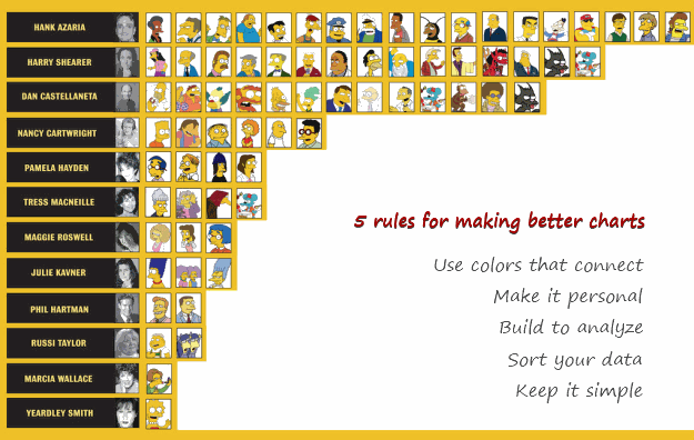
[view high res | original credit]
5 Rules for Making Better Charts
- Make it personal: I immediately looked up my favorite characters when I saw this chart. I am sure that is what many of you would do too. Charts / Slides that poke curiosity thru personal connections are memorable.
- Keep it simple: I am sure one of the new social media info-graphics wiz-bang would have made a whole poster out of this little data, but not this chart maker. Whoever made this chart chose a simple medium (bar chart) to show the characters and voice-over artists. And it works. Whenever you are tempted to use a complex chart, think for a minute if a simpler, familiar alternative is available and use it. KISS always works.
- Sort it: The chart is sorted by number of characters by artist. Sorting makes it easy to compare and view. You should always consider sorting your data in meaningful order.
- Use colors that connect: This chart uses bright yellow color, almost the same as the skin color of Simpson’s characters. It connects well with the audience. You should try to use colors that evoke emotional responses from your audience, whenever possible.(tip: using color in charts)
- Make it easy to compare: One comparison you can immediately draw is that male artists (Hank, Harry, Dan etc.) do so much more voice over work than female artists (Nancy, Yeardley, Julie etc.). You can tell this because the photos of artists are also available next to their names. Remember, your audience are looking for patterns, hidden messages in your charts. So make your charts with that in mind.
Question: What rules do you recommend for making better charts?
Go ahead and tell us what rules do you think we should follow to make awesome charts using comments.
Bonus Question: Who is your favorite non-Simpson Simpson’s character?
I don’t think about charting and formulas too much when weekend is around the corner, and neither should you. So go ahead and indulge in harmless banter. Tell me which non-Simpson Simpson’s character is your favorite?
For me Ned Flanders does it. I think his dialogues are very cleverly written. What about you?


12 Responses to “Analyzing Search Keywords using Excel : Array Formulas in Real Life”
Very interesting Chandoo, as always. Personally I find endless uses for formulae such as {=sum(if(B$2:B$5=$A2,$C$2$C$5))}, just the flexibility in absolute and relative relative referencing and multiple conditions gives it the edge over dsum and others methods.
I've added to my blog a piece on SQL in VBA that I think might be of interest to you http://aviatormonkey.wordpress.com/2009/02/10/lesson-one-sql-in-vba/ . It's a bit techie, but I think you might like it.
Keep up the good work, aviatormonkey
Hi Chandoo,
You might find this coded solution I posted on a forum interesting.
http://www.excelforum.com/excel-programming/680810-create-tag-cloud-in-vba-possible.html
[...] under certain circumstances. One of the tips involved arranging search keywords in excel using Array Forumlas. Basically, if you need to know how frequent a word or group of keywords appear, you can use this [...]
@Aviatormonkey: Thanks for sharing the url. I found it a bit technical.. but very interesting.
@Andy: Looks like Jarad, the person who emailed me this problem has posted the same in excelforum too. Very good solution btw...
Realy great article
"You can take this basic model and extend it to include parameters like number of searches each key phrase has, how long the users stay on the site etc. to enhance the way tag cloud is generated and colored."
How would you go about doing this? I think it would need some VB
Hi,
I found the usage very interesting, but is giving me hard time because the LENs formula that use ranges are not considering the full range, in other words, the LEN formula is only bringing results from the respective "line" cell.
Using the example, when I place the formula to calculate the frequency for "windows" brings me only 1 result, not 11 as displayed in the example. It seems that the LEN formula using ranges is considering the respective line within the range, not the full range.
Any hint?
@Thiago
You have to enter the formula as an Array Formula
Enter the Formula and press Ctrl+Shift+Enter
Not just Enter
Thank you, Hui! I couldn't work out how this didn't work
is there a limit to the number of lines it can analyse.
Ie i am trying to get this to work on a list of sentances 1500 long.
@Gary
In Excel 2010/2013 Excel is only limited by available memory,
So just give it a go
As always try on a copy of the file first if you have any doubts
Apologies if I am missing something, but coudn't getting frequency be easier with Countif formula. Something like this - COUNTIF(Range with text,"*"&_cell with keyword_&"*")
Apologies if I missed, but what is the Array Formula to:
1. Analyze a list of URL's or a list of word phrases to understand frequency;
2. List in a nearby column from most used words to least used words;
3. Next to the list of words the count of occurrences.