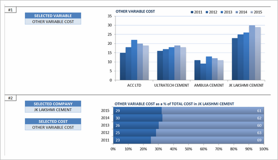
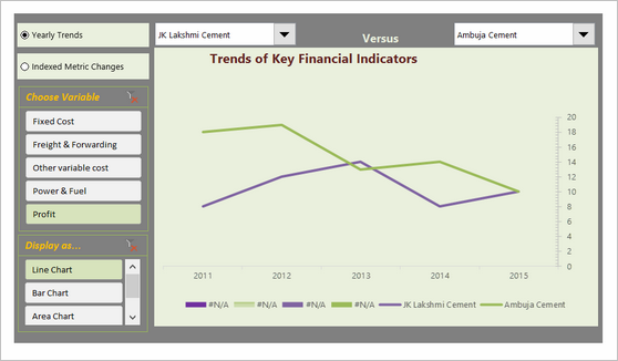
Visualizing Financial Metrics – 30 Alternatives

Share

Facebook
Twitter
LinkedIn

Around 2 months back, I asked you to visualize multiple variable data for 4 companies using Excel.  30 of you responded to the challenge with several interesting and awesome charts, dashboards and reports to visualize the financial metric data. Today, let’s take a look at the contest entries and learn from them.

First a quick note:

I am really sorry for the delay in compiling the results for this contest. Originally I planned to announce them during last week of July. But my move to New Zealand disrupted the workflow. I know the contestants have poured in a lot of time & effort in creating these fabulous workbook and it is unfair on my part. I am sorry and I will manage future contests better.

visualizing-financial-metrics

How to read this post?

This is a fairly large post. If you are reading this in email or news-reader, it may not look properly. Click here to read it on chandoo.org.

  1. Each entry is shown in a box with the contestant’s name on top. Entries are shown in alphabetical order of contestant’s name.
  2. You can see a snapshot of the entry and more thumbnails below.
  3. The thumb-nails are click-able, so that you can enlarge and see the details.
  4. You can download the contest entry workbook, see & play with the files.
  5. You can read my comments & suggestions for improvements at the bottom.
  6. At the bottom of this post, you can find a list of key charting & dashboard design techniques. Go thru them to learn how to create similar reports at work.

Thank you

Thank you very much for all the participants in this contest. I have thoroughly enjoyed exploring your work & learned a lot from them. I am sure you had fun creating these too.

So go ahead and enjoy the entries.

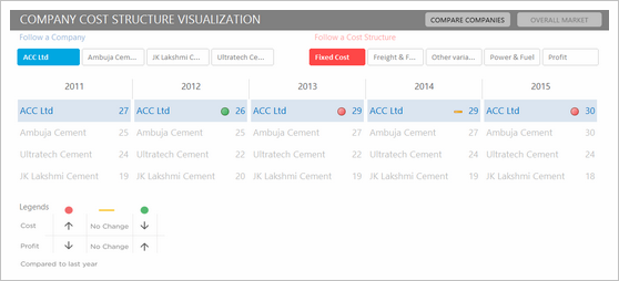
Dashboard by Abhay

Dashboard by Abhay - snapshot

More snapshots (click to enlarge):
Dashboard by Abhay -snapshot1Interactive dashboard -snapshot2Download Workbook
Comments:

  • Interactive dashboard
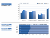
  • Dynamic, can add years and companies. Built with Power Query.
  • Simple and easy to read layout
  • Can add % changes for top & bottom companies
Slicers, Timelines Power Query

Interactive Chart by Akongnwi

Interactive Chart by Akongnwi - snapshot

More snapshots (click to enlarge):
Interactive Chart by Akongnwi -snapshot1Dynamic pivot chart -snapshot2Download Workbook
Comments:

  • Dynamic pivot chart
  • Could have used regular line chart. Smoothed chart creates wrong impression.

Interactive Chart by Alex

Interactive Chart by Alex - snapshot

More snapshots (click to enlarge):
Interactive Chart by Alex -snapshot1Interesting layout and execution -snapshot2Download Workbook
Comments:

  • Interesting layout and execution
  • Allows various comparisons
  • Can add labels to the bars.
Form controls

Interactive Chart by Arnaud

Interactive Chart by Arnaud - snapshot

More snapshots (click to enlarge):
Interactive Chart by Arnaud -snapshot1Interesting layout and story telling -snapshot2Download Workbook
Comments:

  • Interesting layout and story telling
  • Allows various comparisons
  • Can be a bit hard to understand as there are few labels
  • Could have added another set of bubbles (or just labels) to compare previous year’s values
Form controls

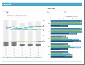
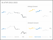
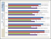
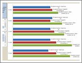
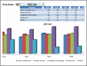
Dashboard by Chandeep

Dashboard by Chandeep - snapshot

More snapshots (click to enlarge):
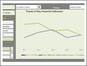
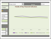
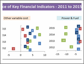
Dashboard by Chandeep -snapshot1Awesome design and analysis -snapshot2Offers additional metrics and comparisons -snapshot3 -snapshot4Download Workbook
Comments:

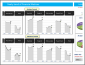
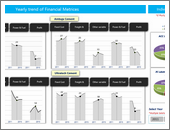
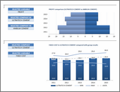
  • Awesome design and analysis
  • Offers additional metrics and comparisons
    Slicers Conditional formatting

    Interactive Chart by Chirayu

    Interactive Chart by Chirayu - snapshot

    More snapshots (click to enlarge):
    Interactive Chart by Chirayu -snapshot1Interactive chart to analyze financial performance YoY -snapshot2Download Workbook
    Comments:

    • Interactive chart to analyze financial performance YoY
    • Simple and easy to read
      Thermometer charts Form controls

      Dashboard by Edouard

      Dashboard by Edouard - snapshot

      More snapshots (click to enlarge):
      Dashboard by Edouard -snapshot1Interactive dashboard with lots of comparison options -snapshot2Download Workbook
      Comments:

      • Interactive dashboard with lots of comparison options
      • Very cool line chart with relative performance
      • Could have re-arranged to fit on one screen. Feels too long.
      Form controls Indexed charts

      Chart by Edwin

      Chart by Edwin - snapshot

      More snapshots (click to enlarge):
      Chart by Edwin -snapshot1Download Workbook
      Comments:

      • Very interesting normalized chart
      • Can be hard to read. Could have added explanation.

      Interactive Chart by Elchin

      Interactive Chart by Elchin - snapshot

      More snapshots (click to enlarge):
      Interactive Chart by Elchin -snapshot1Interactive charts -snapshot2Download Workbook
      Comments:

      • Interactive charts
      • Simple and easy to read
      • Could have removed the filtering buttons from pivot chart
      Slicers

      Chart by Emlyn

      Chart by Emlyn - snapshot

      More snapshots (click to enlarge):
      Chart by Emlyn -snapshot1Multiple charts to visualize various trends -snapshot2Simple and easy to read -snapshot3Download Workbook
      Comments:

      • Multiple charts to visualize various trends
      • Simple and easy to read
      • Can add some insights (% changes etc.)
      Panel Charts

      Become Awesome in Excel & VBA – Create dashboards like these…

      VBA & Excel Classes by Chandoo

      My comments:

      • Learn how to create interactive dashboards & reports using Excel
      • Develop your own macros & VBA code
      • 50+ hours of video training
      • Learn at your own pace
      • Click here to know more

      Interactive Chart by Erik

      Interactive Chart by Erik - snapshot

      More snapshots (click to enlarge):
      Interactive Chart by Erik -snapshot1Interactive dashboard -snapshot2Download Workbook
      Comments:

      • Interactive dashboard
      • VBA driven, allows multiple selections & comparisons
      • Few errors and alignment issues
      • Can add commentary on what metrics / companies are important.
      Slicers

      Chart by Gareth

      Chart by Gareth - snapshot

      More snapshots (click to enlarge):
      Chart by Gareth -snapshot1Download Workbook
      Comments:

      • Simple and easy to read panel chart
      • Could have highlighted trends that are important
      Panel Charts

      Chart by Gerard

      Chart by Gerard - snapshot

      More snapshots (click to enlarge):
      Chart by Gerard -snapshot1Download Workbook
      Comments:

      • An elegant presentation of profit vs expenses data
      • Very good colors and easy to read
      • Could have added ability to sort by latest figures for a selected metric. This can expose key trends easily.
      Panel Charts

      Chart by Marcel

      Chart by Marcel - snapshot

      More snapshots (click to enlarge):
      Chart by Marcel -snapshot1Download Workbook
      Comments:

      • An interesting panel chart to analyze yearly trends and comparisons
      • Somewhat hard to read, could have used left aligned bars.
      Panel Charts

      Chart by MF Wong

      Chart by MF Wong - snapshot

      More snapshots (click to enlarge):
      Chart by MF Wong -snapshot1Download Workbook
      Comments:

      • Elegant panel chart with profit vs. costs view.
      • Very interesting column chart (container chart?)
        Panel Charts Conditional formatting

        Interactive Chart by Michael

        Interactive Chart by Michael - snapshot

        More snapshots (click to enlarge):
        Interactive Chart by Michael -snapshot1Panel chart with YoY and company comparisons -snapshot2Download Workbook
        Comments:

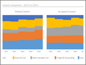
        • Panel chart with YoY and company comparisons
        • Slicers to mix and match values you want to analyze
        • Could have used lines instead of columns, this way fewer colors can be used.
        Panel Charts Slicers

        Chart by Miguel

        Chart by Miguel - snapshot

        More snapshots (click to enlarge):
        Chart by Miguel -snapshot1Download Workbook
        Comments:

        • A panel / combination chart to see all trends in one place
        • Could have used a form control to toggle between indexed vs. regular values. This will make the chart easier to read.
        Panel Charts Indexed charts

        Interactive Chart by Nanna

        Interactive Chart by Nanna - snapshot

        More snapshots (click to enlarge):
        Interactive Chart by Nanna -snapshot1Dynamic dashboard with profit vs. costs view -snapshot2Download Workbook
        Comments:

        • Dynamic dashboard with profit vs. costs view
        • View by company or metric
        • Time is shown on vertical axis. This makes comparisons / trend analysis hard.

        Chart by Pawel
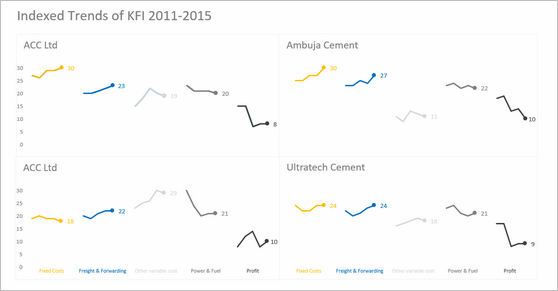
        Chart by Pawel - snapshot

        More snapshots (click to enlarge):
        Chart by Pawel -snapshot1Download Workbook
        Comments:

        • A simple and elegant indexed panel chart to view all trends in one place
        • Nice colors and design. We can call it sperm chart 😉
        • Faint but visible vertical grid lines could make reading easier.
        Panel Charts Indexed charts

        Interactive Chart by Peter

        Interactive Chart by Peter - snapshot

        More snapshots (click to enlarge):
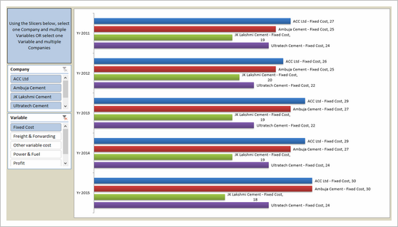
        Interactive Chart by Peter -snapshot1A pivot chart with slicers to toggle measures and companies -snapshot2Download Workbook
        Comments:

        • A pivot chart with slicers to toggle measures and companies
        • Could have added color legend and made the labels shorter
        Slicers

        Become Awesome in Excel & VBA – Create dashboards like these…

        VBA & Excel Classes by Chandoo

        My comments:

        • Learn how to create interactive dashboards & reports using Excel
        • Develop your own macros & VBA code
        • 50+ hours of video training
        • Learn at your own pace
        • Click here to know more

        Infographic by Pinank
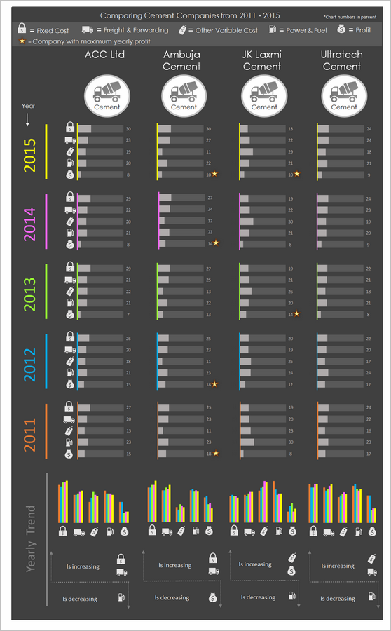
        Infographic by Pinank - snapshot

        More snapshots (click to enlarge):
        Infographic by Pinank -snapshot1Download Workbook
        Comments:

        • Nice infographic style report in Excel.
        • Interesting use of icons to represent costs

          Interactive Chart by Ronny
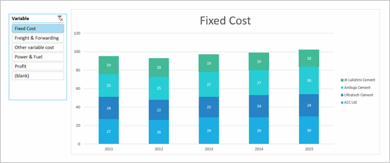
          Interactive Chart by Ronny - snapshot

          More snapshots (click to enlarge):
          Interactive Chart by Ronny -snapshot1Download Workbook
          Comments:

          • A pivot chart with slicers to pick measures
          • Adding values across companies is not a good idea
          Slicers

          Chart by Salim

          Chart by Salim - snapshot

          More snapshots (click to enlarge):
          Chart by Salim -snapshot1Download Workbook
          Comments:

          • Charts made with Power View
          • Can be filtered using PV filters
          • Should have added views to see only one year value. Selecting year just highlights the values.

          Chart by Shivraj
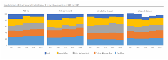
          Chart by Shivraj - snapshot

          More snapshots (click to enlarge):
          Chart by Shivraj -snapshot1Download Workbook
          Comments:

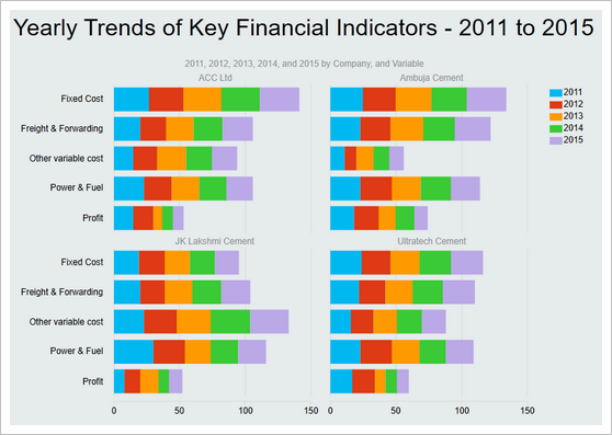
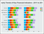
          • An interesting panel chart with stacked columns to view yearly trends by all measures
          • Simple colors and easy to read
          • Since all the numbers add up 100 anyway, visualizing trends becomes hard. Should have used a slicer / form control to show one measure at a time.
          Panel Charts

          Dashboard by Simayan

          Dashboard by Simayan - snapshot

          More snapshots (click to enlarge):
          Dashboard by Simayan -snapshot1A dashboard to understanding yearly trends -snapshot2Download Workbook
          Comments:

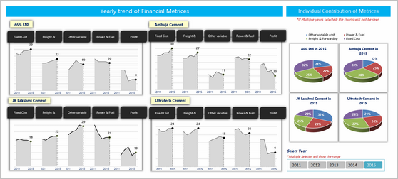
          • A dashboard to understanding yearly trends
          • Slicers to focus on any individual year.
          • 3D pie charts are tricky to read. Should have used a stacked bar chart.
          • Some of the labels are redundant.
          Panel Charts Slicers

          Chart by Sudhir

          Chart by Sudhir - snapshot

          More snapshots (click to enlarge):
          Chart by Sudhir -snapshot1Download Workbook
          Comments:

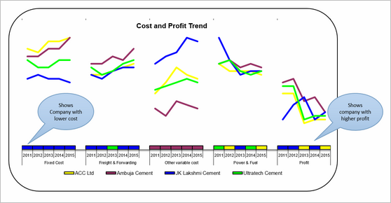
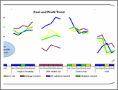
          • A simple line chart to understand yearly trends
          • The tiles to show low cost / high profit companies is interesting.
          • Could have used standard chart colors in Excel 2010. They offer better contrast.
          Panel Charts

          Interactive Chart by Thomas

          Interactive Chart by Thomas - snapshot

          More snapshots (click to enlarge):
          Interactive Chart by Thomas -snapshot1A set of dynamic charts, each offering trends or comparisons based on user input. -snapshot2Download Workbook
          Comments:

          • A set of dynamic charts, each offering trends or comparisons based on user input.
          • Lots of comparisons and variations possible
          • Years on vertical axis can be tricky to read. Should have used another type of chart.
          Dynamic charts Data validation Min Max Charts

          Interactive Chart by Vishesh

          Interactive Chart by Vishesh - snapshot

          More snapshots (click to enlarge):
          Interactive Chart by Vishesh -snapshot1Download Workbook
          Comments:

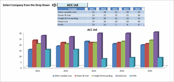
          • A dynamic chart with cost breakup by year
          • The data table above is redundant.
          Dynamic charts

          Interactive Chart by William

          Interactive Chart by William - snapshot

          More snapshots (click to enlarge):
          Interactive Chart by William -snapshot1A dynamic chart with lots of comparisons and analysis. -snapshot2Download Workbook
          Comments:

          • A dynamic chart with lots of comparisons and analysis.
          • Feels a bit buggy. The picture links are not updating on slicer selection.
          Picture links Dynamic charts Slicers

          Chart by Yuhanna

          Chart by Yuhanna - snapshot

          More snapshots (click to enlarge):
          Chart by Yuhanna -snapshot1Simple XY charts with yearly trends and variance analysis -snapshot2Download Workbook
          Comments:

          • Simple XY charts with yearly trends and variance analysis
          • A bit harder to read as lots of dots overlap. Should have added an option to highlight one company at a time.
          Panel Charts

          Become Awesome in Excel & VBA – Create dashboards like these…

          VBA & Excel Classes by Chandoo

          My comments:

          • Learn how to create interactive dashboards & reports using Excel
          • Develop your own macros & VBA code
          • 50+ hours of video training
          • Learn at your own pace
          • Click here to know more

          Techniques used in these dashboards & charts

          If you want to create these kind of charts & reports at work, I suggest reading up the Excel Dashboards & Excel Dynamic Charts pages. Also check out below links to know more about specific techniques.

          Form Controls Data validation Pivot tables Slicers Clickable Cells (VBA)
          VBA Formulas Sortable Tables Data bars (CF)
          Conditional Formatting Scrollable Tables Picture links Sparklines
          Indexed Charts Panel Charts

          How do you like these charts & dashboards? Which are your top 3?

          Quite a few of these entries are really impressive. You can learn a lot by deciphering the techniques in these workbooks. Many thanks to everyone who participated. I will publish the winner names in next few days. Meanwhile, share your comments and tell me what you think. Share your top 3 entries too. 🙂

          Facebook
          Twitter
          LinkedIn

          Share this tip with your colleagues

          Excel and Power BI tips - Chandoo.org Newsletter

          Get FREE Excel + Power BI Tips

          Simple, fun and useful emails, once per week.

          Learn & be awesome.

          Welcome to Chandoo.org

          Thank you so much for visiting. My aim is to make you awesome in Excel & Power BI. I do this by sharing videos, tips, examples and downloads on this website. There are more than 1,000 pages with all things Excel, Power BI, Dashboards & VBA here. Go ahead and spend few minutes to be AWESOME.

          Read my storyFREE Excel tips book

          Overall I learned a lot and I thought you did a great job of explaining how to do things. This will definitely elevate my reporting in the future.
          Rebekah S
          Reporting Analyst
          Excel formula list - 100+ examples and howto guide for you

          From simple to complex, there is a formula for every occasion. Check out the list now.

          Calendars, invoices, trackers and much more. All free, fun and fantastic.

          Advanced Pivot Table tricks

          Power Query, Data model, DAX, Filters, Slicers, Conditional formats and beautiful charts. It's all here.

          Still on fence about Power BI? In this getting started guide, learn what is Power BI, how to get it and how to create your first report from scratch.

          106 Responses to “Waterfall Charts using Excel”

          1. Seth says:

            First of all, great post. Second, an extra thought on the usefulness of waterfall charts in general:

            Waterfall charts are best employed when a stacked bar (or, as I cringe, a pie chart) won't suffice because some of the "contributors" contribute negatively. This example is very helpful to get the basic technique down, but some extra math and series would need to be added to accommodate common waterfall chart applications (cash flow analyses, marketing mix, etc.).

            Jon's add-in does this, I think (at least, based on the screenshots). It can be done without an add-in, but it takes a moment to get the math down on what you're referring to as 'Base Values' in this example (the transparent spacer series).

          2. Mara Caruso says:

            This is an incredibly useful program. In my job, I have found several uses for it already!

            Thanks Aaron for taking th time to educate us!

          3. Gerald Higgins says:

            Hi, nice tutorial, thanks Aaron and Chandoo. This also works in 2003, although some of the stages are very slightly different.

            One possible improvement - some of the connecter lines may look as if they are slightly out of step with the blocks - in the final chart the one between "north" and "east" looks slightly too high. I also got this when I followed the tutorial. You can play around with borders for the element series - either turn them off completely, or make them the same colour as the fill colour, and play around with the line weight. If that doesn't work, consider adding in a small number to the connector values to offset them slightly.

          4. Ed Ferrero says:

            Hi, That's a nice way to draw waterfalls. For a different take on waterfall charts, you might look at my post on how to draw them using scatter charts at;
            http://www.edferrero.com/Blog/tabid/106/EntryID/16/Default.aspx

          5. Steve A. says:

            Thanks for the post. We use them all the time. As noted in an earlier comment, it would be great to adjust this so it can handle negative values, and color-code the negatives in red and positives in green.

          6. Bob says:

            For easier math and handling negative values:
            Three colums of data, labels then the start and end points
            In the chart wizard choose Line Chart and the 1st option - upper left hand corner of the dialog
            Double Click on one of the Lines - select Format Data Series Select Options: Up Down Bars
            Select each line; Patterns, Line, None
            And Bob's your uncle.

            This approach does not have Chandoo's nice connector lines - but it is easy to implement.

          7. Seth says:

            Great add, Bob. Two more things:

            1) The up/down bars are based on the first and last series provided. You can add the line connectors like Aaron's chart has by adding a series for each line segment to the middle of the data table. Could be an easier way to do this, but hey... this worked.

            2) I didn't like that the first datapoint (2008 in my example) and last (2009) were the same color as up bars. I see those as absolutes, and the up/down bars should be for the changes (Chg1-4). So, I added an absolute volume series (named Vol) and changed its chart type to Bar.

            3) Using the same trick that Aaron explains, you can also add data labels. I didn't.

            Bob's (in rows instead of columns):
            Label 2008 Chg1 Chg2 Chg3 Chg4 2009
            Start 0 100 110 100 55 0
            End 100 110 100 55 125 125

            Mine:
            Label 2008 Chg1 Chg2 Chg3 Chg4 2009 Note
            Start 100 110 100 55 UpDown
            Vol 100 125 Type=Bar
            Line 100 100 Type=Line
            Line 110 110 Type=Line
            Line 100 100 Type=Line
            Line 55 55 Type=Line
            Line 125 125 Type=Line
            End 110 100 55 125 UpDown

            Obviously, more cumbersome to set up but...

          8. Seth says:

            Grrr... attempt #2...

            Bob's (in rows instead of columns):
            _Label __2008 __Chg1 __Chg2 __Chg3 __Chg4 __2009
            _Start _____0 ___100 ___110 ___100 ____55 _____0
            ___End ___100 ___110 ___100 ____55 ___125 ___125

            Mine:
            _Label __2008 __Chg1 __Chg2 __Chg3 __Chg4 __2009 Note
            _Start ______ ___100 ___110 ___100 ____55 ______ UpDown
            ___Vol ___100 ______ ______ ______ ______ ___125 Type=Bar
            __Line ___100 ___100 ______ ______ ______ ______ Type=Line
            __Line ______ ___110 ___110 ______ ______ ______ Type=Line
            __Line ______ ______ ___100 ___100 ______ ______ Type=Line
            __Line ______ ______ ______ ____55 ____55 ______ Type=Line
            __Line ______ ______ ______ ______ ___125 ___125 Type=Line
            ___End ______ ___110 ___100 ____55 ___125 ______ UpDown

          9. Martin says:

            OK, guys: I didn't get it at all, but God knows I've tried to !!

            I can't download the sample @the office, but I'm wondering if you can lead me thru this example: I have a list of countries on col C, values for each Line Of Business on clos D and E, and total in col F.

            I'd like to create the waterfall chart to show how each country contributes to the total.

            How do I do thaT??

            thanks !!

          10. Martin says:

            PLease disregard my previous post, I think i hadn't enough caffeine on me.....i totally did it !!

          11. Martin says:

            thanks master !!

            I've actually gone a step further, and combined the chart with a data validation filter, and the result was really impressive, a dynamic waterfall chart, without a single macro line !!!

            Commenting this with a colleague form Finance, he mentioned that in this case (showing info from offices and getting to a region total), waterfall might induce to a confusion, as one might be tempted to understand that a certain office's numbers is based on the previous shown, and reluctantly, i had to agree with that vision.

            Still, I love the results !!!

            Rgds,

            Martin

          12. Outstanding tips. I never experiment that much. Thanks for this nice tutorial. Next time I definitely teach my younger brother about it. Again thanks.

          13. Brian says:

            I wish I could use waterfall charts with pivot tables and Dynamic number of data elements (which is why I use pivot tables). My main issue is related to data elements. I have charts I update every month for every project. So each project has its own set of charts (same charts with each project). However, each project might have 0 to 12 data elements. And every month the number of data element can change for each project. I do not see how I could do waterfall charts without a lot of work when I change the number of data points.

          14. Chandoo says:

            @Brian... One idea: you can take the above tutorial and create waterfall chart with 12 bands and then save it as template. Then next time you need to use a waterfall chart, just use it and set the blank elements as NA().

            Another option is to try Jon's utility. It is a pretty good tool and takes care of most of this work automatically.

          15. [...] please welcome Aaron Henckler as the Member of Month. Aaron has contributed a beautiful tutorial on creating waterfall charts using excel during the last month. He taught me few cool charting tricks through that. Thank you [...]

          16. Ulrich Seidl says:

            on http://www.hichert.com/de/software/exceldiagramme/55
            there are some examples for waterfall charts.

            Diagramm 675 (Rätsel 3)
            Diagramm 657, 656, 655

            if you mouse-click on the chart you can download the corresponding xls-file.

            have also a look on the new poster HI-SUCCESS-Rules for information design.

            brochure in english
            http://www.hichert.com/downloads/media/broschueren/brochure_2008_en.pdf

            poster preview
            http://www.hichert.com/de/shop/poster/203

          17. [...] to Aaron, who guest posted about excel waterfall charts in August. In august, I have turned my attention towards the pivot tables and wrote Excel Pivot [...]

          18. chrisham says:

            This is the best tutorial on Waterfall Charts!

          19. Chandoo says:

            @Chrisham.. no arguments there, Aaron really did a splendid job on this one.

          20. Fakhar says:

            Hi Chandoo,
            Another firsts of its kind though there are many who claim to have prepared the first free version of waterfall charts and want their name to be entered in Guinness World Records but I've seen none.
            My request is please update this note as you best know waterfall charts (WC)are best employed when a stacked bar or a pie chart won’t suffice because some of the “contributors” contribute negatively but above chart did not cover this aspect and also add some more templates of revised watefall charts
            Thanks and best regards
            Fakhar
            PS: Thanks again for always taking time out from your very busy schedule for quick/timely response to our queries

          21. Jeff says:

            To add another wrinkle, any thoughts on how to go from negative to less negative to positive numbers? We have a quarterly loss, trying to go from the GAAP to non-GAAP adjusted, which goes from a loss of 500 to loss of 100 to profit of 400 for example.

          22. Chandoo says:

            @Jeff... I am not sure, but waterfalls are not ideal for showing negative bars. But I have a weird suggestion. Try changing the axis settings so that horizontal axis crosses vertical axis at -600 instead of 0.

          23. Bob says:

            Jeff:
            See my comment from August 11, 2009 and Seth's followup the same date. Nice simple approach that accomplishes your objective. An excellent alternative is to get Jon Peltier's Waterfall add-in - it does everything.

          24. Lachlan says:

            Great thanks Aaron,
            This works really well for constantly incrementing series (ie. when you are always moving up as you move right)
            It can be pretty easily adapted for changes which involve declining values by altering the base to always be the lowest number in the two connector series and using the absolute value for the Element Value.

          25. Todd says:

            I've come up with an improved template that handles negative values just fine. I'll see if I can figure out how to post it.

          26. Todd says:

            Hmm, can't find an easy way to share the file. If anyone's interested, let me know. Basically, you paste in three columns: labels, before, and after. THe excel I made up witll produce a waterfall chart with a starting and ending total, and provide green/red step bars, with dotted line connectors, for positive and negative deltas, respectively.

          27. Todd says:

            Thanks! So, the link is: http://rapidshare.com/files/416227351/Cheese_Waterfall_Template.xlsx

            The filds highlighted in gray are all formulas, so don't need to be touched. It's not the cleanest (I should be able to condense it a bit), but it works for now.

          28. Thomas says:

            Thanx! This is really helpfull and it works great in 2003. I was adjusting my graphs in Illustrator to get the message right :$ This is much more convenient and looks the way it should look.

          29. Banjo says:

            Hi Todd,

            The link is gone ; can you please re load, thanks!

          30. Prabhash says:

            Thanks
            Have been using waterfalls for a long time.. this is very useful

          31. Aji Issac says:

            For animated waterfall charts you can try http://www.fusioncharts.com/powercharts/charts/waterfall/ (This is one of the best product created by an Indian guy when he was 17 year old). I also checked his latest speech at Nasscom Emergeout Kolkata on 28th, 2011. They have clients like Google, Facebook, US Gov etc.

            Thought of mentioning it here :), great work!

          32. Chris says:

            GREAT tutorial. Was able quickly replicate and then adapt for my uses.

          33. Priyanka Aggarwal says:

            Hello Aaron,

            The post is Nice & useful.
            But only for ascending data.
            If any fall will come into account then this template would not support.

            So if possible then Guide for Any fall between the raising Data.

          34. Abhi says:

            Hi

            Great post this and thanks for that. However I'm stuck in the last step and cannot link the label value to the element value. I'm using Excel 2010. Any help ?

          35. Abhi says:

            Spoke too soon ! I was typing in the label box instead of the address box ! Works perfectly now !

          36. Mirela says:

            Please please explain how to display negative values that contribute to the total

            tnx in advance

          37. David says:

            Can this be done in Excel 2002 (what my company has). It seems to fall down for me in step 3, as there doesn't appear to be an option in Excel to convert the series to a line.

          38. Darce says:

            This just made my life a whole lot easier today. Thanks so much for sharing. Some of us have NO talent for this type of thing and when someone like me can make this work...all I can write is: May Many Good Blessings Fall Upon You!

          39. Svetlana says:

            Thank you so much for putting on web these easy to follow and clear instructions on creating waterfall charts. I have just done two and it was quite simple process.
            Will come back for more tutorials!

          40. Quynh says:

            Hi Todd, could you please re-upload your waterfall chart to deal with negative value?
            Thank you a lot!

          41. Tina says:

            Hi Todd - Can you re update your waterfall chart? I am attempting to chart negative values in the midst of positive values and am having a hair raising experience.

            Thanks so much!

          42. Tina says:

            Hi Todd

            Could you please repost oyour waterfall chart. I am attempting to chart some negative values in the midst of postivie values. It is truly a hair raising experience.

            Thanks much

          43. Bob says:

            Tina - please see comments 6 and 7 above.

          44. May says:

            This is cool! Thank you so much for sharing. Of all the approaches I explored, Aaron's is the easiest to understand.

          45. Tina says:

            GREAT post! I used to be a consultant and had this macro automatically built into my powerpoint program. I'm in a new job now and was so happy to find this tutorial to be able to show this kind of analysis again. Thanks!!

          46. Callan says:

            Can you post an example excel file of this tutorial with waterfall ups and downs showing the connector lines? How do you lay it out I cannot get it to work and keep connector lines despite a 3 columns attempt and a few cups of coffee

            Cheers Chandoo and Co!

          47. Hui... says:

            @Callan
            Did you download the file in the section above

            Download the Waterfall Chart Template:
            Please download the waterfall chart template from here [.zip version here]

          48. kaahl says:

            One extra hack I did on this feature was add a mechanism to arrange the columns in order from greatest to least without using vba. I used a combination of a unique_id, the max() function and the vlookup() function. I also set the series label dummy to be 20% of the biggest bar height or a minimum of n. I am using this as part of a display for an input page--the chart reorganizes and relabels with all sorts of different scales. I uploaded a file here: http://www.kaahlsfiles.com/excel/

          49. Sasha says:

            This was very useful and well explained. I followed the steps and did it all myself.
            Thanks heaps.

          50. Chrs says:

            Chandoo - I am using Excel 2010. Was able to navigate the tutorial without a hitch until the end. I cannot get Step 9 to work. Any advice?

          51. Hui... says:

            @Chrs
            "Click a third time on the edge of the box that appears and then type the equals sign “=”. Now go back to your data table and click on the cell of the Element Value that you want appear in the label. Then press enter."

            What this should say is Select the labels for the series, then select an individual label by selecting it again. With just an individual label selected, type a formula in the Formula Bar =$A$10 (Change to suit)
            Press enter.

          52. Ajay Jaiswal says:

            there is not any critical plus and minus data for water fall chart so if its possible then plz add some increasing and decreasing value typ chrat....and thanks for ur tutorial..

          53. A Croal says:

            Superb stuff. Always wanted to know how to do this. very much appreciated.

          54. Jacques says:

            I used to to these kind of charts by myself before, but it took me a lot of time... My company has just installed an excel add-in, which allows you to make a rather nice and very easy to make waterfall chart; it's called Upslide (www.upslide.net), and it's rather great!

          55. DERMOT says:

            Great tutorial. Had to fiddle about to display negatives properly (subtracting them from the base)- but looks good. Thanks for taking the time to post this.

          56. Simon says:

            I don't know why companies never really teach you how to use the basic software you are provided with; I always feel like an XL dummy, but this waterfall diagram trick is pretty nice and worked for me. I have seen business development folks reduced to drawing them in powerpoint, which takes ages and if you need to make a change that causes some sweat and tears. Now I, a mere R&D guy, can get nice value proposition waterfalls for projects and change them painlessly too. Thanks for the post!

          57. Raunak says:

            Hi chandoo,

            I have a two row and 7 column data and i have followed the steps as per the tutorial.
            But i am not able to implement 3rd step while doing it my one of the data vanish. I tried it with all colors, and ultimately my chart got blank.

            Thanks

          58. Larry says:

            I've been running charts like this for a couple of years in Excel 2002. I have it set up as a template for others in my prior department to use in their presentations. It's quite versatile and works for them well...but the labels all fail in Excel 2007. I've got labels that are not manually linked as described above, but rather I've created addtional series to hold the labels. The Y value is the Y value of the series I'm labeling, and the x-value is the TEXT version of the gap number I want to label. Then I set the label to show the x-value. Since the x values are text, they align with the other series' x axis and it has been working flawlessly. Any way to automate labeling like this in Excel 2007? Shy of an add-in?

          59. Jacques says:

            Try this site, http://www.waterfall-chart.com/

            You enter your data, and receive a waterfall as an Excel file.

            Besides, the labels are nicely handled.

          60. Peter says:

            Great explanation.

            You may want to try, too if you have to create many waterfalls or create perfect waterfalls fast including negatives.

            http://lacs.xtreemhost.com

          61. Robin says:

            Wow, this was the most helpful and easy to follow set of directions I have ever found! Thank you so much!!

          62. Rob says:

            I wanted to automate this process so wrote a little sub to take care of it. However it won't handle negative values or a falling waterfall chart (only rising). They are on my todo list.

            [code]Sub WaterfallChart()
            Dim i As Integer
            Dim sum As Double
            Dim base As Double

            On Error GoTo Err1:

            Dim x

            x = Selection.Value

            ThisWorkbook.Sheets.Add

            Range("a1").Activate

            Range("A1").Value = "Axis Labels"
            Range("b1").Value = "Base Values"
            Range("c1").Value = "Element Values"
            Range("d1").Value = "Label Spaces"

            For i = 1 To UBound(x)
            ActiveCell.Offset(0, 3 + i).Value = "Connector " & i
            Next i

            Range("a2").Activate
            base = 0

            For i = LBound(x) To UBound(x)
            ActiveCell.Value = x(i, 1)

            If i LBound(x) Then
            ActiveCell.Offset(0, 1).Value = base
            End If

            ActiveCell.Offset(0, 2).Value = x(i, 2)

            If i = 1 Then
            ActiveCell.Offset(0, 4).Value = x(i, 2)
            Else
            ActiveCell.Offset(0, 2 + i).Value = base
            ActiveCell.Offset(0, 3 + i).Value = x(i, 2) + base
            End If
            ActiveCell.Offset(0, 3).Value = 20

            base = base + x(i, 2)
            ActiveCell.Offset(1, 0).Select
            Next i

            ActiveCell.Value = "Total"
            ActiveCell.Offset(0, 2).Value = base
            ActiveCell.Offset(0, 3).Value = 20
            ActiveCell.Offset(0, 3 + UBound(x)).Value = base

            'Creating the Chart

            Columns("A:A").Select
            Range(Selection, Selection.End(xlToRight)).Select
            Columns("A:H").EntireColumn.AutoFit

            Range("a2", Range("a2").End(xlDown).Offset(0, 3 + UBound(x))).Select

            ActiveSheet.Shapes.AddChart.Select
            ActiveChart.ChartType = xlColumnStacked
            ActiveChart.SetSourceData Source:=Range("a2", Range("a2").End(xlDown).Offset(0, 3 + UBound(x)))
            ActiveChart.PlotBy = xlColumns
            ActiveChart.Axes(xlValue).MajorGridlines.Select
            Selection.Delete

            'Create Connectors

            For i = 4 To UBound(x) + 3
            ActiveChart.SeriesCollection(i).Select
            ActiveChart.SeriesCollection(i).ChartType = xlLine
            With ActiveChart.SeriesCollection(i).Format.Line
            .Visible = msoTrue
            .ForeColor.ObjectThemeColor = msoThemeColorText1
            .ForeColor.TintAndShade = 0
            .ForeColor.Brightness = 0
            End With
            With ActiveChart.SeriesCollection(i).Format.Line
            .Visible = msoTrue
            .Weight = 0.25
            End With
            With ActiveChart.SeriesCollection(i).Format.Line
            .Visible = msoTrue
            .DashStyle = msoLineSysDash
            End With
            Next i

            'remove legend and hide data series

            ActiveChart.Legend.Select
            Selection.Delete
            ActiveChart.SeriesCollection(1).Select
            Selection.Format.Fill.Visible = msoFalse
            Selection.Format.Line.Visible = msoFalse

            ActiveChart.SeriesCollection(3).Select
            Selection.Format.Fill.Visible = msoFalse
            Selection.Format.Line.Visible = msoFalse

            'Apply Data Labels

            ActiveChart.SeriesCollection(3).ApplyDataLabels
            For i = 1 To UBound(x) + 1
            ActiveChart.SeriesCollection(3).Points(i).DataLabel.Select
            Selection.Formula = "=" & ActiveSheet.Name & "!R" & i + 1 & "C3"
            Next i

            Exit Sub

            Err1:
            MsgBox ("An error has occurred")
            Exit Sub

            Err2:
            MsgBox ("Non-numeric data")
            End Sub[/code]

          63. Rob says:

            I should have noted that data is entered in the following fashion:
            North 20
            South 10
            East 40
            West 30

            Then select the data and run the Sub.

          64. Dean b says:

            great article!
            Seen a pre build waterfall chart builder that is really handy
            http://www.excelwithcharts.com/topic7.html

            go check it out!

          65. andie says:

            this is AWESOME ... simply AWESOME

            tx,
            //andie

          66. Ulrich says:

            ....and here we have some extreme waterfalls...like Iguaçu, Niagara, Victoria...lol...
            http://www.hichert.com/en/consulting/exhibits/65

          67. Brian says:

            BOOM!
            2012 Budget Bridge in picture form. Thanks Man!!!!

          68. jatin narang says:

            Brilliant! I really liked the waterfall chart! Will be coming back for more!

            Thanks a bunch!

          69. Rich Bilsback says:

            Thank you, Thank you.  I spent hours trying to figure out how to fix my data labels for a waterfall I had cloned.  Finally, I found this article and the part that says...
            "Click a third time on the edge of the box that appears and then type the equals sign “=”. Now go back to your data table and click on the cell..."

            There's no way anyone could discover that on their own!! 

          70. anderson says:

            Wow.. never thought there's a tool to make me easier to analyze the growth of my company..
             
            thanks a lot!! you're such a great help!

          71. Olivia says:

            Thank you so much! This is a wonderful tutorial and very clear even for an excel-challenged person such as myself!

          72. Kania Laya says:

            It's really helpful! It helps me to answer my boss' question :p
             
            THankss a lott

          73. Anurag says:

            Thanks a lot.. Extremely useful post..saved me a lot of time and trouble.

          74. EC says:

            How could I show more visually the third component of the waterfall chart is heavily dependent on the first and second?

            I am trying to 'build a story' that the starting point (jump off point) for this year to next (final number) is dependent on three main components A, B and C. But  C is dependent on success of A and B. So while the waterfall chart shows that A, B and C are component of from getting from this year to the next but it does not show the relationship between A and B with C.

            Any idea how to do this more visually and powerfully?

            Thanks! 

          75. [...] I just G**gled, Excel Waterfall Chart.... http://peltiertech.com/WordPress/exc...bridge-charts/ Excel Waterfall Chart - Tutorial and Template - Learn how to make waterfall charts using MS Excel | ... Create an Excel Waterfall Chart - YouTube Create Excel Waterfall Chart I hope that helps. [...]

          76. Ian says:

            How to you get the waterfall chart to work when the variable goes below the x axis? Lets say you are looking at how sales have translated into negative profits. You have the main sales bar and progressively with expense categories it goes below the line. The series that goes below the line will be part of the same series that you are removing in previous items e.g cost of sales to create the floating effect. Therefore I am left with nothing below the line as that series is artifically removed. Hopefully that makes sense. 

          77. Hey Chandoo,
            This is a great example of using the classic set up for the waterfall chart while adding the connectors. This is actually the first time I have seen connectors used in the waterfall.
            Thanks for sharing.

          78. Andrew says:

            Hi, thanks for the post it's helped me create something more meaningful than what I was using previously. I'm stuck on something though, I'm using Excel 2007 and trying to add the horizontal lines between certain points on the stacks that show up as dotted on your chart. Can anyone advise how I can go about adding these using the options in Excel?

            Cheers
            Andrew

          79. Alain says:

            Feel free to use the waterfall chart template I created and let me know your feedbacks:

            http://www.alainblattmann.com/index.php/excel/waterfall-chart-bridge-chart

            Regards,
            Alain

          80. Mark Barrett says:

            Thanks, Chandoo. Very useful article. Now I better understand how it works. But I found add-in. I made several templates with different configuration of charts and use it. Look at this http://fincontrollex.com/?page=products&lang=en

          81. […] - Thanks to Aaron Henckler at Chandoo.org for creating an excellent tutorial on waterfall chartsii - Thanks to Rob Bovey at AppsPro for creating a very useful add-in for labeling […]

          82. Rajesh says:

            Thanks guys, this really helped me in understanding and creating a good waterfall graph.

          83. ayatollah says:

            I'm just dropping by to let you know, that I've visited this post numerous times to help me with with my waterfall charts.

            Thank you so much!

          84. […] Excel Waterfall Chart - Tutorial and Template - Learn how to make waterfall charts using MS Excel | … http://www.contextures.com/excelwaterfallchart.html Excel Waterfall Charts (Bridge Charts) - Peltier Tech Blog If you insert columns for the extra periods (rather than add them to the end) your charts will update automatically to the new columns. […]

          85. Hi,

            It was really helpful data. alothough it was difficult to implement on mulitple data but managed to do that.

            Thanx>>>>>>
            saurabh gupta

          86. ish says:

            thanks! this helped me a lot

          87. Ferdinand says:

            Thanks guys 🙂 its 2nd July, 2014 and this article is still very relevant and helpful!
            Took a little reading up but I managed to edit it and expand it to cover more range, awesome!

          88. faraz says:

            Great help, my boss ask me to prepare and it was easy.

          89. Jason says:

            Phenomenal tutorial, worked perfectly and looks great!! It's sad that it takes so many steps to make this work in Excel, but the steps you laid out make such a better waterfall than the other tips I've seen elsewhere...

          90. Nilesh says:

            Thanx a lot aaron

            I was struggling with some data and was not satisfied with the presentation, made it in waterfall today.
            Wil b able to sleep tonite 😉

            thanx again

          91. Robert says:

            Thank you for the post. Everything works great with the tutorial but when I decide to insert another row into the table (e.g., if I was to add another region to the above table) the corresponding chart breaks in that the connector with the new bar is not visible and I can't seem to find a way to create it. I end up recreating the chart from scratch. Any help would be greatly appreciated.

          92. Shailendra says:

            Excellent post. I have used waterfall chart many times in the past but automatic update of connectors was really useful. Thanks

          93. bilal says:

            A really nice step by step way of producing a waterfall chart. It all went well when I had positive values , however, once I had a negative value, the relative bar was shown below the X axis. Any solution for this ?

          94. Matt says:

            Hi Chandoo,

            This waterfall chart doesn't work for negative values. How do you show a negative value?

            Matt.

          95. Bob says:

            @Matt. Please see my comment from Aug 11, 2009 (6th comment from the top above). Nice simple way to handle waterfalls including negative values. The following comments from Seth adds some nice enhancements. Of course, Jon Peltier's utility is the best.

          96. THANH says:

            Many thanks. Excellent post. It was really useful for me.

          97. Selina says:

            Thank you!! This is very well explained and visually useful 🙂 helped me a lot! Thanks again!!
          98. Megna says:

            Great Explanation. Keep it up

            Also see More robust waterfall chart taking care of Negative Values and diff color for negative values at

            https://eduqfa.com/ultimate-waterfall-chart-excel/

          99. Srinivasan Hariharan says:

            Dear Chandoo
            Could you kindly send me the waterfall chart in pdf format by email please.
            Would be of great help
            Best regards
            Srinivasan H, Mumbai

          Leave a Reply